You are using an out of date browser. It may not display this or other websites correctly.
You should upgrade or use an alternative browser.
You should upgrade or use an alternative browser.
High_Five's latest activity
-
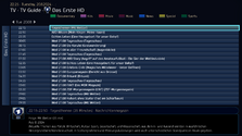
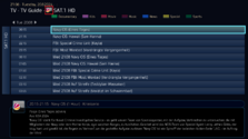
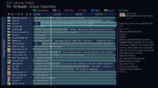
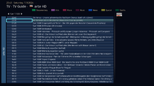
 High_Five replied to the thread PureVisionHD 1080.Good news! (y) The image can remain. The cause of the cropped image edges is the masking of the texture in the line <texture mask=“tvguide_mask.png”></texture> of the control for the single...
 -
 High_Five replied to the thread PureVisionHD 1080.All in all, the new features already look very good. The only thing that could perhaps be improved is the display of the single channel image in the title bar, which currently appears cut off at...
 -
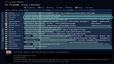
 High_Five replied to the thread PureVisionHD 1080.After a longer period of getting used to it, I have to say that your approach of labeling the TV group or channel name at a constant distance from the top edge is more pleasant to read, especially...
 -
 High_Five replied to the thread PureVisionHD 1080.For me, the display with a fixed pixel pitch from the top edge looks asymmetrical. I think that the TV group or the selected program should be arranged in the middle as a superordinate theme...
 -
 High_Five replied to the thread PureVisionHD 1080.Yes, I know. I meant that “Label” instead of “LabelBold” font would suit better.
 -
 High_Five replied to the thread PureVisionHD 1080.Well done! ;) Just one small point regarding the font. In my opinion, the “Label” font would be better suited for the “Single Channel” label, as it is also used on the main page of the TV guide...
 -
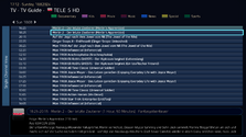
 High_Five replied to the thread PureVisionHD 1080.You are of course right in principle that the background for the channel group selector button does not have to be displayed in the individual channel overview, and that is fine. Nevertheless, I...
 -
 High_Five replied to the thread PureVisionHD 1080.Addition to your TV guide: In order to fill the corresponding empty button of the channel group selector button on the program overview for a single TV channel with the selected channel, I have...

