Australia
- Moderator
- #1
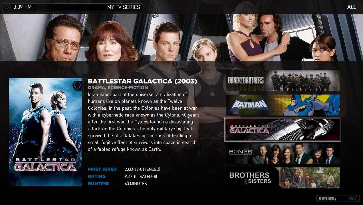
Hey guys, was playing around with the default Wide Banners layout today as I was unhappy with how it looked. I came up with alternative that uses both the wide banners and posters which is now possible in TVSeries 2.3.
What do you prefer, the new layout or old?
New Style "Wide Banner List + Selected Poster"
or
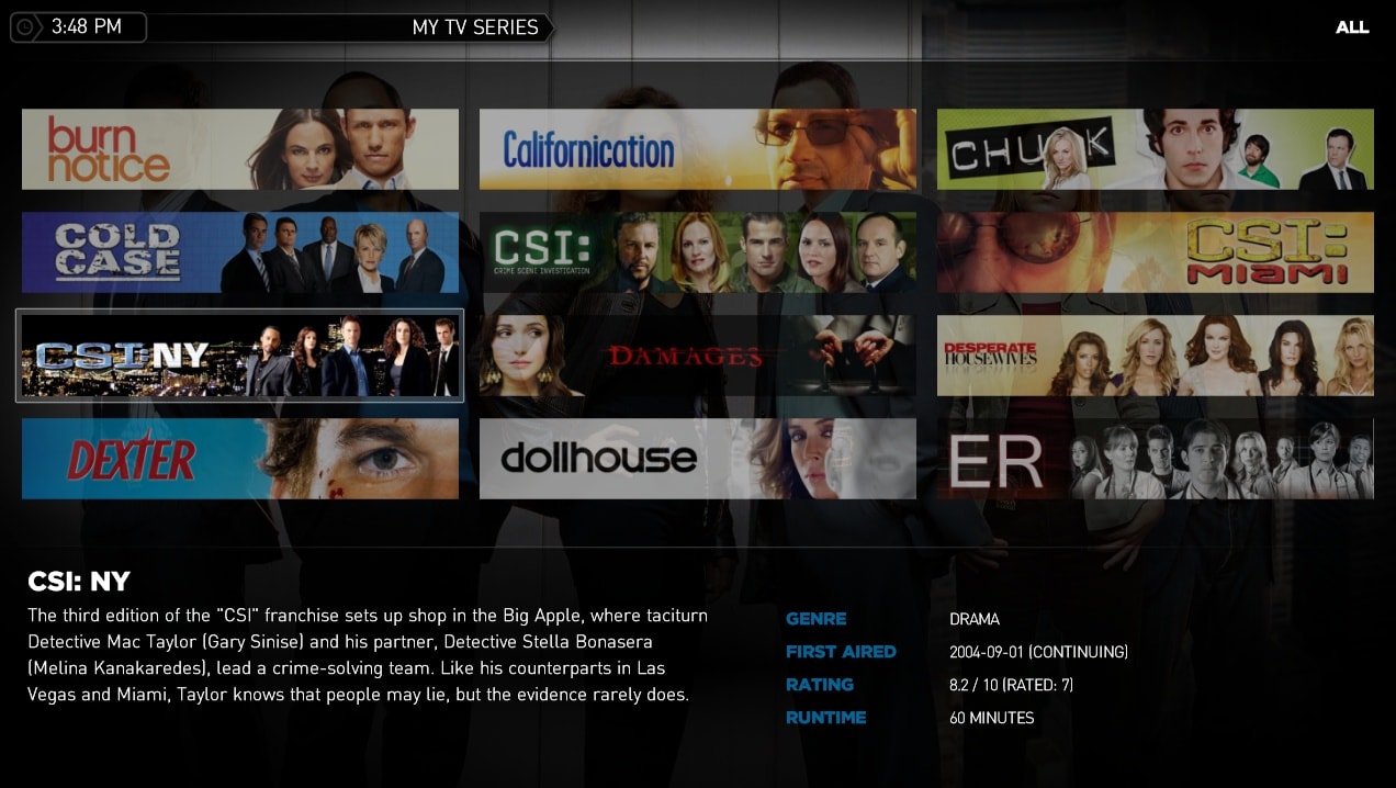
Old Style "Wide Banner 4x3 Grid"
What do you prefer, the new layout or old?
New Style "Wide Banner List + Selected Poster"
or
Old Style "Wide Banner 4x3 Grid"