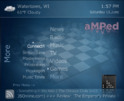
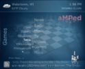
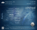
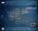
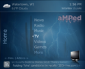
Hi all! I have created this thread so you can post any cool modifications you have made for aMPed 3.1. Please post screenshots and xml files so other users can try them out.

You are using an out of date browser. It may not display this or other websites correctly.
You should upgrade or use an alternative browser.
You should upgrade or use an alternative browser.
aMPed User Mods (1 Viewer)
- Thread starter Dadeo
- Start date
Re: aMPed 3.0 (4:3) - revaMPed!
Osd backgrounds from Core.Everyone can use if you like them.Or my modifications
@kmarkot - nice work on the OSD backgrounds! I am assuming those are for Monochrome theme? I also made some changes to them for 3.1 but maybe I will see if I can incorporate yours for the new release!
Osd backgrounds from Core.Everyone can use if you like them.Or my modifications
- Moderator
- #4
Re: aMPed 3.1 User Mods
Hi Dadeo,
I'm jumping into skinning again ... it's been awhile. I hadn't done anything special to my 800x600 skin and have gotten behind on skin code changes. There is a lot to change for the upgrade to 1.1 final, and I still haven't gotten all of my skin working, so I'm shifting gears and using aMPed as a base for my new skin... ya, I like how you've done things in aMPed, and I'm just beginning to figure out your xml's.
I found I can bump aMPed up to 800x600 pretty successfully by batch-changing all posX and posY to shift the screens over and down, allowing for my TV's overscan mask. Then changing the skin size to 800x600 in references.xml
I still had to tweek the backdrop/Fan-art size, because it still fell well inside the overscan mask. I ended up separating the background image from common.window.bars.xml, making a separate import screen, then moving the common.window.bars.xml to overlay the backdrop images, with common.window.background.xml underneath the backdrop. Then I was free to re-size and reposition the backdrop to fill my frame properly.
Once I get aMPed tweaked, I will explore other design ideas for my own satisfaction.
Thanks for such a GREAT skin!
Chuck
- Moderator
- #5
aMPed Mod - Rustic Blue (v 0.01)
I've attached my (wip) mod for aMPed 3.3. I borrowed the background graphic from Maya and adjusted the colors for my livingroom decor. Since my livingroom is painted in a reproduction of an early-American color (which I tried to match) I called the mod aMPed_Rustic_Blue.
The biggest change is in BasicHome, which has a new central menu with popup sub-menus (my wife likes the navigation better). I've placed overlays over all the fanart and gave them their own mask where I could, and I set all the fanart to keepaspectratio and centered. I've also replaced several other media files with tinted versions to go along with the new color scheme.
One warning, though. I only checked the screens against the plugins I actually use, so user beware. I use primarily a remote control with my MP HTPC.
The mod is restricted to 4:3 and 15pt text, since that is what I'm using for my TV. After creating an appropriate display setup (I used the default files from SVN with my previous aMPed setup), copy the aMPed folder and rename it "aMPed_Rustic_Blue". Copy the files from the zip into the new "aMPed_Rustic_Blue" folder, replacing all the same-name files.
Dadeo - I hope there is something useful with my new Basic Home menu. I LOVE aMPED 3.3 ...


Enjoy, ... and feedback is welcome. Let me know if there are any glaringly obvious issues that need to be fixed and I'll see if I can figure it out. I'm looking into the movie/TV program info icons that Maya uses to replace those in aMPed for Rustic_Blue. The default ones are just a little too colorful/playful for my taste .... I haven't figured that out yet.
Chuck
I've attached my (wip) mod for aMPed 3.3. I borrowed the background graphic from Maya and adjusted the colors for my livingroom decor. Since my livingroom is painted in a reproduction of an early-American color (which I tried to match) I called the mod aMPed_Rustic_Blue.
The biggest change is in BasicHome, which has a new central menu with popup sub-menus (my wife likes the navigation better). I've placed overlays over all the fanart and gave them their own mask where I could, and I set all the fanart to keepaspectratio and centered. I've also replaced several other media files with tinted versions to go along with the new color scheme.
One warning, though. I only checked the screens against the plugins I actually use, so user beware. I use primarily a remote control with my MP HTPC.
The mod is restricted to 4:3 and 15pt text, since that is what I'm using for my TV. After creating an appropriate display setup (I used the default files from SVN with my previous aMPed setup), copy the aMPed folder and rename it "aMPed_Rustic_Blue". Copy the files from the zip into the new "aMPed_Rustic_Blue" folder, replacing all the same-name files.
Dadeo - I hope there is something useful with my new Basic Home menu. I LOVE aMPED 3.3 ...
Enjoy, ... and feedback is welcome. Let me know if there are any glaringly obvious issues that need to be fixed and I'll see if I can figure it out. I'm looking into the movie/TV program info icons that Maya uses to replace those in aMPed for Rustic_Blue. The default ones are just a little too colorful/playful for my taste .... I haven't figured that out yet.
Chuck
Attachments
- Thread starter
- #6
Hey Chuck - nice work I especially like the down arrow for third level submenus (like Games). My idea for aMPed 3.4, which you might wish to use, is small buttons for main menu items (probably same as the hover images) as I think those are quite clear. I think catavolt did something similar in latest PureVision. Of course text will change to show which button is highlighted. Then you do not need so much room for main menu items. I could use small button images for all sub menu items as well, but I am not sure they are always that identifiable. What do you think? If text shows the highlighted item maybe that is enough? The arrows (as you used) would clearly show which submenu you were in.
I guess you know I am not a fan of much text over backdrops/fanart. I try to avoid it wherever possible. Hence the above idea. Just a matter of taste.
Anyway, I am in chill mode today, but I will check out your mod ASAP and let you know if I see anything.
Thanks again for all your support and creativity! It seems you were able to mod 3.3 more easily than previous versions? I did not manage to get everything in MP I wanted to so that 'margins' could be adjusted, but I think it was a bit better.
EDIT: What do you mean by "movie/TV program info icons" ?
- Moderator
- #7
Hey Chuck - nice work I especially like the down arrow for third level submenus (like Games). My idea for aMPed 3.4, which you might wish to use, is small buttons for main menu items (probably same as the hover images) as I think those are quite clear. I think catavolt did something similar in latest PureVision. Of course text will change to show which button is highlighted. Then you do not need so much room for main menu items. I could use small button images for all sub menu items as well, but I am not sure they are always that identifiable. What do you think? If text shows the highlighted item maybe that is enough? The arrows (as you used) would clearly show which submenu you were in.
I guess you know I am not a fan of much text over backdrops/fanart. I try to avoid it wherever possible. Hence the above idea. Just a matter of taste.
Hense the overlays... I'm not a fan of fanart and backgrounds overpowering the 'important' forground information on the screen. I worked and reworked the overlays for several days trying to find an acceptable balance. My wife wrinkled her nose at the idea of using graphics in place of the text in the menu
Anyway, I am in chill mode today, but I will check out your mod ASAP and let you know if I see anything.
Thanks, it's appreciated. Hope you got some well deserved down-time.
Thanks again for all your support and creativity! It seems you were able to mod 3.3 more easily than previous versions? I did not manage to get everything in MP I wanted to so that 'margins' could be adjusted, but I think it was a bit better.
It was easier to follow, this time around. I don't know if I made the mods in the appropriate places, though. I haven't studied your customization system yet. But it looks good... if it weren't for people like me who want to add more layers (fanart masks and multiple overlays)
oops ... meant to say Logos. The Logos in Maya are organized diferently, so I have to locate the ones I prefer to use and move them around. I found the aMPed Logos more distracting than usefull (sorry)EDIT: What do you mean by "movie/TV program info icons" ?
- Thread starter
- #8
Yeah at first I hated all the fanart in MP - I'm too old - it was too visually distracting for me. But now I find it easier to see a huge image than to read - must be even older LOL (or blind from too many hours on computer!) My son says I just caved to modern trendsI'm not a fan of fanart and backgrounds overpowering the 'important' forground information on the screen. I worked and reworked the overlays for several days trying to find an acceptable balance. My wife wrinkled her nose at the idea of using graphics in place of the text in the menu
I think for your mod, without all the font/screen size and other options, you are safe to skin it the 'normal' way - i.e. mostly window by window. But actually adding layers is very easy because it is all done in common.window.backdrop.overlays.xml - except for Basic Home and a few other anomalies (there are always some in MP!). But maybe all you had to do for your fanart masks/overlays was just change the fanart_overlay texture to what you wanted? Then the code would already have been done in the backdrop overlays xml. Not sure what side effects that might create, but should be close.It was easier to follow, this time around. I don't know if I made the mods in the appropriate places, though. I haven't studied your customization system yet. But it looks good... if it weren't for people like me who want to add more layers (fanart masks and multiple overlays)
I thought maybe you meant the logos. Last I checked Maya did not have genre logos, I will have to take another look. I already have two more logo packs mostly done, one like photopeter's pack for aMPed 3.2 and another basically like the current aMPed logo themes, but matching the media info logos (i.e. white on dark). They are just missing a few genres I have to add. Then I will post them on Google code as optional logo packs. I can include yours too, if you like. It's not that hard to change logos in TV Series, and My Films has a config option to select your logos pack. I don't think Videos even supports them yet, other than in OSD, but hopefully the trend for user options will continue. I guess it is obvious I am a big supporter of that!oops ... meant to say Logos. The Logos in Maya are organized diferently, so I have to locate the ones I prefer to use and move them around. I found the aMPed Logos more distracting than usefull (sorry)
And no need to apologize Chuck. I realize aMPed is not really your 'style' and you use it as a good base for 4:3. I think I have been living in India too long - I can't live without color anymore! When I go home, Canada just seems so bland to me now LOL. But with the new theme editor (coming in 3.4 I hope) you can create your own theme and adjust intensity for your TV/monitor, or for each room in your house, and your wife can get you to match the new paint job. "Just a little darker Chuck, no not THAT dark!"
- Moderator
- #9
I'm trying to make an "Avalon" mod from my "Rustic Blue" Mod...
I'm having problems getting the "Header" to reposition into the topbar. When I change the Pos and remove the animations (90 degree rotation), with Left align, in the Styles section of references.xml... the text just disappears. Once I figure it out, the weather details will go in the bottom bar. I'll also put the Recent Additions thumbs and labels in the bottom bar.
I don't know why it's not working. Do you have any suggestions?
Thanks,
Chuck
The mod so far.... just on Basic Home.
Attachments
- Thread starter
- #10
Hi Chuck - really cool!!! It's hard for me to tell - it all sounds correct to me. Maybe you can post the code for the Header style you have in references.xml.
What I usually do is remove the style from the control at first - get it working without the style, then when I have it how I want it, I copy the code to the style in references.xml. I am not sure you even need to use a style for your headers. I mainly use the styles so I can adjust for different font/screen sizes.
BTW at present the Recently Added info is a temporary solution using highlightedbutton text for visibility but Migue is working out a way to track the buttons in Basic Home editor so we can do it properly.
Users who are viewing this thread
Online now: 2 (members: 0, guests: 2)
Similar threads
Thanks CyberSimian, that's fixed it (y) and also thanks to AJS for including the change in the next release.
Thanks CyberSimian, that's fixed it (y) and also thanks to AJS for including the change in the next release.
When using the List Layout for Argus TV Recorded TV the page count is above the bottom information bar, refer to attached...
- Replies
- 4
- Views
- 293
@Brownard another logs of failed installations. I'll take a look into the user management.
Edit: I can confirm user management is completey broken with NET4 and NET6 :( Neither an existing profile can be selected nor a new one can be created.
@Brownard another logs of failed installations. I'll take a look into the user management.
Edit: I can confirm user management is...
Description:
Hi there.
First of all, I appreciate all the effort in MediaPortal 2 release 2.5 - visible changes look great (eg...
- Replies
- 1
- Views
- 526
I removed all sign of MySQL, rebooted, did a clean reinstall. It reinstalled 5.6, But I've still got both the same problem - unable to connect to any of the specified MySQL hosts. And Hostname is still in red. I don't understand - this is a dedicated TV computer. Unless an update did this I don't know why there's a problem in the...
I removed all sign of MySQL, rebooted, did a clean reinstall. It reinstalled 5.6, But I've still got both the same problem -...
I've been using MediaPortal for 20 or so years. Last night it recorded perfectly. This arvo it doesn't - will run videos but not...
- Replies
- 2
- Views
- 421
I uninstalled MP, made sure no sub folders were left n any programmes folders, changed the computer name, rebooted, installed MP and set logs and rebooted and ran TVServer. Didn't do anything in regard to S Loopback adapter.
I've been using NextPvr since the problem became insurmountable. Only reason it's not a good long term...
I uninstalled MP, made sure no sub folders were left n any programmes folders, changed the computer name, rebooted, installed MP...
I've been using MediaPortal for 20 or so years. Last night it recorded perfectly. This arvo it doesn't - will run videos but not...
- Replies
- 24
- Views
- 2K
I had the same issue and found the executable under
C:\ProgramData\Team MediaPortal\MediaPortal\skin\Titan\BasicHome.Editor\TitanEditor.exe
Only the shortcut was missing.
I had the same issue and found the executable under
C:\ProgramData\Team...
Hi all,
Not a rant, more a sharing of experience (maybe hoping to get some clarification on which wrong turn I took)
It has been...
- Replies
- 9
- Views
- 2K

 Canada

