I found some notes I made during the MP install I did recently for the RC1 (sorry for the delay in posting). These are not really bugs, but I think it could make the tool (and the first impression that a new user gets from MP) better. Some may seem to be nitpicking, but I think that improving small things is also important.
So here it goes:
* The path in the first screen looks weird with the 8.3 folder names. The normal long names would be nicer I think.
* The languages in the drop down for language selection should start with a capital letter (just English spelling rules). So "English" in stead of "english".
* I found the text in the dialogs sometimes a hard to read, because it is on a (light)gray background. Also the text in the labels for the radio buttons is quite small. I think it would help if it was a bit bigger (same for the other texts with the same fontsize). I think these texts might be even harder to read for people that are installing MP on a PC with only a CRT TV attached (I used PC monitor).
* The spacing between the radiobuttons on the different screens varies, makes it look a bit messy.
* I think it would be visually nicer if the Back/Next buttons were closer together like in other installation programs.
Maybe also use the "arrows" on the buttons like you see a lot in other installers. So "Next >" in stead of "Next"
* On the TV server/build in plugin selection screen the text is too much and too small. Also a lot of technical stuff. I am not sure on how to improve on this. Maybe a different layout of this screen is needed? Or less information? Or have some kind of link for "detailed comparison" that opens a big new window (or website?) with all the details of the 2 compared? Hmm, I think I like the last option best, but not sure about website, cause it might be a problem when the user is not connected to the internet.
* In the window with the action list the Install button is in a weird place. It took me a while to find it (no seriously, I got the error dialog and thought WTF is going on what should I do now). In most installers you see nowadays the Next button will be replaced with an Install button in cases like this. Right now you will get a scary looking error message if you just keep clicking at the same place. Errors are bad, they give a negative feeling to a user since it looks scary (an information icon instead of the red icon would already be better, but avoiding the error by hiding/disableing the button would even be better).
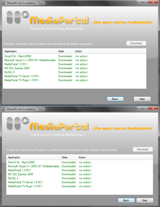
* The box with the installation actions is misaligned, it is too much to the left, it should be in the middle of the dialog, also the Install/download button is too far to the left. It looks messy this way. See attached screenshot for what I mean. The top one is now, the bottom one is edited by me (just mockup) to align everything a bit more.
* I think it would be nice if the Deploy tool had an option to start MP/configuration on the last screen.
Well thats it") I hope it is of some use.
I hope it is of some use.
So here it goes:
* The path in the first screen looks weird with the 8.3 folder names. The normal long names would be nicer I think.
* The languages in the drop down for language selection should start with a capital letter (just English spelling rules). So "English" in stead of "english".
* I found the text in the dialogs sometimes a hard to read, because it is on a (light)gray background. Also the text in the labels for the radio buttons is quite small. I think it would help if it was a bit bigger (same for the other texts with the same fontsize). I think these texts might be even harder to read for people that are installing MP on a PC with only a CRT TV attached (I used PC monitor).
* The spacing between the radiobuttons on the different screens varies, makes it look a bit messy.
* I think it would be visually nicer if the Back/Next buttons were closer together like in other installation programs.
Maybe also use the "arrows" on the buttons like you see a lot in other installers. So "Next >" in stead of "Next"
* On the TV server/build in plugin selection screen the text is too much and too small. Also a lot of technical stuff. I am not sure on how to improve on this. Maybe a different layout of this screen is needed? Or less information? Or have some kind of link for "detailed comparison" that opens a big new window (or website?) with all the details of the 2 compared? Hmm, I think I like the last option best, but not sure about website, cause it might be a problem when the user is not connected to the internet.
* In the window with the action list the Install button is in a weird place. It took me a while to find it (no seriously, I got the error dialog and thought WTF is going on what should I do now). In most installers you see nowadays the Next button will be replaced with an Install button in cases like this. Right now you will get a scary looking error message if you just keep clicking at the same place. Errors are bad, they give a negative feeling to a user since it looks scary (an information icon instead of the red icon would already be better, but avoiding the error by hiding/disableing the button would even be better).
* The box with the installation actions is misaligned, it is too much to the left, it should be in the middle of the dialog, also the Install/download button is too far to the left. It looks messy this way. See attached screenshot for what I mean. The top one is now, the bottom one is edited by me (just mockup) to align everything a bit more.
* I think it would be nice if the Deploy tool had an option to start MP/configuration on the last screen.
Well thats it
I hope it is of some use.