First impressions of Titan in MP 1.3.0b (1 Viewer)

rsbrux

Documentation Group
  • Team MediaPortal
  • April 15, 2007
    1,137
    117
    Home Country
    Switzerland Switzerland
    Here are my first impressions of Titan:
    1. I am not a fan of such visually "busy" user interfaces (UIs), but understand that they are popular. From this viewpoint, it's good to have such a skin among those "officially supported".
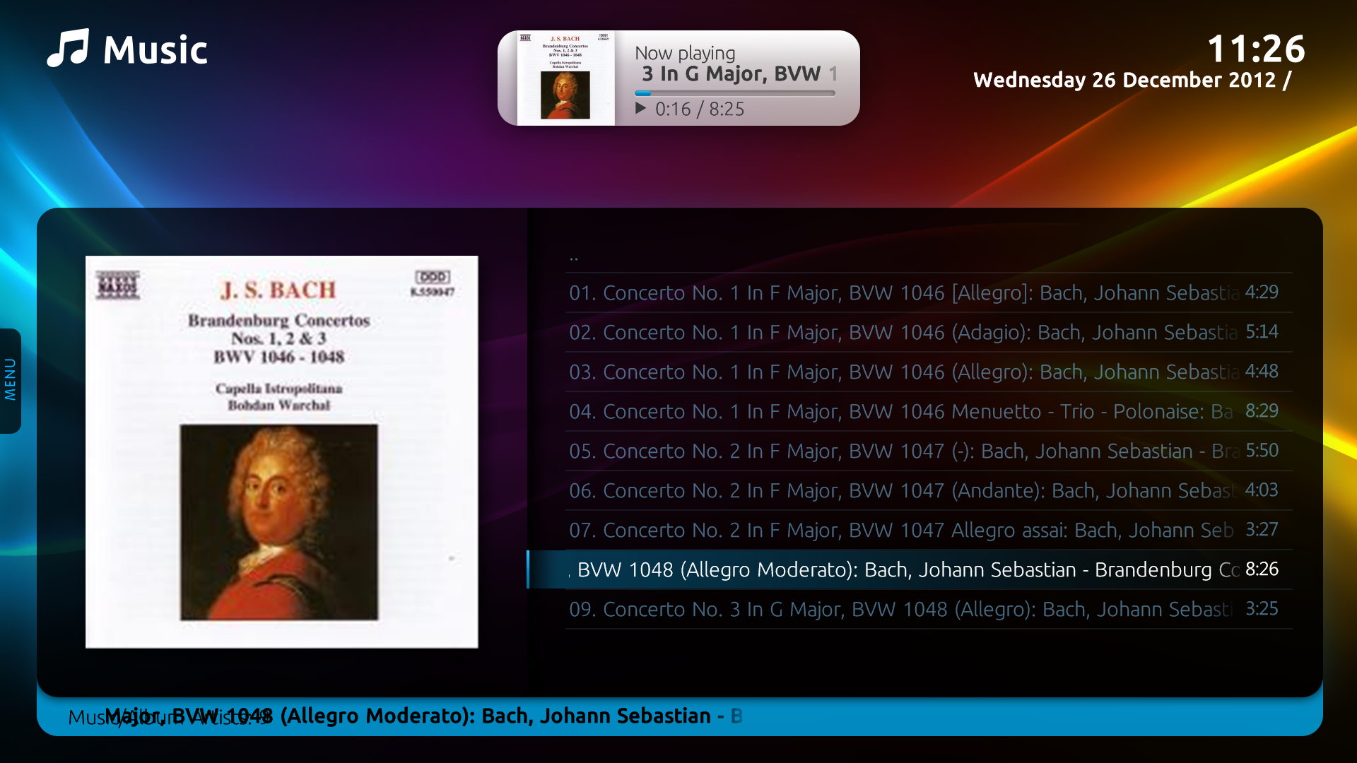
    2. The "Now Playing" view is a vast improvement, now capable of showing more text, especially useful for classical music.
    3. The standard music view seems to suffer from a failure to use the available space on the right half of the screen for the currently playing title. This title also overlaps with the title of the view at bottom left (see attachment "11-26-05.png").
    4. The update feature is nice, but it seems to require administrative privileges, at least I get a UAC prompt asking for administrator credentials. Is there some way to avoid this?
    5. The "power bar" submenu at the bottom of the home screen is a nice feature, but after activating it, I couldn't get out except by selecting one of the options (e.g. to close MP). There was no response to the MCE remote "back" key or the keyboard "ESC" key.
     

    Attachments

    • 11-26-05.png
      11-26-05.png
      796.6 KB

    mpsam

    Portal Pro
    June 16, 2009
    179
    75
    "The "power bar" submenu at the bottom of the home screen is a nice feature, but after activating it, I couldn't get out except by selecting one of the options (e.g. to close MP). There was no response to the MCE remote "back" key or the keyboard "ESC" key."

    The 'power bar' is activated with the Down arrow key (cursor), it is deactivated with the UP arrow key. However, you have a valid point, it should respond to the BACK or ESC key. I suspect most persons, like you and I, tried those keys (BACK & ESC) and ended up choosing one of the options to get out.
     

    rsbrux

    Documentation Group
  • Team MediaPortal
  • April 15, 2007
    1,137
    117
    Home Country
    Switzerland Switzerland
    Yeah, I figured out the bit with the "up" key today: doh! ;-)
    Anyway, thanks for seconding my motion!
    P.S. I noticed similar behaviour in DefaultWide as well: For example, the left menu in Music doesn't automatically go away after selecting a new view, and "BACK" and "ESC" exit from Music completely, instead of just closing the menu. Now it's the "right" key to exit the menu.
     
    Last edited:

    wawa79

    Portal Pro
    December 9, 2008
    111
    28
    Niort
    Home Country
    France France
    My feedback on Titan.
    First, the navigation is fine, smooth, the light popup menus are well organized and clearly improve the user experience.

    I am not fan of the rainbow colored background. I would prefer shades of one single color but this is just a matter of taste...

    Accessing MP settings from MP is great... except that items should be arranged in 1 column instead of 2: with 2 columns, all item labels are cropped (in French, at least) so it is unusable.

    EPG font size is too small for correct readibility when the TV set is far (compared to Black Glass). But this is a common issue to many MP themes (we do not all have our sofa at less than 5 meters from the TV set...)

    I share the remark for Music : lot of lost space in list views!

    Last, I would like having the latest selected 'exit' command showing as default on the 'Exit' menu instead of the 'Restart command' (I do not often restart my HTPC by myself). So when I access the menu, I would directly access the 'Sleep' command which is the one I use every time I stop using MP.
     

    rsbrux

    Documentation Group
  • Team MediaPortal
  • April 15, 2007
    1,137
    117
    Home Country
    Switzerland Switzerland
    My feedback on Titan.
    I am not fan of the rainbow colored background. I would prefer shades of one single color but this is just a matter of taste...
    IIRC there is an option to select a blue background instead.
     

    u28151

    Portal Pro
    March 24, 2005
    179
    20
    Home Country
    Sweden Sweden
    Is there anything to do about the color scheme for context popup using Titan skin? I think it is hard to read light grey text on white background...
     

    Attachments

    • MP Context.jpg
      MP Context.jpg
      357.9 KB
    Last edited:

    kiwijunglist

    Super Moderator
  • Team MediaPortal
  • June 10, 2008
    6,746
    1,751
    New Zealand
    Home Country
    New Zealand New Zealand
    Is there anything to do about the color scheme for context popup using Titan skin? I think it is hard to read light grey text on white background...

    @ncoH this seems to be a recurring comment on the forums, so I thought I'd draw your attention to it. I have no problem reading this text with my display personally. Maybe consider a higher contrast option (?theme with dark grey instead of light grey text). Cheers kiwi.
     
    Last edited:

    Users who are viewing this thread

    Top Bottom