
 United States of America
[ EDIT: I can post a patch to svn 23209 if it makes inserting this into svn easier. I recently updated my workspace to 23209 and had a heck of a time patching GUIImage.cs (I ended up doing it manually - there was just too many changes since my last workspace snapshot).
EDIT 2: I found a bug in my patch that prevents the border from taking part in animations. I have attached a second, incremental change patch the corrects this problem. The second patch must be applied after the original patch - the second patch changes only CachedTexture.cs to incorporate the (global) final transform matrix.]
This patch adds bordering support to image and button control types. With this patch you have the ability to add borders composed of textures that you identify. Each border (around an image or button) is a rectangular shape and each side of the border rectangle is itself a rectangle drawn with the specified border texture. The following attributes are added to image and border control types as specified:
Image control attributes:
border - specifies a comma separated list of border edge thickness for each side of the border. The order of values is left, right, top, bottom. This field accepts either four integer values separated by commas or a single integer value which is then used for all four sides. Examples: <border>10</border> -or- <border>10,10,1,1</border>
border, position - specifies the position of the border relative to the image edges. Valid values are "outside", "inside", "center". The default value is "outside". Example: <border position="center">10</border>
border, textureRepeat - specifies whether the texture used for the border should repeat or stretch inside each of the four rectangles that compose the overall border. The default value is "no". Example: <border textureRepeat="yes">10</border>
border, textureRotate - specifies whether or not the texture used for the border should be rotated for each of the border rectangles. If the texture should rotate then the texture will be rotated 90 deg for the right border rectangle, 180 deg for the bottom, and 270 deg for the left. The default value is "no". Example: <border textureRotate="yes">10</border>
border, texture - specifies the tetxure filename for the border rectangles. A single file is used for all four of the border rectangles. Based on the value of textureRepeat, the entire texture extent is either stretched (scaled up/down) to fill the border rectangles or is scaled (up/down) to fit inside the border rectangle at its native aspect ratio and repeatedly drawn until the border rectangle is filled. The default value is "image_border.png". This texture file must exist in the skin media directory otherwise no border will be drawn. Example: <border texture="my_border.png">10</border>
border, colorKey - specfies the color key for the border texture. The default value is 0xFFFFFFFF. Example: <border colorKey="0x66FFFFFF">10</border>
Button control attributes:
The button control border attributes are identical to those on the image control, however, since the button control manages three images the implementation extends to each of the three images; textureFocus, textureNoFocus, and hover.
Examples:
<textureFocus border="10" position="center" texture="my_border.png">my_focus_texture.png</textureFocus>
<textureNoFocus border="10" position="center" texture="my_border.png">my_no_focus_texture.png</textureNoFocus>
<hover border="10" position="center" texture="my_border.png">my_hover_texture.png</hover>
The implementation alters GUIImage.cs, GUIButtonControl.cs, GUIAnimation.cs, and CachedTexture.cs and is backward compatible (it will not break any existing skins). Application of this patch will change only Core.dll (the GUI library).
I have done a lot of testing to make sure all the algorithms work -- I spent a lot of time on the DrawBorder() method in GUIImage.cs so I hope ya'll like this new feature.
One thing I noticed is that if the texture you specify as the border texture is much bigger than then border rectangles then it may not render very nicely. If this happens simply scale down the texture image to be closer to the border rectangle sizes. The poor rendering appears to be an artifact of MS DirectX implementation (read - there's nothing I can do about it).
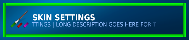
I have included a number of images (to get you excited about this patch) including the images I used for the border textures so you can recreate exactly what I have used in testing. The following skin xml produces the attached images. Note the images with the star borders; look at the orientation of the top of the star in the first images vs. the others (example of textureRotate) and look at the position of the star borders in each image with respect to the semi-transparent button image (example of position center,inside,outside).


EDIT 2: I found a bug in my patch that prevents the border from taking part in animations. I have attached a second, incremental change patch the corrects this problem. The second patch must be applied after the original patch - the second patch changes only CachedTexture.cs to incorporate the (global) final transform matrix.]
This patch adds bordering support to image and button control types. With this patch you have the ability to add borders composed of textures that you identify. Each border (around an image or button) is a rectangular shape and each side of the border rectangle is itself a rectangle drawn with the specified border texture. The following attributes are added to image and border control types as specified:
Image control attributes:
border - specifies a comma separated list of border edge thickness for each side of the border. The order of values is left, right, top, bottom. This field accepts either four integer values separated by commas or a single integer value which is then used for all four sides. Examples: <border>10</border> -or- <border>10,10,1,1</border>
border, position - specifies the position of the border relative to the image edges. Valid values are "outside", "inside", "center". The default value is "outside". Example: <border position="center">10</border>
border, textureRepeat - specifies whether the texture used for the border should repeat or stretch inside each of the four rectangles that compose the overall border. The default value is "no". Example: <border textureRepeat="yes">10</border>
border, textureRotate - specifies whether or not the texture used for the border should be rotated for each of the border rectangles. If the texture should rotate then the texture will be rotated 90 deg for the right border rectangle, 180 deg for the bottom, and 270 deg for the left. The default value is "no". Example: <border textureRotate="yes">10</border>
border, texture - specifies the tetxure filename for the border rectangles. A single file is used for all four of the border rectangles. Based on the value of textureRepeat, the entire texture extent is either stretched (scaled up/down) to fill the border rectangles or is scaled (up/down) to fit inside the border rectangle at its native aspect ratio and repeatedly drawn until the border rectangle is filled. The default value is "image_border.png". This texture file must exist in the skin media directory otherwise no border will be drawn. Example: <border texture="my_border.png">10</border>
border, colorKey - specfies the color key for the border texture. The default value is 0xFFFFFFFF. Example: <border colorKey="0x66FFFFFF">10</border>
Button control attributes:
The button control border attributes are identical to those on the image control, however, since the button control manages three images the implementation extends to each of the three images; textureFocus, textureNoFocus, and hover.
Examples:
<textureFocus border="10" position="center" texture="my_border.png">my_focus_texture.png</textureFocus>
<textureNoFocus border="10" position="center" texture="my_border.png">my_no_focus_texture.png</textureNoFocus>
<hover border="10" position="center" texture="my_border.png">my_hover_texture.png</hover>
The implementation alters GUIImage.cs, GUIButtonControl.cs, GUIAnimation.cs, and CachedTexture.cs and is backward compatible (it will not break any existing skins). Application of this patch will change only Core.dll (the GUI library).
I have done a lot of testing to make sure all the algorithms work -- I spent a lot of time on the DrawBorder() method in GUIImage.cs so I hope ya'll like this new feature.
One thing I noticed is that if the texture you specify as the border texture is much bigger than then border rectangles then it may not render very nicely. If this happens simply scale down the texture image to be closer to the border rectangle sizes. The poor rendering appears to be an artifact of MS DirectX implementation (read - there's nothing I can do about it).
I have included a number of images (to get you excited about this patch) including the images I used for the border textures so you can recreate exactly what I have used in testing. The following skin xml produces the attached images. Note the images with the star borders; look at the orientation of the top of the star in the first images vs. the others (example of textureRotate) and look at the position of the star borders in each image with respect to the semi-transparent button image (example of position center,inside,outside).
Code:
<control>
	<description>tv settings button</description>
	<type>button</type>
	<id>1001</id>
	<label>LONG DESCRIPTION GOES HERE FOR THESE SETTINGS</label>
	<font>h3</font>
	<textXOff>90</textXOff>
	<textYOff>50</textYOff>
	<textcolor>#buttonDescTextColor</textcolor>
	<textcolorNoFocus>#buttonDescTextColor</textcolorNoFocus>
	<textureFocus border="15" texture="stargood1.png" position="center" textureRepeat="yes"
		colorKey="22FFFFFF">list-nofocus.png</textureFocus>
	<textureNoFocus>-</textureNoFocus>
	<scrollStartDelaySec>1</scrollStartDelaySec>
	<scrollWrapString>#buttonScrollWrapString</scrollWrapString>
	<width>600</width>
	<height>96</height>
	<onup>1005</onup>
	<ondown>1002</ondown>
	<onleft>1006</onleft>
	<onright>1006</onright>
</control>
<control>
	<description>videos settings button</description>
	<type>button</type>
	<id>1002</id>
	<label>LONG DESCRIPTION GOES HERE FOR THESE SETTINGS</label>
	<font>h3</font>
	<textXOff>90</textXOff>
	<textYOff>50</textYOff>
	<textcolor>#buttonDescTextColor</textcolor>
	<textcolorNoFocus>#buttonDescTextColor</textcolorNoFocus>
	<textureFocus border="15"  texture="stargood1.png" position="inside" textureRepeat="yes"
		textureRotate="yes" colorKey="22FFFFFF">list-nofocus.png</textureFocus>
	<textureNoFocus>-</textureNoFocus>
	<scrollStartDelaySec>1</scrollStartDelaySec>
	<scrollWrapString>#buttonScrollWrapString</scrollWrapString>
	<onup>1001</onup>
	<ondown>1003</ondown>
	<onleft>1007</onleft>
	<onright>1007</onright>
</control>
<control>
	<description>pictures settings button</description>
	<type>button</type>
	<id>1003</id>
	<label>LONG DESCRIPTION GOES HERE FOR THESE SETTINGS</label>
	<font>h3</font>
	<textXOff>90</textXOff>
	<textYOff>50</textYOff>
	<textcolor>#buttonDescTextColor</textcolor>
	<textcolorNoFocus>#buttonDescTextColor</textcolorNoFocus>
	<textureFocus border="15"  texture="stargood1.png" position="outside" textureRepeat="yes"
		textureRotate="yes" colorKey="22FFFFFF">list-nofocus.png</textureFocus>
	<textureNoFocus>-</textureNoFocus>
	<scrollStartDelaySec>1</scrollStartDelaySec>
	<scrollWrapString>#buttonScrollWrapString</scrollWrapString>
	<onup>1002</onup>
	<ondown>1004</ondown>
	<onleft>1008</onleft>
	<onright>1008</onright>
</control>
<control>
	<description>weather settings button</description>
	<type>button</type>
	<id>1004</id>
	<label>LONG DESCRIPTION GOES HERE FOR THESE SETTINGS</label>
	<font>h3</font>
	<textXOff>90</textXOff>
	<textYOff>50</textYOff>
	<textcolor>#buttonDescTextColor</textcolor>
	<textcolorNoFocus>#buttonDescTextColor</textcolorNoFocus>
	<textureFocus border="2" texture="image_border_dash.png" position="inside" textureRepeat="yes"
		textureRotate="yes" colorKey="66FFFFFF">list-nofocus.png</textureFocus>
	<textureNoFocus>-</textureNoFocus>
	<scrollStartDelaySec>1</scrollStartDelaySec>
	<scrollWrapString>#buttonScrollWrapString</scrollWrapString>
	<onup>1003</onup>
	<ondown>1005</ondown>
	<onleft>1009</onleft>
	<onright>1009</onright>
</control>
<control>
	<description>setup wizard settings button</description>
	<type>button</type>
	<id>1005</id>
	<label>LONG DESCRIPTION GOES HERE FOR THESE SETTINGS</label>
	<font>h3</font>
	<textXOff>90</textXOff>
	<textYOff>50</textYOff>
	<textcolor>#buttonDescTextColor</textcolor>
	<textcolorNoFocus>#buttonDescTextColor</textcolorNoFocus>
	<textureFocus border="10,10,1,1" position="outside" colorKey="66FFFFFF">list-nofocus.png</textureFocus>
	<textureNoFocus>-</textureNoFocus>
	<scrollStartDelaySec>1</scrollStartDelaySec>
	<scrollWrapString>#buttonScrollWrapString</scrollWrapString>
	<onup>1004</onup>
	<ondown>1001</ondown>
	<onleft>1010</onleft>
	<onright>1010</onright>
</control>
<control>
	<description>music settings button</description>
	<type>button</type>
	<id>1006</id>
	<label>LONG DESCRIPTION GOES HERE FOR THESE SETTINGS</label>
	<font>h3</font>
	<textXOff>90</textXOff>
	<textYOff>50</textYOff>
	<textcolor>#buttonDescTextColor</textcolor>
	<textcolorNoFocus>#buttonDescTextColor</textcolorNoFocus>
	<textureFocus border="1" position="outside" colorKey="66FFFFFF">list-nofocus.png</textureFocus>
	<textureNoFocus>-</textureNoFocus>
	<scrollStartDelaySec>1</scrollStartDelaySec>
	<scrollWrapString>#buttonScrollWrapString</scrollWrapString>
	<onup>1010</onup>
	<ondown>1007</ondown>
	<onleft>1001</onleft>
	<onright>1001</onright>
</control>
<control>
	<description>appearance settings button</description>
	<type>button</type>
	<id>1008</id>
	<label>LONG DESCRIPTION GOES HERE FOR THESE SETTINGS</label>
	<font>h3</font>
	<textXOff>90</textXOff>
	<textYOff>50</textYOff>
	<textcolor>#buttonDescTextColor</textcolor>
	<textcolorNoFocus>#buttonDescTextColor</textcolorNoFocus>
	<textureFocus border="18" position="inside" colorKey="66FFFFFF">list-nofocus.png</textureFocus>
	<textureNoFocus>-</textureNoFocus>
	<scrollStartDelaySec>1</scrollStartDelaySec>
	<scrollWrapString>#buttonScrollWrapString</scrollWrapString>
	<hyperlink>701</hyperlink>
	<onup>1007</onup>
	<ondown>1009</ondown>
	<onleft>1003</onleft>
	<onright>1003</onright>
</control>
<control>
	<description>skin settings button</description>
	<type>button</type>
	<id>1009</id>
	<label>LONG DESCRIPTION GOES HERE FOR THESE SETTINGS</label>
	<font>h3</font>
	<textXOff>90</textXOff>
	<textYOff>50</textYOff>
	<textcolor>#buttonDescTextColor</textcolor>
	<textcolorNoFocus>#buttonDescTextColor</textcolorNoFocus>
	<textureFocus border="10" texture="tv_green_border1.png" position="outside" textureRepeat="yes"
		textureRotate="yes">list-nofocus.png</textureFocus>
	<textureNoFocus>-</textureNoFocus>
	<scrollStartDelaySec>1</scrollStartDelaySec>
	<scrollWrapString>#buttonScrollWrapString</scrollWrapString>
	<onup>1008</onup>
	<ondown>1010</ondown>
	<onleft>1004</onleft>
	<onright>1004</onright>
</control>


