Issue #1: The mouse over areas for the channel group switch arrows do not change their sizes
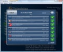
So if you move your mouse from the position in the first picture up to the channel group switch arrows, the cursor will be well within the left arrow, however the actual mouse over is shown for the right arrow and the channel group switch also goes to the right after that.
 ->
->

Issue #2: Since channel group names are typically not the same length, you have to resposition your cursor after every switch
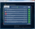
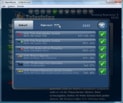
If I switch from the second picture to another group, like the one in the third picture, the cursor position will not be over the same arrow as before or not over any arrow at all. This makes it impossible to quickly switch between channel groups with your mouse (or other pointing devices). This is sometimes as aggravating as the main menu mouse position scrolling .
.

This problem can be solved by simply putting the arrows to the left of the channel group name instead of the right.
I realise that a software like MediaPortal will probably focus around remotes rather than classic PC input devices... but still, those issues should be dealt with since MediaPortal still has a mouse interface after all.
So if you move your mouse from the position in the first picture up to the channel group switch arrows, the cursor will be well within the left arrow, however the actual mouse over is shown for the right arrow and the channel group switch also goes to the right after that.
 ->
->

Issue #2: Since channel group names are typically not the same length, you have to resposition your cursor after every switch
If I switch from the second picture to another group, like the one in the third picture, the cursor position will not be over the same arrow as before or not over any arrow at all. This makes it impossible to quickly switch between channel groups with your mouse (or other pointing devices). This is sometimes as aggravating as the main menu mouse position scrolling

This problem can be solved by simply putting the arrows to the left of the channel group name instead of the right.
I realise that a software like MediaPortal will probably focus around remotes rather than classic PC input devices... but still, those issues should be dealt with since MediaPortal still has a mouse interface after all.

 Austria


