First of all aj1405 i *really really* like your skin and i think its the best out there at the moment.
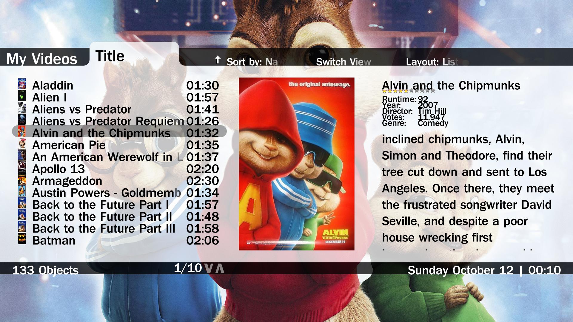
But I think Soob is right and the whole color icon stuff isnt improving your skin. I have to say that i wasnt happy when you added the small icons for folders and the permanent menu with icons in music, weather and pictures.
I think that the whole thing shouldnt look like Explorer but like a cool media skin (which it is).
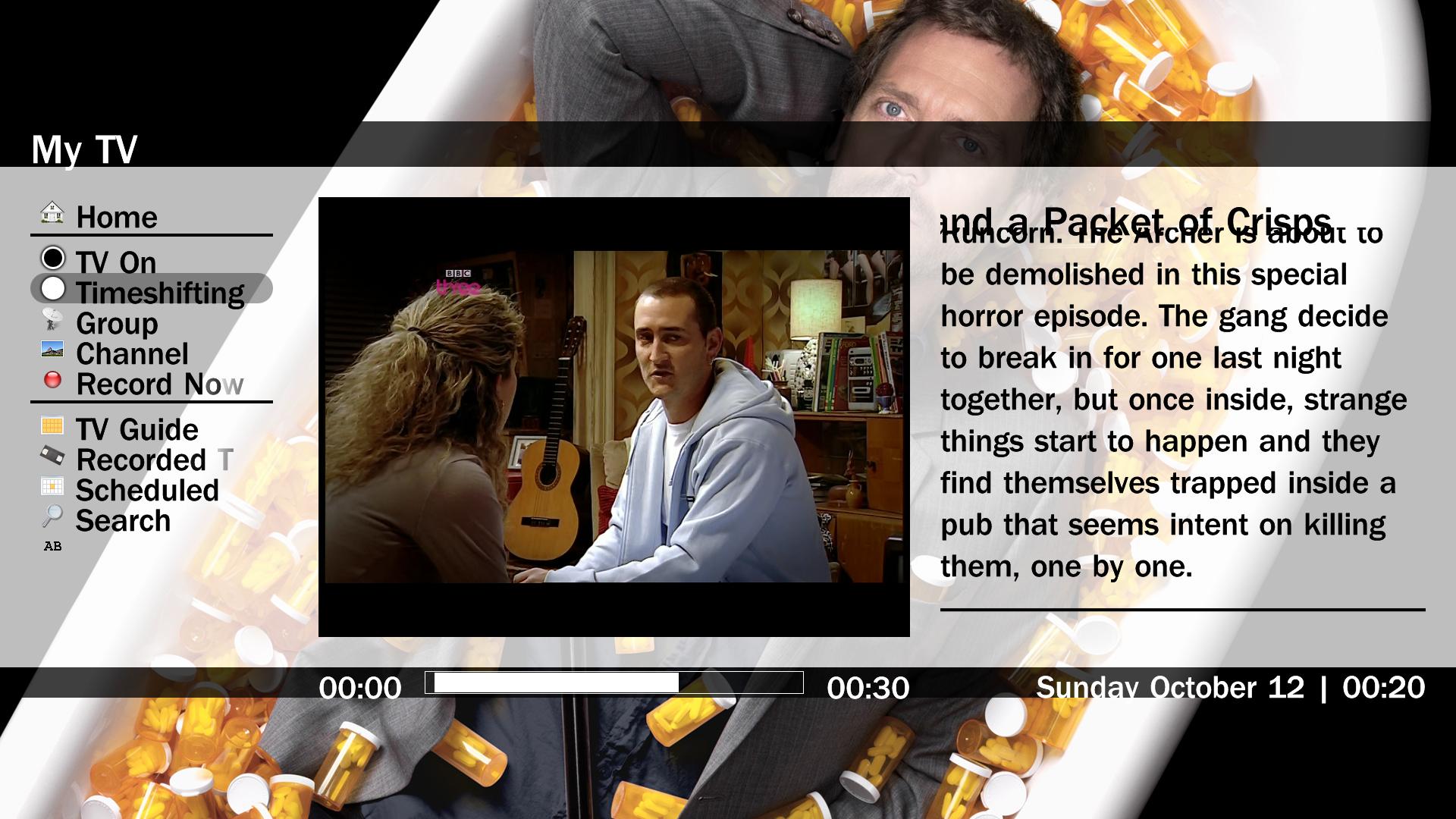
I think the whole basic home stuff could use a slightly different direction - for example i really like the aeon wide 1.2 solution for basic home - that looks amazing without using icons but using fanart (which is already integrated in your skin very well).
One more thing - i use media portal for playing my mp3 collection a lot - and i really like the "now playing" screen - in my opinion this screen could use some improvement too - at least the name of the song and the artist could be somehow highlighted (bigger letters eg) - do you intend to implement the "best tracks on the album" and "similar tracks" - stuff?
Thanks for considering this and once more thanks for your great work!
But I think Soob is right and the whole color icon stuff isnt improving your skin. I have to say that i wasnt happy when you added the small icons for folders and the permanent menu with icons in music, weather and pictures.
I think that the whole thing shouldnt look like Explorer but like a cool media skin (which it is).
I think the whole basic home stuff could use a slightly different direction - for example i really like the aeon wide 1.2 solution for basic home - that looks amazing without using icons but using fanart (which is already integrated in your skin very well).
One more thing - i use media portal for playing my mp3 collection a lot - and i really like the "now playing" screen - in my opinion this screen could use some improvement too - at least the name of the song and the artist could be somehow highlighted (bigger letters eg) - do you intend to implement the "best tracks on the album" and "similar tracks" - stuff?
Thanks for considering this and once more thanks for your great work!
 Norway