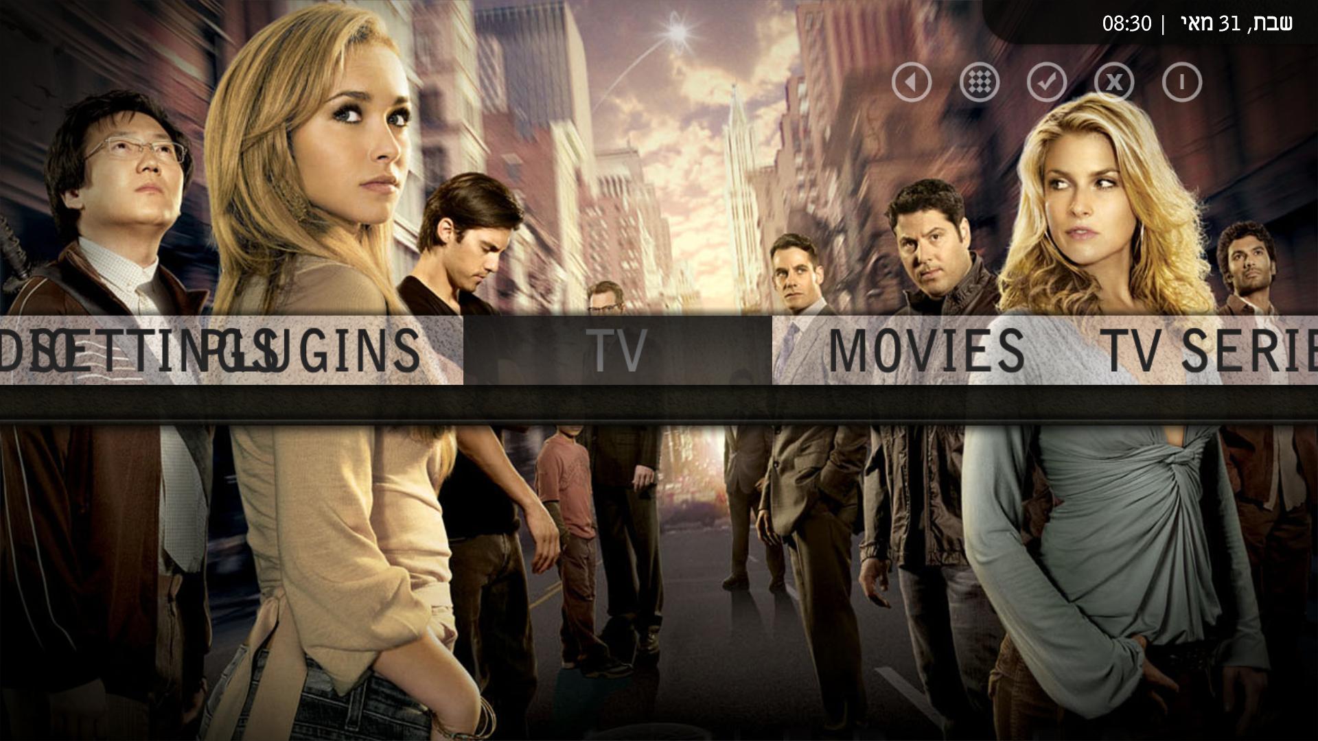
Aeon Wide (1366x768) (1 Viewer)

ThaClown

Moderator - Dutch Forums
May 28, 2006
807
26
Den Bosch
Home Country
Netherlands Netherlands
just some more of my 2cents....

- My weather is hard to read, needs some black behind the text.
- Movie covers and TV series art are a bit small (both in selection and general view) could do with a resize of at leat 33%
- In Now Playing screen, I cant get to Lyrics and or Current playlist... controls stay 'stuck' at the LastFM options.
- The Preview in the main TV section is a bit small.

Really just my opinion:
- Fan art is not visible, bould be cool if it was more like Monochrome... (info to the right, art to the left)
- I''d like to see even more of the background, so even tighter placing of info (thinner info bar in the middle) would be my vote.
- Bigger screencap in the TV series info screen would be cool.
- Would a view like this be possible?
aeon_videos-smallicon.jpg


Really amazing job! me and my girlfiend love it.
 

kingnubian

Portal Pro
March 18, 2008
67
0
Home Country
Canada Canada
Keep up the amazing work PR. Great to hear that you have moved over to the Monochrome 2.0 code base (My skin of choice).
 

kalinium1

MP Donator
  • Premium Supporter
  • January 10, 2007
    114
    0
    Tel Aviv
    Home Country
    Israel Israel
    Skin looks amazing, it gives MP the sharpest look.

    Have you decided not to use the sub-menus concept? or is it just not ready yet?

    I'm using it on a 1920X1080 screen, from what I've tested, when visualisation is on, the little "now playing" window in the left corner is shown twice, one cover overlapping another.

    I also think the list view is a bit hard to read because it's white on white background, same goes to my weather.

    and one last thing, would you consider enlarging the icons in my weather? I feel this skins "needs" bigger icons to match it's concept.

    Thanks for your hard wotk!
     

    carmenm

    Portal Pro
    April 15, 2008
    258
    4
    Home Country
    France France
    I have a strange problem with the skin. I installed the font, emptied the cache but still the skin doesnt use the font :s
    Another thing what are those logos you use on the TVSeries screenshot ?
     

    kalinium1

    MP Donator
  • Premium Supporter
  • January 10, 2007
    114
    0
    Tel Aviv
    Home Country
    Israel Israel
    Another thing,
    when changing default feature to TV, the menu on the left is corrupt.
    After I slide it to the left or right, it gets fixed, but when MP loads, it looks like this.
    Is it because I'm using it with 1920X1080 resolution?
     

    Attachments

    • 1.jpg
      1.jpg
      239.3 KB

    uncertainty

    Portal Pro
    September 29, 2007
    140
    2
    NYC
    Home Country
    United States of America United States of America
    Great skin btw and it works great on my 1080i HDTV. I have one question though regarding the SVN that was required. It seems to work fine on my stock install of 0.2.3. Can you tell me what I am missing without having the recommended SVN installed?

    Thanks again for a great conversion of a skin.
     

    TheMaestro

    Portal Member
    May 21, 2008
    6
    0
    Ooh, shall have to install this one! i love the way Aeon works, interface feels smooth, intuitive,a nd everything suitably sized and usable. :D

    Psycho, one quick question - I've been dabbling with the SML in an attempt to remove a couple of buttons from home basic, but quickly discovered this sin'ty just a case of deleting all the button references. Any chance you could explain a little what I'd need to do or where I might be going wrong? :) Thanks a heap if you do.

    Lastly, anyone likely to make a skin for the Emulators or MyPrograms plugin? Seems to be the only thing this is really missing now, then it would be the MP skin to end all skins!

    Cj
     

    bobrap

    MP Donator
  • Premium Supporter
  • May 22, 2006
    210
    3
    TN
    Home Country
    United States of America United States of America
    Would someone please be so kind and explain how I can adjust the colors of the pop up menus. The highlight bar is just about the color (black) as the background. Thanks for any help.:D
     

    Users who are viewing this thread

    Top Bottom