- Thread starter
- Moderator
- #101
Interesting approachI hope this demonstrates
")

Interesting approachI hope this demonstrates


 United Kingdom
Yes, that is very unusual. I guess we just have to take a punt and go for the option that works for most scenariosI have been doing some MP housekeeping this afternoon, and came upon this programme that has subtitles at the top (admittedly an unusual case):
..THANKYOU, THANKYOU. looks perfect!@2BitSculptor
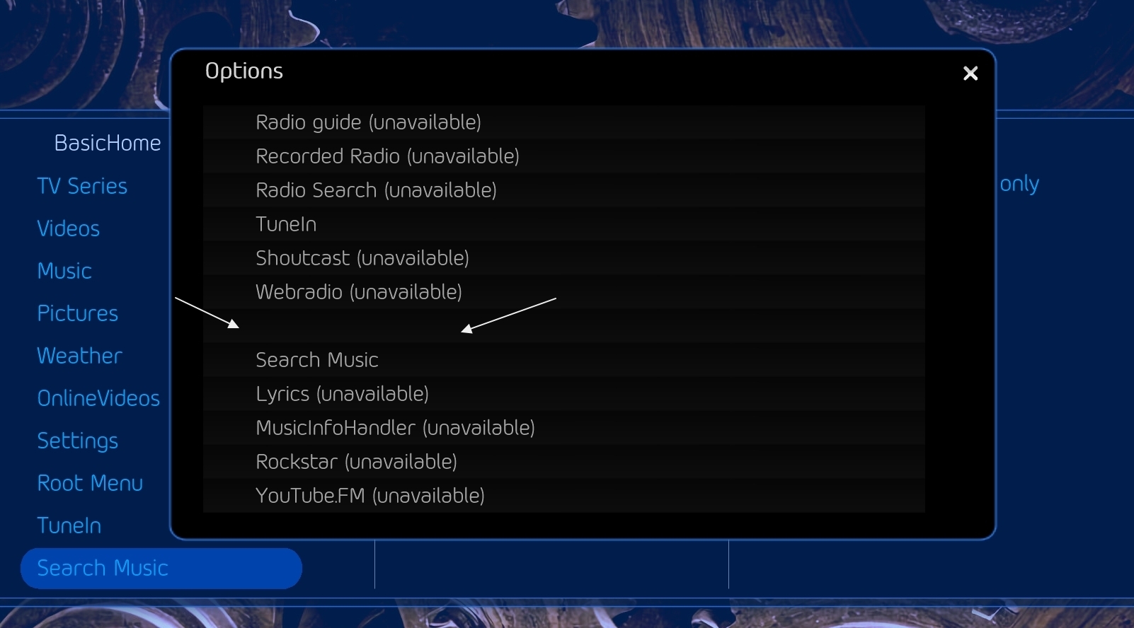
I made a workaround for the TuneIn NowPlaying screen to show the 2 lists completely
See attached xml
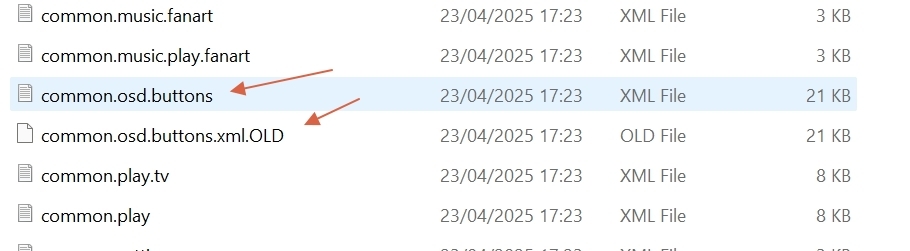
Fixed01 - common.osd.buttons.xml have 2 files (1 active 1 old).
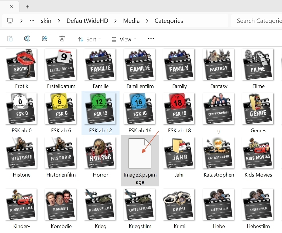
02 - do image3.... need to be there ?
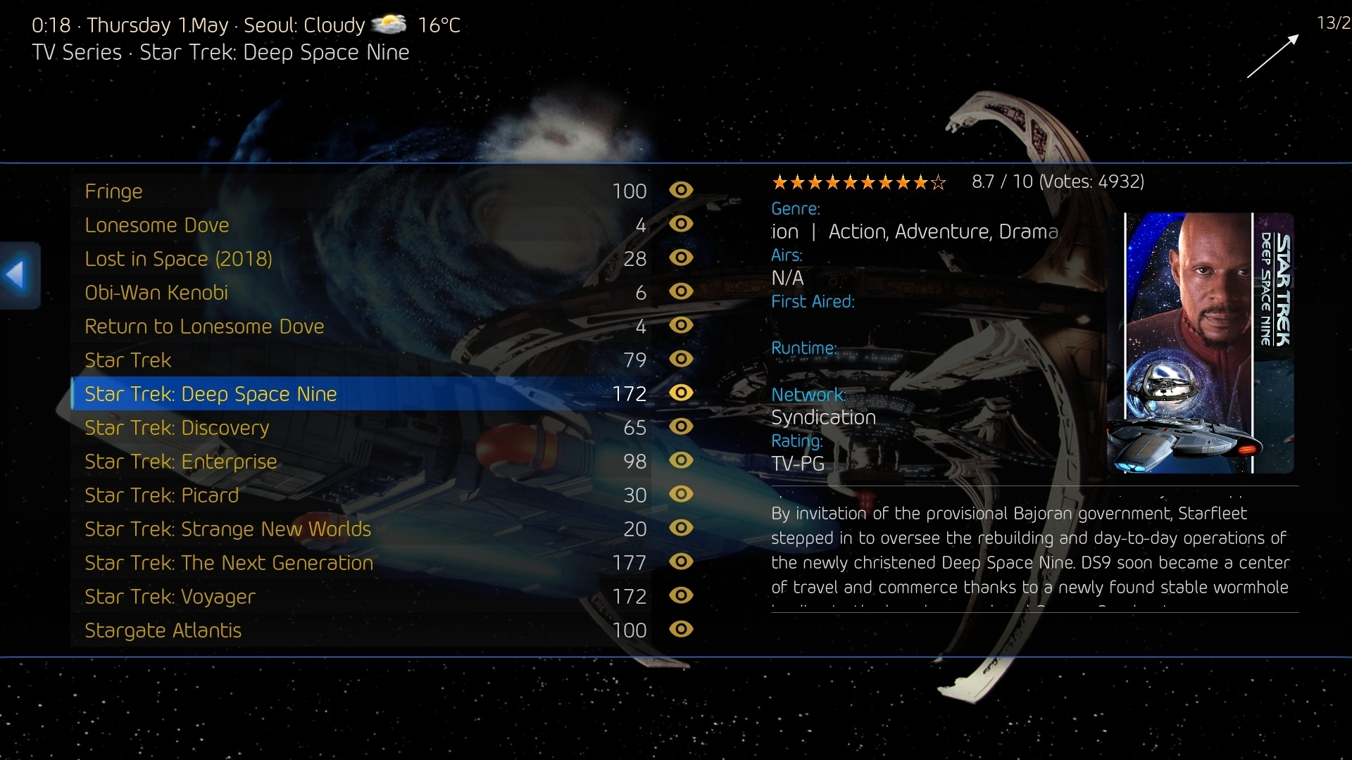
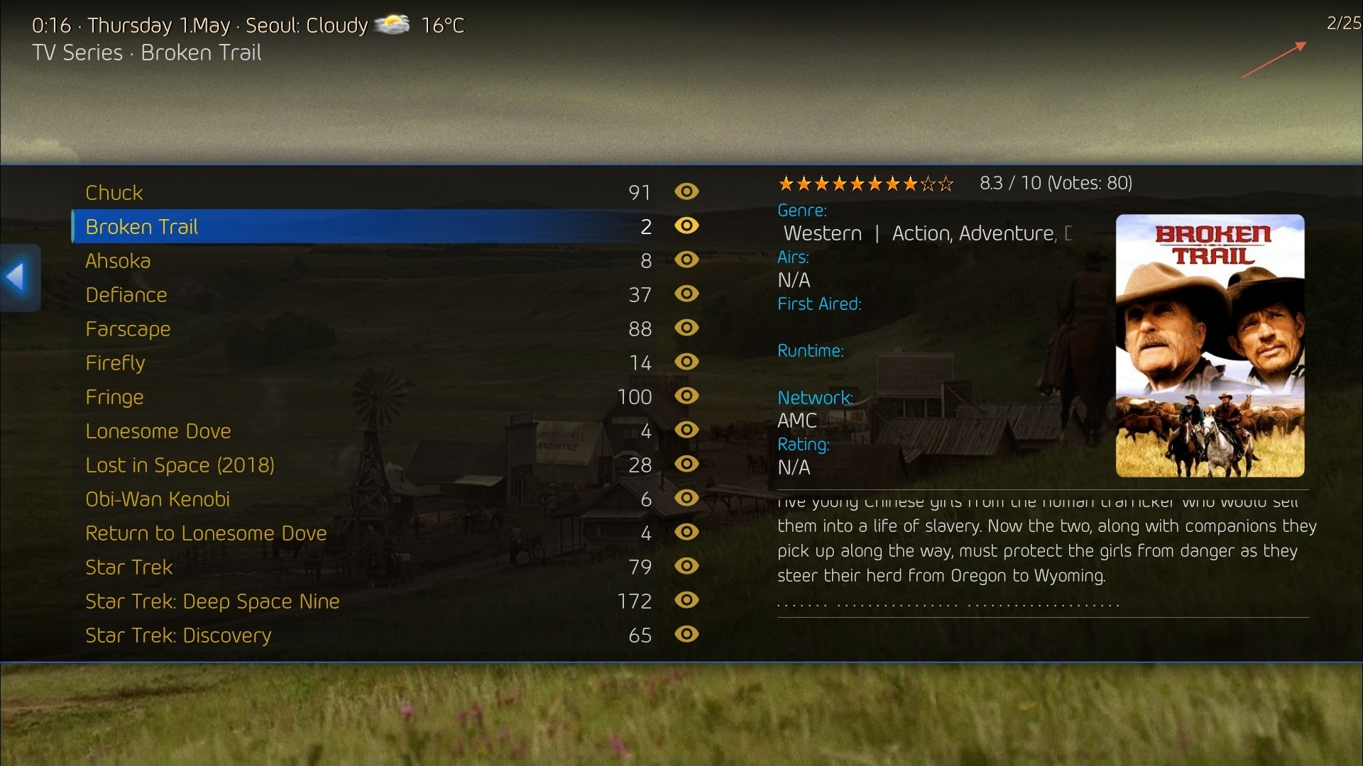
03a and 03b - mptvseries , itemcount from 1 to 9 view fine 10 to up ...not.
Hmm, I don´t see it here (it´s the entry for mvCentral)4 - in basic home setting , i thing missing something in the list , cannot be empty text there ...
 : United Kingdom
It's just an idea, but I think the 'osd_progress_background.png' image used in videoFullScreen.xml and mytvFullScreen.xml is very dark, especially when viewed from 18 feet away. So, I tried changing the color to yellow, white and then very light gray. But, to me, the progress bar didn't look very good with any of those.Interesting approach
Sorry to say: Not good - all your suggestions are based on your very personal taste - and as a standard skin should serve the majority of users, there will be no changesWhat to you think?