[Update] Skin Concepts (1 Viewer)

nanogod

Portal Pro
March 22, 2007
92
38
Bamberg
Home Country
Germany Germany
Hey you skinning-gurus...;)

I have made a few Photoshop concepts for a skin i want to make.
Before i start, i want to have some opinions and critics from you.
How do you like it? Should i change something?

I want the skin to be easyly read and simple to use.
Waht do you guy think about different background colors. eg.: red background for music, green for Tv, blue for videos and yellow for pics?

Let me know...:)

EDIT: So, long time has gone and im making small steps...
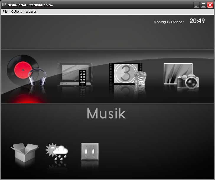
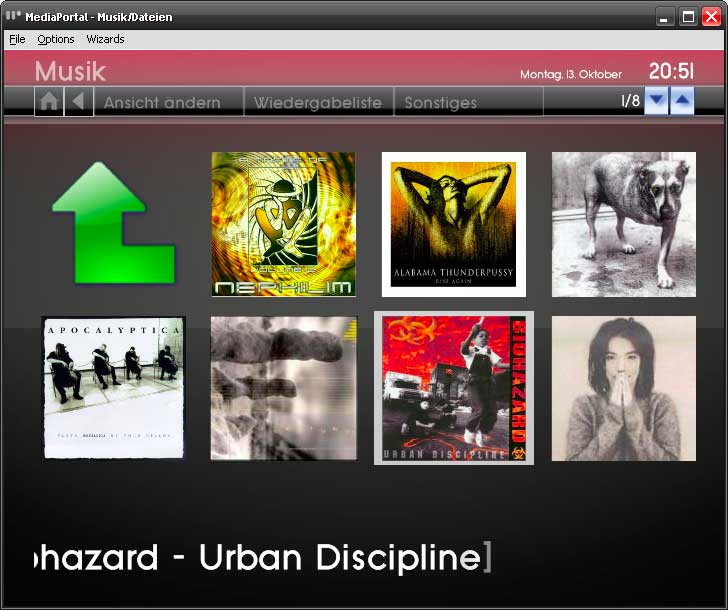
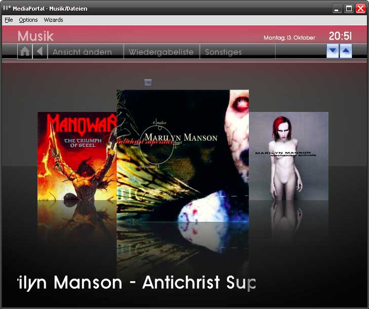
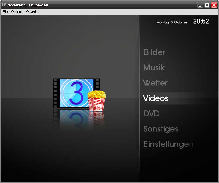
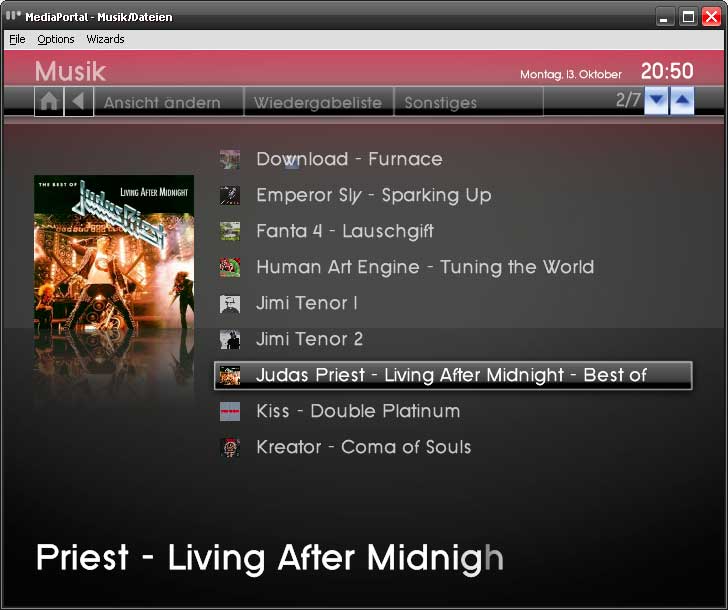
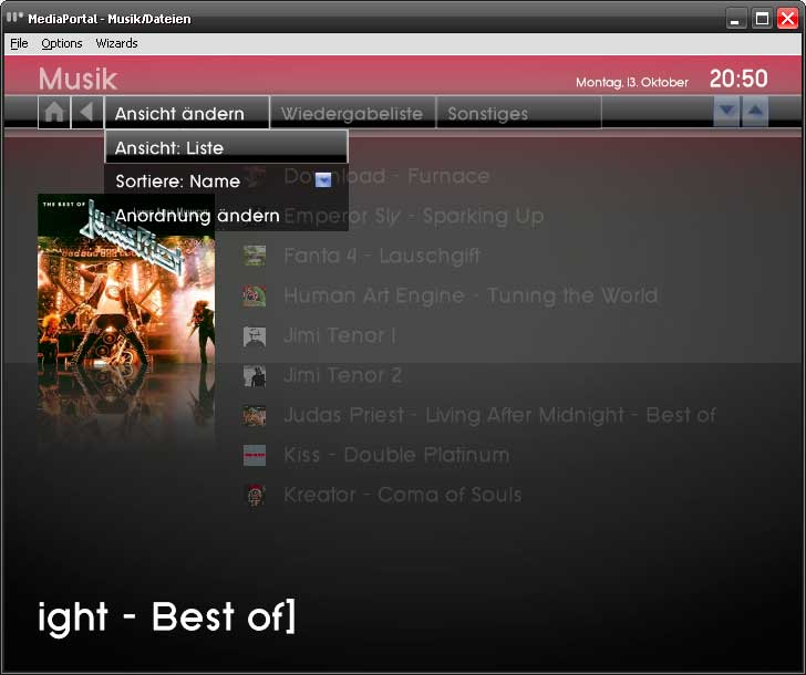
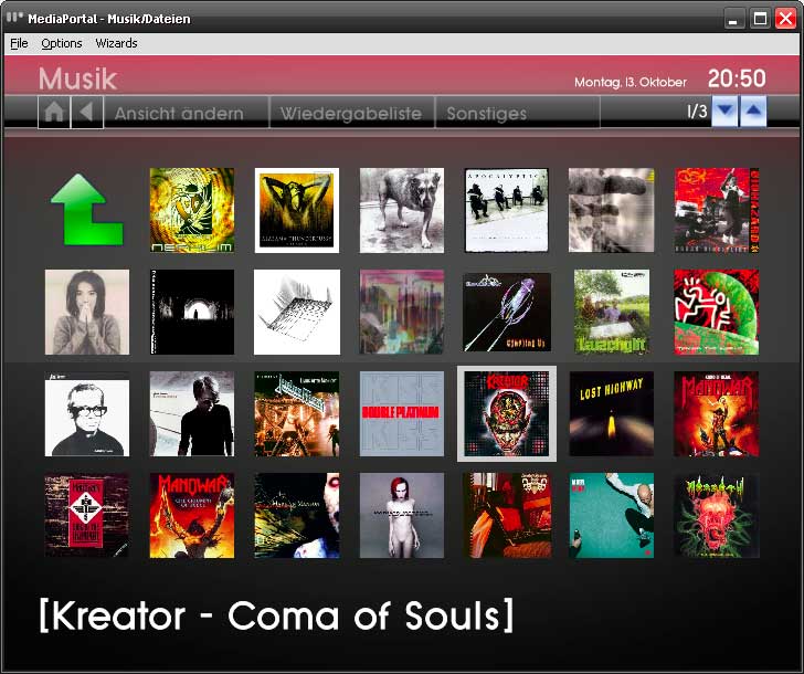
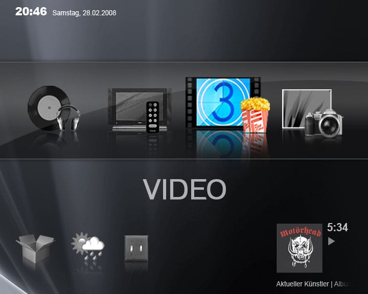
Here are a few screenshots taken from MP.
This is basically my progress. Not so much i know, but i´m totally sucking at xml.
So if any of you skinning XML-Gurus would like to help me, i would be glad.
Just PM me.
The grafics are mostly done, but the xmls are very rough...

Greetings, and i hope to hear from someone, who wants to help ;-)

EDIT 02.05.09:
Sorry for not responding so long...:oops:
I have been very busy at the moment, so i had no time editing this skin.
but a few people seem to like it, so i will release what i have done so far...
this is not a good working version. a few parts work but there is much more todo.
If someone wants to continue this skin, you are welcome. Maybe i could provide some grafics or upload/send the psd file. just ask. but i have no time at the moment to further develop this skin.
I woukld be happy if you give me credit if you continue ths skin.

So... happy skinning:D
 

Attachments

  • basichome.jpg
    basichome.jpg
    25.8 KB
  • bigthumbs.jpg
    bigthumbs.jpg
    56.4 KB
  • filmstrip.jpg
    filmstrip.jpg
    44.9 KB
  • home.jpg
    home.jpg
    22.9 KB
  • listview.jpg
    listview.jpg
    45.1 KB
  • menu.jpg
    menu.jpg
    36 KB
  • smallthumbs.jpg
    smallthumbs.jpg
    68.4 KB
  • Pollux 0-1.zip
    30.6 KB

ThaClown

Moderator - Dutch Forums
May 28, 2006
807
26
Den Bosch
Home Country
Netherlands Netherlands
I like it alot, exept for the home screen... to bright colours imo.
But look very good keep it up!
 

iMse

Portal Pro
February 4, 2006
56
8
Home Country
Sweden Sweden
Really nice!
I really think you should go for different colors for different sections. And please make a widescreen version too ;)
 

endo-soft

Portal Member
April 21, 2007
16
1
Qatar
Home Country
Germany Germany
This looks pretty good so far. I somewhat dislike the font used in the home screen. It looks just too "SystemFont". Maybe you could even get rid of the textbar in the middle at all.
Will the proposed tiles view in Music support the wall scroll effect like PICLENS? That was great.
 

nanogod

Portal Pro
March 22, 2007
92
38
Bamberg
Home Country
Germany Germany
Thanks for your comments. I´m glad that you seem to like it.

I like it alot, exept for the home screen... to bright colours imo.

Too bright? You mean the highlighted color i suppose? I made it to make the color of the section clear. But, yes, maybe i could make it a little bit less saturated. Is it what you mean? Maybe i could do only the highlighted object colored and the others, unselected in grey...? I will think about it...

Looks good. There aren't any 4:3 skins that have this look either.

Yes i´m totally with you ;-)

I really think you should go for different colors for different sections. And please make a widescreen version too

I hope i will do an widescreen version too. But first will come the 4:3 Verison, because it is for my own needs *g* ...
But a friend of mine has announced interest in a widescreen version. So i will probably have to make one ...

This looks pretty good so far. I somewhat dislike the font used in the home screen. It looks just too "SystemFont". Maybe you could even get rid of the textbar in the middle at all.

Yes, i´m not too happy with it too. I will try something different.

Will the proposed tiles view in Music support the wall scroll effect like PICLENS? That was great.

That will be great! But i doubt i will have the skills to accomplish something like that. Im not very good at XML Coding and all that stuff. I´m pretty good at graphics, but when it comes down to code...:mad:

But i learn fast, and it is my second skin, so i think it will come along... maybe without PICLENS... sorry.
I now have holiday for a week, so i may have some time to start initial xml-work. But for now... the weather here is fantastic. I will grap a bottle of wine and go to the park!

Thanks and read you!
 

MoPhat

Retired Team Member
  • Premium Supporter
  • June 17, 2007
    816
    226
    Berg
    Home Country
    Switzerland Switzerland
    Hi nanogod, i like very the live tv screen :D

    I mean a skin should not be overloaded with graphics, colors and icons... it should be clean and very easy to read and use like the monochrome skin.

    MoPhat
     

    Spragleknas

    Moderator
  • Team MediaPortal
  • December 21, 2005
    9,471
    1,822
    Located
    Home Country
    Norway Norway
    Interesting concept indeed.
    Looking forward to seeing the result.

    Can't have to many skins to choose from :) I know how it is to be a 4:3 user (was until a year ago), and lately there have been very few updated 4:3 skins (to bad about foofaraw)
     

    nanogod

    Portal Pro
    March 22, 2007
    92
    38
    Bamberg
    Home Country
    Germany Germany
    I mean a skin should not be overloaded with graphics, colors and icons... it should be clean and very easy to read and use like the monochrome skin.

    And did i succeed this task?
    This is my intention to make this skin.

    What do you think about the new basic homescreen?
    Better, because fewer colors?
    Better Font?

    Or was the first colorful verison more attractive?

    I´m still searching for a name for this skin.
    At the moment its called "Pollux"
    But maybe some guys of you have a better name?
     

    Attachments

    • basic_home_alt.jpg
      basic_home_alt.jpg
      43.3 KB

    Users who are viewing this thread

    Top Bottom