
 Australia
- Moderator
- #1
Quote from Justin, trakt admin:
A more unified user profile page
Check out the brand new look for your user profile page. Each page has a unified header to make navigation much easier plus there are new icons with selected states so you know exactly where you are.
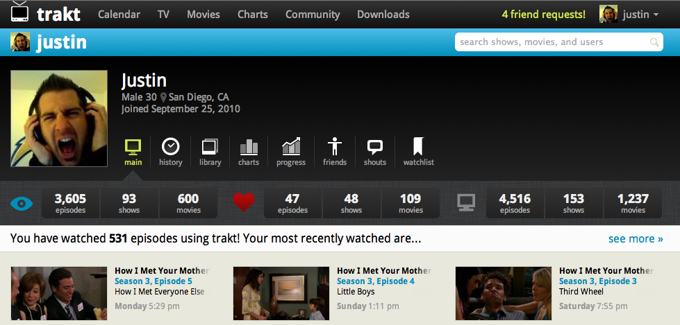
Your main profile page will be shown by default and it now contains lots more stats! The first pod is how many things you watched, followed by how many things you've rated positively, and lastly how many items are in your collection. Each number is linked to the appropriate library page. This gives a great overview for you all you stats junkies (which is most of you!)
Also notice the more prominent links for each section. Previously it was hard to tell what links went were and there weren't even links to someone's progress or watchlist.
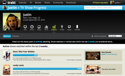
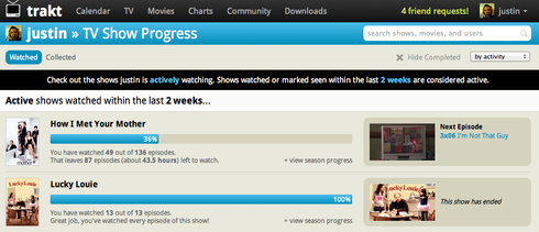
Here's another example of the unified header, it really helps tie everything together. Here's the new progress page followed by the old look.
Official discussion on this change can be found here.
A more unified user profile page
Check out the brand new look for your user profile page. Each page has a unified header to make navigation much easier plus there are new icons with selected states so you know exactly where you are.
Your main profile page will be shown by default and it now contains lots more stats! The first pod is how many things you watched, followed by how many things you've rated positively, and lastly how many items are in your collection. Each number is linked to the appropriate library page. This gives a great overview for you all you stats junkies (which is most of you!)
Also notice the more prominent links for each section. Previously it was hard to tell what links went were and there weren't even links to someone's progress or watchlist.
Here's another example of the unified header, it really helps tie everything together. Here's the new progress page followed by the old look.
Official discussion on this change can be found here.