- January 24, 2012
- 2,523
- 2,715
- Home Country
-
 United Kingdom
- Moderator
- #1
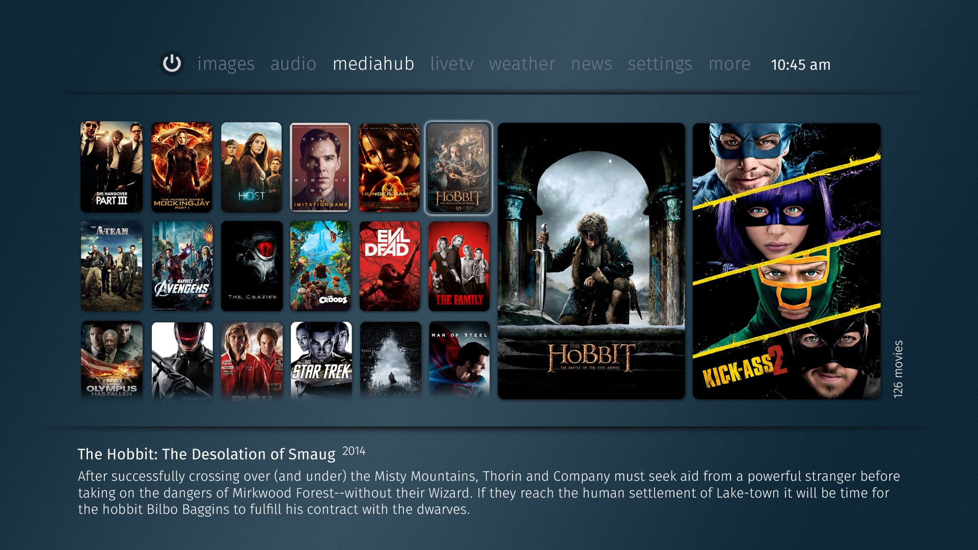
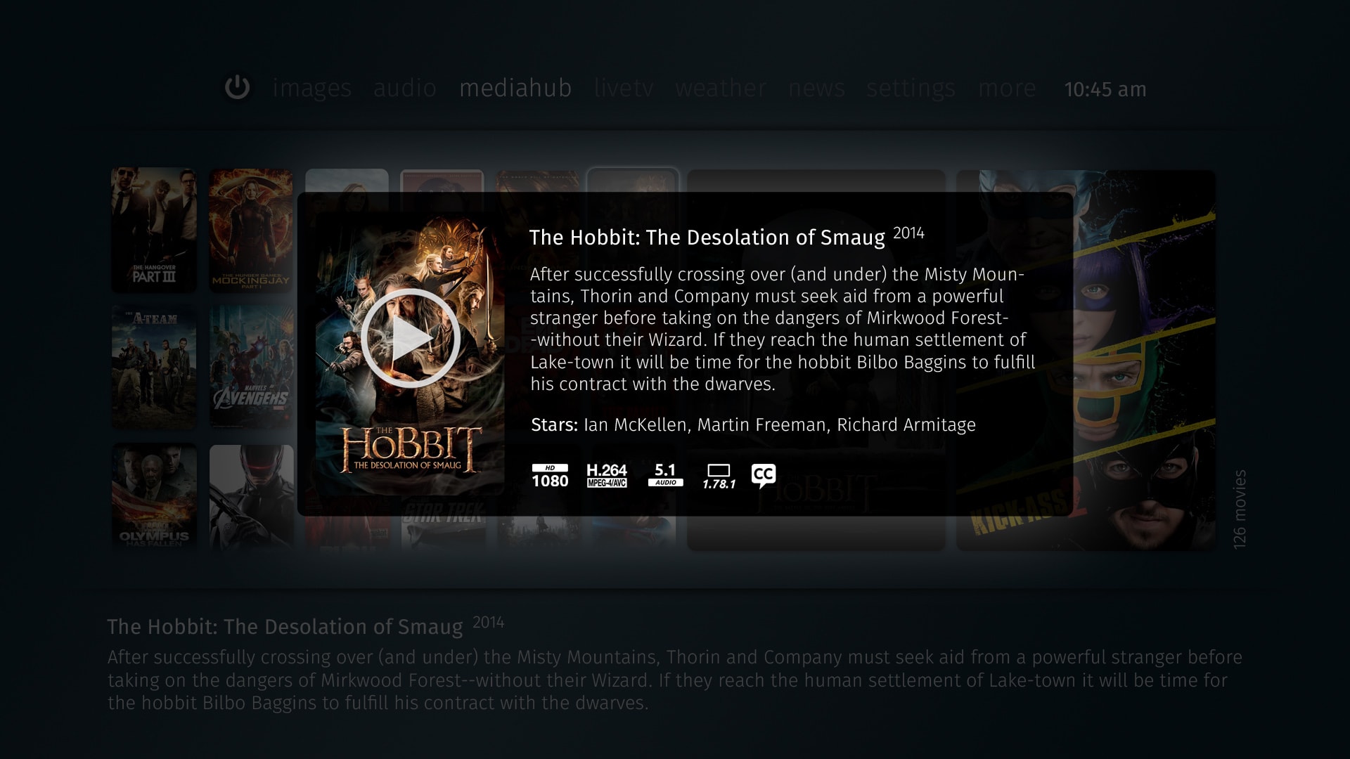
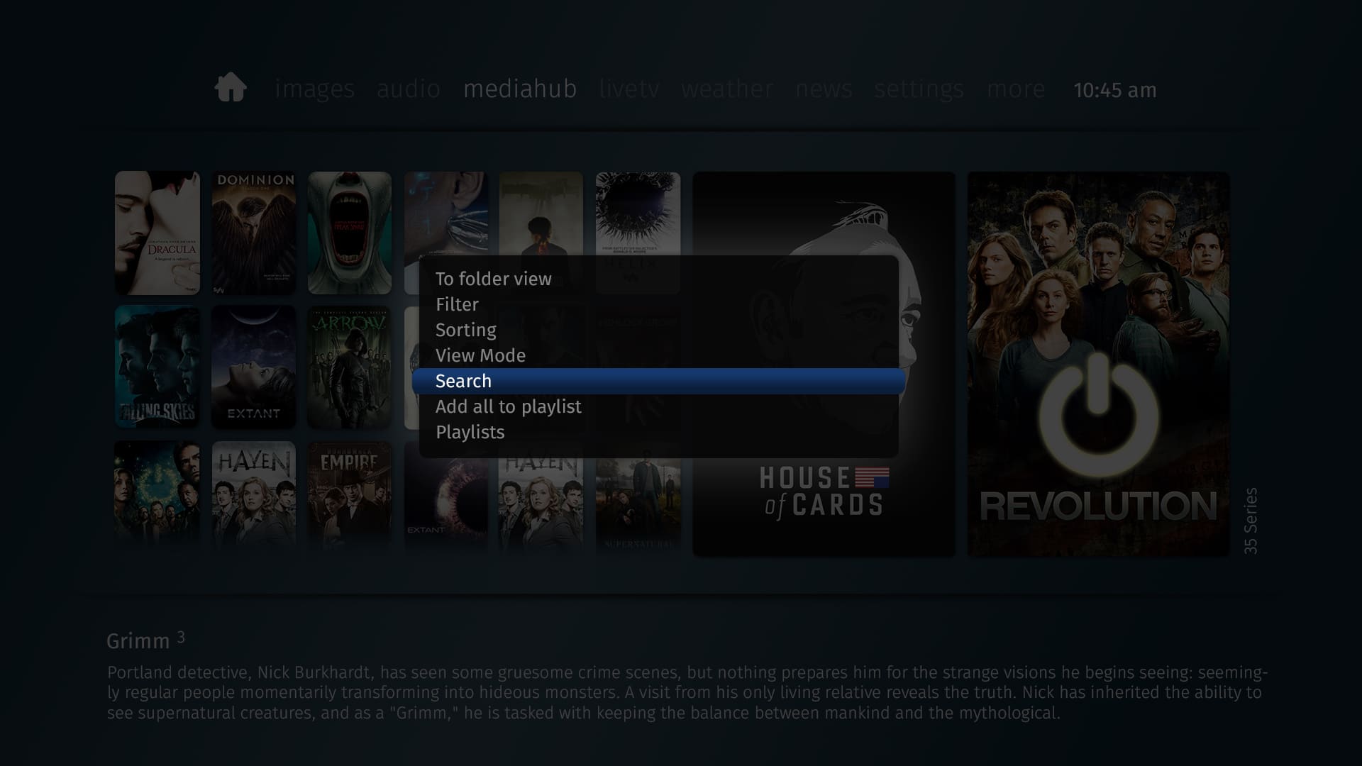
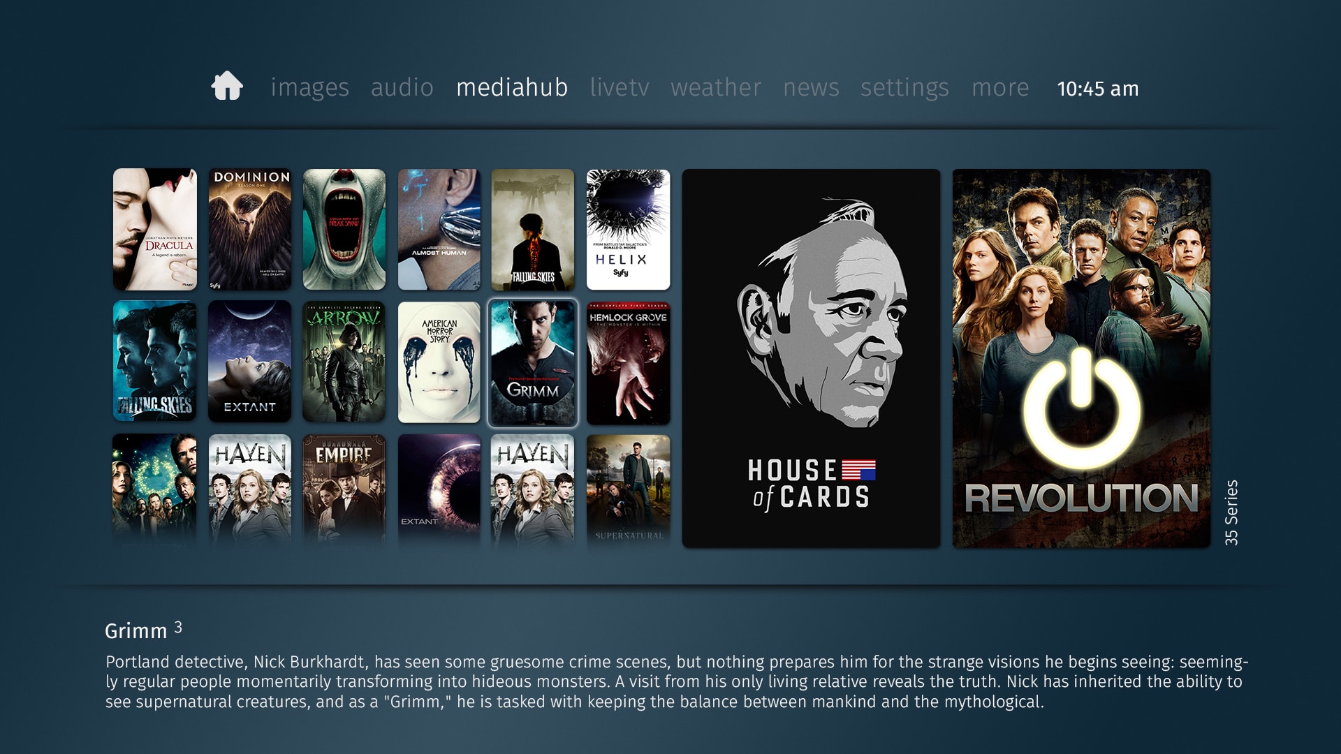
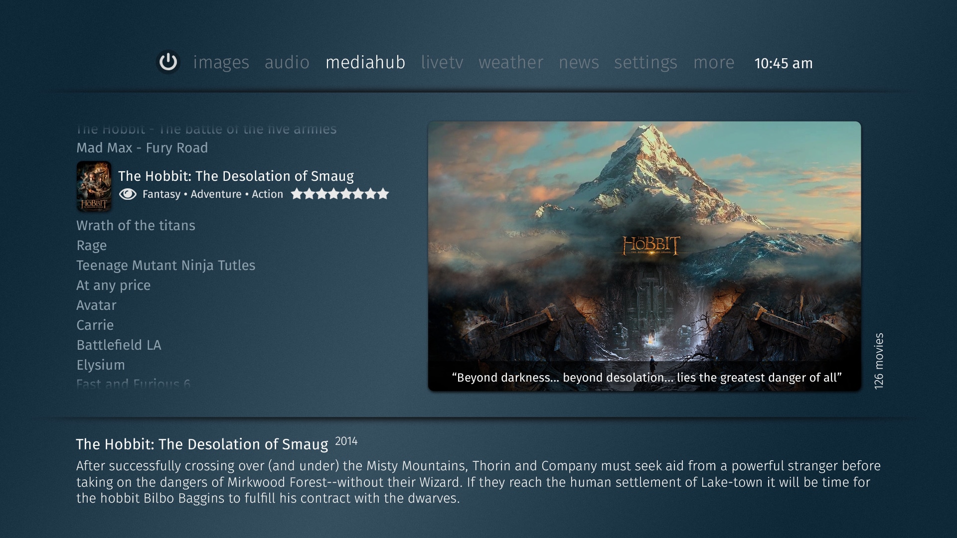
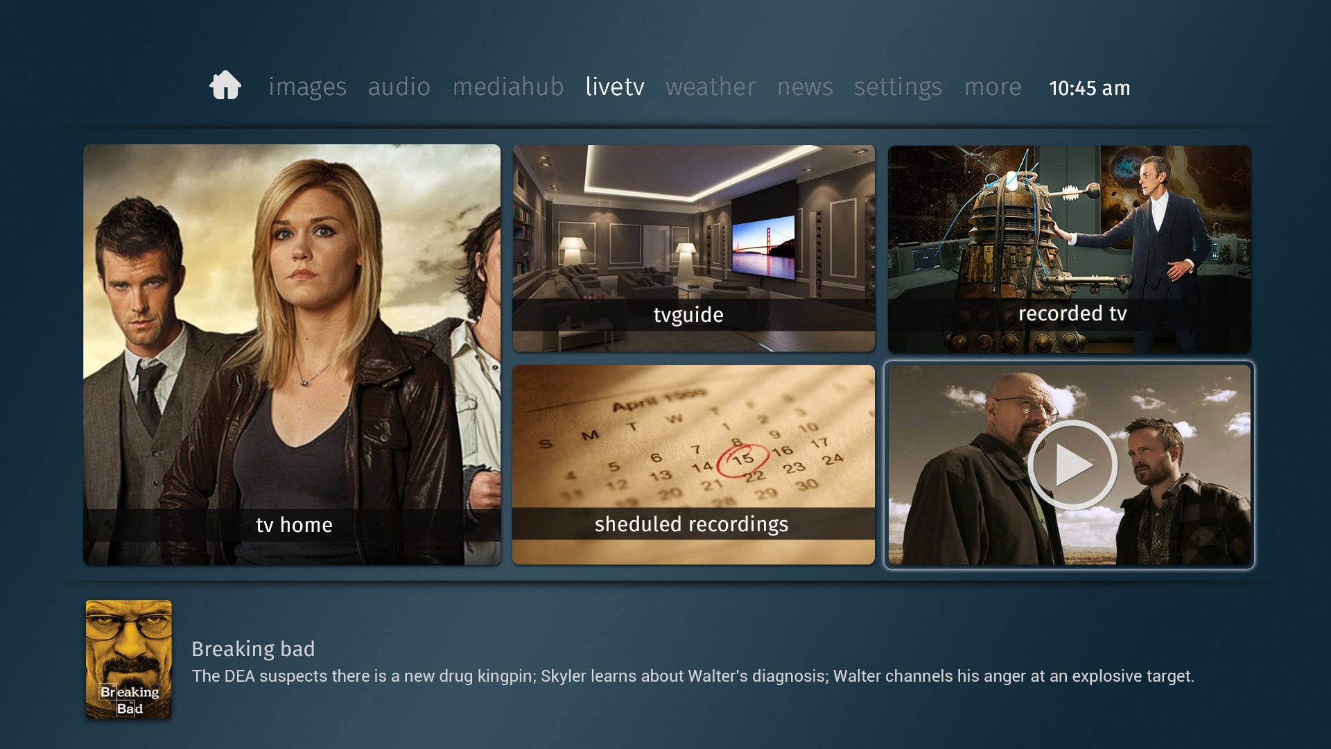
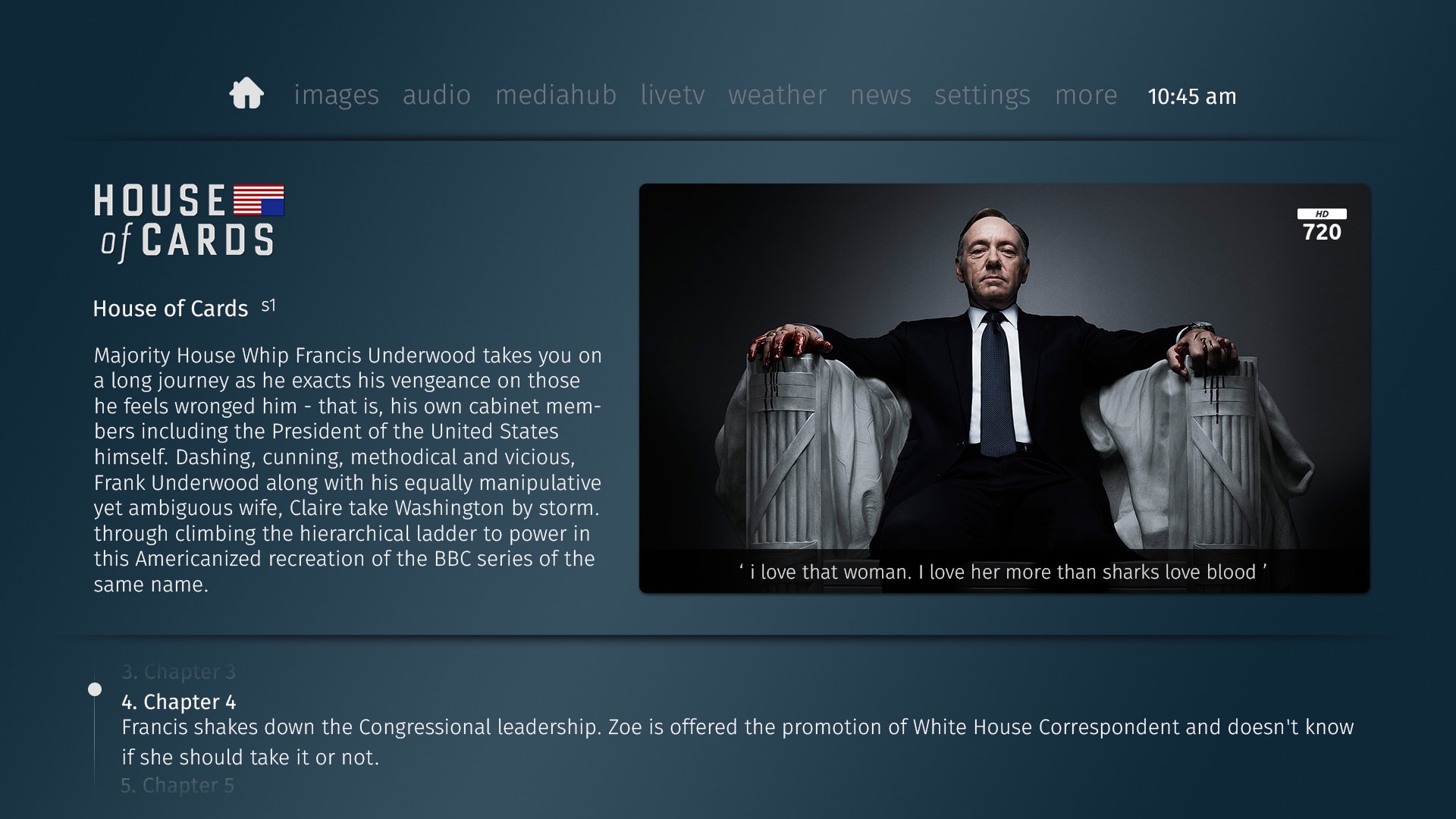
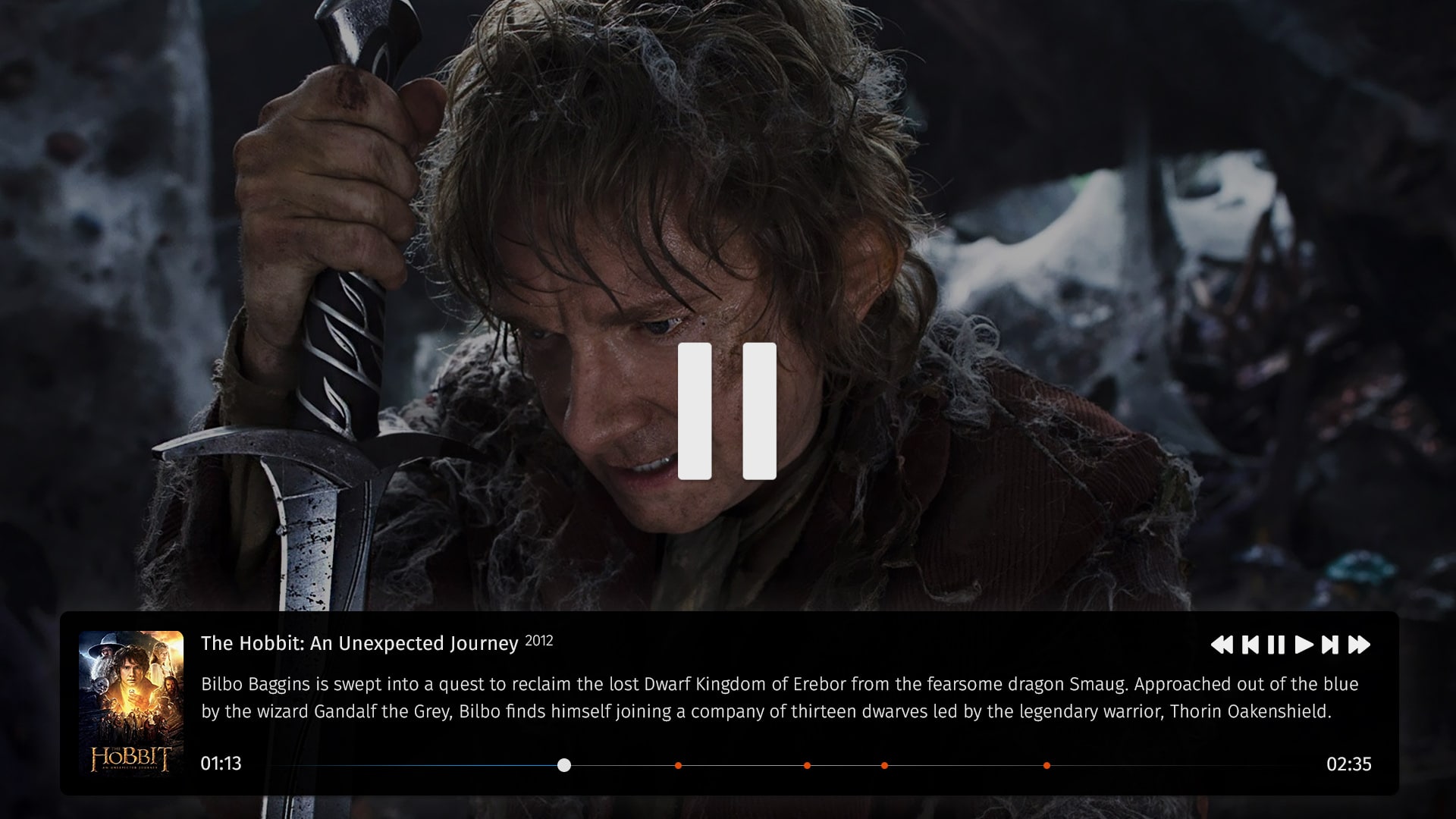
Hi guys
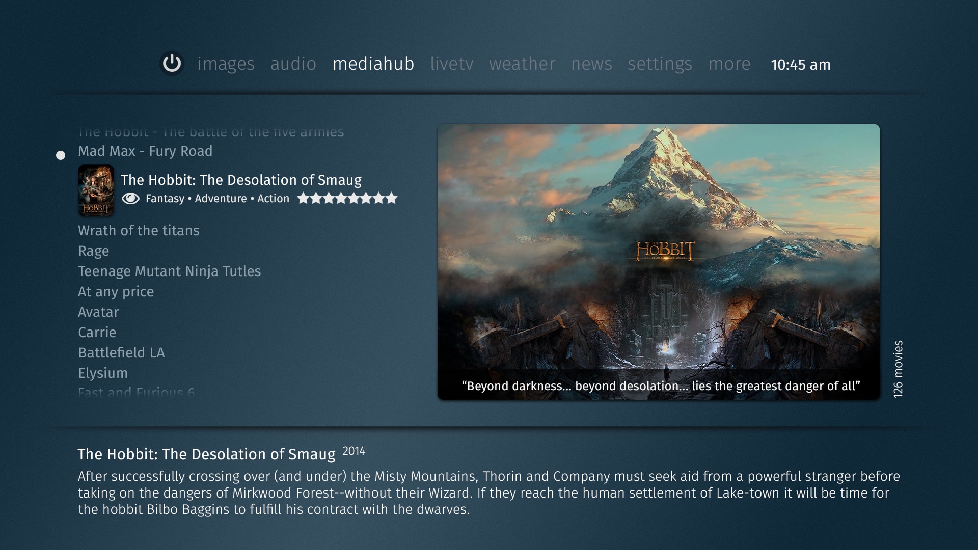
@morpheus_xx Contacted me recently and asked if i could put something together for MP2 based on my skin OnePortal and work with him to realise it, so as requested here are a couple of mockup shots to show the design i am going for.")
Let me know of any ideas you might have on things to include etc.
@morpheus_xx Contacted me recently and asked if i could put something together for MP2 based on my skin OnePortal and work with him to realise it, so as requested here are a couple of mockup shots to show the design i am going for.
Let me know of any ideas you might have on things to include etc.