Blue3++ (a 4:3 skin mod) - 0.1.3 (1 Viewer)

joz

Portal Pro
March 17, 2008
1,353
306
Home Country
Netherlands Netherlands
Blue3++ is a skin specifically designed with small screens in mind!
This skin is mainly focused on readability and usability.
Besides that it also supports a lot of plugins, an overview of what's currently supported can be found here

To keep things centralized and maintainable I started using Google Code and groups.
This is the place to find detailed info about Blue3++, discuss Blue3++ in general and submit a bug you have found

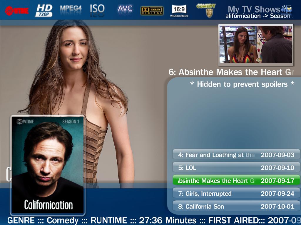
To already get a quick idea I attached some screenshots.

Download Blue3++ 0.1.3
 

Paranoid Delusion

Moderation Manager
  • Premium Supporter
  • June 13, 2005
    13,052
    2,978
    Cheshire
    Home Country
    United Kingdom United Kingdom
    hi joz

    Looks really good, if i was going to pick fault with any it would be my trailers, the picture is just to low, otherwise looks great, thanks for doing this :)
     

    joz

    Portal Pro
    March 17, 2008
    1,353
    306
    Home Country
    Netherlands Netherlands
    Hey PD,

    after some thought I have decided to arrange it like this. Because my screen is so tiny I really do not have a lot of room to work with. So fonts are big and There's really not anywhere else to put it, the details take up a lot of room maybe should rearrange 'em a bit). In The games section of MyTrailers the image is shown as an overlay of the summary. This way it appears as if the texbox is only, say 100px high but it's actually 400 or something.

    I just noticed myself that some of my layout is a little offcenter (watchmenu etc) didn't ever really notice this on my little TV :)

    But I don't know really. I find it kinda hard to do things right for MyTrailers because of the sharing of xml files between the 2 sections (apple trailers and games). The right upper part still has some room, maybe I should scale the image down in XML and put it over there. This will have the advantage that the trailers list could be bigger then 3 rows.
     

    joz

    Portal Pro
    March 17, 2008
    1,353
    306
    Home Country
    Netherlands Netherlands
    :D for the encouragement so far!
    Now all I need is some more feedback :)

    Please note the "? = by request". This I have no use for myself but I can imagine others liking these kind of modifications. So if there's no real motivation for me to change this, I won't (since I don't use this anyways)

    And ofcourse all other suggestions and comments are welcome too!
     

    joz

    Portal Pro
    March 17, 2008
    1,353
    306
    Home Country
    Netherlands Netherlands
    Came accross a little problem. All of a sudden MP is telling me my skin is outdated. I set the version in reference.xml to 0.9.4.0, so that shouldn't be the cause.
    Dunno what's going on here, it even tells me the normal blue3 skin is outdated.
    Does anybody know what's going on here?

    p.s.
    Next release is on the way. MyEmulators is the big bit that still needs to be finished.

    ------------------

    Nevermind, fixed this by having a Blue3 skin folder (I renamed the original to blue3++) and that fixed it :)
     

    joz

    Portal Pro
    March 17, 2008
    1,353
    306
    Home Country
    Netherlands Netherlands
    New release is out, see first post.

    Tvseries is a long way from really be completed but I didn't want this release to be hold back (especially because of the tv button issue). Also would like some feedback on my approach of puting al detail info in a fadelabel, this way more room is available for fanart but I'm not really happy yet with the looks of it.
     

    joz

    Portal Pro
    March 17, 2008
    1,353
    306
    Home Country
    Netherlands Netherlands
    Now I'm satisfied with TVSeries :)
    This is the result.

    The fanart is scaled down with ratio now (all my current fanart is widescreen like I guess most people).
    Because there are 16:9 ratios and 16:10 ratios out there, there could be a problem with some fanart for people. Still have to experiment with this, seems good for my fanart.

    I kinda wanted to rotate the DVD cover image on it's X-axis but couldn't get that going, any help? Saw something about <rotateX> but no go yet. Different idea I had is to make the dvd cover transparent somehow, dunno if this can be done...
    Is there any complete skin tags and attribute guide somewhere?

    -------------

    Figured out a permanent ratio solution

    -------------

    Forgot to put the rating somewhere... O no, no more room!!!

    -------------

    Thinking of doing the listcontrol like Moving Pictures. Try this tonight and see how it works out, will post new screen if it looks ok.

    -------------

    Maybe I should put the dvd cover in episode listing next to (left or right, probably right) the episode image and scale it down bigtime. The large one (unscaled) I will have showing on seasons listing. Too bad nobody really started using this (not that strange with all those way better looking 16:9 skins ;)), don't hold out on your feedback! I'd even appreciate feedback purely based on my screenshots...
     

    Attachments

    • tvseries2.JPG
      tvseries2.JPG
      107.6 KB

    jte

    Portal Member
    November 18, 2008
    20
    0
    Home Country
    Netherlands Netherlands
    Looks very nice, thank you.
    Keep up the good work !

    :D
     

    Dadeo

    Docs Group Manager
  • Premium Supporter
  • November 26, 2006
    5,340
    3,321
    Himalayas, India
    Home Country
    Canada Canada
    Hey Joz, Nice work! I have a 20" CRT and this is the first skin that really works on it without a lot of mods. I still find the fonts a bit small, but when I increase them in the fonts.xml everything still looks great. I haven't tested it a lot yet. But I have noticed a couple of things though some of these may be because I am still using MP 2.3.0. I'll check it out on RC4 as well and let you know if there are any differences.

    1. TV Series - Could the Genre scroll left so you can see it all? Often these are long with multiple genres, Action and Adventure doesn't even fit fully.
    2. TV Series - There is no title of the plugin at the top (i.e. TV Series) which is a small point I know :)
    3. TV Series - On the details screen I don't like the Episode name scrolling on top of the Season Image. Could it be just above or below?
    4. TV Series - I LOVE THE TICKERTAPE details of the episode at the bottom, Brilliant!
    5. My Films - I don't think you need the title 3 times on the screen (list, top, below cover) I know Blue3 does this as well
    6. My Films - What about using the ticker tape idea here as well to display the tech details of the film?
    7. My Films - There is no Date/Time on the Details screen
    8. My Films - When playing a film I love how the cover image resizes (on the Details screen) to fit the now playing box, but the box behind the image does not resize and looks odd. On the main screen, the now playing box does overlap the main image.
    9. TV Guide - No Title, no Now Playing screen. If you use the Search button on the main TV window, the Now Playing box overlaps the data. If you select Search from the TV Guide, there is no Now Playing Screen.

    OK that's as far as I have got. I love what you have done, keep it up! And if you want more feedback, let me know!
     

    Users who are viewing this thread

    Top Bottom