- October 14, 2005
- 81
- 3
Click here !
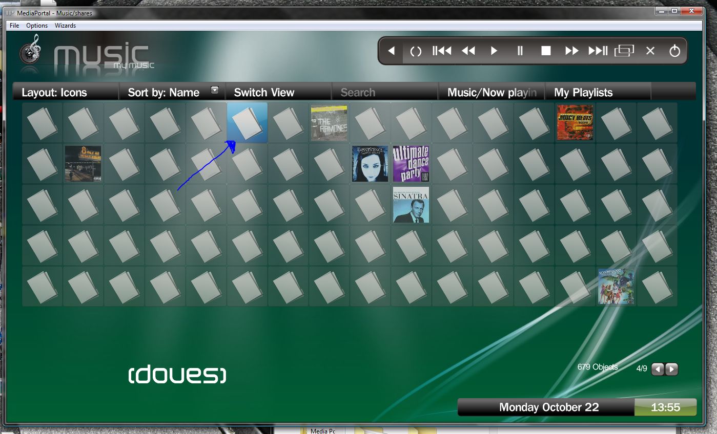
I just took this quick screenshot to illustrate :
The highlight of the album isnt very clear
The dodgy album art in the bottom left. Notice you can JUST see the top of the art at the bottom, and the bottom at the top. All my art is like this, regardless of resolution.
Not essential, but the album artist would be nice, listed under the album title in a smaller font perhaps ?
Don't get me wrong, great skin as i said earlier, just if things are brought to light, it can be improved further")
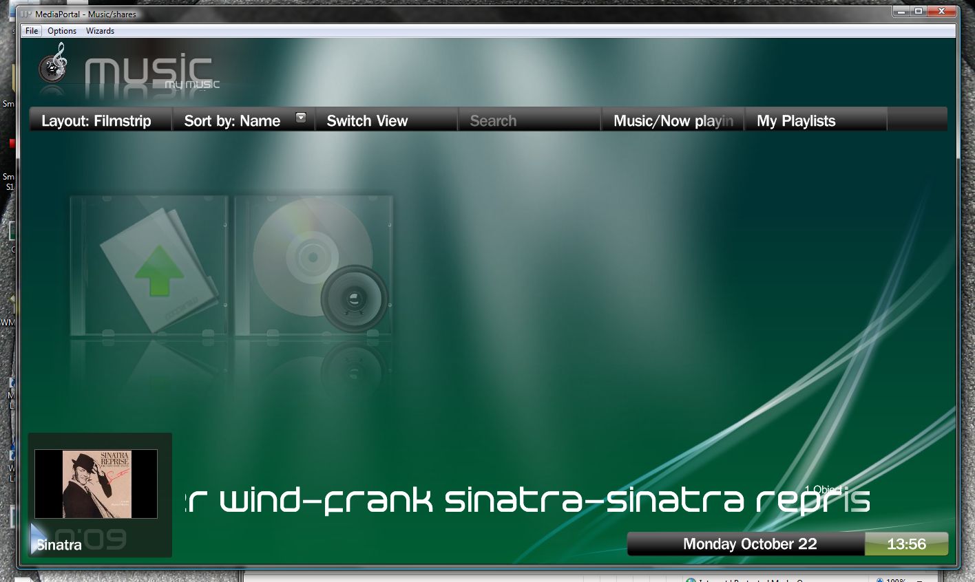
I just took this quick screenshot to illustrate :
The highlight of the album isnt very clear
The dodgy album art in the bottom left. Notice you can JUST see the top of the art at the bottom, and the bottom at the top. All my art is like this, regardless of resolution.
Not essential, but the album artist would be nice, listed under the album title in a smaller font perhaps ?
Don't get me wrong, great skin as i said earlier, just if things are brought to light, it can be improved further
 United Kingdom