- April 15, 2007
- 1,225
- 187
- Home Country
-
 Switzerland
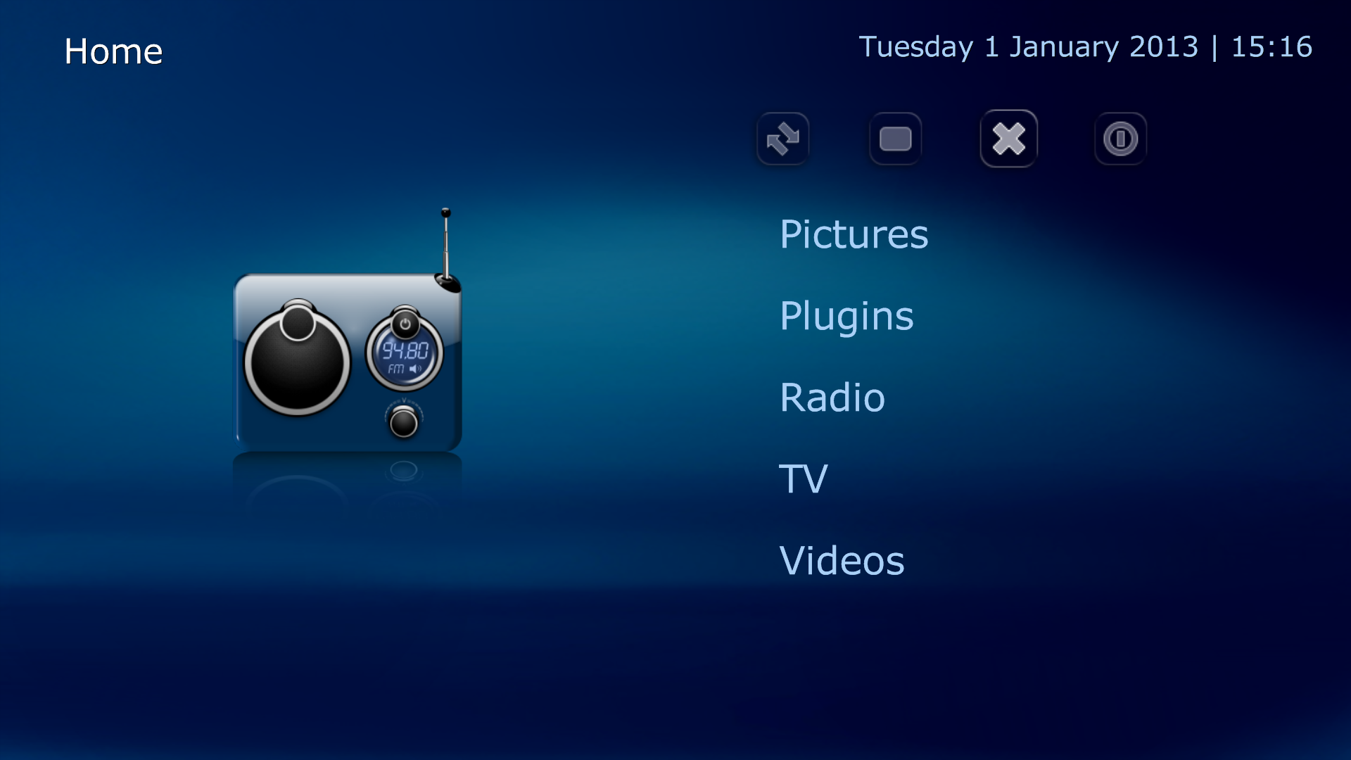
At the risk of outing myself as sooo last century, I have to say that I am disappointed with the new DefaultWide.
- The old version was simple, functional and intuitive.
- I understand the desire for "eye candy", but isn't that the purpose of "unofficial" skins or the new Titan?
- The control menu (power, etc.) is now hidden; you have to be psychic to find it.
- The icons in same for "close" and "power" were easily distinguishable in the old version. I couldn't identify a "close" icon in the new one.
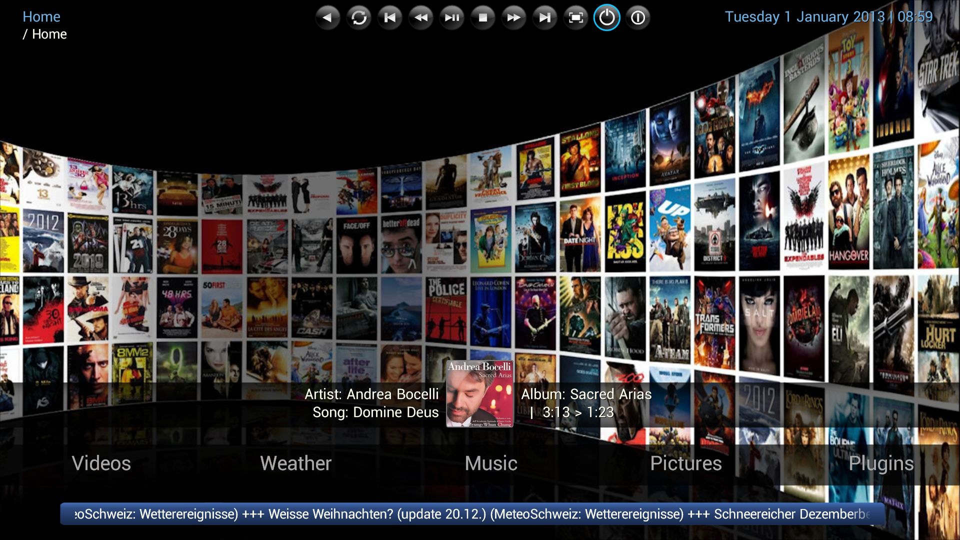
- The home screens waste a lot of real estate, l prefer the verticl menu in the old classic home.
- Most views seem to have smaller font but fewer lines. Huh? For example, I can now see only 4 albums at once.
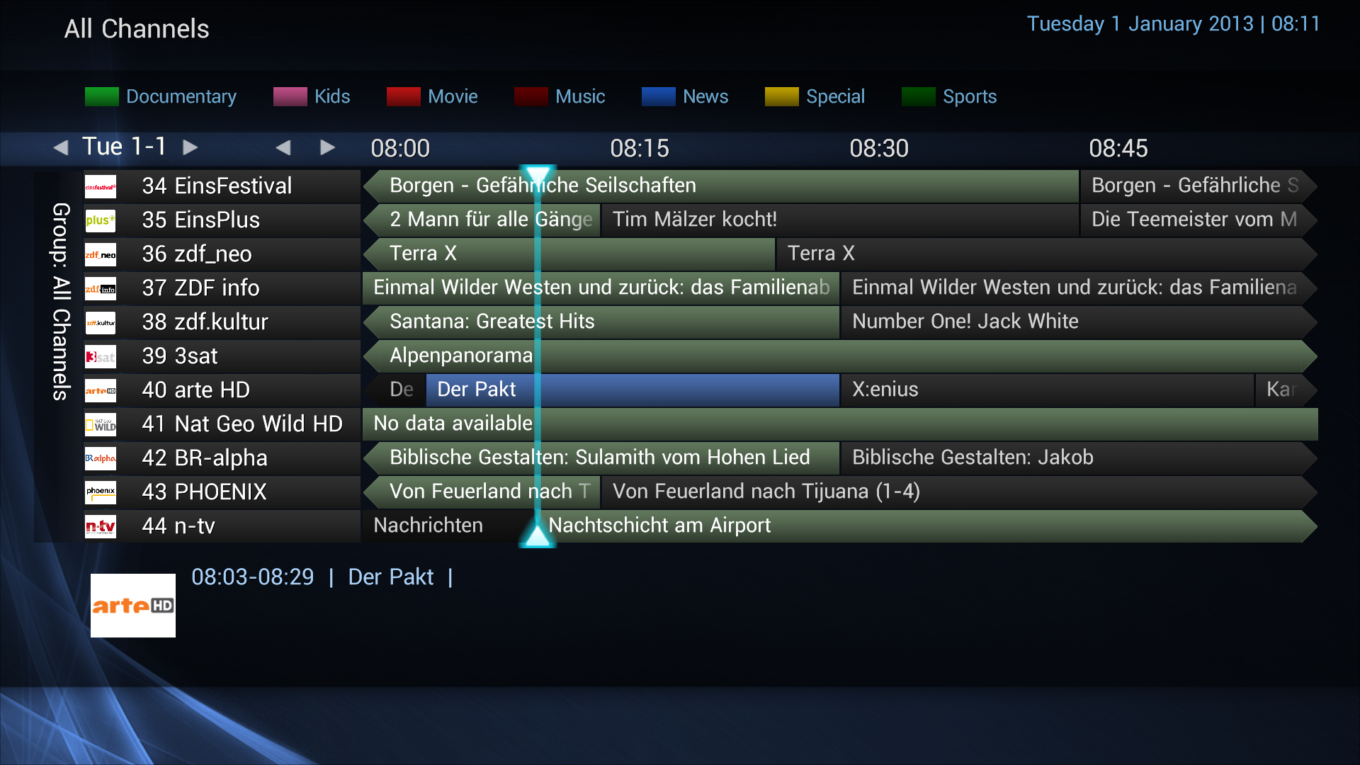
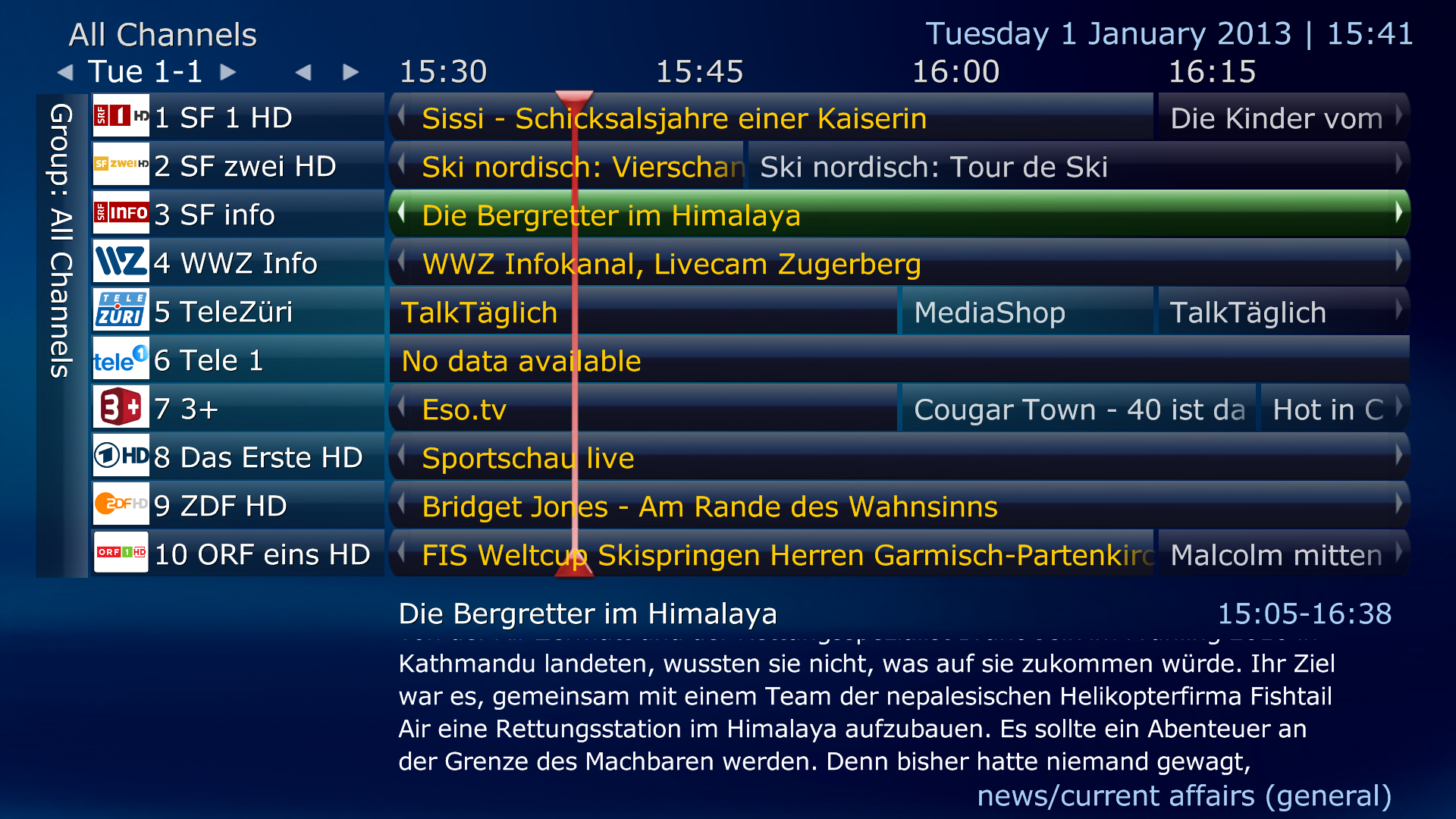
- The TV guide seems to display logos smaller than before, they don't fill the available space on each line.
- Genre highlighting isn't working for me, but this could be due to inadequate information from my (cable) provider.
- One major improvement is that long music track titles are no displayed without scrolling in Music - Now Playing, and in other screens when music is playing: HOORAY!
- Another is the availability of a lot more settings within the on-screen settings plugin.
")