
You are using an out of date browser. It may not display this or other websites correctly.
You should upgrade or use an alternative browser.
You should upgrade or use an alternative browser.
Monochrome (for those who like dark skins), updated... (4 Viewers)
- Thread starter Psycho Reptile
- Start date

- Moderator
- #162
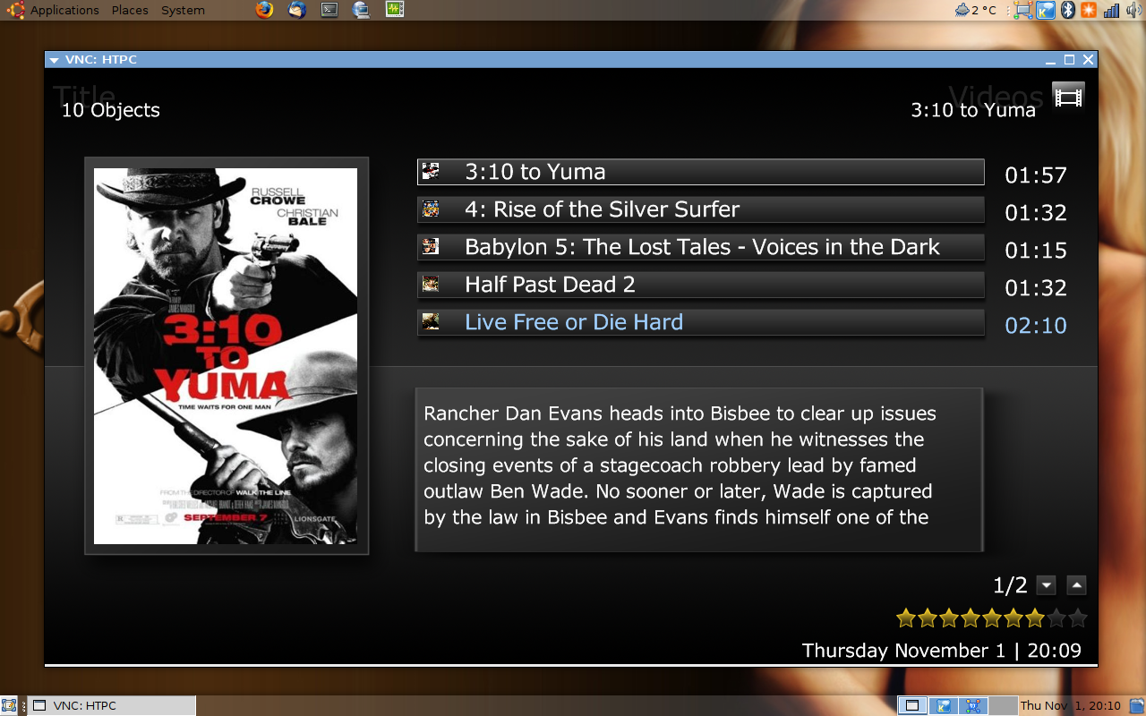
Here is a little idea I just had for movie title screen.
(not mockup)
But am not happy with it yet, perhaps something more like the tvseries screen?
That looks very smart and overall slick!
Emph

I have the same like robyf, on my screen with 1920 x 1080 are the program description out of the screen on the right side.
can you underlay the program description with a grey background (fullscreen tv)? its hard to read on a bright movie with white text
please change the miniEPG because its not possible to select a channel correctly.
thanks for that great work
MoPhat
Same for me also 1920x1080 and text out of the screen
Here is a little idea I just had for movie title screen.
(not mockup)
But am not happy with it yet, perhaps something more like the tvseries screen?
That is list view or info page? I like the idea of having the synopsis on the first page because i have LOTS of movies that i dont know the story at all

Here is a little idea I just had for movie title screen.
(not mockup)
But am not happy with it yet, perhaps something more like the tvseries screen?
That is list view or info page? I like the idea of having the synopsis on the first page because i have LOTS of movies that i dont know the story at all
If I remember well spinsafe revolve has this layout.
If I remember well spinsafe revolve has this layout.
You remember correctly. I use that skin first thing after i update the movie database to check that everything is allright. But I want a prettier skin
Maybe psycho or somebody else decide to put some info in the first page.

- October 3, 2006
- 270
- 6
- 48
- Home Country
-
 Norway
You are right Telstar, its the listview. The new listview stuff that was created for xface really is handy.
I dont think this have been seen in Revolve, however - the movie plot has.
My whole idea was to get a large cover, almost half the screen. Listview, the plot and some more info if space left.
Like the mptvseries screen when you are scrolling episodes.
I dont think this have been seen in Revolve, however - the movie plot has.
My whole idea was to get a large cover, almost half the screen. Listview, the plot and some more info if space left.
Like the mptvseries screen when you are scrolling episodes.

- Thread starter
- #168
I'll have a look.What I think PS could do is to edit the TV-series.xml so it works for people with 1360x768 res. I posted the numbers i had to change, but far from everyone uses the forum, and alot(if not most) of the 720p screens are actually 1366x768.
So if edititing those numbers doesnt screw it up on 1280x720 screens i think it should be done by default.
Not yet, remember this is an alpha release.The thing I don't understand is OSD on TV. Is it implemented like the screenshots or not?
Thanks..great done work, looks realy great !!
Nope.Do you have this in a 4:3 layout??
Nice, I just wish we could display that info in shares view. Genre etc view is not really useful for me with loads of kids movies. Have a look at the TV Series xml for positioning etcHere is a little idea I just had for movie title screen.
(not mockup)
But am not happy with it yet, perhaps something more like the tvseries screen?
Thanks, I'll sort them out soon.First of all this is a great skin and I love it so keep up the good work!!!
Now to the bugs...
I have a problem in tv screen. Look at the screenshot, part of the program description is out of the screen on the right.
Another problem is that OSD does not look like the screenshots. What I get is the second screenshot.
In icon views in my video there are remains of text (title of movies) to the right of the screen.. look at third screenshot.
One thing to say is I use 1360 x 768 resolution.
- October 3, 2006
- 270
- 6
- 48
- Home Country
-
Norway
I dont like title, genre views either - basically any view that use the database.Nice, I just wish we could display that info in shares view. Genre etc view is not really useful for me with loads of kids movies. Have a look at the TV Series xml for positioning etcHere is a little idea I just had for movie title screen.
(not mockup)
But am not happy with it yet, perhaps something more like the tvseries screen?
And that is only with one reason - Mediaportals IMDB function sucks. Its much better handled in Meedio, where you can choose from many more covers and DETAILED plots with the remote, inside the program.
Perhaps something for the devs to fix?
(Check the MovieNight plugin)You can get almost same view with shares though, but only with a large cover and the list. (no plot, details)
That is IMO better than the current listview, with only one small cover.

Users who are viewing this thread
Online now: 4 (members: 0, guests: 4)