
 Canada
Screenies please...
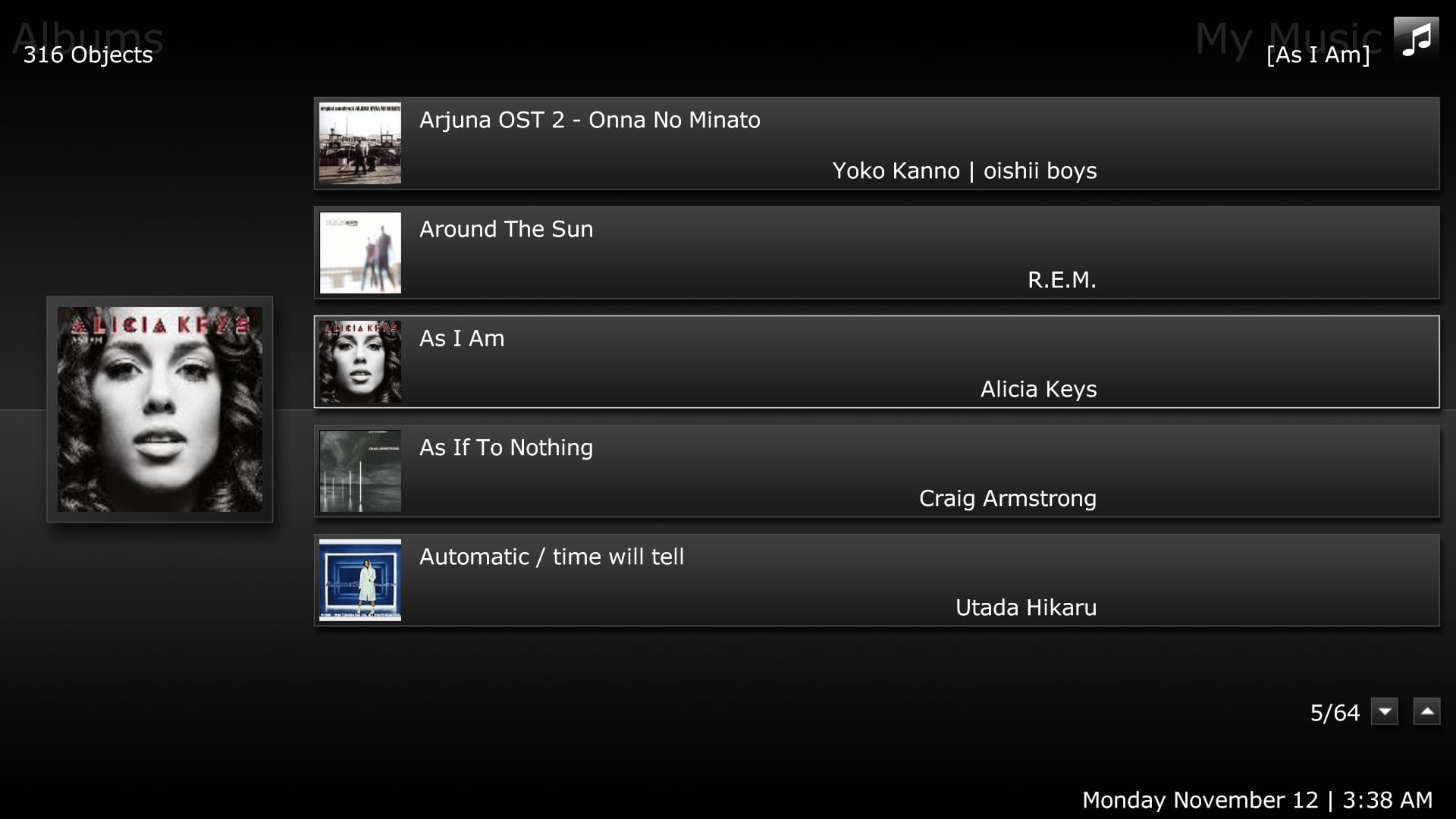
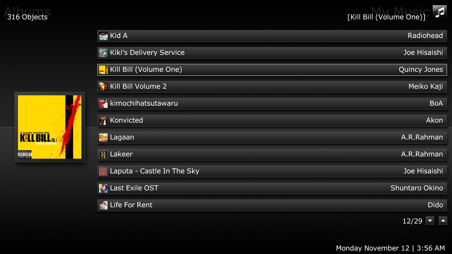
Sure, they're attached. You can see in the first image (big icon list layout, album view in my music) (....20.jpg), the artist information doesn't really look right. I found it to be the same positioning on your revision skin, but in this one it stands out as odd for some reason. I would have the artist names be moved to the right, like in the third image (list layout).
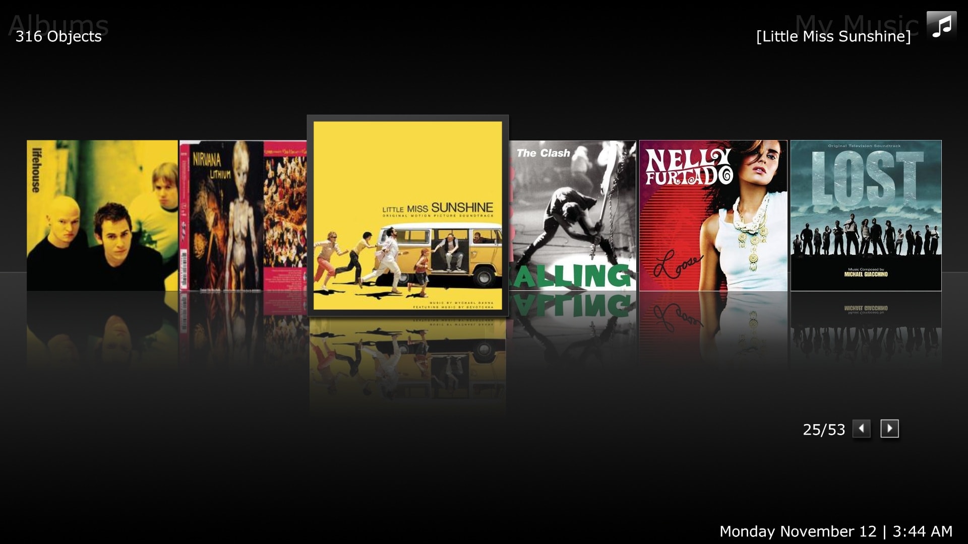
In the second image, in the top right corner where it says the album title, in this case Little Miss Sunshine, I think it'd be good to show the artist there. I know that might go against your minimalist approach, so I wouldn't mind if this didn't go in there.

 .
.


