United States of America
Hi,
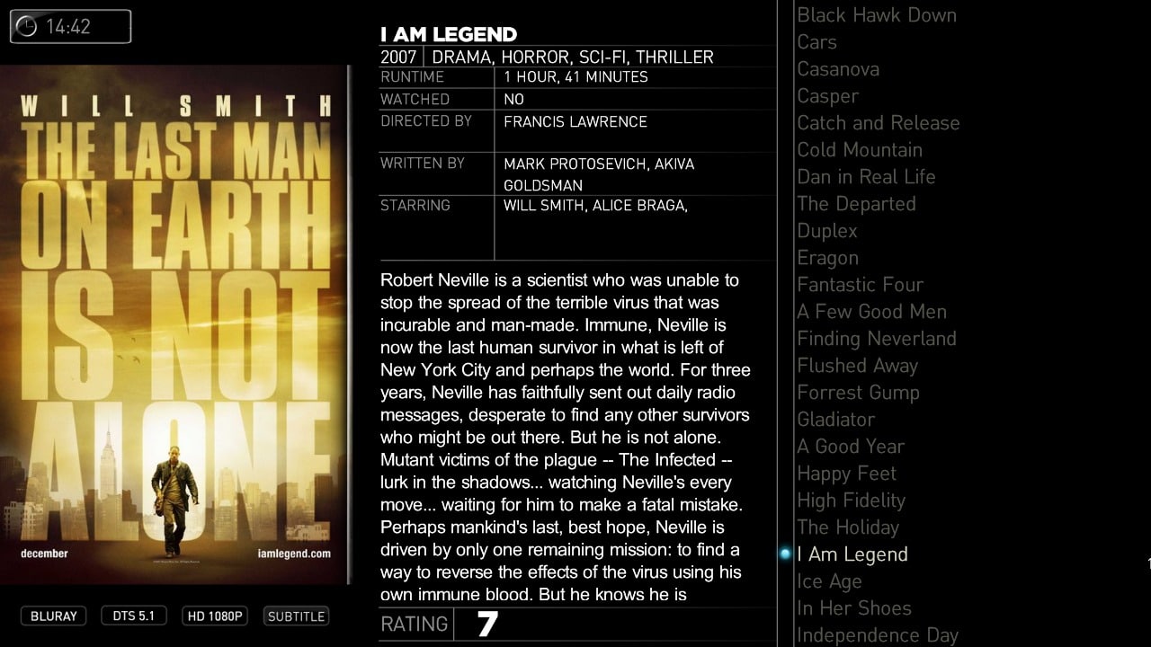
Thank you for your feedback buddyman. What do the rest of you think about the listview. Is it the layout I use for TV-Series better or is the Moving Picture the winner or should I use both (one fot tvseries and and one for moving pictures).
cheers
cul8er
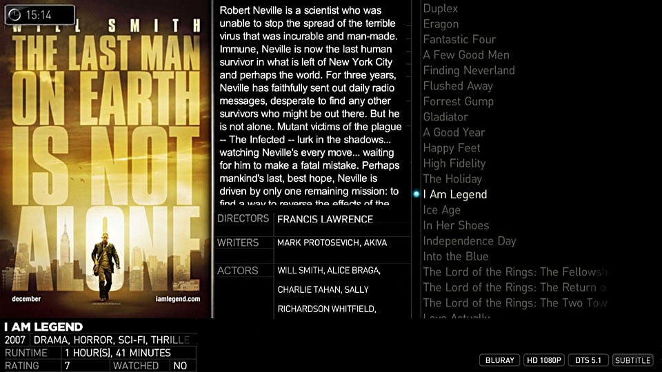
I like the new list view you made and actually like Emph's suggestion, but I think it would look better if the entire thing was somewhat transparent so you could perhaps see the fanart in the background. The only other issue I have is that it seems like the description box is way too big with emph's mock up. Not sure how that could be fixed though...
 Great work as usual man!