Austria
Just started playing again with the new release - and i have to say it's a wow - it immediatly hit the woman accaptence factor (with the wmc skin) - in point of view only small things sre disturbing me - so I would like to have more space between the tiles and some menues and working indiactors (circle) are not centered.
Startup is - wow - incredible and import is now also running fine (I only have movies and series for now)
but - the menues are still a mess. It's not clear why I have to have two rows of menues next to eachother. I would expect that when I change an item in the left hand menue that the right one will show me the submenues I have availibel. Not in MP2. Also I would expect that when i press "menue" on the remot I will get a dialog to work with - or that the slider menue right hand will open (which seems to have the same indication) - but it does not work. Maybe this is because my remote is configured for MP1?
Over all - I really hope you will manage to tighten up the menus (special as everything is configured within MP - which is great)
Over all - great work - hopefully the number of Dev's will see the potential and start working to bring the plugins to MP2!
THX
Last edited:
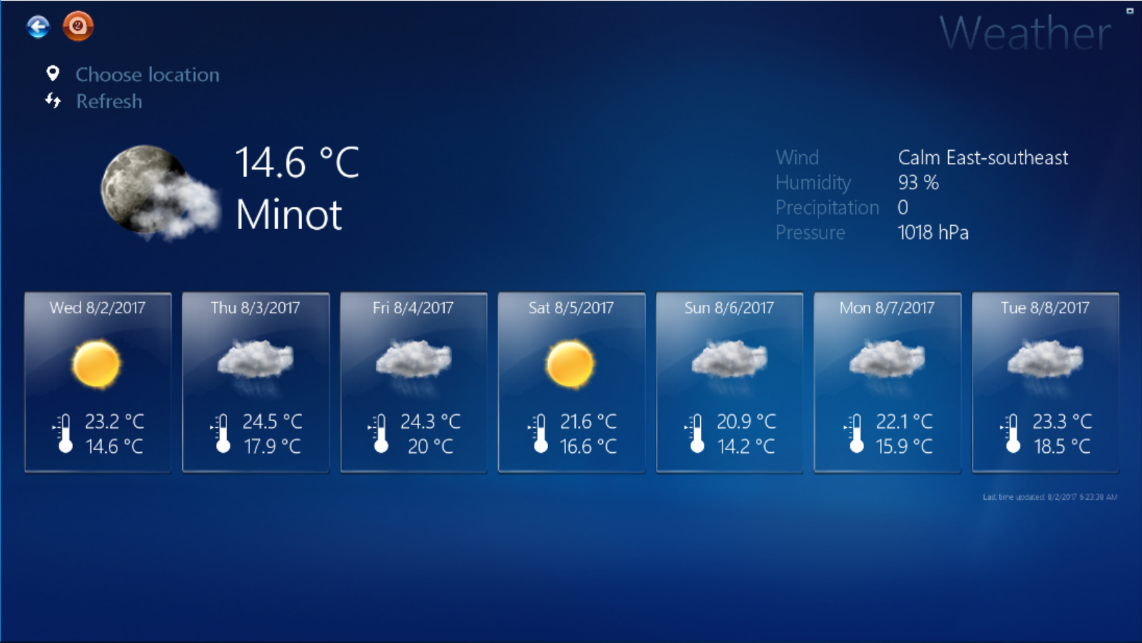
") Though not much changed for WMC skin.
Though not much changed for WMC skin.