
You are using an out of date browser. It may not display this or other websites correctly.
You should upgrade or use an alternative browser.
You should upgrade or use an alternative browser.
A new Plugin for the Music-Part! Is it possible? (3 Viewers)
- Thread starter Helios61
- Start date
 Germany
More iDeas
Hi, I have been wanting a new music plugin for some time now, and I have started a few threads for what I feel are important for a music plugin.
Please have a look and see if this is something you would consider. I am more than willing to elaborate on the threads.
https://forum.team-mediaportal.com/...music-navigation-using-sms-style-input-51668/
https://forum.team-mediaportal.com/...usic-quality-bitrate-codec-information-51622/
- Moderator
- #143
I have some new ideas for the Playlist part. But perhaps we would need a new Playlist editor plugin instead? Of course, this depends on if a non-saved list can be "loaded"?
Options like:
Merge current playlist into saved playlist (select this, and all your saved playlists will be listed) -> confirmation "Are you sure?" yes/no -> save playlist as new yes/no
Edit playlist : re-arrange by artists | re-arrange by album | re-arrange by genre | re-arrange by play time (this will change the sorting descending, choose a "re-arrange" again to sort ascending)
When the list is re-arranged by artists the context menu will show options like "remove all entries by this artist" "keep only this artist". When playlist is in re-arranged by genre view you'd get "remove all entries from this genre", "keep only entries from this genre".
What do you think, would a plugin called "Music Playlist editor" be better than integrating such functions into the music part?
Emph
I've just found this thread and it is good that it was started, but i think it is going the wrong way. With all due respect, the problem is that too many layman seem to believe too strongly in their beliefs. Now, I'm all for focusing on the actual user, but more for prototyping and feedback. Creating intuitive interfaces is actually quite hard, which can be seen from the many faulty software that is out there (including many windows applications). Emphatic is, quite destructively, changing the focus to a part that does not need actual fixing and would be a complete waste of time (and I mean COMPLETE). I stress this still after so many before me, because I wish to shock you into accepting that you are actually being the arrogant one emphatic. Failing to accept a common view that is shared by every single developer is brave nor wise. It is ignorance and (in your case) a failure to understand the basic logic behind the system.
So, having said that, it might be a good idea to first define a target user for which to design a new implementation and to accept that the changes are probably so intensive that they only will be in MP2. That is of course unless someone has the skill and time to make their own plug in (I doubt it). It would be a better time investment to get it good/better for MP2 right out of the box.
For me the user that should need the focus has the following set up or at least parts of it:
- A large collection of correctly tagged music files (no lazy users, they'll have to man up and realise that this is by FAR the best way)
- A large wide-screen TV (This aspect will influence the design heavily, afterwards it could be dumbed down to 3/4. The other way around would restrict design choices for 16/9 based on a much smaller 3/4 user base)
- A (MCE style) remote he/she prefers to use (fast selecting is based on remote, all use cases use a remote)
- A girlfriend and several friends that use the system (Easy and intuitive, maybe with some initial coaching from the user)
- An internet connection (Lookups, scrobbling, music video's etc.)
- Little time or interest in configuring views etc. (Super configurability is great, but I believe it is better to restrict and excel at the few options available)
- After initial set up wants to go back to the configuration as little as possible (so automatic updates of the database built-in)
As has been mentioned, when I look at this list, most problems are skin-based, with some extra coding. I think about these extra or more refined features:
- The main selection screen needs to be modified heavily. I'll try to make some mock-ups soon. My thinking is, the current view only is the best in a very specific situation, where you want to almost aimlessly browse your collection, which i do sometimes. For this specific task one could design a much better view. But for quickly selecting songs and building a playlist, other views are much more preferable.
- My default view would be simply a list of songs, alphabetically. Big, maybe even backdrops if there is a HD source with album art displayed quite big. One then uses the remote buttons to filter the list moving-pictures style (so NO SMS style). Clearly visible should be 3 or so filtering options that can be switched by one of the remote buttons: ALL (searches every tag), Artist, song, maybe album. This will enable the user to really quickly select artists or specific songs, without having to modify the view as is now the case.
- Another view could be more catered to parties etc. Not sure how it would look, but it would focus more on browsing through everything and use genres. A playlist visible would be usefull.
- Now playing: Integration of backdrops and lyrics. I would make the albumart a video window that can also display video files. Make it possible for people to easily search for videos on youtube, MTV whatever. If a good match was found, save this link in the database. A central database where users could do lookups would be great, but i don't think this really exists? An option to change the audio to be from the video or the audio file. Maybe even manual synching (can't really see this happening without being cumbersome though). The whole video business could wait for a later release as it might get complex really quickly, but it would be a software seller I think.
- I think of a 'first user' mode, where information is shown on the screen regarding the buttons on the remote and what actions they perform. This mode can then be turned of in mediaportal itself, when the user feels comfortable. This will hopefully convince people to use this instead of share views and will ensure that a user uses all options available to him to the fullest.
I think you get the general idea. The main screen will be more catered to type of user or situation and how the intended music can be selected as quickly and intuitively as possible. The other view is more catered to creating an as clear and comprehensive overview of the whole collection as possible, intended for people not aware of everything that is in the actual collection.
There is probably much more to think of and to refine, but personally I like this approach. Fewer actions are needed to the 'sidebar', that for me breaks the 'flow' of the program and is a rather ugly solution.
To be honest this type of review is necessary for all of Mediaportal's main programs. However, tv series and movies are now already done great by my tv-series and moving pictures and the TV-server and plugin work ok (only thing that really needs work is the recording part imo).
- Moderator
- #145
the problem is that too many layman seem to believe too strongly in their believes.
^^

Emph
- Moderator
- #146
Well said Kingmob.
I've taken over the Music part, when it was finished and concentrated more on the player side, than doing something on the GUI.
I will soon start a thread with ideas, how Music should look like in MP2 and you're all welcome to submit idea.
Coding should start in mid January. (Started a new job at beginning of this week and don't have any time to spend on MP coding).
I fully understand the frustration the community has, but unfortunately i can't do anything from my side at the moment.
my fear is, that soon or later the author of the new plugin will hit some problem, which requirres a change in the player or core architecture and then nothing can be done.
The way media portal works in music terms is ok and like all programs is not perfict. I currently use media portal to link to another app called silverjuke. Now while this again it has its own floors when hosting partys it works well.
For me simplist way to have a party setup is as follows. At the bottom of the screen a list of currently queued tracks so you can tell how long to wait, whats playing/played. At the top a nice big seach box to allow you to find tacks by any tag e.g artist/album/genre/date. In the middle vew of all the albums with maybe a number of ways of displaying depending on user prefernce. People pick a track which is then added to the bottoom of the queue each track is played in sequence. With an overide switch to allow the host to play a track next or move on. You need to have someway of stopping users from playing the same track over and over as well as stoping them from selecting loads from the same artist. Default that 10 stongs need to be by different artists or different tracks before they can be played again. If if you wish to have a random play setup if the jukebox is not in use that also good but it has properly randomize it's choices i.e make note of the last 10 tracks played and make sure it does not pick tracks from the same artist. It would also be usefull to for the host to limit it to say one genre e.g only 80's if there having an 80's party.
For me simplist way to have a party setup is as follows. At the bottom of the screen a list of currently queued tracks so you can tell how long to wait, whats playing/played. At the top a nice big seach box to allow you to find tacks by any tag e.g artist/album/genre/date. In the middle vew of all the albums with maybe a number of ways of displaying depending on user prefernce. People pick a track which is then added to the bottoom of the queue each track is played in sequence. With an overide switch to allow the host to play a track next or move on. You need to have someway of stopping users from playing the same track over and over as well as stoping them from selecting loads from the same artist. Default that 10 stongs need to be by different artists or different tracks before they can be played again. If if you wish to have a random play setup if the jukebox is not in use that also good but it has properly randomize it's choices i.e make note of the last 10 tracks played and make sure it does not pick tracks from the same artist. It would also be usefull to for the host to limit it to say one genre e.g only 80's if there having an 80's party.
The way media portal works in music terms is ok and like all programs is not perfict. I currently use media portal to link to another app called silverjuke. Now while this again it has its own floors when hosting partys it works well.
For me simplist way to have a party setup is as follows. At the bottom of the screen a list of currently queued tracks so you can tell how long to wait, whats playing/played. At the top a nice big seach box to allow you to find tacks by any tag e.g artist/album/genre/date. In the middle vew of all the albums with maybe a number of ways of displaying depending on user prefernce. People pick a track which is then added to the bottoom of the queue each track is played in sequence. With an overide switch to allow the host to play a track next or move on. You need to have someway of stopping users from playing the same track over and over as well as stoping them from selecting loads from the same artist. Default that 10 stongs need to be by different artists or different tracks before they can be played again. If if you wish to have a random play setup if the jukebox is not in use that also good but it has properly randomize it's choices i.e make note of the last 10 tracks played and make sure it does not pick tracks from the same artist. It would also be usefull to for the host to limit it to say one genre e.g only 80's if there having an 80's party.
After reading that (and few other views how music section should work) I think there are just too many different goals that it would be possible to build one perfect music plugin (unless lot of different default views are offered and user can pick the most suitable from those for his/her personal use cases).
Good thing is that MPII has much more flexibility when it comes to views, so it might be just enough to provide group of different view setups and possibility to create custom view structures (media library in MPII will allow quite nice possibilities for views in the data).
- The main selection screen needs to be modified heavily. I'll try to make some mock-ups soon. My thinking is, the current view only is the best in a very specific situation, where you want to almost aimlessly browse your collection, which i do sometimes. For this specific task one could design a much better view.
While you're breeding over some mockups - may I throw in the crossbar UI concept? I don't like neither the PS3 music part nor the 7MC's but almost every interface to quickly select among many files relies on some horizontal filtering first (e.g. genre / artist / album) and then allows you to vertically browse the filtered contents.
Here's is an example of some desktop app. There are dozens of them (amarok, rhythmbox, winamp, itunes, ...) following the same concept so many people should be used to it.
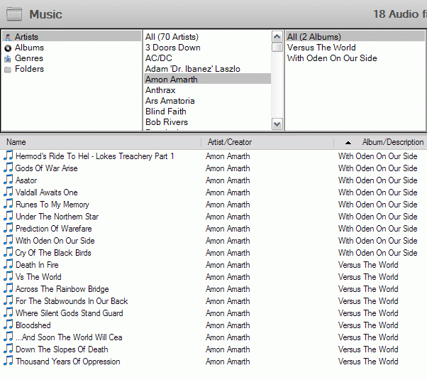
Now either have three horizontal buttons or even the full lists at the top of the music screen for "quick filtering".
Now either have three horizontal buttons or even the full lists at the top of the music screen for "quick filtering".
Users who are viewing this thread
Online now: 4 (members: 0, guests: 4)