About the X-Factor Skin (R479) (2 Viewers)

Status
Not open for further replies.

orph

MP Donator
  • Premium Supporter
  • March 8, 2009
    62
    5
    Home Country
    Canada Canada
    Like everyone else who posts on this particular thread... I too am a huge fan of x-factor. You asked for suggestions, I hope you don't mind mine. I for one am a huge fan of the vertical sub-menu, but I sincerely love what you've done with the metallic/red look.

    Here are my thoughts:


    - make the whole banner smaller (even more so than what I've illustrated). Most of us (I think) use 37" TVs at the least, and for those using smaller screens, they're sitting closer. So the fonts can be smaller, allowing for more BG real-estate.
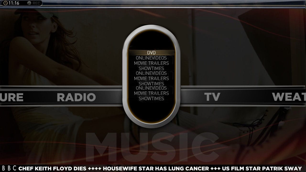
    - instead of a circle for your buttons, how about an oval?
    - with the oval, you can include the sub-menus as illustrated below. Not sure if buttons allow for 'alpha'(as in cut-out texts at edges)(illustrating my ignorance in programming :confused:)
    - I for one am a huge fan of a weather ticker up the whole time, being that it's Canada and weather changes hourly. Having that option available would be great. Doesn't need to be as thick as it currently is.

    Thems my thoughts. Thanks again for such a great skin!:D
     

    Attachments

    • example.jpg
      example.jpg
      106.9 KB

    cul8er

    Retired Team Member
  • Premium Supporter
  • August 31, 2006
    2,159
    2,679
    Home Country
    Sweden Sweden
    Hi orph,

    Fantastic! I really like your image. It will make navigation really easy. Thank you for this great suggestion.

    best regards
    cul8er
     

    cul8er

    Retired Team Member
  • Premium Supporter
  • August 31, 2006
    2,159
    2,679
    Home Country
    Sweden Sweden
    Hi Ticiano,

    Don't worry. You will still have all the old layouts to choose from (Aeon, Horizontal and vertical) ;) One of the reasons for creating this new is that I want one alternative that is lighter = faster load times than all the others that are quite heavy. From my early tests this menu is mcuh faster both in navigation and especially opening (returning to it from a plugin).

    cheers
    cul8er
     

    Imokles

    MP Donator
  • Premium Supporter
  • April 27, 2009
    115
    14
    Home Country
    Germany Germany
    I also like orph's suggestion. However, you should not make the font too small. I am using a 42" screen from a 4m distance, and I think the font size currently used for the vertical submenu entries should be the lowest limit.
     

    Flippinga

    MP Donator
  • Premium Supporter
  • May 27, 2009
    55
    24
    Pijnacker
    Home Country
    Netherlands Netherlands
    Hi Cul8er,

    Thanks for reading all of our comments and the willingness for change!
    I love the latest screen layout with the round (not oval!) selector. Much better than previous idea.
    A fast loading home screen, GREAT!

    Orhp's idea is really the current vertical menu made round is it not? If it is possible in a round (maybe somewhat bigger) selector it would be nice i think.
    Putting sub-menu's in there would be to crowded i think but you might be able to pull it off somehow...

    The one thing that got me using your skin is that only X-factor has sub-menu's in the home screen that are easily configurable.

    Greetings,
    Flip
     

    Imokles

    MP Donator
  • Premium Supporter
  • April 27, 2009
    115
    14
    Home Country
    Germany Germany
    Don't get me wrong - I really love this skin and I am looking forward to this new basichome. However, I actually think that X-Factor is practically unusable without a submenu system. This is mainly because of two reasons.

    First of all, X-Factor does not have a topbar menu like Blue3 where stuff like "now playing", "exit", "settings" etc. usually is accessible. If you don't want to miss those entries, you have to configure them into the menu somewhere.

    Second and more important, Mediaportal and XBMC are different in some important aspects. In Mediaportal, you need additional plugins for stuff that is standard functionality in XBMC. For example, in XBMC you can access Last.Fm, Shoutcast streams, uPnP sources and Music Videos directly from the main music menu - you need plugins in Mediaportal to do the same. Moreover, all plugins in XBMC are categorized (e.g. as video, music) and will automatically appear in the respective section of XBMC. So in this sense, you actually have submenus because you are presented with a configurable selection once you select a menu entry like "Music". That's why I think skins like Alaska work in XBMC but can't be directly converted to Mediaportal (concept-wise).

    So if a submenu system would look too crowded, maybe another alternative would be to clear the screen completely and just present the sub-choices in the same style (similar to the "plugins" menu in Blue3). The background could then indicate in what sub-section you are currently browsing.
     

    Flippinga

    MP Donator
  • Premium Supporter
  • May 27, 2009
    55
    24
    Pijnacker
    Home Country
    Netherlands Netherlands
    Idea for new basic home sub-menu

    Cul8er,

    How about this idea/screen;

    You can have it animate upwards (open submenu) on pressing enter and fade in the submenu items...!
    It still looks very cool and the font is the same size as in vertical.

    Then, pressing left or right (users can configure by choice to) leave it open and display next/previous submenu, or display next/previous menu item and open on pressing enter.

    :)

    I like the idea of not showing the menu pictures (Aeon style) very much but I also like the vertical menu very much!

    Greeting,
    Flip
     

    Attachments

    • newsubmenu.jpg
      newsubmenu.jpg
      123.3 KB

    emphatic

    Design Group
  • Team MediaPortal
  • August 25, 2006
    3,728
    1,185
    Alingsås
    Home Country
    Sweden Sweden
    Cul8er,

    How about this idea/screen;

    You can have it animate upwards (open submenu) on pressing enter and fade in the submenu items...!
    It still looks very cool and the font is the same size as in vertical.

    Then, pressing left or right (users can configure by choice to) leave it open and display next/previous submenu, or display next/previous menu item and open on pressing enter.

    :)

    I like the idea of not showing the menu pictures (Aeon style) very much but I also like the vertical menu very much!

    Greeting,
    Flip

    That looks spectacular. I would prefer the menu further down like it is now though to not block the artwork too much.
    Emph
     

    Imokles

    MP Donator
  • Premium Supporter
  • April 27, 2009
    115
    14
    Home Country
    Germany Germany
    Cul8er,

    How about this idea/screen;

    You can have it animate upwards (open submenu) on pressing enter and fade in the submenu items...!
    It still looks very cool and the font is the same size as in vertical.

    Then, pressing left or right (users can configure by choice to) leave it open and display next/previous submenu, or display next/previous menu item and open on pressing enter.

    :)

    I like the idea of not showing the menu pictures (Aeon style) very much but I also like the vertical menu very much!

    Greeting,
    Flip
    Great!
     
    Status
    Not open for further replies.

    Users who are viewing this thread

    Top Bottom