
You are using an out of date browser. It may not display this or other websites correctly.
You should upgrade or use an alternative browser.
You should upgrade or use an alternative browser.
About the X-Factor Skin (R479) (1 Viewer)
- Thread starter cul8er
- Start date
- Status
- Not open for further replies.
Hi Ticiano,
Don't worry. You will still have all the old layouts to choose from (Aeon, Horizontal and vertical)One of the reasons for creating this new is that I want one alternative that is lighter = faster load times than all the others that are quite heavy. From my early tests this menu is mcuh faster both in navigation and especially opening (returning to it from a plugin).
cheers
cul8er
hi cul8er ! i like the new menu ...look very good ... I do hoop that you will also give us the option layout like the orginal plan ....https://forum.team-mediaportal.com/...actor-skin-r340-68714/index40.html#post519954
Aeon Style ... for me i only use a but 12 plugin wich is all i need for now , and any menu's like Aeon is work very wall and very fast ..
for me ... it's not have to be right now ... just don't cut the idea completely ...
Hi Cul8er,
have you seen ERCA's mods to the TV show fanart view?
I like it because it looks like the background picture is not 1280x720 but resized so that it fits in. This way you see more of the fanart Because normally the background picture is covered up partially for the info (info, list of episodes or seasons or series etc).
have you seen ERCA's mods to the TV show fanart view?
I like it because it looks like the background picture is not 1280x720 but resized so that it fits in. This way you see more of the fanart
Because normally the background picture is covered up partially for the info (info, list of episodes or seasons or series etc).- August 31, 2006
- 2,159
- 2,679
- Home Country
-
 Sweden
- Thread starter
- Moderator
- #415
Hi,
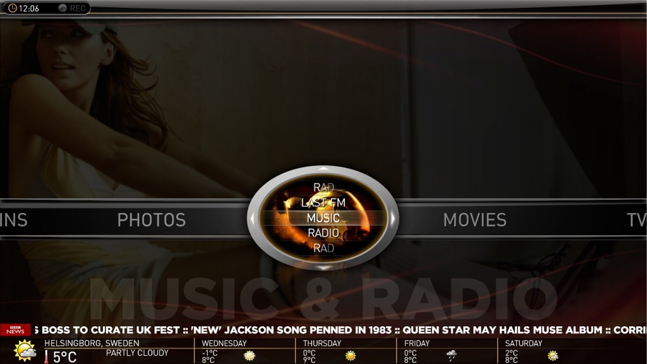
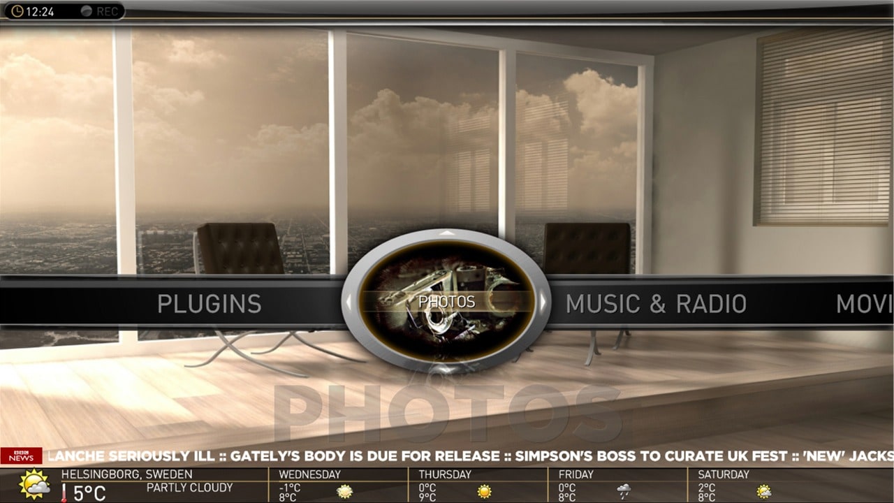
And here is a screenshot of the new basichome menu (fully working) in MP.
Main Menu (The horizontal part);
* Horizontal is all main menues (menu 1 to 6) that you have configured in the Menu Editor. Scrolls like an Aeon menu.
* Scrolling from left to right or right to left changes the image in the elipse to show now selected main menu.
* You have the main menu label in LARGE text below.
Submenu (The vertical part);
* Submenus are within the elipse and you can scroll up/down (scrolls like an Aeon menu).
* The image in the elipse will change with the submenues.
* You have the main menu label in LARGE text below. This will not change when changing submenus.
Backdrop;
* Backdrop changes with mainmenues (not submenues).
Navigation;
* the elipse have arrows (left/right/up/down)
* left/right changes main menu
* up/down changes submenues withing selected main menu.
By the way, do you like the one with a "black" overlay or the one just showing the backdrop as it is the best?
cheers
cul8er
Attachments
- March 4, 2008
- 2,114
- 1,176
- Home Country
-
Netherlands
Hi,
By the way, do you like the one with a "black" overlay or the one just showing the backdrop as it is the best?
cheers
cul8er
Thanks cul8er for the good addition in the menu's. This looks really nice. Do you have a youtube film about it or something? Im curious. Ofcourse if you will make a release soon, dont bother.
Regarding your question..... Hmmm.. Difficult. In my opinion this is dependant on the backdrop. If the selection of backdrops are well matched with the menu colors, then it is ok. With a wide variaty of color usage in the backdrops I think it becomes a bit uncomfortable for the eye... Especially when going through the menu back and forth... So then the overlay color seems better to smoothen out this effect.
You, or anyone, can try and find all backdrops with the same main colors in it to make it look good.
Ofcourse this is just my opinion...
It is all about what your preference is. I prefer a more selected backdrop collection to create a sense of a color theme.- April 17, 2009
- 101
- 0
- 40
- Home Country
-
Germany
i got 3 problems with the skin.
1. Mediaportal misses some backgrounds of buttons:

the second problem is the mini-epg when i switch between tv-channels with the channel up and down button.
I can't see whats on the channel right now. only the channel logo changes. The text is the same.
last but not least the fonts are two big (i copied the fonts of #1 post to the windows font dir):

Anybody have same problems?
- Moderator
- #419
By the way, do you like the one with a "black" overlay or the one just showing the backdrop as it is the best?
I prefer the one without the dark overlay. It will still be possible to not use any backgrounds inside that ellipse, right? I think I will just use a semitransparent dark background for everything, as the background images seem to be a bit busy IMHO.
Great work as usual.
Emph
- April 27, 2009
- 115
- 14
- Home Country
-
Germany
Hi cul8er,
the menu looks very good. I like the "backdrop only" screenshot better simply because I think the pictures overlapping each other is too confusing. But you can probably guess my suggestion: Make it a menu option
Two additional questions:
for this great skin!
Regards
Imokles
the menu looks very good. I like the "backdrop only" screenshot better simply because I think the pictures overlapping each other is too confusing. But you can probably guess my suggestion: Make it a menu option
Two additional questions:
- Regarding the submenu backdrop (i.e. the picture in the oval): Can we use rectangle-sized pictures and the skin will only show the relevant portion of it and hide the rest?
- I assume weather and RSS feed are visible all the time since there is no sensible way to navigate to them? One alternative possibility would be to have both at the bottom of the screen and show weather (and hide RSS feed) only when the menu focus is on the "Weather" module entry. I think this would make the screen more "calm" if you understand what I mean.
for this great skin!Regards
Imokles
- Status
- Not open for further replies.
Users who are viewing this thread
Online now: 2 (members: 0, guests: 2)