aMPed 3.2 - mega-aMPed for MP 1.1.x! (1 Viewer)

Dadeo

Docs Group Manager
  • Premium Supporter
  • November 26, 2006
    5,340
    3,321
    Himalayas, India
    Home Country
    Canada Canada
    Re: aMPed 3.2 - mega-aMPed!

    Hi briegel - sorry to take so long to respond. It has been a hectic few days! Thumbnail panels are a total pita!
    The problem is that image sizes are all different so:
    • If you make each thumb square, then the wider images are cropped (as most skins do) which I don't like and portrait images are a disaster.
    • If you DON'T use keepaspectratio, then the thumbs/icons get distorted, in some cases quite badly
    I have been debating about removing the frame altogether.
    To try that, just add:
    Code:
    <imageFolder>-</imageFolder>
    <imageFolderFocus>-</imageFolderFocus>
    Test it first in the thumbnail control of common.facade.music.xml.. Let me know what you think. It is by far the easiest fix.

    If you want to keep the frames and make them narrower, Here are the important tags to adjust for that (since you are using the normal icons view)
    Code:
    <itemWidth>74</itemWidth>
    <itemHeight>68</itemHeight>
    <textureWidth>64</textureWidth>
    <textureHeight>64</textureHeight>
    <thumbWidth>58</thumbWidth>
    <thumbHeight>58</thumbHeight>
    <thumbPosX>3</thumbPosX>
    <thumbPosY>3</thumbPosY>
    <zoomXPixels>30</zoomXPixels>
    <zoomYPixels>25</zoomYPixels>
    You have to get these all adjusted correctly.
    The main tag you want for the frame is the texturewidth/height. Again test it in the common.facade.music.xml until you get something you like, then you can try it in references.xml. Note that aMPed uses a diff style for wide thumbnails, so if you want to change it everywhere you may want to change the style definition as well.

    Hope that helps, I look forward to seeing what you come up with!
     

    briegel

    Portal Pro
    July 2, 2008
    86
    31
    Home Country
    Germany Germany
    Re: aMPed 3.2 - mega-aMPed!

    Hi Dadeo,

    I've tried to change texture with and -hight as well as zoom pixels. The frame than changes and the gap can be removed. But one problem can't be solved: The position of the image inside the frame can't be changed in relation to the frame. So the overwriting of the frame is still visible.
    The image overwrites one or two pixels of the left and top side of the frame.

    In older versions of mediaportal and the aMPed an Blue3 skin there were also some mismatches between Image and frameposition but with some "try and error" i could match them for all kinds of thumbnails and filmstrip viewings perfectly (for quadratic images). Landscape images were also overwriting the left and right side of the frame. So i made most images quadratic.

    On the one hand i also don't like distorted images but on the other hand removel of the frames is no good solution because highlighted frames are eye captures and make it very easy to navigate inside the thumbnail panel.

    So the best solution would be to have flexible (dynamic) frames that always fit with the image.

    :D
    Briegel
     

    Dadeo

    Docs Group Manager
  • Premium Supporter
  • November 26, 2006
    5,340
    3,321
    Himalayas, India
    Home Country
    Canada Canada
    Re: aMPed 3.2 - mega-aMPed!

    Hey Briegel - now you know why I just gave up and left them like that :D I just don't have the tools I need to do what I want, which is the same as you suggest.

    The position of the image inside the frame can't be changed in relation to the frame. So the overwriting of the frame is still visible.
    You can alter the thumb in relation to the frame a bit by changing
    Code:
    <thumbPosX>3</thumbPosX>
    <thumbPosY>3</thumbPosY>
    Start by changing them to 0 or 1 and fiddle from there :p

    On the one hand i also don't like distorted images but on the other hand removel of the frames is no good solution because highlighted frames are eye captures and make it very easy to navigate inside the thumbnail panel.
    Good point, what I tried was zooming the focused image a lot more like some skins do. It helps, But I cannot say I really loved it.

    So the best solution would be to have flexible (dynamic) frames that always fit with the image.
    +1000 :D but we only just got image borders for all images, so I am not holding my breath. But if we had that then we could keep the aspect ratio and it would look much better imo.

    Your feedback has given me some ideas to explore, so thanks. Once I get our new Wiki ready for release I will try and get some time to start skinning aMPed for MP 1.2.0 (with a whole bunch of new skin features :D) and I will see what I can come up with then. Maybe I can get you to take a look/help at that point?
     

    mguebert

    Portal Pro
    February 9, 2010
    82
    10
    Home Country
    United States of America United States of America
    Re: aMPed 3.2 - mega-aMPed!

    Love the skin, any chance 4 the record will be supported.
     

    Dadeo

    Docs Group Manager
  • Premium Supporter
  • November 26, 2006
    5,340
    3,321
    Himalayas, India
    Home Country
    Canada Canada
    Re: aMPed 3.2 - mega-aMPed!

    Support for For The Record (4TR) was added in aMPed 3.2 and updated to ver 1.5.0.1. I just forgot to add it to the list of Supported Plugins! :oops: :sorry:

    Did you try it yet? I know several aMPed users who are using it, including our main tester Reg.
     

    mguebert

    Portal Pro
    February 9, 2010
    82
    10
    Home Country
    United States of America United States of America
    Re: aMPed 3.2 - mega-aMPed!

    Thanks Dadeo,


    No I have not downloaded it yet. I loved the look of the skin, but when I checked the supported plugins 4tr wasn't there so I asked. Thanks for response, I will be sure to download it.
     

    briegel

    Portal Pro
    July 2, 2008
    86
    31
    Home Country
    Germany Germany
    Re: aMPed 3.2 - mega-aMPed!

    Hi Dadeo
    You can alter the thumb in relation to the frame a bit by changing
    Code:
    <thumbPosX>3</thumbPosX>
    <thumbPosY>3</thumbPosY>
    Start by changing them to 0 or 1 and fiddle from there :p

    That is what i tried (even before) but the only thing that changes is the position of the whole (selected) thumb including the frame. The funny thing is, that it moves to negativ directions.
    Try a value of 25 for both, x and y than you will see that the thumb moves up and left. :confused:

    Your feedback has given me some ideas to explore, so thanks. Once I get our new Wiki ready for release I will try and get some time to start skinning aMPed for MP 1.2.0 (with a whole bunch of new skin features :D) and I will see what I can come up with then. Maybe I can get you to take a look/help at that point?
    Yes, when i get an indication from you i surely will help ;)


    BTW: I also changed the listcontrol in common.facade.music.xml.
    The number of items should be bigger than 9 because most music CDs have more than 9 tracks.
    Up to now i use 10 items. It also looks good when they are centerd. May be even 11 will work.
    My opinion: The more items the better the overview.
     

    Dadeo

    Docs Group Manager
  • Premium Supporter
  • November 26, 2006
    5,340
    3,321
    Himalayas, India
    Home Country
    Canada Canada
    Re: aMPed 3.2 - mega-aMPed!

    Hi Dadeo
    You can alter the thumb in relation to the frame a bit by changing
    Code:
    <thumbPosX>3</thumbPosX>
    <thumbPosY>3</thumbPosY>
    Start by changing them to 0 or 1 and fiddle from there :p

    That is what i tried (even before) but the only thing that changes is the position of the whole (selected) thumb including the frame. The funny thing is, that it moves to negativ directions.
    Try a value of 25 for both, x and y than you will see that the thumb moves up and left. :confused:
    Hmm I don't have time to test atm, but x0 and y0 should move the thumb to the left/top of the frame, then you can adjust the frame smaller to fit IIRC. Part of the problem is the frame image I used distorts so I need to use a new one! I think if you use values too big for the total size of the texture, then you end up with negative value results. (can't remember for sure now ;) )

    The only hope I can offer is that we find a much nicer display for icons views in aMPed 3.3! :D
    Yes, when i get an indication from you i surely will help ;)
    AWESOME!! :D

    BTW: I also changed the listcontrol in common.facade.music.xml.
    The number of items should be bigger than 9 because most music CDs have more than 9 tracks.
    Up to now i use 10 items. It also looks good when they are centerd. May be even 11 will work.
    My opinion: The more items the better the overview.
    Can you post a screenshot of that using 18pt font?
     

    briegel

    Portal Pro
    July 2, 2008
    86
    31
    Home Country
    Germany Germany
    Re: aMPed 3.2 - mega-aMPed!

    Hi Dadeo,

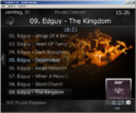
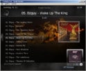
    attached the screenshot of the 18pt aMPed.
    I shifted the listcontrol up (<posY>135</posY> in common.facade.music.xml ) and made it higher ( hight=420 in references.xml ) for 18pt.

    In the 12pt design i made the hight 400. But this didn't look good in the 18pt viewing.
    In the second screenshot you see the 12pt aMped with the 420 hight.
    The list is too close to the edge (Music/File information) may be is shift it down...

    ...and i changed the spaceBetweenItems from 4 to 2.
     

    Attachments

    • 18pt.jpg
      18pt.jpg
      109.1 KB
    • 12pt.jpg
      12pt.jpg
      101.4 KB

    Dadeo

    Docs Group Manager
  • Premium Supporter
  • November 26, 2006
    5,340
    3,321
    Himalayas, India
    Home Country
    Canada Canada
    Re: aMPed 3.2 - mega-aMPed!

    Thanks briegel - nice in 12pt, a bit too much text for me in 18pt, but that is just a matter of taste. It works especially well for music tracks view for sure.

    I'll take a look when I start skinning aMPed for 1.2.0, If you refine it any further let me know - I could use that as a basis.

    Maybe I can add an option to aMPed 3.3 where you can select 'short' or 'long' list items for all lists - much like you can select 8 or 10 lines for TV Guide now. So 'short' would give you 7 items in 18pt or 9 items in 12pt, while 'long' would give you 8 items in 18pt and 11 items in 12pt.

    If there is any interest, let me know, we can post a poll to see how many users would like that. It's a bit of work so I only want to do it if many users would like it.
     

    Users who are viewing this thread

    Top Bottom