- January 24, 2012
- 2,523
- 2,715
- Home Country
-
 United Kingdom
- Thread starter
- Moderator
- #251
In your opinion maybe but we have already had this conversation and majority of people do not access it this way me icluded which is why it is like it is.When I press on live TV on the main tab, I go directly to the tv guide. It would be more intuitive to go to live tv immediately imo.
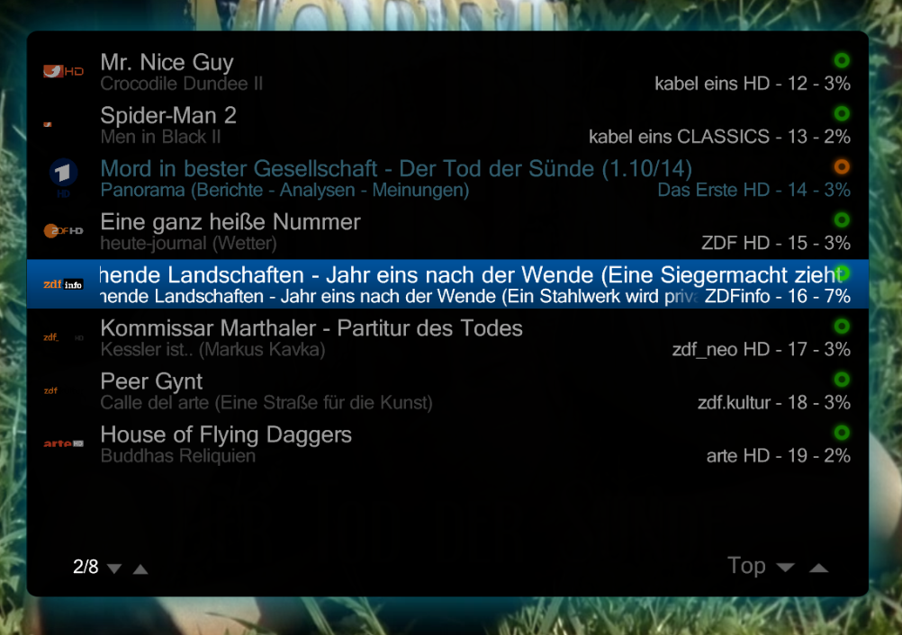
I prefer them this way as opposite to your opinion you can actually see which items are unwatched faster plus there are filters available to view unwatched items and a red tab unwatched indicator under the cover.The colour difference between watched and unwatched is confusing. The unwatched movies are a bit greyish. The watched movies 'pop' out more then the unwatched, because of the blue coulour. Maybe reverse the colours or use other colours?
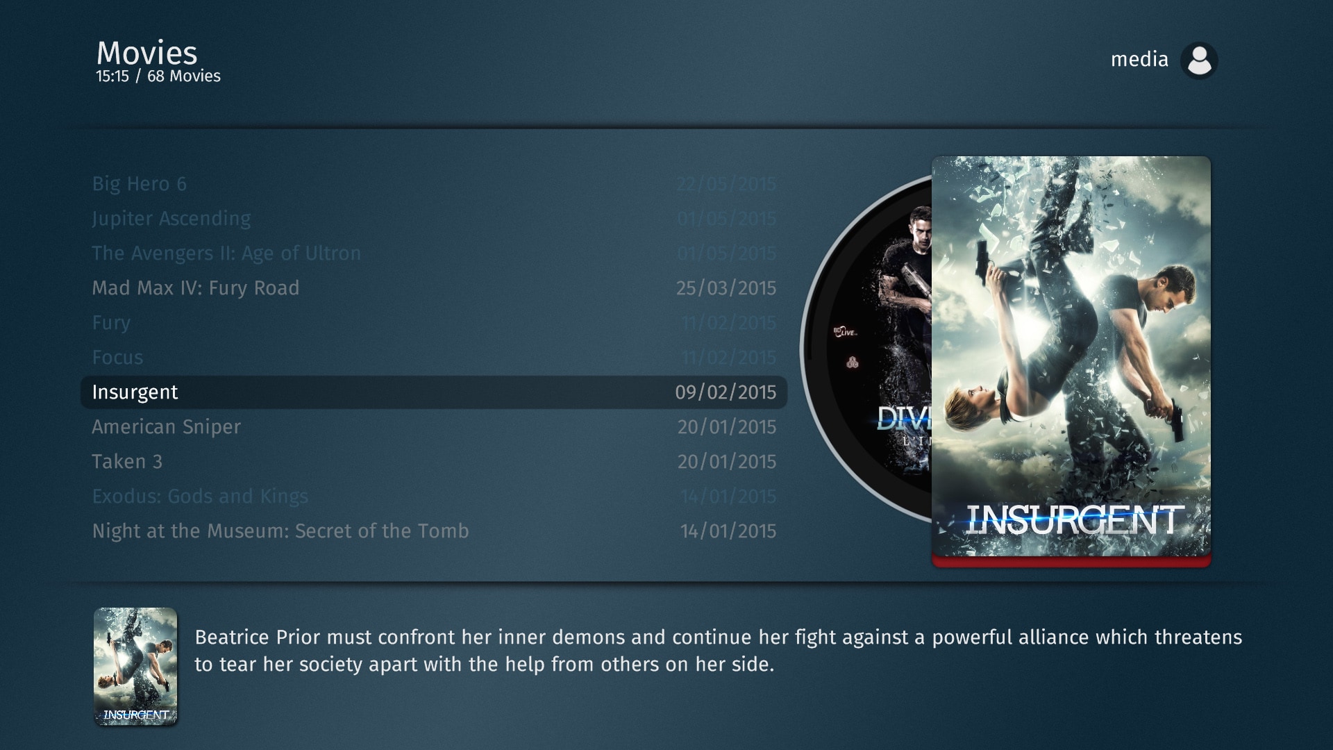
Disagree i'm not really sure how you could miss a button that is half of the screen in widthWhen selecting the movie I go to the movie details. 'Play''and 'Trailers' need more 'pop' to let them be more visible to the user. There is a lot of text and the selection box is easy to miss.
Those buttons are the same size as everywhere else they are used and no problem for me but you are welcome to adjust themWhen I press the info button while playing a movie, the buttons to adjust audio, subs etc. are quite small. Even on my 55 inch TV. Maybe raise the size.
Current time and remaining time are displayed when selecting info button so you should be able to work out the end time ? time remaining is missing from zap osd which i can add but that screen is only shown for a couple of seconds anyway so you may not even catch it.When I jump back and forth through a movie, with the left, right, up and down buttons, the total time left isn't displayed. Also maybe add an option to change time left to actual time and end time.
Already implementedMaybe add some fanart in the background but subtle.
The skin is designed to be as clean as possible hence why no hidden menu icon is visible, it is accessed the same in every screen if available so once you have done it once you know what to do. Again please feel free to adjust and add to the mod section if you don't like it.Add an indicator for the 'left' menu.More user friendly
Also please dont take offence to any comments i have made they are just my honest answers to comments on a skin which i made for personal use but have made available to everyone.
 i think people get stuck in their ways sometimes.