- March 17, 2008
- 1,353
- 306
- Home Country
-
 Netherlands
- Thread starter
- #11
Hey Dadeo  for your feedback!
I'm really not much of a designer myself so I'd really appreciate feedback on how people think it looks and what can be improved.
I'll just go over your feedback real quick:
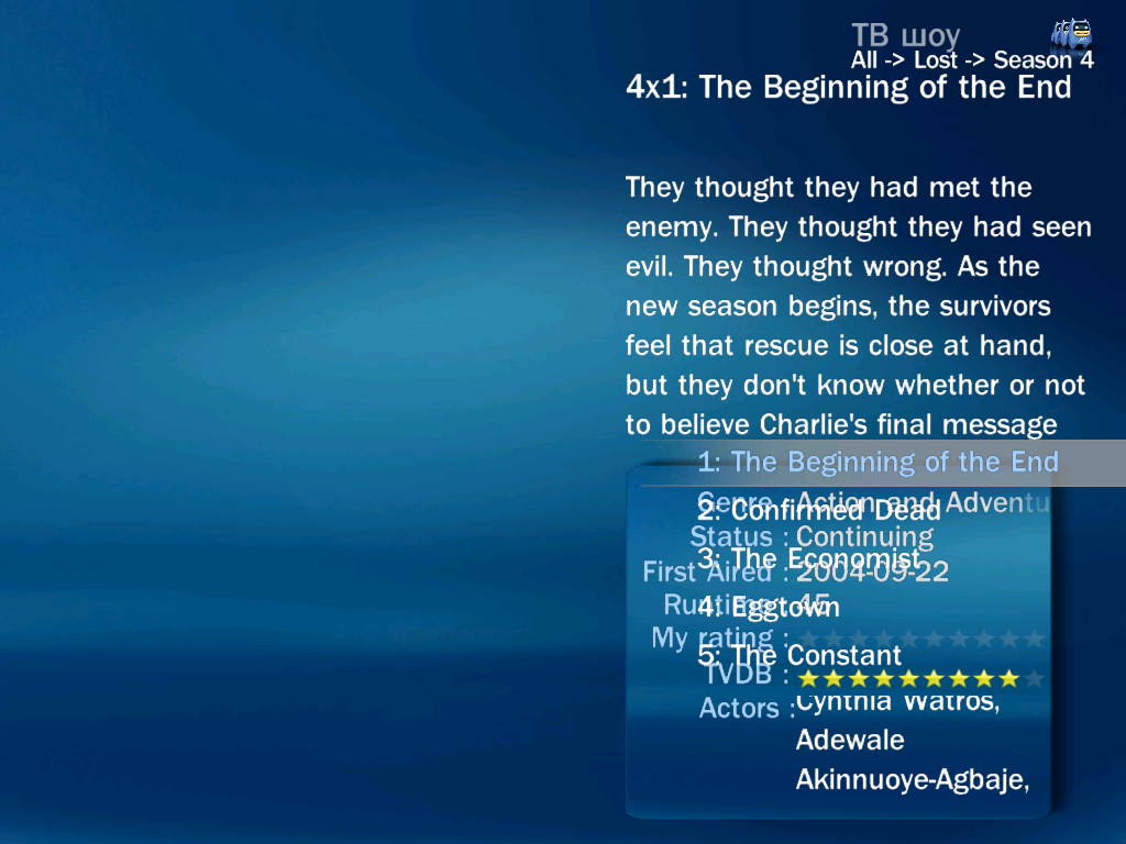
1. TV Series - Could the Genre scroll left so you can see it all? Often these are long with multiple genres, Action and Adventure doesn't even fit fully.
I'm not really sure what you mean. The transition between screens (say season list and episode list) will make the fadelabel reset itself. I believe there won't be anything I can do about that.
2. TV Series - There is no title of the plugin at the top (i.e. TV Series) which is a small point I know
Already have a version with title incorparated in the design (see my last post). Will be part of 0.0.3 release
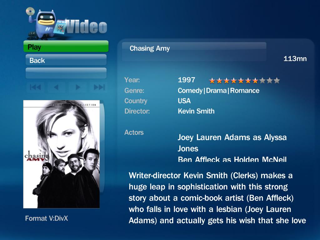
3. TV Series - On the details screen I don't like the Episode name scrolling on top of the Season Image. Could it be just above or below?
Already changed it a bit, it's now below the episode image
4. TV Series - I LOVE THE TICKERTAPE details of the episode at the bottom, Brilliant!
Thx, it's a real spacesaver! Since my screen is so tiny I really have not much room to work with
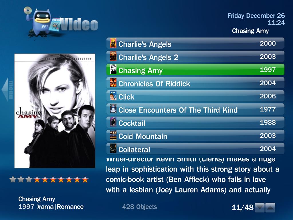
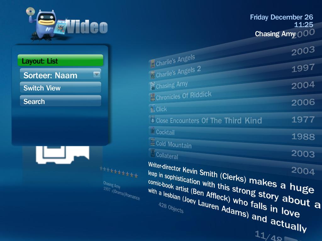
5. My Films - I don't think you need the title 3 times on the screen (list, top, below cover) I know Blue3 does this as well
6. My Films - What about using the ticker tape idea here as well to display the tech details of the film?
7. My Films - There is no Date/Time on the Details screen
8. My Films - When playing a film I love how the cover image resizes (on the Details screen) to fit the now playing box, but the box behind the image does not resize and looks odd. On the main screen, the now playing box does overlap the main image.
I haven't really started adjusting MyFilms yet but I will take your points in account when I'm getting at skinning for MyFilms
9. TV Guide - No Title, no Now Playing screen. If you use the Search button on the main TV window, the Now Playing box overlaps the data. If you select Search from the TV Guide, there is no Now Playing Screen.
I'd have to test this out myself. The HTPC I'm creating this skin for doesn't have TV card so I really should test it out on my desktop (which does have a tv card). I'll check this out and see what can be done.
I'll try updating the roadmap tonight to incorporate your points. Maybe I won't add all of them tonight cause I'll have to check some stuff to really understand what you're talking about.
Think I agree with most of your feedback so eventually you'll see a release coming out with (hopefuly all) your suggestions done
for your feedback!I'm really not much of a designer myself so I'd really appreciate feedback on how people think it looks and what can be improved.
I'll just go over your feedback real quick:
1. TV Series - Could the Genre scroll left so you can see it all? Often these are long with multiple genres, Action and Adventure doesn't even fit fully.
I'm not really sure what you mean. The transition between screens (say season list and episode list) will make the fadelabel reset itself. I believe there won't be anything I can do about that.
2. TV Series - There is no title of the plugin at the top (i.e. TV Series) which is a small point I know
Already have a version with title incorparated in the design (see my last post). Will be part of 0.0.3 release
3. TV Series - On the details screen I don't like the Episode name scrolling on top of the Season Image. Could it be just above or below?
Already changed it a bit, it's now below the episode image
4. TV Series - I LOVE THE TICKERTAPE details of the episode at the bottom, Brilliant!
Thx, it's a real spacesaver! Since my screen is so tiny I really have not much room to work with
5. My Films - I don't think you need the title 3 times on the screen (list, top, below cover) I know Blue3 does this as well
6. My Films - What about using the ticker tape idea here as well to display the tech details of the film?
7. My Films - There is no Date/Time on the Details screen
8. My Films - When playing a film I love how the cover image resizes (on the Details screen) to fit the now playing box, but the box behind the image does not resize and looks odd. On the main screen, the now playing box does overlap the main image.
I haven't really started adjusting MyFilms yet but I will take your points in account when I'm getting at skinning for MyFilms
9. TV Guide - No Title, no Now Playing screen. If you use the Search button on the main TV window, the Now Playing box overlaps the data. If you select Search from the TV Guide, there is no Now Playing Screen.
I'd have to test this out myself. The HTPC I'm creating this skin for doesn't have TV card so I really should test it out on my desktop (which does have a tv card). I'll check this out and see what can be done.
I'll try updating the roadmap tonight to incorporate your points. Maybe I won't add all of them tonight cause I'll have to check some stuff to really understand what you're talking about.
Think I agree with most of your feedback so eventually you'll see a release coming out with (hopefuly all) your suggestions done