Germany
Hi.
Don't know if this is a skin specific bug but I think i show it here as it is a minor one and visible in WMC skin:
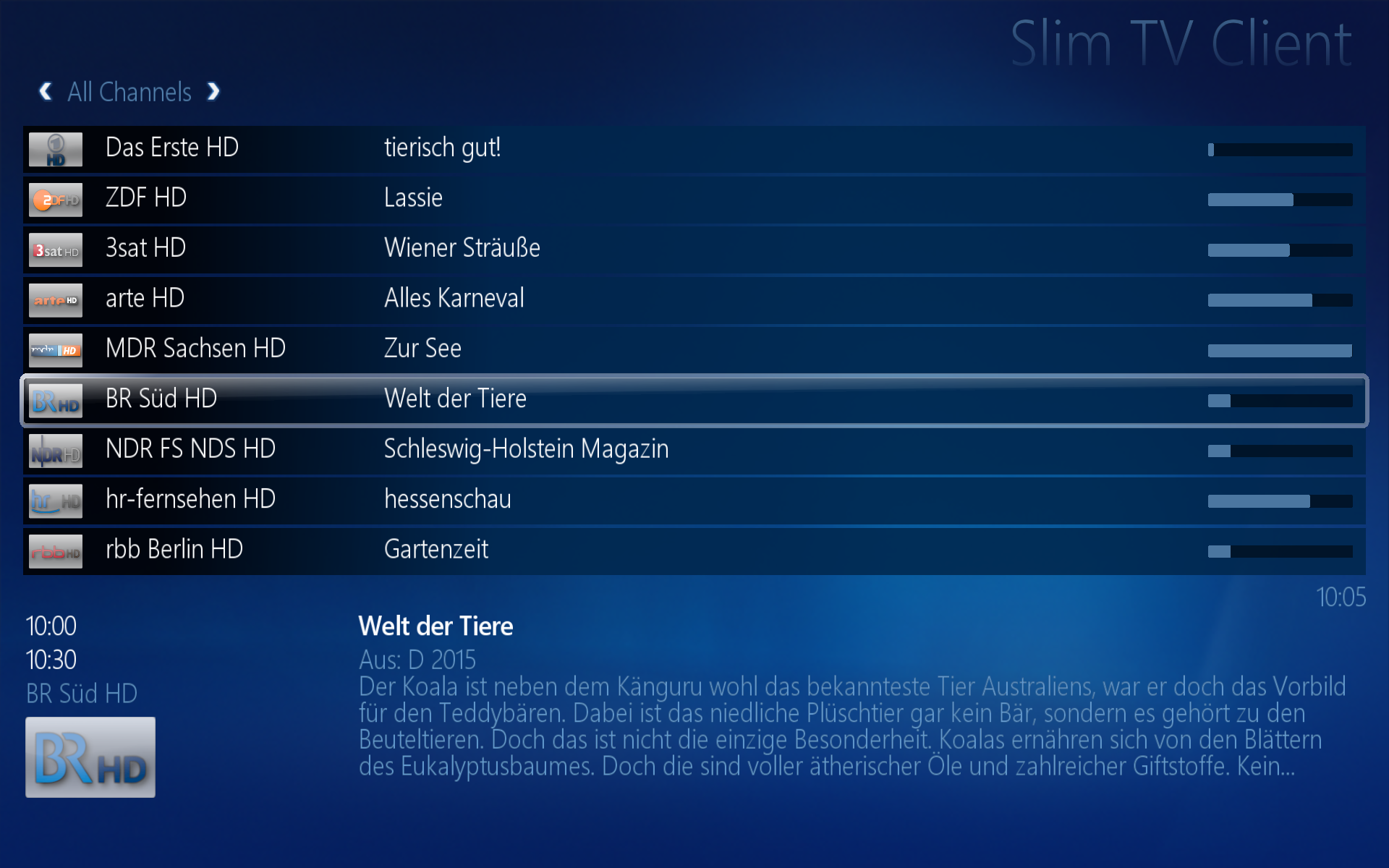
The play percentage when playing music is not reset after a song is finished:

358% played is not really a valid value...
Don't know if this is a skin specific bug but I think i show it here as it is a minor one and visible in WMC skin:
The play percentage when playing music is not reset after a song is finished:
358% played is not really a valid value...
")