How to Change watched/unwatched colors (1 Viewer)

sleepycol

Portal Pro
June 2, 2006
538
39
Home Country
United Kingdom United Kingdom
Can someone upload the changed files? It would be nice to have a set of overhauled files here, no need for more people to edit their files.

Emph

With a screengrab so we can see the colour changes?
 

sanderson

Portal Member
November 4, 2008
38
16
Home Country
United States of America United States of America
Can someone upload the changed files? It would be nice to have a set of overhauled files here, no need for more people to edit their files.

Emph

Here are the reference.xml files. I've included the one with only the played color changed by me, and the one with colors swapped by wogboy112.
Sorry, but can't do screen grabs right now.
 

Attachments

  • references.xml (colors switched).zip
    27.8 KB
  • references.xml (played color to red).zip
    27.8 KB

crazyboy

MP Donator
  • Premium Supporter
  • March 25, 2006
    38
    8
    Here my reference.xml file with played color set to yellow (the same of default wide skin in mediaportal 1.2.3)
     

    Attachments

    • recoding_color.jpg
      recoding_color.jpg
      275.7 KB
    • references.xml
      27.7 KB

    ninjatobben

    Portal Member
    March 31, 2010
    22
    1
    -1 to color swap!! Came here because I thought it was a bug. It seems I'm a minority, but the new colors doesn't make any sense to me. Grey means watched in my eyes.
     
    Last edited:

    sam3

    Portal Member
    February 5, 2013
    11
    2
    34
    Home Country
    United Kingdom United Kingdom
    -1 to color swap!! Came here because I thought it was a bug. It seems I'm a minority, but the new colors doesn't make any sense to me. Grey means watched in my eyes.
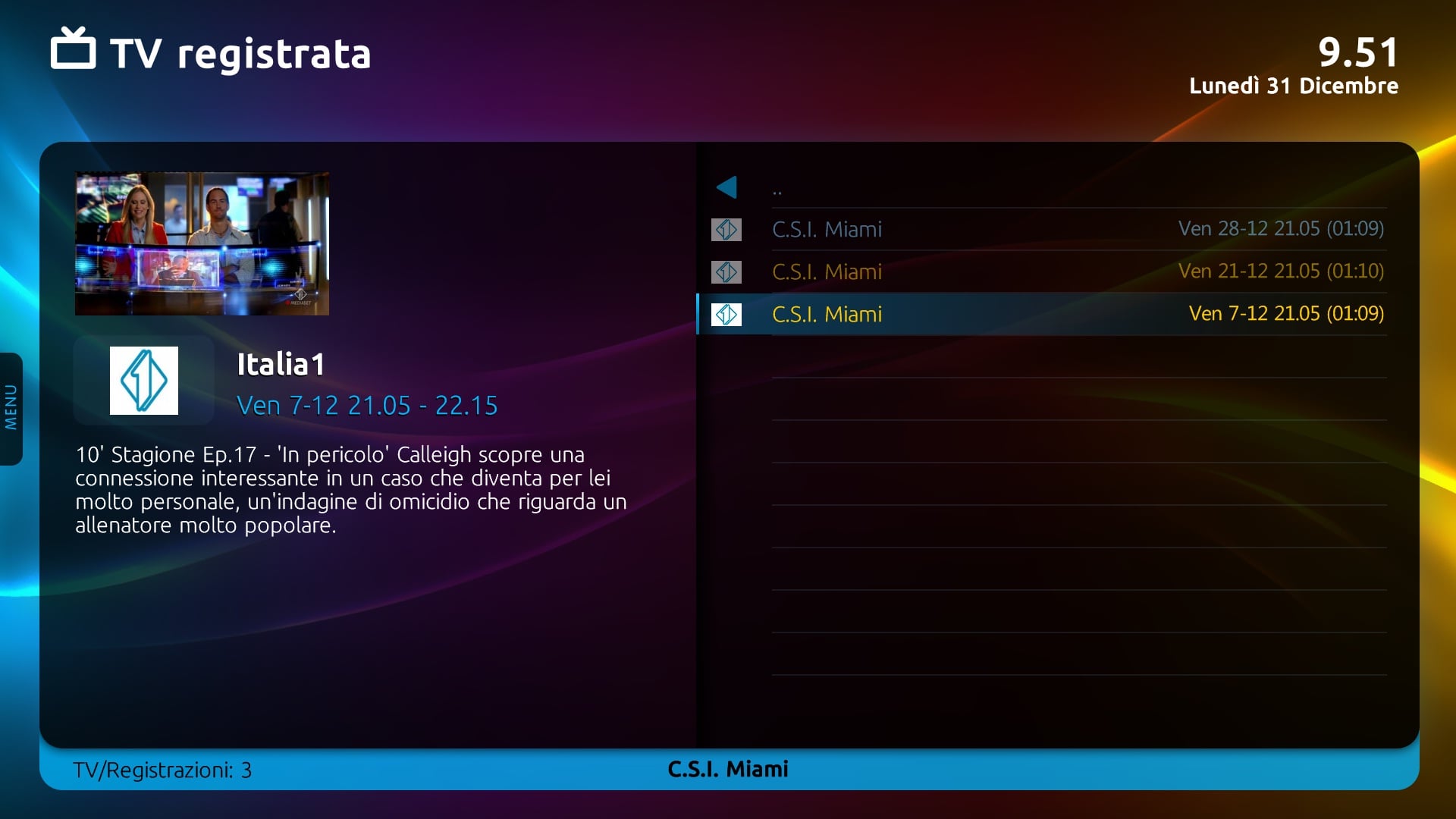
    I have to agree that there's something still quite not right about the interface too. You actually have 4 font colours (white, blue and a dimmed version of each). I think it may be clearer if you turn off font dimming of unselected titles and just stick with two colours for unwatched and watched items (white and grey).
    The blue highlight box of selected items should be enough.
    I also think its unnecessary to have both watched and unwatched indication symbols in the tv series episodes menu. Just having a symbol next to watched episodes should be enough (see pics).
    16-03-18.png
    16-03-18_edited.png

    In general the unwatched symbol is not clear at what it is supposed to indicate. I can see the developers were trying to create an anti-watched eyeball thing but it looks more like a warning/error symbol (red cross) rather than a symbol indicating this is new (see last pic).
    16-03-49.png
     
    Last edited:

    kiwijunglist

    Super Moderator
  • Team MediaPortal
  • June 10, 2008
    6,746
    1,751
    New Zealand
    Home Country
    New Zealand New Zealand
    I would agree that the unwatched icon is unnecessary and it looks nicer without


    I'd also prefer to scrap the unwatched icon on unwatched series/movies in favour of having a watched icon for the watched ones and nothing display for the unwatched one.
     
    Last edited:

    ajs

    Development Group
  • Team MediaPortal
  • February 29, 2008
    15,492
    10,371
    Kyiv
    Home Country
    Ukraine Ukraine
    I would agree that the unwatched icon is unnecessary and it looks nicer without


    I'd also prefer to scrap the unwatched icon on unwatched series/movies in favour of having a watched icon for the watched ones and nothing display for the unwatched one.

    How to make display as you have in the picture?
     

    ajs

    Development Group
  • Team MediaPortal
  • February 29, 2008
    15,492
    10,371
    Kyiv
    Home Country
    Ukraine Ukraine
    ^ you could probably just delete the unwatched icon png from the titan folder.
    I deleted, but in general all the icons are gone, as watched and not watched :(
     
    J

    joostzilla

    Guest
    Actually i dont like the coloured/dimmed text in the lists myself. Imho opinion all text should be the same color. In Avalon we had this as user setting.
    And i agree that only one icon would be enough. I would recommend only a icon for unwatched. That seems only logical.
    I will contact Nico to tackle this issue.
     

    Users who are viewing this thread

    Top Bottom