Improving the TV screen look and handling (1 Viewer)

ge2301

Lead Design MP2
  • Team MediaPortal
  • January 11, 2014
    8,705
    3,491
    Stuttgart
    Home Country
    Germany Germany
    @morpheus_xx
    As you are overworking the TV part and I the TV design, I'd like to make some comments.
    I'm honestly totally lost is various screens, that do basically show comletely or almost same information. Why do we need that? It's just confusing from my point of view.
    • Channel / EPG
    1) tv2.jpg 2) tv.jpg 3) tv3.jpg
    1 is necessary, but my recommendation is to eliminate 2 completely and I'll bring 3 into a good format​
    • FullScreenTV
    4) tv4.jpg 5) tv5.jpg 6) tv6.jpg
    4 is ok, but 5 and 6 should be eliminated completely​

    Let's keep things simple and user friendly, I was really clicking around and thinking what are all those screens for?? :eek:

    PS: So far only the design for 1 is done. 2 to 6 are not touched by me
     

    morpheus_xx

    Retired Team Member
  • Team MediaPortal
  • March 24, 2007
    12,073
    7,459
    Home Country
    Germany Germany
    The number 2) is the "home" screen for TV. Here we have only few options currently:
    • Provide further links to recordings, schedules, program search (in menu already)
    • Offer a way to actually turn on TV
      • If you never used it before, which channel is to tune? --> that's why there is a channel list
      • If user enabled "automatical tune last channel" this happens immediately and this screen is "skipped"
    The 4): It's the short overview about now (white) and next (blue) program
    The 5): It's the long details view for current program
    The 6): It's the long details view for next program

    I've implemented this after I've seen this in a real TV menu and I liked the way to show the different details.
     

    Lehmden

    Retired Team Member
  • Premium Supporter
  • December 17, 2010
    12,553
    3,934
    Lehmden
    Home Country
    Germany Germany
    Hi.
    Normally I liked the "TV" screen from MP1 but at least with BlueVision we have the TV menu that basically do the same. So here is no need for this screen at all as long as all needed actions are reachable from the menu (like it is today).
    So for this....
    • If you never used it before, which channel is to tune?
    Do it like it is on MP1, simply tune the first channel in the list. This only is for the very first usage of an MP2 installation. After that, the last used channel should be stored for next time usage. This is how "normal" STB and TV did work, so why don't do it here the same way? With this most people are used to handle it as always...

    Not only for TV but in general we should think about a "memory" for MP2, a table in the DB or an local xml file or similar that stores (separate for every client if we use the DB for this) the last used positions, media items and so on. An example... I've watched the second last episode from "Haven" I've got (S05E14). After this episode is finished I need to check the weather or the news or if a planed recording properly is scheduled or similar. After I'm finished with that I like to watch the next unseen Episode of "Haven". Now I need to navigate all the way down to "Videohub - Series - (un)seen - Haven - Season 5 - Episode 15 - Play". It would be much better if the route was like this "Videohub - Series - Play" and I'm done. If there is no unseen Episode of Haven left then I should end up in "Series - (un)seen" so I can choose a different series to watch. The "back" button should act as an "one level up" button (not only) in this scenario so I can choose a different series if I like also there still are unseen episodes of the last watched series... This is how e.g. MP1 or Kodi is working and I like it the better.
     

    Lehmden

    Retired Team Member
  • Premium Supporter
  • December 17, 2010
    12,553
    3,934
    Lehmden
    Home Country
    Germany Germany
    green does not fit
    Ok, maybe my monitor is not that good calibrated, but for me the program recently airing in your sample Multi EPG view has a green colour, maybe with a turquoise tint but definitely green.
     

    morpheus_xx

    Retired Team Member
  • Team MediaPortal
  • March 24, 2007
    12,073
    7,459
    Home Country
    Germany Germany
    Do it like it is on MP1, simply tune the first channel in the list. This only is for the very first usage of an MP2 installation. After that, the last used channel should be stored for next time usage. This is how "normal" STB and TV did work, so why don't do it here the same way?
    Some few more things to consider:
    1. Even with the "auto tune last" channel is activated, there are checks if any other player is active. TV is then only activated if no other player is running. As this screen is the normal entry point (also for other skins), it would not be good to end an active player only because the navigation reaches TV home screen.
    2. IIRC the TV home screen in MP1 had a simple button "TV on/off"? We could use this too (in favor of the channel selection). But a screen with only a single button on it I'd found quite useless. If this screen would use a base layout where the menu is always visible (like in settings), we would at least see the available menu items directly.
     

    ge2301

    Lead Design MP2
  • Team MediaPortal
  • January 11, 2014
    8,705
    3,491
    Stuttgart
    Home Country
    Germany Germany
    • Thread starter
    • Admin
    • #6
    The number 2) is the "home" screen for TV. Here we have only few options currently:
    • Provide further links to recordings, schedules, program search (in menu already)
    • Offer a way to actually turn on TV
      • If you never used it before, which channel is to tune? --> that's why there is a channel list
      • If user enabled "automatical tune last channel" this happens immediately and this screen is "skipped"
    Thanks for explaining, a few things became more clear. With mouse control it's confusing, because clicking right mouse brings you always one screen further.
    I also think that we do not need 2. 3 could be shown for the first time tuning to first channel. By this we have only 2 screens.
    As Lehmden mentioned one function is currently missing: Coming back to the TV screen with links to recordings, schedules, EPG with only back button.

    The 4): It's the short overview about now (white) and next (blue) program
    The 5): It's the long details view for current program
    The 6): It's the long details view for next program
    I think it's taste or about habits. I'd use the EPG for that, but it's fine :)
     

    Lehmden

    Retired Team Member
  • Premium Supporter
  • December 17, 2010
    12,553
    3,934
    Lehmden
    Home Country
    Germany Germany
    IRC the TV home screen in MP1 had a simple button "TV on/off"?
    Yes. But in MP1 there are all the buttons for the various actions we can find in BV (and Apollo) TV menu. We don't have such for Titan, Reflection and so on, so we can do a screen with all those buttons. This did not hurt on BV and Apollo at all...
    Here is a MP1 TV screen:
    screen-15-jpg.120078

    Actually TV is playing (indicated by the green dot), but not in full screen. It looks as if it is playing on the TV set from the picture. You can navigate to this preview and press the OK button on it to reach full screen TV. With "TV Ein" you can switch TV on or off. "Kanal" shows the channel list similar to what we now have in TV screen. "TV Programm" leads to the MultiEPG view, "Aufnahmen" leads to Recordings. "Geplante Aufnahmen" leads to a list of upcoming schedules something that still is missing in MP2 (see picture below), "Jetzt Aufnehmen" starts a recording instantly, "Laufende Aufnahmen" is sowing any currently running recordings, "TV-Streams" is showing all recently active Live TV streams with an option to "kill" them, "Suche" leads to the (newly added to MP2) search function and at last "Videotext" is showing teletext informations of the current (or last selected) channel.
    I really can imagine this in BV skin. The right area (normally displaying the fanart) is showing the running TV program (if it's running) and the left area (normally displaying the media item list) is showing the menu. This would fit nicely, I'm pretty sure.


    This is the desperately missing schedules screen:
    screen-18-jpg.120081

    The menu is about this:
    "Datum" is the sorting order and the up arrow is showing that currently the order is ascending. This can be changed to descending and you can order by date, channel or by program name, if you like. "Serien", recently switched off (that's why the dot is red), changes the screen to something similar we already have in MP2, the "schedules" screen. With "Neu" you can plan a schedule right from here, either showing the Multi EPG or a requester to enter a manual recording with channel, start and stop time... With "Aufräumen" the schedules and the recordings! are cleaned up. No longer existing recordings are removed from the DB, cancelled schedules are removed and conflicts (not enough available tuner for all planed actions) are solved....
    On the top left corner you see the recently running recordings and/or the next planed schedules (including the available free disk space for recordings)...

    By the way, this are screenshots from my not finished BackVision skin for MP1, something I really would love to create similar for MP2 in future...
     

    morpheus_xx

    Retired Team Member
  • Team MediaPortal
  • March 24, 2007
    12,073
    7,459
    Home Country
    Germany Germany
    If I use the "master_configuration_menu.xaml" (without hiding menu) as base here, the screen looks this way:

    This means the left side menu is already similar to MP1. Placing the TV video inside center region (instead of channels) is possible. But in this case the screen looks differently to all other media related parts. And with the latest version which moves the player controls into the "currently playing screen", it is incosistent to show TV frame in here.
    And then also the PiP scenario is to be considered, how to show the 2 concurrent video frames?

    Then the MP1 screen shows an OSD here, while OSDs are generally only visible inside Fullscreen states. Would be inconsistent then as well.

    Don't get me wrong: I'm very happy about improvements, but I think we need to create a consistent look and feel, no matter if it is Media, TV or Online Videos.

    upload_2015-10-18_11-32-7.png
     

    ge2301

    Lead Design MP2
  • Team MediaPortal
  • January 11, 2014
    8,705
    3,491
    Stuttgart
    Home Country
    Germany Germany
    • Thread starter
    • Admin
    • #9
    I think we need to create a consistent look and feel, no matter if it is Media, TV or Online Videos.
    Thats the point and also the background about my questions. I want a simple, userfriendly and consistant solution. The design and structure should fit to other screens :)
     

    ge2301

    Lead Design MP2
  • Team MediaPortal
  • January 11, 2014
    8,705
    3,491
    Stuttgart
    Home Country
    Germany Germany
    Ok, maybe my monitor is not that good calibrated, but for me the program recently airing in your sample Multi EPG view has a green colour, maybe with a turquoise tint but definitely green.
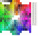
    Indeed it's turquoise, so must be your screen :) I picked #003333 and made it brighter for you.
     

    Attachments

    • color_codes-hex.gif
      color_codes-hex.gif
      103.9 KB

    Users who are viewing this thread

    Top Bottom