New Layout of BasicHome Menu Buttons? (14 Viewers)

2BitSculptor

Super Moderator
  • Team MediaPortal
  • January 23, 2008
    2,038
    1,081
    South Central Wisconsin
    Home Country
    United States of America United States of America
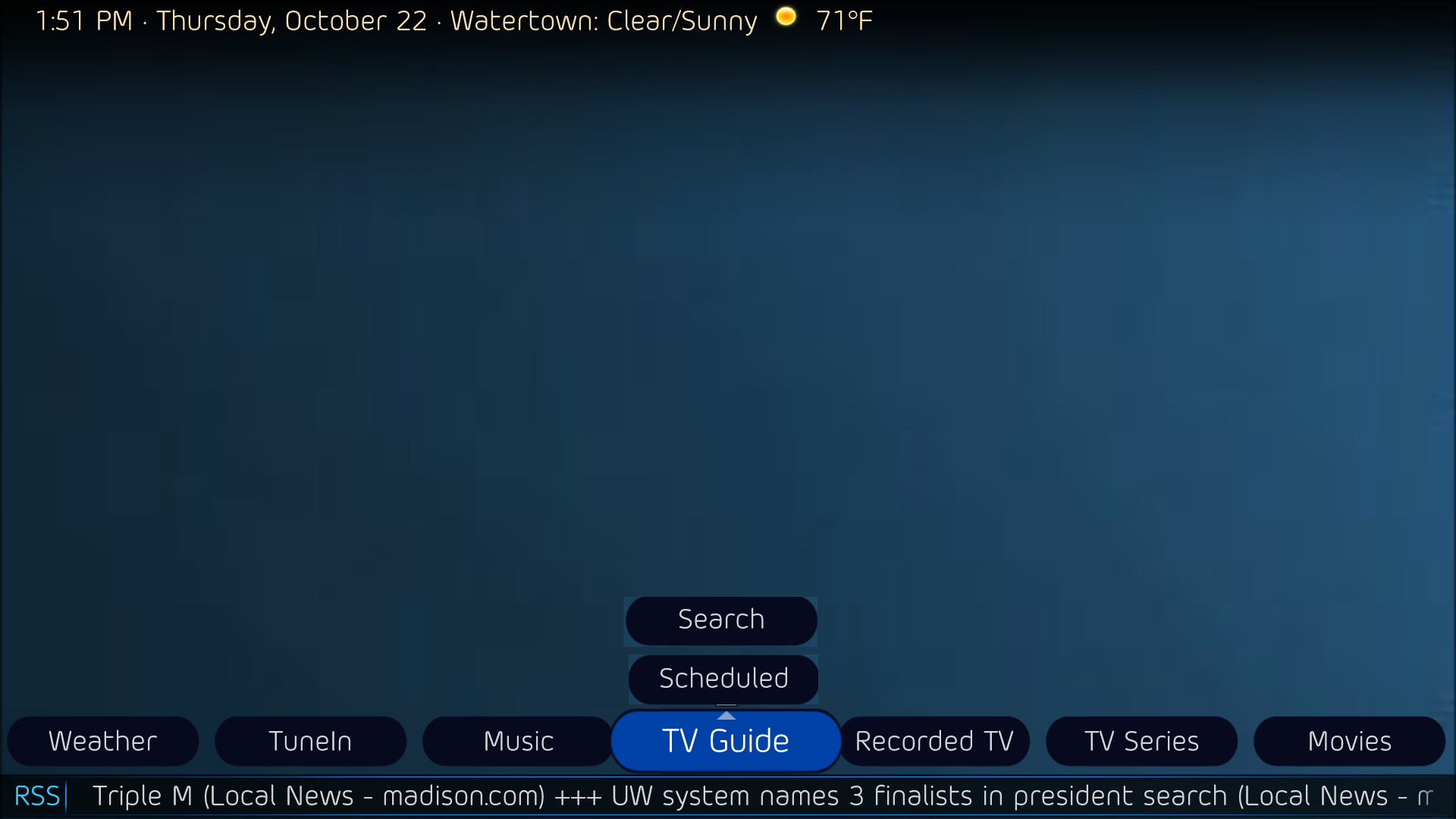
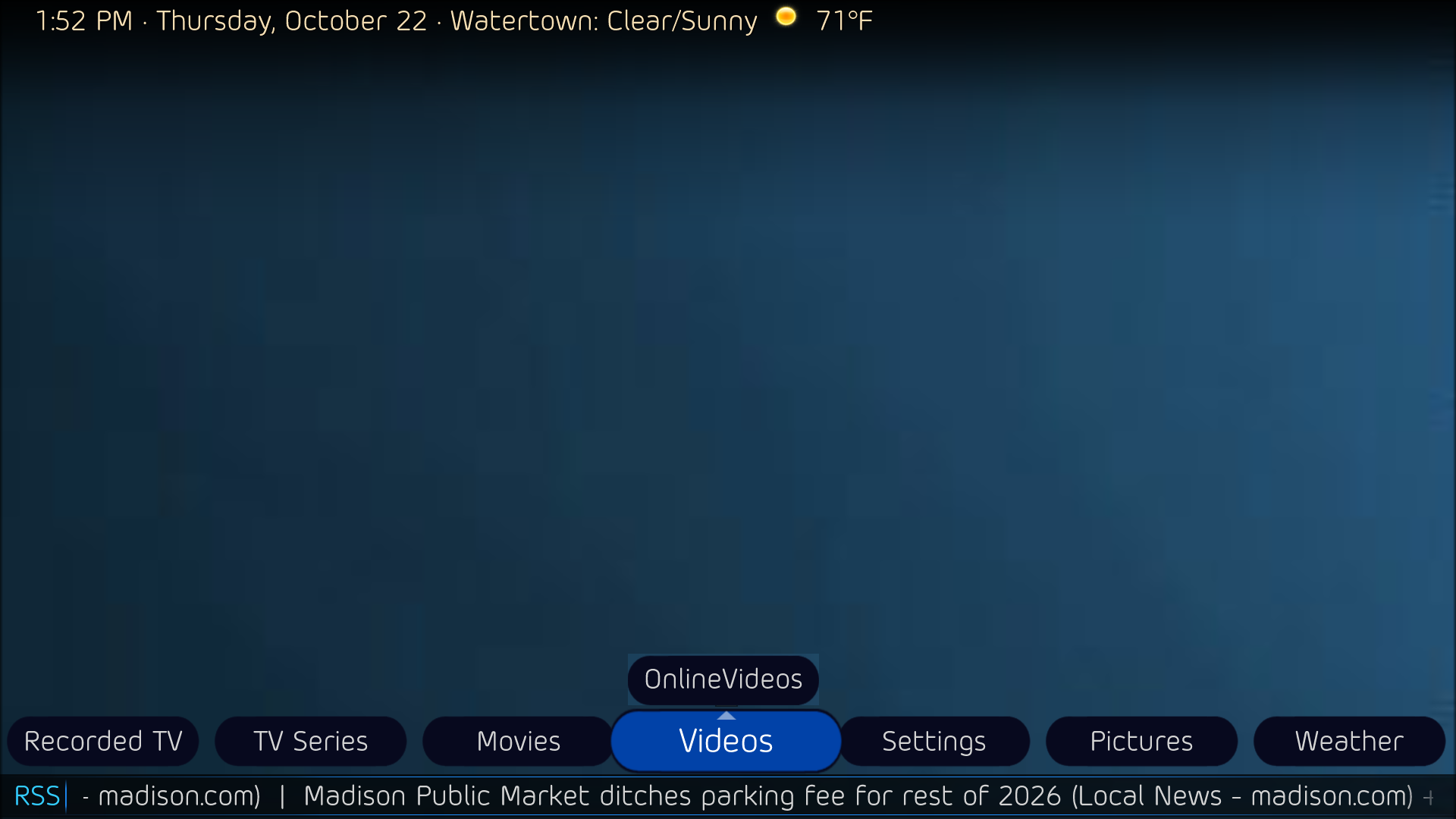
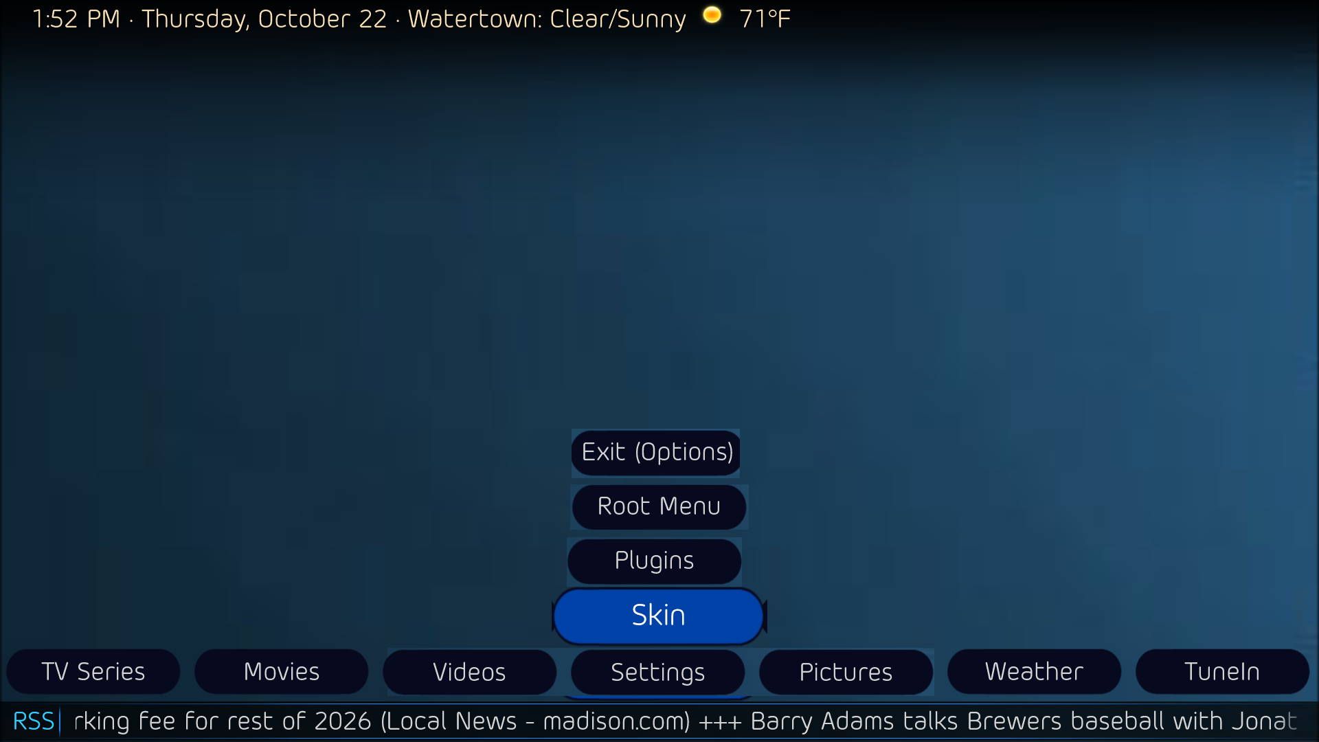
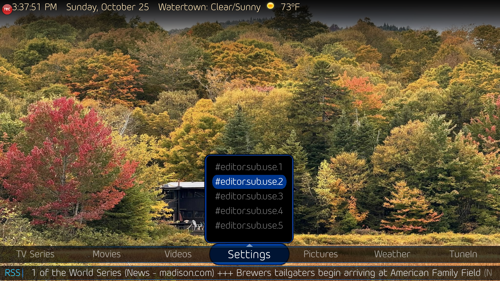
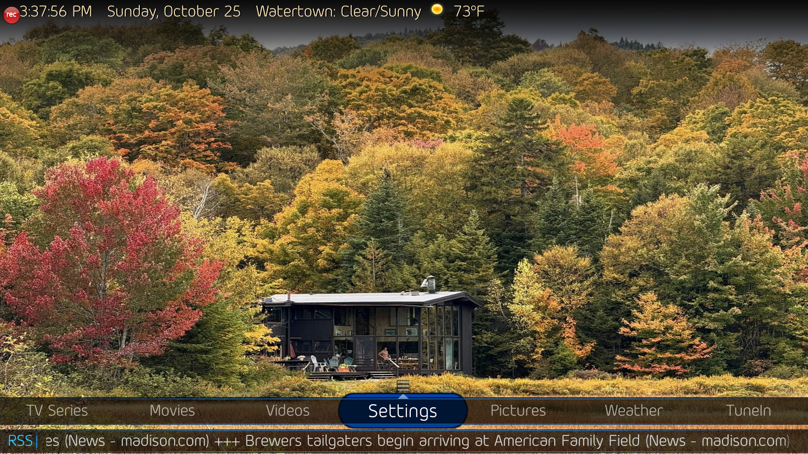
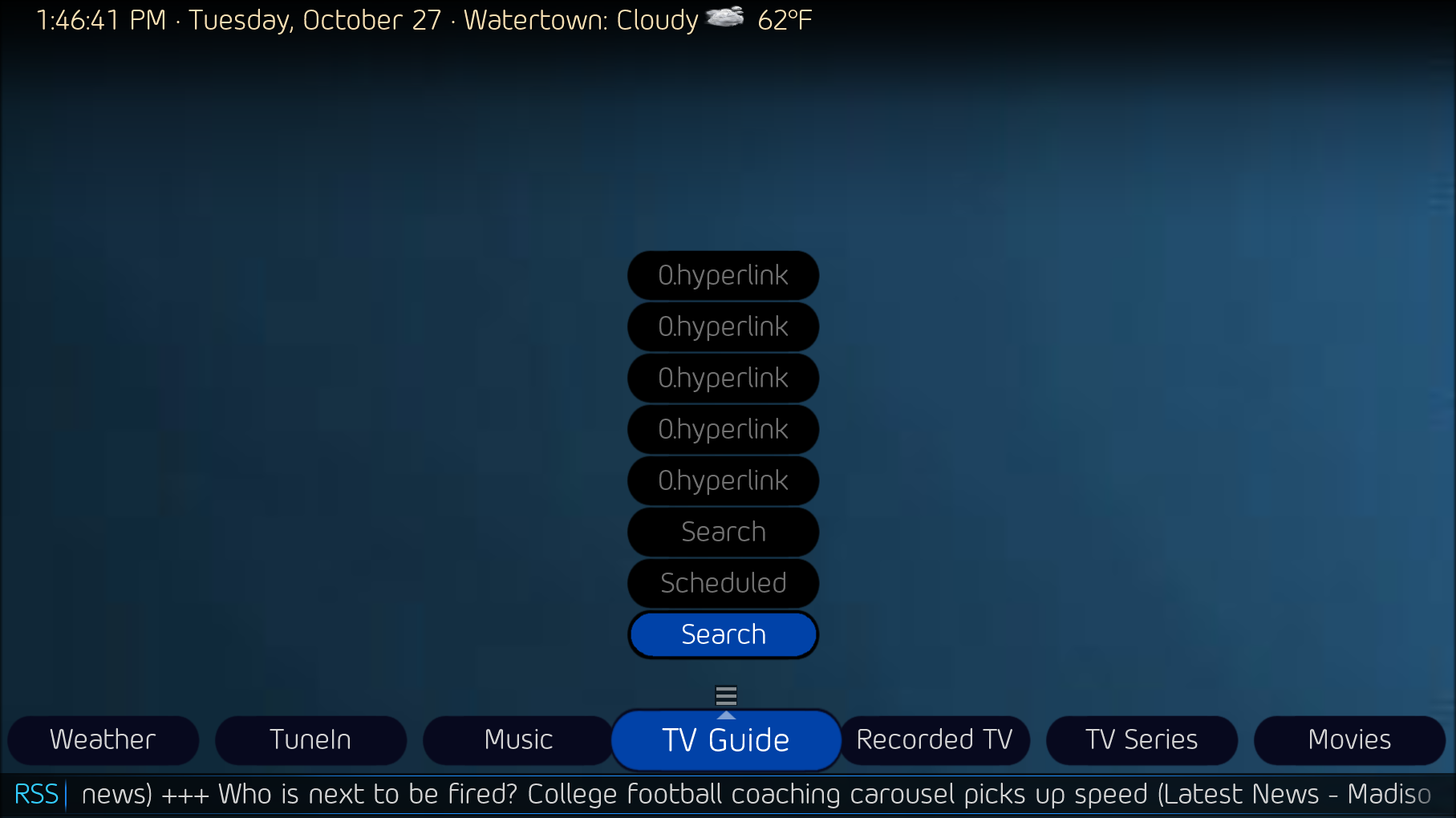
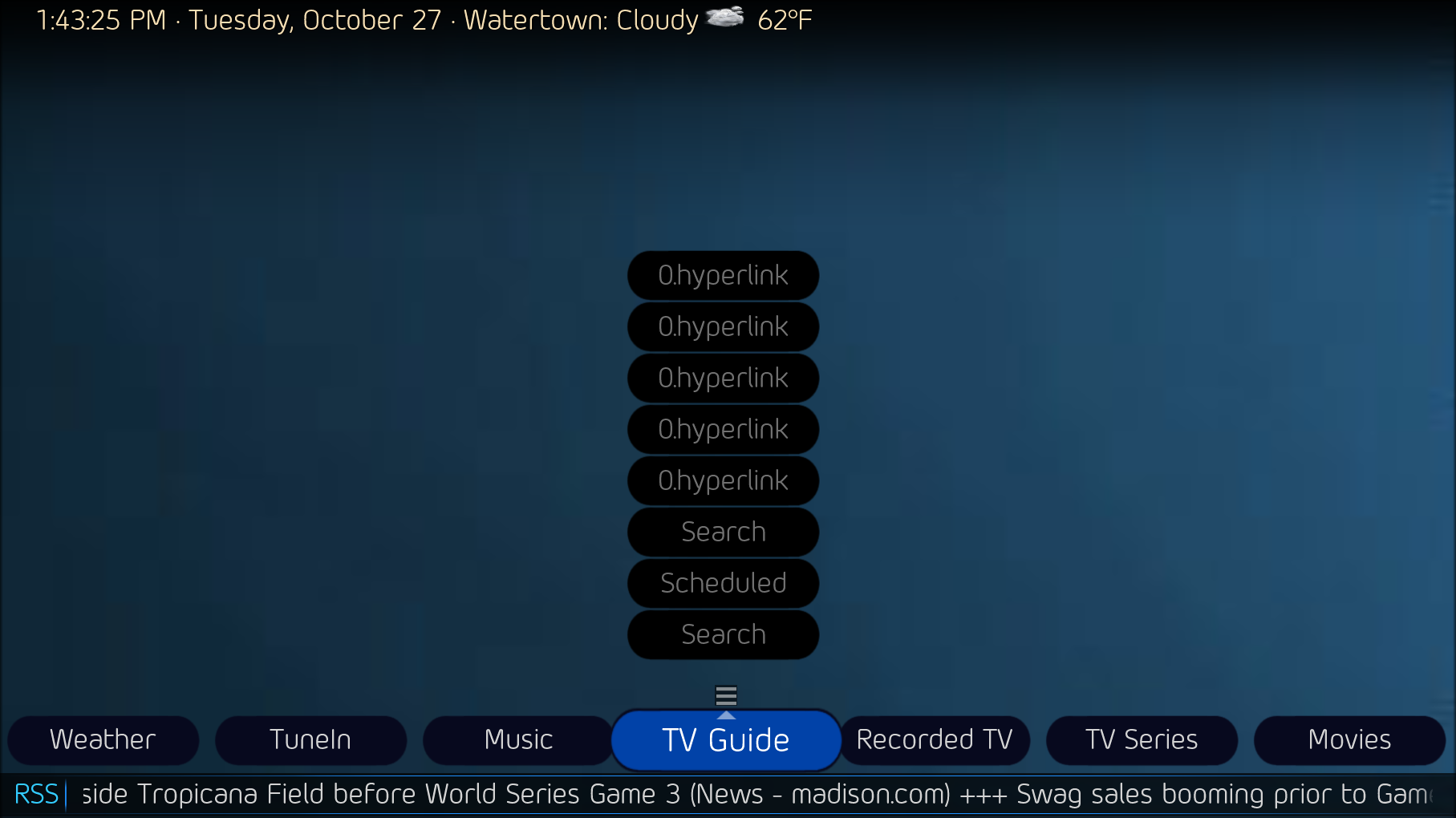
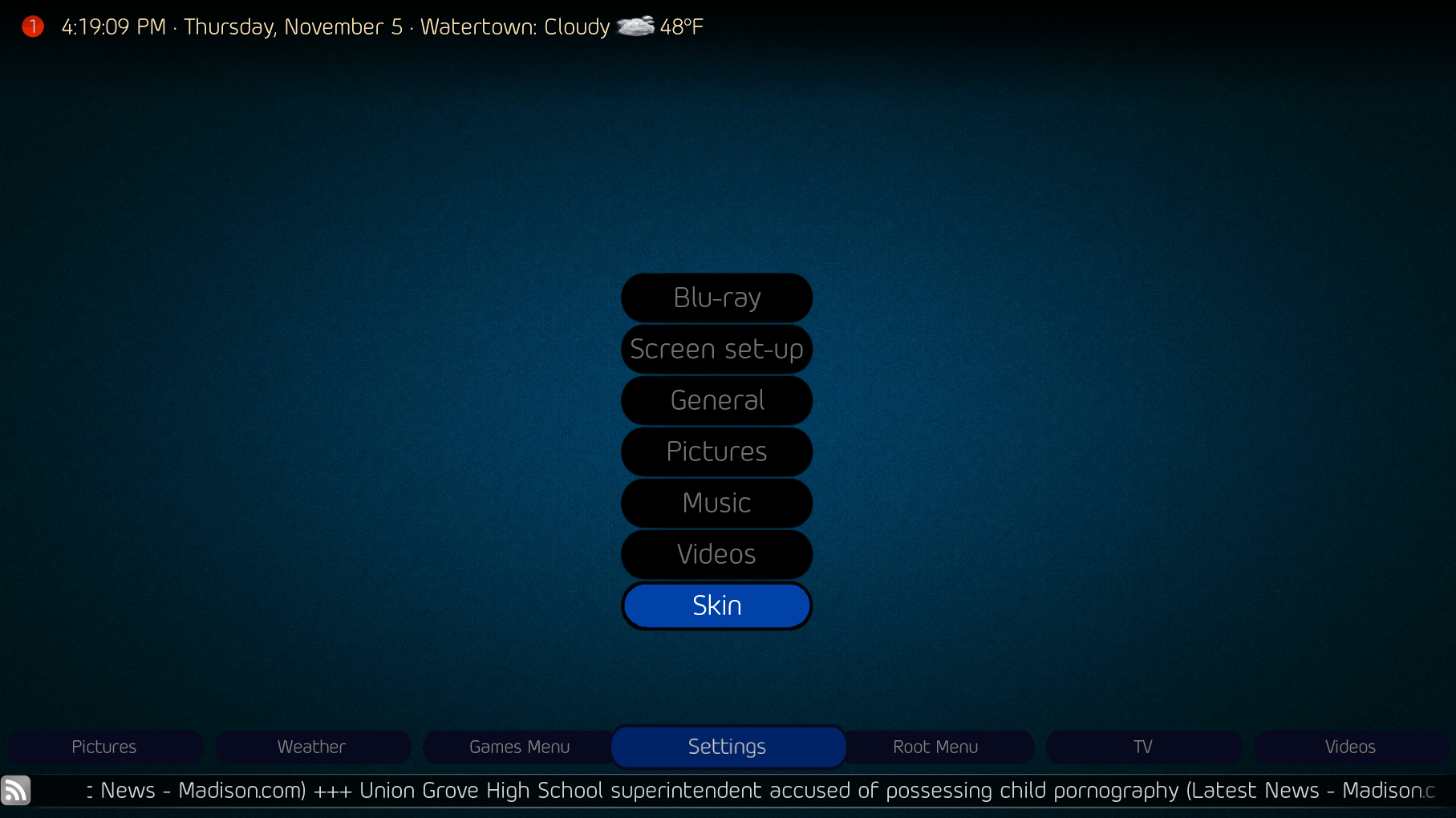
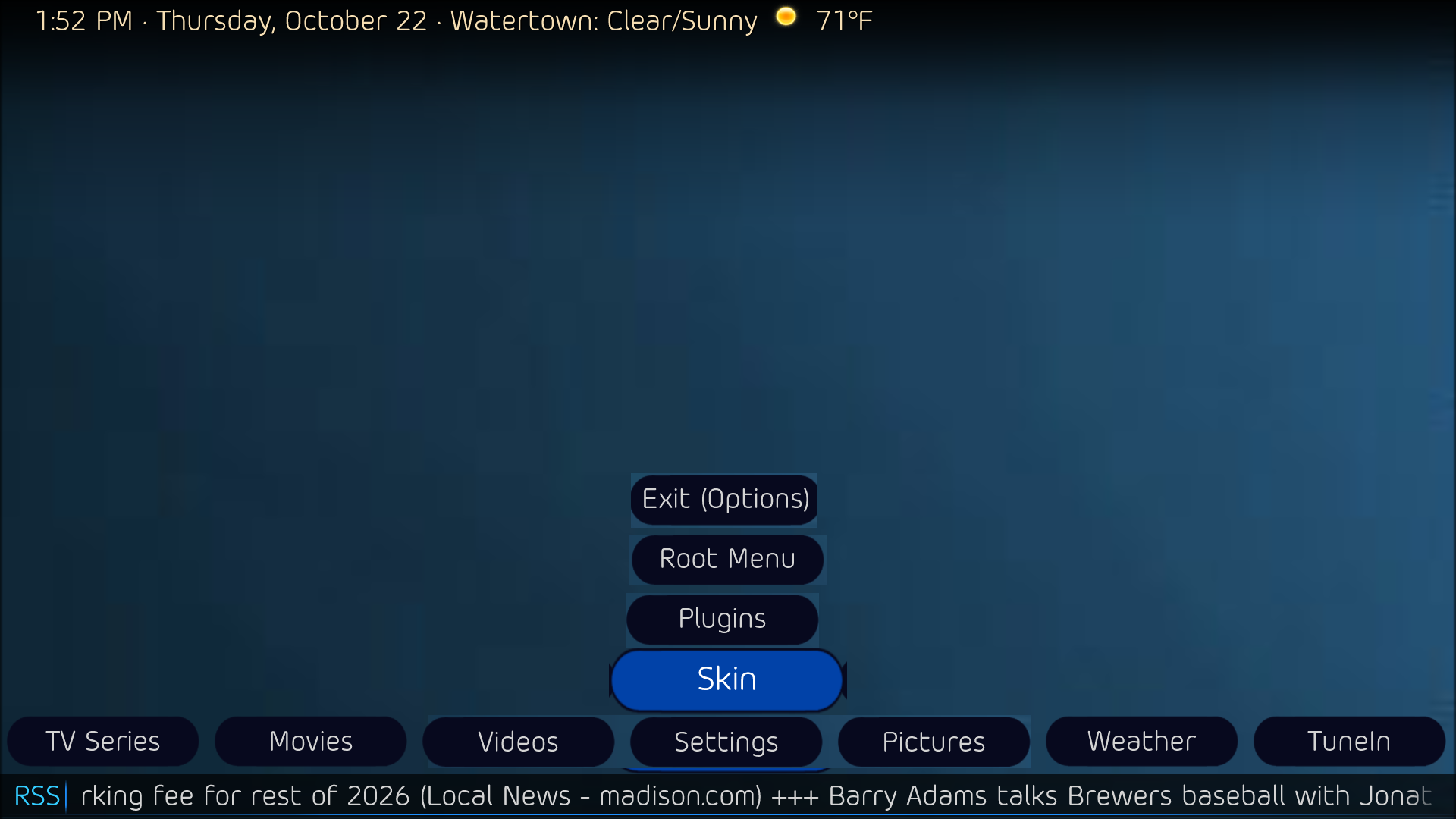
    I'm looking at messing with the Old Eyes theme for DefaultWideHD. I'd like to create a new Layout in the skin editor, maybe called "Horizontal text - Stack", that uses stacked buttons for the sub menus, rather than the horizontal buttons. Do you think it is possible? I've never liked the wraparound repeat of the buttons across the screen, if you've got fewer than 7 sub menu items.

    some example mockups:
     

    Attachments

    • 13-51-49.png
      13-51-49.png
      154.2 KB
    • 13-52-24.png
      13-52-24.png
      152 KB
    • 13-52-41.png
      13-52-41.png
      161.6 KB
    Last edited:

    2BitSculptor

    Super Moderator
  • Team MediaPortal
  • January 23, 2008
    2,038
    1,081
    South Central Wisconsin
    Home Country
    United States of America United States of America
    • Thread starter
    • Moderator
    • #3
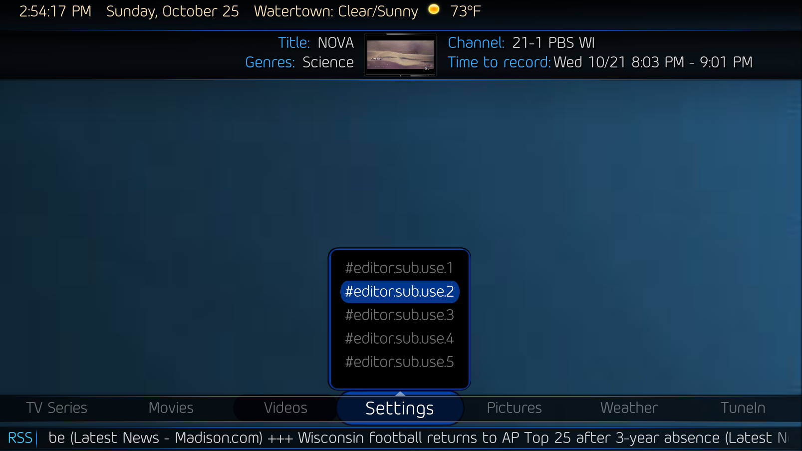
    Beginning to get my thoughts into code. Using parts of the Horizon Up theme from the PurevisionHD 1080 skin. It's just a layout idea for my OldEyes-Stack theme, I haven't figured out displaying the actual sub-menu or functions yet, like proper visability. I'm still deciphering catavolt's code.
     

    Attachments

    • 14-54-17.png
      14-54-17.png
      181.3 KB
    • 15-37-51.png
      15-37-51.png
      2.8 MB
    • 15-37-56.png
      15-37-56.png
      3 MB
    Last edited:

    2BitSculptor

    Super Moderator
  • Team MediaPortal
  • January 23, 2008
    2,038
    1,081
    South Central Wisconsin
    Home Country
    United States of America United States of America
    • Thread starter
    • Moderator
    • #4
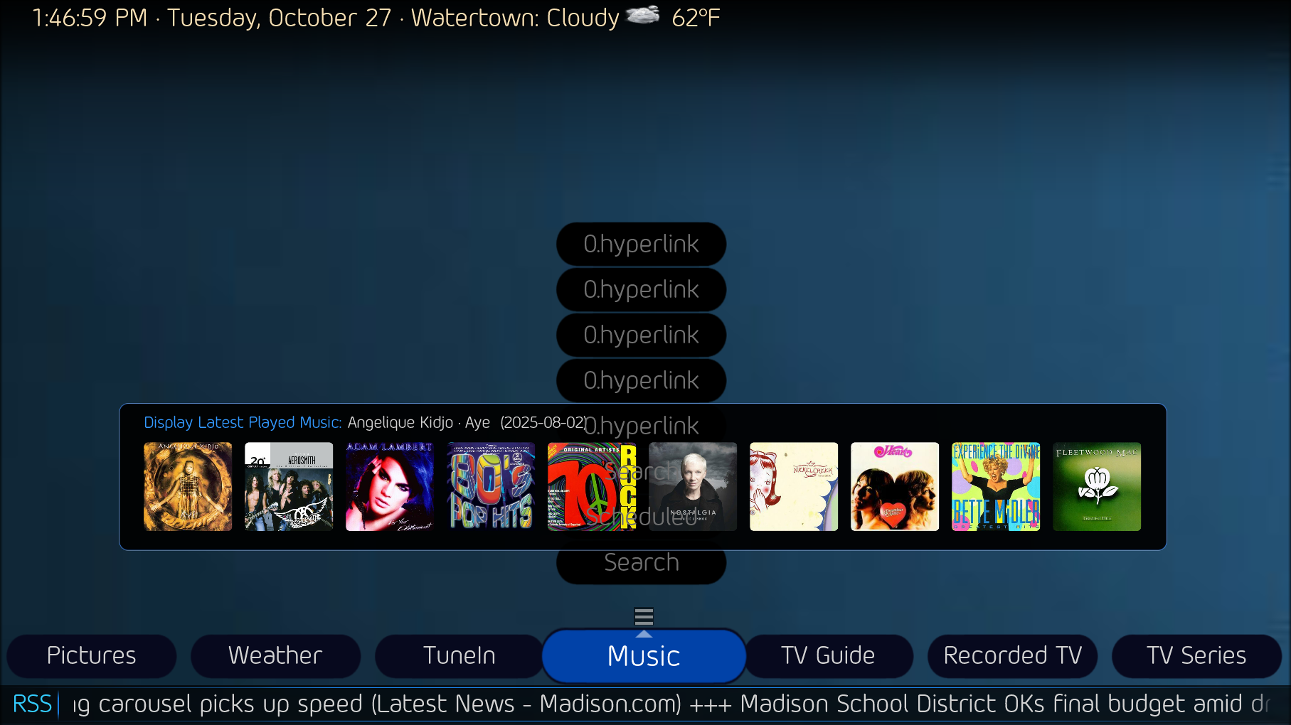
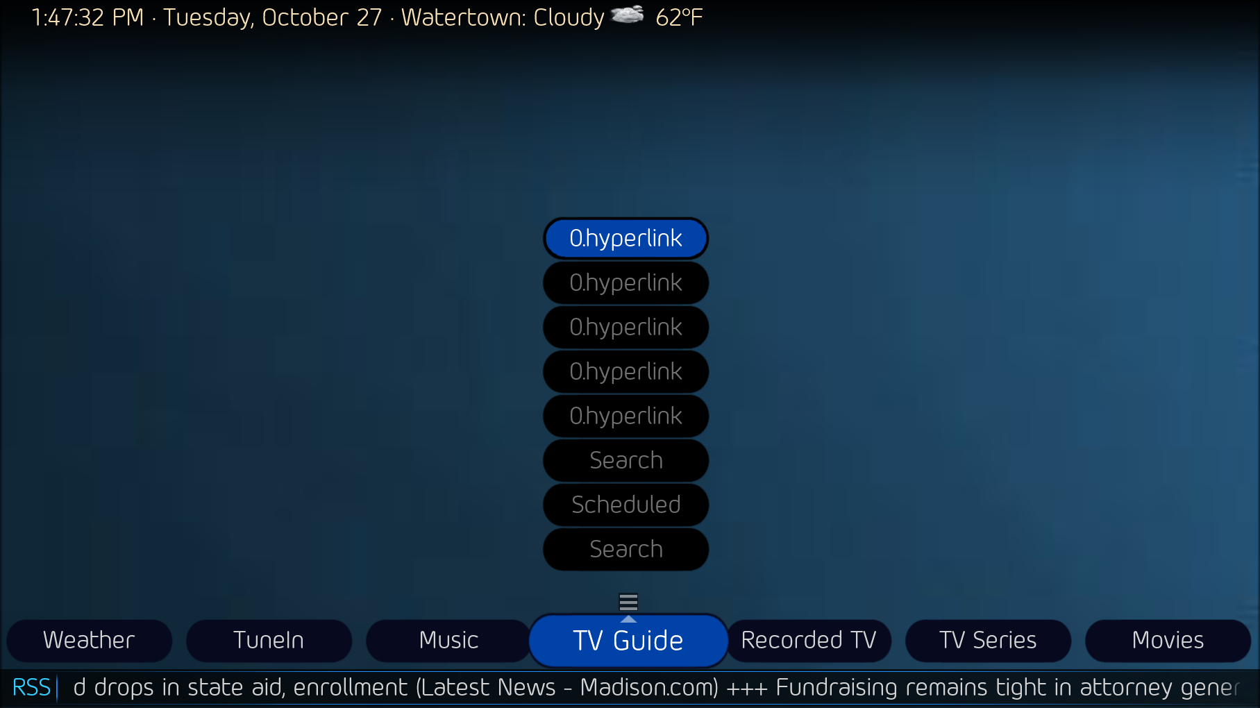
    I've inserted the Horizon Up theme's "BasicHomeEditor.sub.static.xml" group code into my Old Eyes Stacked2 - test theme's "BasicHomeEditor.sub.text.xml". I removed the frame image and created button images that fit the "BasicHomeEditor.main.text.xml" look. Navigation works for up-down-left-right. But ... the unfocused buttons do not disappear, the menu text doesn't change, the menu items don't display properly (in this case, only two item buttons should be displayed). The Menu arrow displays even on buttons it's not intended to. I re-sorted the 8 button controls to display bottom to top sequence. When, for example, the recently added media panel displays, then disappears when a button is focused, as it should. And at this point I'm thinking I'm over my head.
     

    Attachments

    • 13-46-59.png
      13-46-59.png
      475.1 KB
    • 13-47-32.png
      13-47-32.png
      178.8 KB
    • 13-46-41.png
      13-46-41.png
      180.8 KB
    • 13-43-25.png
      13-43-25.png
      178 KB
    Last edited:

    2BitSculptor

    Super Moderator
  • Team MediaPortal
  • January 23, 2008
    2,038
    1,081
    South Central Wisconsin
    Home Country
    United States of America United States of America
    • Thread starter
    • Moderator
    • #6
    First hurdle... how to get the submenu group buttons to read from the bottom, at a position just above the main menu center (like in my first mock-up examples), inverting the original top down arrangement in the menu box, where any empty cells are on top (so no buttons appear there)

    Any ideas?
     

    Attachments

    • 16-19-09.png
      16-19-09.png
      1.6 MB
    • 13-52-41.png
      13-52-41.png
      161.6 KB

    2BitSculptor

    Super Moderator
  • Team MediaPortal
  • January 23, 2008
    2,038
    1,081
    South Central Wisconsin
    Home Country
    United States of America United States of America
    • Thread starter
    • Moderator
    • #7
    What about rotating the group 180 degrees, and rotate each button another 180, then offset the group posX and posY to the right, above the main menu center to center the group?

    Looks like I'm gonna have to split up the group into 8 individual buttons .... :(
     
    Last edited:

    CyberSimian

    Test Group
  • Team MediaPortal
  • June 10, 2013
    3,851
    3,060
    Southampton
    Home Country
    United Kingdom United Kingdom
    I am not sure exactly what end result you want, but in a "button stack" (the "StackLayout()" function), you can choose whether you want buttons that are not visible (due to their visibility conditions) to be elided, or not elided:
    • If a button is elided, buttons below are moved up to eliminate the gap.
    • If a button is not elided, a gap will appear where the invisible button would be.
    Elision is controlled by the third parameter of the "StackLayout()" function (true or false).

    -- from CyberSimian in the UK
     

    2BitSculptor

    Super Moderator
  • Team MediaPortal
  • January 23, 2008
    2,038
    1,081
    South Central Wisconsin
    Home Country
    United States of America United States of America
    • Thread starter
    • Moderator
    • #10
    I am not sure exactly what end result you want, but in a "button stack" (the "StackLayout()" function), you can choose whether you want buttons that are not visible (due to their visibility conditions) to be elided, or not elided:
    • If a button is elided, buttons below are moved up to eliminate the gap.
    • If a button is not elided, a gap will appear where the invisible button would be.
    Elision is controlled by the third parameter of the "StackLayout()" function (true or false).

    -- from CyberSimian in the UK
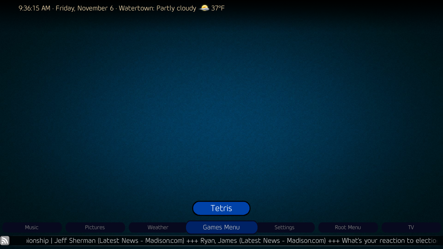
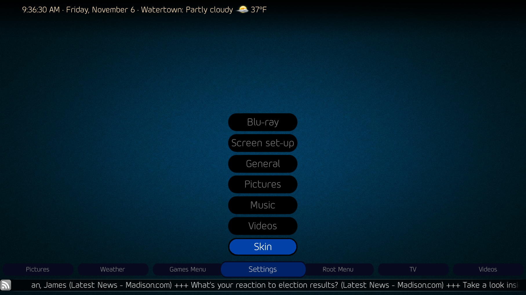
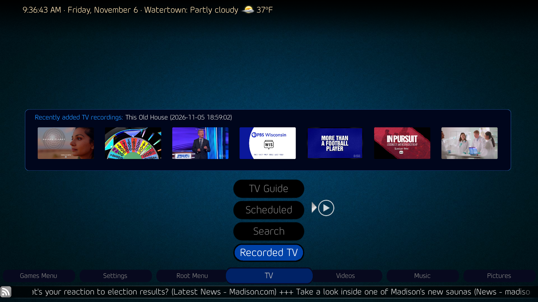
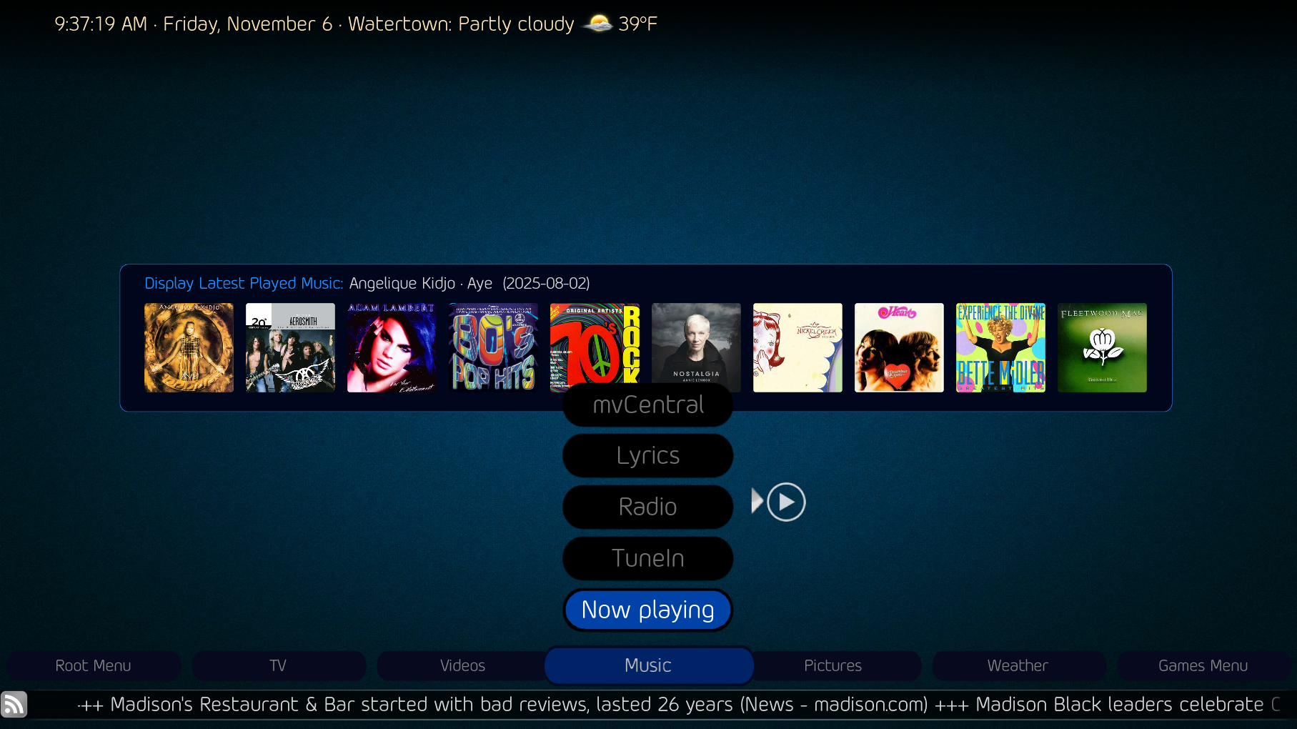
    Thanks, I did know that. I wanted to fill the stack from the bottom-up, which putting posX and posY in the individual button controls accomplished, and commenting-out the StackLayout control kept it from filling in top-down. The posX was kept in the group control to insure the placement of the group was kept. Also kept in the group control was description, ID, type, animation and visible conditions. The buttons/IDs were arranged bottom to top to visually make sense.

    I will have to adjust the placement of the new-added-media and media description boxes to allow for the taller stack of buttons. I'm thinking to move the new-media box up to where the description box is, and make a scrolling-text box to fit in the space to the right of the buttons, since the text will be larger as well.

    Is there a way to adjust the new-media indicator to the posY position of a focused sub-menu media button (given it has new-media)? It makes sense in the original theme with a central menu box to have a central indicator for the whole menu, but not with dynamic menu height.
     

    Attachments

    • 09-36-15.png
      09-36-15.png
      1.7 MB
    • 09-36-30.png
      09-36-30.png
      1.6 MB
    • 09-36-43.png
      09-36-43.png
      1.5 MB
    • 09-37-19.png
      09-37-19.png
      1.6 MB
    Last edited:

    Users who are viewing this thread

    Top Bottom