
You are using an out of date browser. It may not display this or other websites correctly.
You should upgrade or use an alternative browser.
You should upgrade or use an alternative browser.
ORIGINAL THREAD (OLD): About the X-Factor Skin (2 Viewers)
- Thread starter cul8er
- Start date
- Status
- Not open for further replies.
cul8er,
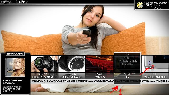
I always find myself moving the current selected button to either side when I want to read the news ticker.
I know nothing of XML, but I manage to find the reference to the bottom image of the button and remove it. It´s a lot easier to read the ticker now.
Would you consider rethinking the buttons? Please see pic attached. Removing 1 and making 2 stand out seems nice and it won´t interfere with the ticker.
Allow me to modify your skin again. In moving pictures, the dimming of non-selected covers is not good IMHO. As I said before, when you're browsing movies you want to see all of them "lit". It is easier that way.
I managed to remove the alpha thingy and tried to add a zooming effect to the selected cover. But, my XMLs skills only went so far. I manage to zoom the cover but not the dvd frame. I´d love to know how to zoom the frame like in the filmstrip view.
Also, it would be nice to have the bottom part of the screen (where movie title appears) dimmed along with the covers when you are selecting the top menu.
Same thing for MyTV Series regarding the dimming. I added 3 more rows to the banner view for a total of 6 rows(maybe it´s too much). I did not managed to zoom the banner when selected.
I can post the modified xmls if anyone is interested, but again my xmls skills are almost non-existent.
Thanks!
Attachments
- August 31, 2006
- 2,159
- 2,679
- Home Country
-
 Sweden
- Thread starter
- Moderator
- #363
Hi camoura,
Thank you for your feedback.
1. I will see if I can modify the alpha of moving pictures. Will also have a look at zooming.
2. I do not agree with you regarding the homescreen and the newsticker. I will leave it as it is.
3. The banner view is modified to allow more rows in the version to come.
Finally, please do not add modified xmls in this thread. I would like this thread to only contain news about the skin, bug reports and user comments/feedback. If we start posting MODs here it will be much harder for me to provide good support. I welcome user MODs because I think it helps bringing the best out of skins. If you create a MOD please do it in a new thread.
Best Regards
cul8er
cul8er i like the new screens looks interesting, i like how the moving pictures filmstrip is, but with tv series you have the fanart showing in the top right, and also in the back ground will it stay like this, i mean wouldnt it look better with only one form of visable fanart
- August 31, 2006
- 2,159
- 2,679
- Home Country
-
Sweden
- Thread starter
- Moderator
- #367
Hi happy,
I tried to;
* have the same fanart both in the window and in the "little window to the right" but this was not supported by the plugin
* only have fanart in the "little window to the right" but then the screen is very dark
If anyone can come up with a good design I will try it. All ideas are welcome")
cheers
cul8er
I tried to;
* have the same fanart both in the window and in the "little window to the right" but this was not supported by the plugin
* only have fanart in the "little window to the right" but then the screen is very dark
If anyone can come up with a good design I will try it. All ideas are welcome
cheers
cul8er
Shouldn´t the designs of moving pictures and tv series be the same.
- Moving Pictures (list view): you have cover on the left
- MyTVSeries (list view): you have cover centered
I like having the large covers on the left as in MovingPictures (LIST VIEW)
My humble considerations:
TV SERIES - EPISODES: I like having covers on the left.
MOVING PICTURES FILMSTRIP VIEW: Is it necessary to show the movie details? You can get the details when you select the movie anyway. You'll get a cleaner view without that box. Perhaps showing only release date and runtime at the botton along with movie title would be nice.
TV SERIES - SERIES - FILMSTRIP VIEW: You have all the same information when you select a serie. Not necessary to show the details. (same case as moving pictures). I would leave only small covers and fanart, with series name on the bottom, as in moving pictures. Maybe adding genre and network.
MOVING PICTURES DETAILS: VERY GOOD. Don't touch it)))
MOVING PICTURES LIST VIEW: VERY GOOD. Don't touch it)))
Please show us a picture of TV Series Banner View!
Sorry for being so picky, but I really like the skin !
- Moving Pictures (list view): you have cover on the left
- MyTVSeries (list view): you have cover centered
I like having the large covers on the left as in MovingPictures (LIST VIEW)
My humble considerations:
TV SERIES - EPISODES: I like having covers on the left.
MOVING PICTURES FILMSTRIP VIEW: Is it necessary to show the movie details? You can get the details when you select the movie anyway. You'll get a cleaner view without that box. Perhaps showing only release date and runtime at the botton along with movie title would be nice.
TV SERIES - SERIES - FILMSTRIP VIEW: You have all the same information when you select a serie. Not necessary to show the details. (same case as moving pictures). I would leave only small covers and fanart, with series name on the bottom, as in moving pictures. Maybe adding genre and network.
MOVING PICTURES DETAILS: VERY GOOD. Don't touch it
)))MOVING PICTURES LIST VIEW: VERY GOOD. Don't touch it
)))Please show us a picture of TV Series Banner View!
Sorry for being so picky, but I really like the skin !
Hi happy,
I tried to;
* have the same fanart both in the window and in the "little window to the right" but this was not supported by the plugin
* only have fanart in the "little window to the right" but then the screen is very dark
If anyone can come up with a good design I will try it. All ideas are welcome
cheers
cul8er
what about a custom background, something that reflects that its the xfactor skin, something subtle then display the fanart in the window on the right, i mean im no good with graphics but maybe emphatic could have a go i seen him do a few things
just a thought
- Moderator
- #370
Shouldn´t the designs of moving pictures and tv series be the same.
As Movies don't have a list of episodes (like TV Series does) or different seasons to consider when doing a layout, it's better to keep the two designs somewhat similar (to fit into the whole design of the skin) yet easily distinguishable IMHO. However, in the TV Series list view, perhaps the cover would look better to the left like in TV Series.
TV SERIES - EPISODES: I like having covers on the left.
Having the cover in the middle is a nice compromise that fits both list view and poster view. Perhaps someone will release a mod for this .xml when this skin get's moved to Hot Skins. It should be there already.
MOVING PICTURES FILMSTRIP VIEW: Is it necessary to show the movie details? You can get the details when you select the movie anyway. You'll get a cleaner view without that box. Perhaps showing only release date and runtime at the botton along with movie title would be nice.
How about including an alternative .xml (like Psycho Reptile does for his skins) without the "info box"? Or... again, wait for a modified skin file...
TV SERIES - SERIES - FILMSTRIP VIEW: You have all the same information when you select a serie. Not necessary to show the details. (same case as moving pictures). I would leave only small covers and fanart, with series name on the bottom, as in moving pictures. Maybe adding genre and network.
Do you really see the same info when you select a series? Doesn't it show episode/season info if you click it?
Sorry for being so picky, but I really like the skin !
Me too!
Emph
what about a custom background, something that reflects that its the xfactor skin, something subtle then display the fanart in the window on the right, i mean im no good with graphics but maybe emphatic could have a go i seen him do a few things
just a thought
Actually I like this view very much and wouldn't want to change it that much. Do keep in mind that the fanart that's behind the semi transparent background does rotate pictures from your "tv" background folder and therefore gives this view a bit of "life". I've had some ideas already for this, but it didn't work out because of some limitations in MediaPortal's Poster view. Only way to get it to work would include some serious xml hacking skills and unfortunately, I'm lacking those.
Emph
- Status
- Not open for further replies.
Users who are viewing this thread
Online now: 2 (members: 0, guests: 2)