ORIGINAL THREAD (OLD): About the X-Factor Skin (3 Viewers)

Status
Not open for further replies.

ltfearme

Community Plugin Dev
  • Premium Supporter
  • June 10, 2007
    6,755
    7,200
    Sydney
    Home Country
    Australia Australia
    Hi sergiocos,

    Can you try this regarding the slow loading of TVSeries pictures;
    1. Open the TVSeries.SkinSettings.xml file in the skin/xfactor library.
    2. Change this line <seriesbanners>100</seriesbanners> to <seriesbanners>60</seriesbanners>
    3. Change this line <seriesposters>100</seriesposters> to <seriesposters>20</seriesposters>
    4. Change this line <seasonbanners>100</seasonbanners> to <seasonbanners>75</seasonbanners>
    5. Change this line <episodethumbs>100</episodethumbs> to <episodethumbs>90</episodethumbs>

    Does this help?

    And I will look at the radio problem for you as well.

    best regards
    cul8er

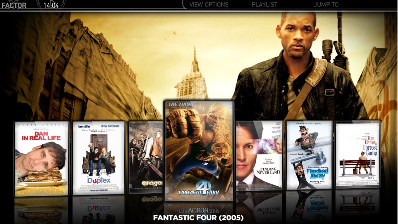
    this workaround seems to load posters faster, but there is a slight quality loss, so I can live without it... I preffer X-Factor to "shine", and I can wait for 2 secs for the posters to load. It seems strange, that's all (btw, there are 35 posters in my TV-Series).

    I want to thank you for your quick response and for the radio-fix (whenever you are ready). Your work is kindly appreciated.

    Try slightly higher quality then:

    <seriesposters>50</seriesposters>

    that should be more than enough without any noticeable image quality loss...there is other conditions to consider like your screen resolution when it does the scaling but 50% should be good for 1920x1080. I havent got the skin loaded at the moment but if you can still see quality loss from your TV then increment by 10%
     

    emphatic

    Design Group
  • Team MediaPortal
  • August 25, 2006
    3,754
    1,242
    Alingsås
    Home Country
    Sweden Sweden
    Yes, that looks very nice. If I may suggest a little border at the top though. The scrolling text is aligned to the left, so the runtime label kinda floats about, and doesn't look like it has a real setting (to me). If there is a border where you put the movie title along with the runtime, these two labels are aligned horizontally and that looks better.

    If production year is added, I suggest you put it like I did in my mockup.
    Emph
     

    Attachments

    • screen.jpg
      screen.jpg
      134.2 KB

    cul8er

    Retired Team Member
  • Premium Supporter
  • August 31, 2006
    2,159
    2,679
    Home Country
    Sweden Sweden
    Hi revned,

    I love your screenshot. Thank you for your help. I have modifyed it a little (hope you don't mind) and attach it below.

    What do you think?

    best regards
    cul8er
     

    Attachments

    • movpic_thumbs_big2.jpg
      movpic_thumbs_big2.jpg
      260.8 KB

    revned

    Portal Member
    May 7, 2009
    33
    1
    Bergen op Zoom
    Home Country
    Netherlands Netherlands
    Hi Cul8er.

    I am glad you like my mockup. Is the summary text scrolling in yours? Because that's the only thing i hate about mediaportal. That's why i'm using as little details as possible in my big thumbs view, so the summary box is as big as possible. I'm using a details screen in Moving Pictures, so when i want more details like actors, director and stuff, i just go to the details page. In my opinion you get 3 different views:

    - filmstrip: lot of fanart, no info
    - big thumbs: medium fanart, basic info
    - list view: little/no fanart, lots of info

    One other question. My grilfriend is complaining that the posters look to small in the big thumbs view. Is it possible to maker these a little bigger and show only 3 covers on screen for example?
     

    sergiocos

    Portal Pro
    March 31, 2009
    53
    5
    Targoviste
    Home Country
    Romania Romania
    Try slightly higher quality then:

    <seriesposters>50</seriesposters>

    that should be more than enough without any noticeable image quality loss...there is other conditions to consider like your screen resolution when it does the scaling but 50% should be good for 1920x1080. I havent got the skin loaded at the moment but if you can still see quality loss from your TV then increment by 10%

    :D Now the posters load instantly and they look good, too!

    the revned mockup + the new cul8er series look ... :eek: i thought this skin is perfect, but you guys never cease to amaze me... thanks! (PS: I'm also for the 3 covers on the left, so we can see clearly the cover, and enough fanart)
     

    cul8er

    Retired Team Member
  • Premium Supporter
  • August 31, 2006
    2,159
    2,679
    Home Country
    Sweden Sweden
    Hi,

    I have remade the myVideos (even if not that many has answered in the poll, quite some people has read it and it is clear what you wanted) to make it look like Moving Picture. Here is the result.

    cheers
    cul8er
     

    Attachments

    • myvideos_list.jpg
      myvideos_list.jpg
      227.7 KB
    • myvideos_filmstrip.jpg
      myvideos_filmstrip.jpg
      257.7 KB
    • myvideos_bigthumbs.jpg
      myvideos_bigthumbs.jpg
      279.1 KB
    • myvideos_smallthumbs.jpg
      myvideos_smallthumbs.jpg
      312.4 KB

    cul8er

    Retired Team Member
  • Premium Supporter
  • August 31, 2006
    2,159
    2,679
    Home Country
    Sweden Sweden
    Hi wolfie smith,

    I'm unable to reproduce the problem that you have with myEmulators and the fanart. Could you please help me by answering these questions:
    1. What resulution do you use, 1280x720?
    2. What resulution is the image in?

    Can you also please extract the attached file (latest version) and see if the problem is still there. Thanks!

    cheers
    cul8er
     

    Attachments

    • myEmulators.rar
      30.6 KB
    Status
    Not open for further replies.

    Users who are viewing this thread

    Top Bottom