i like the layouts, personally i prefer the bigger banners on the right of the screen

You are using an out of date browser. It may not display this or other websites correctly.
You should upgrade or use an alternative browser.
You should upgrade or use an alternative browser.
ORIGINAL THREAD (OLD): About the X-Factor Skin (2 Viewers)
- Thread starter cul8er
- Start date
- Status
- Not open for further replies.
- August 31, 2006
- 2,159
- 2,679
- Home Country
-
 Sweden
- Thread starter
- Moderator
- #622
Hi,
camoura, when you wrote your last feedback I must admit that I lost inspiration for a few hours. But after that it really got me thinking if I was heading the right direction with the skin. And then remb0 wrote this;
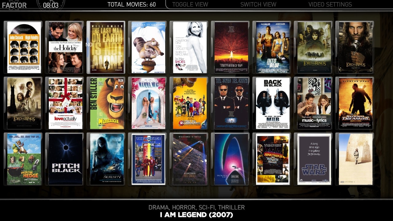
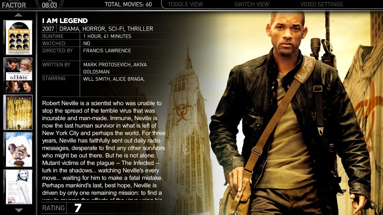
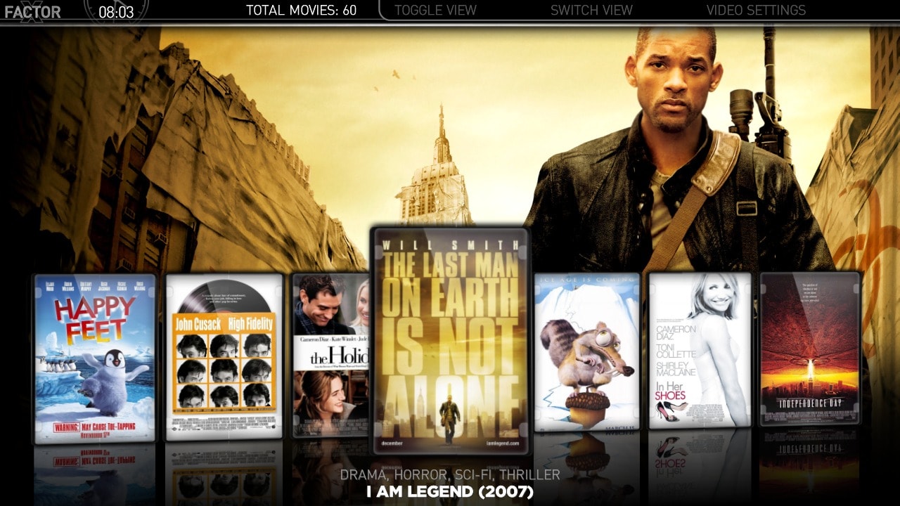
and thats when the last missing piece of information appeared. I had never thought about the possibility to have different designs for Small Thums and Big Thumbs. I didn't think that was possible but after some hours of skinning this is the different view for Moving Pictures;
* List
* Small Thumbnails (I use the big thumbnail "wall" from release 191)
* Big Thumbnails (I use the new vertical thumb list)
* Filmstrip
So, BIG thank you to camoura and remb0 for your feedback") and once again you the community has proven me wrong
and once again you the community has proven me wrong
Finally, what do you think about the attached images for Moving Pictures?
best regards
cul8er
camoura, when you wrote your last feedback I must admit that I lost inspiration for a few hours. But after that it really got me thinking if I was heading the right direction with the skin. And then remb0 wrote this;
the new layouts are very cool. but the one in the older version: big icons i mis.
can i use the 3 new layouts and the iconwall from the older version insted of the new little icon version on the vertical bar?
and thats when the last missing piece of information appeared. I had never thought about the possibility to have different designs for Small Thums and Big Thumbs. I didn't think that was possible but after some hours of skinning this is the different view for Moving Pictures;
* List
* Small Thumbnails (I use the big thumbnail "wall" from release 191)
* Big Thumbnails (I use the new vertical thumb list)
* Filmstrip
So, BIG thank you to camoura and remb0 for your feedback
and once again you the community has proven me wrong Finally, what do you think about the attached images for Moving Pictures?
best regards
cul8er
Attachments
- April 17, 2009
- 101
- 0
- 40
- Home Country
-
Germany
i also think, that the first page of the TV-Series view shows to much information about the series.
I prefer a view with a small list an the focus on fanarts.
The full inforamtion of content you can get on the detail-pages
I prefer a view with a small list an the focus on fanarts.
The full inforamtion of content you can get on the detail-pages
- August 31, 2006
- 2,159
- 2,679
- Home Country
-
Sweden
- Thread starter
- Moderator
- #624
Hi crackmaniac,
This is what the different layouts are for. For example; Use filmstrip view for Series (almost none info and lots of fanart) and then you can use listview or filmstrip for Season view and get more details.
Some users like fanart and some like details. I try to provide views that covers both
cheers
cul8er
- April 17, 2009
- 101
- 0
- 40
- Home Country
-
Germany
i Like some details and much fanart :-D
ok, that's my problem :-S
don't misunderstand me, i like your skin.
ok, that's my problem :-S
don't misunderstand me, i like your skin.
- September 25, 2006
- 724
- 48
- Home Country
-
Italy
very very goodHi,
Finally, what do you think about the attached images for Moving Pictures?
But for "Small Thumbnails" view i personally prefer the R200 lyout (more informatio displayed).
and ............ don't forget this smal help if you have free-time
thanks
massimo
I add e new button (called Scarica la Guida TV) on TV section by add this command to mytvhome.xml:is possible to add e new button in "TV" .......
<control>
<description>Multishortcut</description>
<type>button</type>
<id>14</id>
<label>Scarica la Guida TV</label>
<hyperlink>4649</hyperlink>
<onup>13</onup>
<ondown>15</ondown>
<onright>99</onright>
</control>
It works fine but only with keyboard, i'm not able to reach the new button with the remote.
Wich is my error?
Thanks
massimo
- Moderator
- #627
Hi,
camoura, when you wrote your last feedback I must admit that I lost inspiration for a few hours. But after that it really got me thinking if I was heading the right direction with the skin. And then remb0 wrote this;
the new layouts are very cool. but the one in the older version: big icons i mis.
can i use the 3 new layouts and the iconwall from the older version insted of the new little icon version on the vertical bar?
and thats when the last missing piece of information appeared. I had never thought about the possibility to have different designs for Small Thums and Big Thumbs. I didn't think that was possible but after some hours of skinning this is the different view for Moving Pictures;
* List
* Small Thumbnails (I use the big thumbnail "wall" from release 191)
* Big Thumbnails (I use the new vertical thumb list)
* Filmstrip
So, BIG thank you to camoura and remb0 for your feedback
Finally, what do you think about the attached images for Moving Pictures?
best regards
cul8er
Nice to see that you got something good out of this. To have a totally different look between the two thumb views is awesome! Something that's been bothering me from the start of using MediaPortal actually, "hey, why are there two views that similar?" Btw, does the view with the "thumb strip" to the left use scrolloffset to keep focus in the middle? I can't remember if it has atm?
Emph
Hi Cul8er,
Don't know what I've done, or doing wrong. Have delete the cache before installing, but I just cannot get the vertical wide banners in TV series. I even deleted the whole skin, and did a fresh install. It still has the the old wide banner layout. Using 2.2 version of TV series. Any Ideas.
PS: I love the new layout for Moving pictures, and tV series (once I get it)
Cheers
Trouty
- Moderator
- #629
Hi Cul8er,
Don't know what I've done, or doing wrong. Have delete the cache before installing, but I just cannot get the vertical wide banners in TV series. I even deleted the whole skin, and did a fresh install. It still has the the old wide banner layout. Using 2.2 version of TV series. Any Ideas.
PS: I love the new layout for Moving pictures, and tV series (once I get it)
Cheers
Trouty
Did you remove your old X-Factor directory, or did you rename the new one? When I migrate to a new version, I always rename the old, working version to "X-Factor old" or something, then copy the new folder into MediaPortal\Skins. Otherwise you'll have to open MediaPortal configuration to select the new skin. This is a very easy mistake to make.
Emph
Hi,
I have worked on TVSeries a little. Please let me know what you think and if this provides more variance between the views. Also the widebanner view I have included two designs and I would very much like your opinion on wich to use in next version.
etagure;
Thank you for your help on correcting myEmulators
best regards
cul8er
First of all: I also like the new designs (both TV series and Moving pictures). And to answer your question: I prefer the version with banners on the left.
- Status
- Not open for further replies.
Users who are viewing this thread
Online now: 3 (members: 0, guests: 3)