PureVisionHD 1080 (4 Viewers)

High_Five

Design Group
  • Team MediaPortal
  • February 10, 2023
    61
    143
    Home Country
    Germany Germany
    Mission accomplished. (y) Congratulations, I would say you have also mastered the last hurdle brilliantly. The channel images are displayed immediately and consistently, even after several consecutive calls. From my side, I can't think of any major improvements at the moment. ;)
     

    catavolt

    Design Group Manager
  • Team MediaPortal
  • August 13, 2007
    14,596
    10,581
    Königstein (Taunus)
    Home Country
    Germany Germany
    Mission accomplished.
    Well, not completely ;)
    I added a TVGuide with 15 lines which should fill the "gap" between 12 lines and 18 lines.
    My original plan was to remove the TVGuide with 10 lines completely, leaving only the TVGuides with 12, 15, 18 and 24 lines.
    For now, I'll leave the TVGuide with 10 lines in, and see what you think about removing it.
    I have also recreated the info images when selecting the desired TVGuide in the Skin Settings screen.
    You can find all this (including the necessary modified files) in the attached ZIP file.
    Have fun testing ;)
     

    Attachments

    • TVGuides.zip
      2.6 MB

    High_Five

    Design Group
  • Team MediaPortal
  • February 10, 2023
    61
    143
    Home Country
    Germany Germany
    Difficult decision! The overview of the channels is slightly better in the TV guide with 10 lines, but the discrepancy between the relatively large font of the TV programmes and the relatively small font of the corresponding programme description is larger and therefore somewhat more annoying than in the TV guide with 12 lines and upwards. Personally, I would probably delete the TV guide with 10 lines for reasons of homogeneity. ;)
     

    catavolt

    Design Group Manager
  • Team MediaPortal
  • August 13, 2007
    14,596
    10,581
    Königstein (Taunus)
    Home Country
    Germany Germany
    Here some screenshots of the new GFX and/or layout of some games:

    11-15-51.jpg 11-16-23.jpg 11-17-36.jpg

    Hope you´ll like it ;)
     

    catavolt

    Design Group Manager
  • Team MediaPortal
  • August 13, 2007
    14,596
    10,581
    Königstein (Taunus)
    Home Country
    Germany Germany
    Hi folks,
    As we just released MP 1.35 Pre Release (x86/x64), you´ll find the new version PureVisionHD 1080 v. 12.0 ::: HERE :::

    New in version PVHD 12.0:
    • Redesign of TVGuides, inclusive a new guide with 15 lines
    • Redesign of BasicHome for Skin default and Modern UI
    • Redesign of many games with new layout and new GFX, especially Diamond Crush, Tetris, Connect 4, Frustration and Yahtzee
    • Redesign of weather screens
    • Change of overlay colour when opening menus
    • Fix of several display glitches
    Hope you´ll like it ;)
     

    High_Five

    Design Group
  • Team MediaPortal
  • February 10, 2023
    61
    143
    Home Country
    Germany Germany
    Hi catavolt,
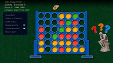
    I have designed a new game board for "connect4" that I wanted to show. I've polished up the other graphic elements a bit, especially the colour of the green tiles. After removing the MyConnBack.png from the grouping, the pointer 01 is now displayed when the button for ‘New game’ is pressed, which was not the case before. I have empirically adjusted the starting point of the slide animation of the MyConnBack.png to synchronise the speed with the animation of the group of the other graphic elements. By the way, is there a formula for calculating the speed of the slide effect of a group with several elements? I would be interested to know, as this always differs from the speed of a single element with the same animation! Finally, I have also included a small animation for the case of winning the game.
    Have fun trying it out!

    High_Five

    Screenshot.png
     

    Attachments

    • Connect4.7z
      1.7 MB

    High_Five

    Design Group
  • Team MediaPortal
  • February 10, 2023
    61
    143
    Home Country
    Germany Germany
    Hello catavolt,
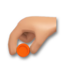
    I have another question about ‘connect4’. In the game variant ‘player against player’, you alternately throw a red and a yellow chip into the game board. To show the order of the players, it would be helpful to show the chip colour of the symbolised hand alternating between red and yellow. I have attached a corresponding graphic, but unfortunately I have not managed to display the hand with changing chip colour depending on the property ‘#player’. Can you perhaps try to find a programming solution? ;)
    MyConn4Cur_red.png
     

    catavolt

    Design Group Manager
  • Team MediaPortal
  • August 13, 2007
    14,596
    10,581
    Königstein (Taunus)
    Home Country
    Germany Germany
    display the hand with changing chip colour depending on the property ‘#player’. Can you perhaps try to find a programming solution?
    Atm I did not find any solution to do that, because as you already said we only have the property #player .
    OFC I modified your new design in the following way:
    • Used the old board, because I don´t like your board at all with its "elephant-legs" (please do not take this as an insult - just my opinion!!!)
    • Added the new GFX for winning the game
    • Removed the extra button because the win animation should always be shown
    • Adjusted the colours of the new exclamation marks to the colour of the existing question marks
    • Added shadows to the question marks and exclamation marks
    • The hand now has the really used yellow chip
    • Some positioning/animation adjustments
    ZIP attached ;)
    Please be sure after copying to clear the skin cache and restart MP
     

    Attachments

    • Connect4.zip
      1.4 MB

    High_Five

    Design Group
  • Team MediaPortal
  • February 10, 2023
    61
    143
    Home Country
    Germany Germany
    Well, to be honest, the reason for my new construction of the game board was actually to get a little closer to the surface texture of a real toy model.;)
    The plate-like feet were merely a compromise, as I didn't like the idea of a frontal view with two vertical supports. Nevertheless, I like my version very much, but tastes differ.
    The hand with the yellow chip used in the game in the ‘player vs. player’ version seems less useful to me, as it emphasises the yellow player. I would find the previous hand with the abstract representation better.
     

    Users who are viewing this thread

    Top Bottom