PureVisionHD 1080 (5 Viewers)

High_Five

Design Group
  • Team MediaPortal
  • February 10, 2023
    61
    143
    Home Country
    Germany Germany
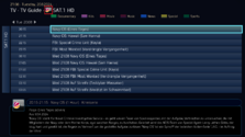
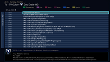
    For me, the display with a fixed pixel pitch from the top edge looks asymmetrical. I think that the TV group or the selected program should be arranged in the middle as a superordinate theme, similar to a horizontal organization chart. ;)
    Could you please post the corresponding xml for testing?
     

    High_Five

    Design Group
  • Team MediaPortal
  • February 10, 2023
    61
    143
    Home Country
    Germany Germany
    After a longer period of getting used to it, I have to say that your approach of labeling the TV group or channel name at a constant distance from the top edge is more pleasant to read, especially for the larger TV guides, and the asymmetrical impression is not so disturbing.
    Perhaps you could adjust the text color in the title of the single channel page for “Single Channel Label” with “lightgray” as in the title for “TV Group” on the main page. ;)
     

    catavolt

    Design Group Manager
  • Team MediaPortal
  • August 13, 2007
    14,596
    10,581
    Königstein (Taunus)
    Home Country
    Germany Germany
    New version with more corrections/enhancements ;)
    For not so experienced users: Stop MP. Copy the content of the ZIP into your PVHD folder (overwrite all), then clear the skin cache, then restart MP and enjoy ;)
     

    Attachments

    • TVGuides.zip
      17.2 KB

    High_Five

    Design Group
  • Team MediaPortal
  • February 10, 2023
    61
    143
    Home Country
    Germany Germany
    All in all, the new features already look very good. The only thing that could perhaps be improved is the display of the single channel image in the title bar, which currently appears cut off at the edges. ;)

    Single image cut off.png

    P.S.: Small graphic error in the tvpg.png .
     

    High_Five

    Design Group
  • Team MediaPortal
  • February 10, 2023
    61
    143
    Home Country
    Germany Germany
    Good news! (y) The image can remain. The cause of the cropped image edges is the masking of the texture in the line <texture mask=“tvguide_mask.png”></texture> of the control for the single channel image. Without masking, the channel image is displayed correctly! ;)

    <control>
    <description>Single Channel Image</description>
    <type>image</type>
    <id>33</id>
    <width>60</width>
    <maxWidth>60</maxWidth>
    <height>52</height>
    <valign>bottom</valign>
    <keepaspectratio>yes</keepaspectratio>
    <texture></texture>
    </control>

    Regular channel image.png
     

    Users who are viewing this thread

    Top Bottom