
You are using an out of date browser. It may not display this or other websites correctly.
You should upgrade or use an alternative browser.
You should upgrade or use an alternative browser.
PureVisionHD 1080 (9 Viewers)
- Thread starter catavolt
- Start date

 Germany
- Thread starter
- Moderator
- #622
AW: PureVisionHD (16:9)
Hi to all,
just released the PVHD versions 3.2:
PureVisionHD (16:9)
Version 3.2
dated: 19.12.2009
compatible with MediaPortal 1.1.0 BETA1 AND latest SVN
DL: PureVisionHD 3.2
PureVisionHD Blue (16:9)
Version 3.2
dated: 19.12.2009
compatible with MediaPortal 1.1.0 BETA1 AND latest SVN
DL: PureVisionHD Blue 3.2
With these versions I tried to modernize the PureVisionHD skins with new semitransparent buttons, a new styled topbar etc. Fixed different issues (e.g. background in TVSeries if no fanart) and a lot of small fixes.
Hope you´ll like the new style of PureVisionHD! (Comments welcome!)
So again I wish you and all your beloved ones a nice Christmas time and may all your wishes come true!
Hi to all,
just released the PVHD versions 3.2:
PureVisionHD (16:9)
Version 3.2
dated: 19.12.2009
compatible with MediaPortal 1.1.0 BETA1 AND latest SVN
DL: PureVisionHD 3.2
PureVisionHD Blue (16:9)
Version 3.2
dated: 19.12.2009
compatible with MediaPortal 1.1.0 BETA1 AND latest SVN
DL: PureVisionHD Blue 3.2
With these versions I tried to modernize the PureVisionHD skins with new semitransparent buttons, a new styled topbar etc. Fixed different issues (e.g. background in TVSeries if no fanart) and a lot of small fixes.
Hope you´ll like the new style of PureVisionHD! (Comments welcome!)
So again I wish you and all your beloved ones a nice Christmas time and may all your wishes come true!
- Thread starter
- Moderator
- #624
New OSDs for PureVisionHD
Hi to all,
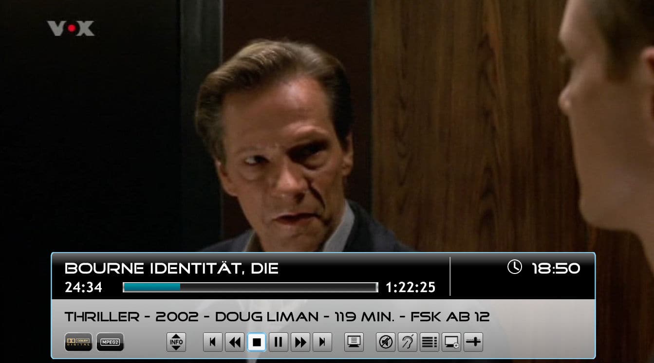
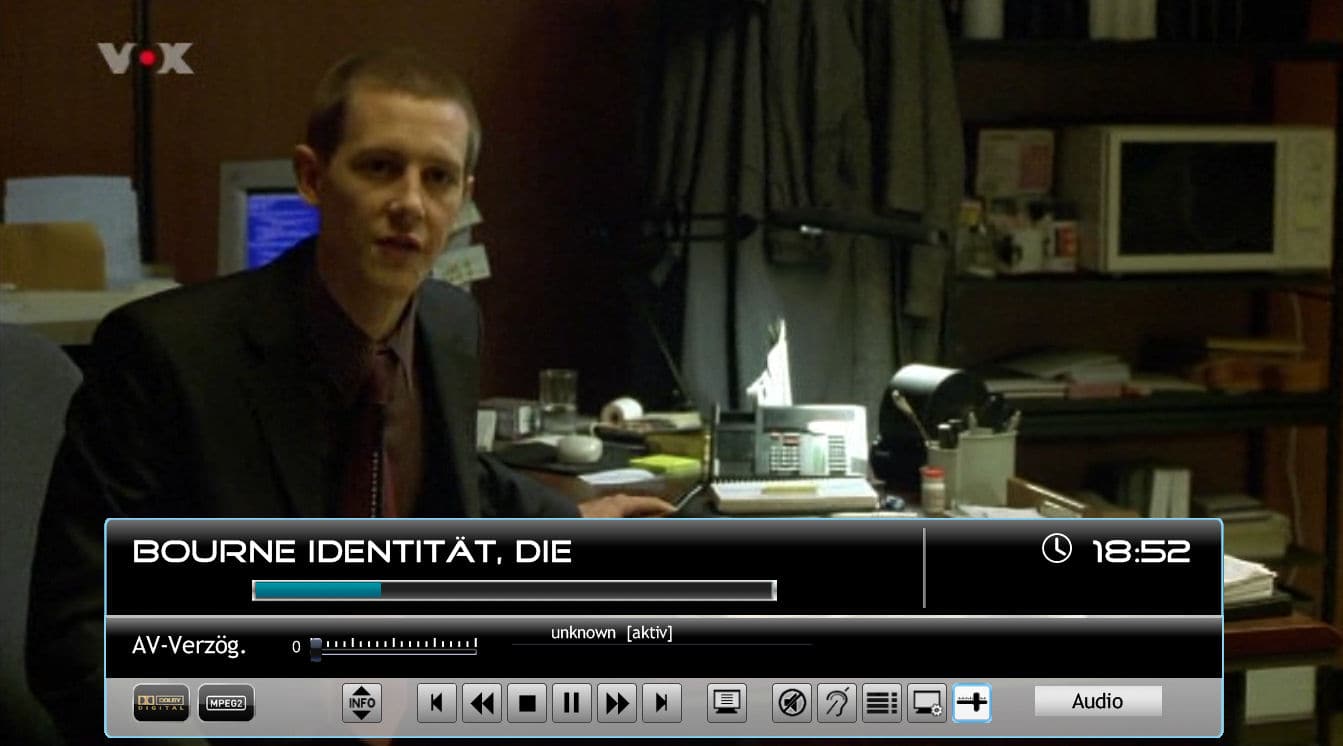
I experimented a bit to find a better solution for the OSD menus in TV and Video (the ones for Audio, Video, Bookmarks etc.) which atm occupy a space in the middle of the screen.
So I came up with the solution you´ll find in the enclosed RAR file.
The Video OSD now also shows a fadelabel with the media info like genre, year, director, runtime and mpaa rating.
When activating one of the menus, they are now displayed within the standard OSD.
Please note that you have to scroll down to reach the next item, although they are displayed next to each other.
The lists for subtitles and audio languages show only 2 lines, but you can scroll down to show the rest.
Maybe some images show more than words can explain, so please have a look at the attached images.
If you like to test these new layouts, DL the RAR file and overwrite the respective files in your PVHD directory with those from this file. They work for both HD skins.
Please feel free to test and tell me if I should do it that way in the future.
 in advance for your valuable cooperation!
BTW: Bookmarks won´t function in TV OSD, I´m in contact with the devs why not. This applies also for the GFX adjustments (gamma, brightness etc.), so they are no longer displayed.
Hi to all,
I experimented a bit to find a better solution for the OSD menus in TV and Video (the ones for Audio, Video, Bookmarks etc.) which atm occupy a space in the middle of the screen.
So I came up with the solution you´ll find in the enclosed RAR file.
The Video OSD now also shows a fadelabel with the media info like genre, year, director, runtime and mpaa rating.
When activating one of the menus, they are now displayed within the standard OSD.
Please note that you have to scroll down to reach the next item, although they are displayed next to each other.
The lists for subtitles and audio languages show only 2 lines, but you can scroll down to show the rest.
Maybe some images show more than words can explain, so please have a look at the attached images.
If you like to test these new layouts, DL the RAR file and overwrite the respective files in your PVHD directory with those from this file. They work for both HD skins.
Please feel free to test and tell me if I should do it that way in the future.
in advance for your valuable cooperation!BTW: Bookmarks won´t function in TV OSD, I´m in contact with the devs why not. This applies also for the GFX adjustments (gamma, brightness etc.), so they are no longer displayed.
Attachments
- Moderator
- #625
catavolt, thanks again! This is just to note that for me the scrolling signs in the basic home screen are still flickering in 3.2. So far I have not seen this effect in other places like long file names, etc.
BR
MaxT
BR
MaxT
- Thread starter
- Moderator
- #626
AW: PureVisionHD (16:9)
MaxT: What do you mean with scrolling signs? If you get flickering, this may be related to other issues with your installation/setup. From the skin side there should be no problems, here all is working smooth without any flickering. To narrow down your problem it would be helpful to know what OS, which renderer is used, which MP version etc.
MaxT: What do you mean with scrolling signs? If you get flickering, this may be related to other issues with your installation/setup. From the skin side there should be no problems, here all is working smooth without any flickering. To narrow down your problem it would be helpful to know what OS, which renderer is used, which MP version etc.
- Moderator
- #627
catavolt: I use Vista 64 bit, MP 1.1.0 beta with the latest SVN, EVR, PureVisionHD Blue 3.2
Under flickering I mean small back and forth (just several pixels) movements of unselected signs like Pictures, Video, etc which in Russian do not completely fit to appropriate bar (on the left in PureVisionHD Blue) and therefore scroll when selected. I think danb mentioned this issue here and I have the same symptoms.
Please let me know what other info I need to provide?
Regards,
MaxT
Under flickering I mean small back and forth (just several pixels) movements of unselected signs like Pictures, Video, etc which in Russian do not completely fit to appropriate bar (on the left in PureVisionHD Blue) and therefore scroll when selected. I think danb mentioned this issue here and I have the same symptoms.
Please let me know what other info I need to provide?
Regards,
MaxT
- Thread starter
- Moderator
- #628
AW: PureVisionHD (16:9)
MaxT: Aaah, understand now! Yes, that issue is well known, it happens on all buttons with shadow and wrap enabled. There is a bug in the shadow/wrap implementation in the skin engine which will (hopefully) be fixed until the final release of 1.1.0 RC1. Sorry that I can´t help more with that bug, the only possibility would be to deactivate all shadow/wrap features (which would brake the entire design of PVHD then...). Here I can only see a 1-pixel jump to the left when leaving a control.
So let´s hope the devs fix that bug soon!
MaxT: Aaah, understand now! Yes, that issue is well known, it happens on all buttons with shadow and wrap enabled. There is a bug in the shadow/wrap implementation in the skin engine which will (hopefully) be fixed until the final release of 1.1.0 RC1. Sorry that I can´t help more with that bug, the only possibility would be to deactivate all shadow/wrap features (which would brake the entire design of PVHD then...). Here I can only see a 1-pixel jump to the left when leaving a control.
So let´s hope the devs fix that bug soon!
- Thread starter
- Moderator
- #629
New OSDs for PureVisionHD
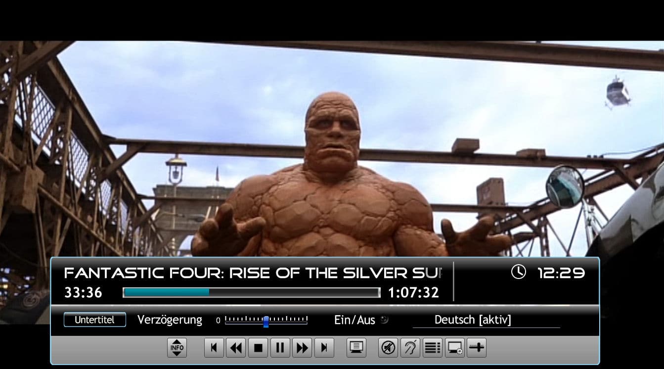
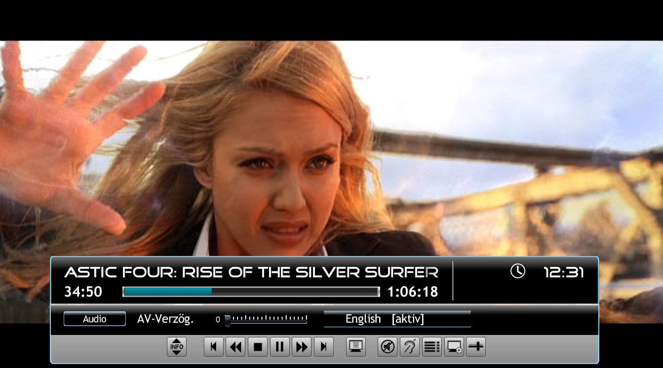
Hi to all willing to test the new OSDs. I reworked the first version, so here you can download the necessary file to replace.
Also added two screenshots to show the new layout.
When looking at the list controls for subtitles/languages they were extremely small. So I decided to display them in normal font size. You can stilll scroll in that lists to see the other options.
Hope you´ll like it that way. Comments are highly welcome!
Hi to all willing to test the new OSDs. I reworked the first version, so here you can download the necessary file to replace.
Also added two screenshots to show the new layout.
When looking at the list controls for subtitles/languages they were extremely small. So I decided to display them in normal font size. You can stilll scroll in that lists to see the other options.
Hope you´ll like it that way. Comments are highly welcome!
Attachments

AW: PureVisionHD (16:9)
Hi catavolt!
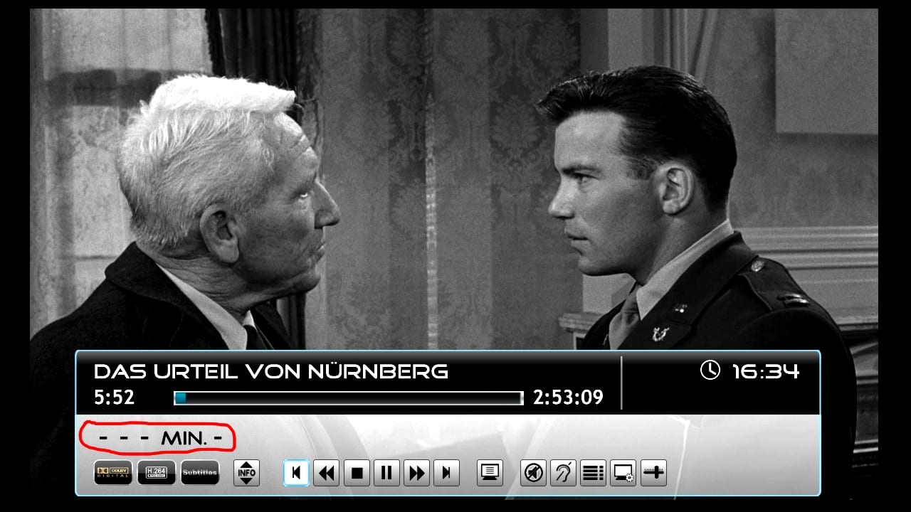
Thanks for the new release and the testfiles! I like the new features and the new style, especially the light-blue border! But please take a look at the screenshot: What does the red marked area mean? Is it a bug?
Best regards
Helios
Hi catavolt!
Thanks for the new release and the testfiles! I like the new features and the new style, especially the light-blue border! But please take a look at the screenshot: What does the red marked area mean? Is it a bug?
Best regards
Helios
Attachments
Users who are viewing this thread
Online now: 6 (members: 0, guests: 6)