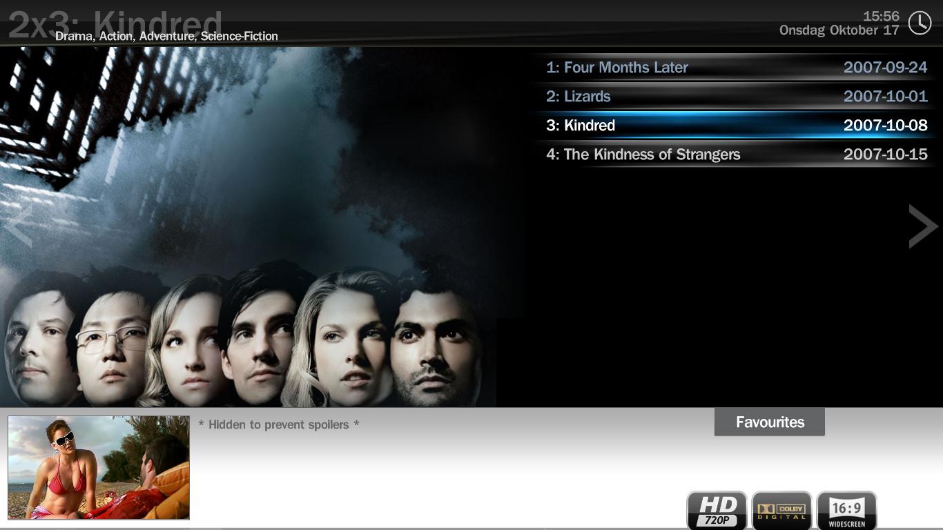
Series Select Mockup (with XFace skin) (2 Viewers)

Darre

Portal Pro
April 21, 2007
925
80
Home Country
Norway Norway
:D Ok its working as it should now =) Except the 2 invibible rows. Ill try the altered dll and see how it goes. Only prob is it will effectivly erase all the improvement done to core.dll after the day it was made :-/

* I think the logos should be placed a bit higher.. it should be some space between them and the bottom of the screen. Other then that its fantastic!
* The grey box down on the left side should be updated with some eye candy IMO.
* The arrows on the sides doesnt show up untill you actually switch view yourself. Is that intentional? Its great for me as it is because i know about the function; and usually i only watch shows in the fav category. But its not very girlfriend/wife friendly i think.
* :D


And btw: if using the altered .dll makes my HTPC grow legs and attack me ill try to warn you.
edit: It didnt :p
 

Attachments

  • tvseries_epview2.JPG
    tvseries_epview2.JPG
    103.6 KB

spuck

Community Skin Designer
April 6, 2007
397
59
Home Country
Sweden Sweden
  • Thread starter
  • Moderator
  • #43
That's weird, you are actually missing a part at the bottom as you can see compared to mine: LINK TO IMAGE
I don't see why that would happen, only difference is my display got 1280x720p resolution..

the arrows should not be seen anywhere but the seriesbanner views.. Gonna fix em now..
New version uploaded.

btw if someone wants to make something nice instead of the grey box I'll be happy to include it. Dimensions are: W 262 H 147.
 

Darre

Portal Pro
April 21, 2007
925
80
Home Country
Norway Norway
Hmm.. I cant use 1280x720. It looks like crap on my TV. But what part of the code do i have to change to move them up a bit? I can edit the xml myself if i just know what part to edit =)
 

spuck

Community Skin Designer
April 6, 2007
397
59
Home Country
Sweden Sweden
  • Thread starter
  • Moderator
  • #45
I've moved them up in version 0.2.3. Was supposed to do that earlier anyway. :p

Probably not the easiest way to create a skin file which is 1366x768 when you got a display with only 1280x720. :p
 

runarius

Portal Pro
February 1, 2007
100
2
Home Country
Norway Norway
ah, nice, now it actually works:D I was thinking of two things that may improve the view.

- When going from left to right in the series screen, I sometimes press right one too many times, which makes it change view, which I really don't want. I don't know a good solotion for this at the moment, but I have one which may do it a little better: the arrows are moved below all the series, so that to change view, I have to go all the way down, untill the arrows are selected, and when they are, and I press left or right, they change the view. If I press down, I go straight to the top of the series-list without changing view. I think this would be the best way of solving it, that is, if there are somebody else who has this proble, which I believe there is, since this should be able to be used by anyone.

- Lets say I have a total of 21 series, which would need 7 rows. At this moment, to scroll down, I have to go to the last visible row(number 5) and press down. I would like it to scroll at the fourth visible row, or maybe even the third. This way, I get to see more of what is below my selected series.

Hope you understand what I meen.
 

spuck

Community Skin Designer
April 6, 2007
397
59
Home Country
Sweden Sweden
  • Thread starter
  • Moderator
  • #47
1. The arrows are just so you know it's possible to press left/right. It's actually supposed to be text above the arrows with the name of the next/prev view. ( The arrows don't actually do shit ) Just haven't figured out how to rotate the labels with the text yet..

2. That's a good idea! I would like that too!!! :D
 

runarius

Portal Pro
February 1, 2007
100
2
Home Country
Norway Norway
yeah, I know they don't do shit, but I really don't think that it should be so that you can so easaly by accident change the view. another solution might be that when you are ate collumn 3 and press right, it doesn't change view, it instead highlights the right arrow, and if you press right again, it will change the view. This might be better.

btw, the seasons screen looks just the same as the earlier screenshot. am a little confused about this. I know I have deleted the cache, many times. using the text-view intead of graphical at the moment instead, which actually works great enough.
 

spuck

Community Skin Designer
April 6, 2007
397
59
Home Country
Sweden Sweden
  • Thread starter
  • Moderator
  • #49
Can't really do anything about the season select page since it's connected to the series select. It's the way the plugin is designed I guess.. Only a programmer could fix this so we can skin both pages differently..
 

runarius

Portal Pro
February 1, 2007
100
2
Home Country
Norway Norway
ah, well, I guess that is ok. I don't mind using the text version of the seasons-view=D

Series-view is looking so great, thanks for all your work=D
 

Users who are viewing this thread

Top Bottom