Germany
- Thread starter
- #41
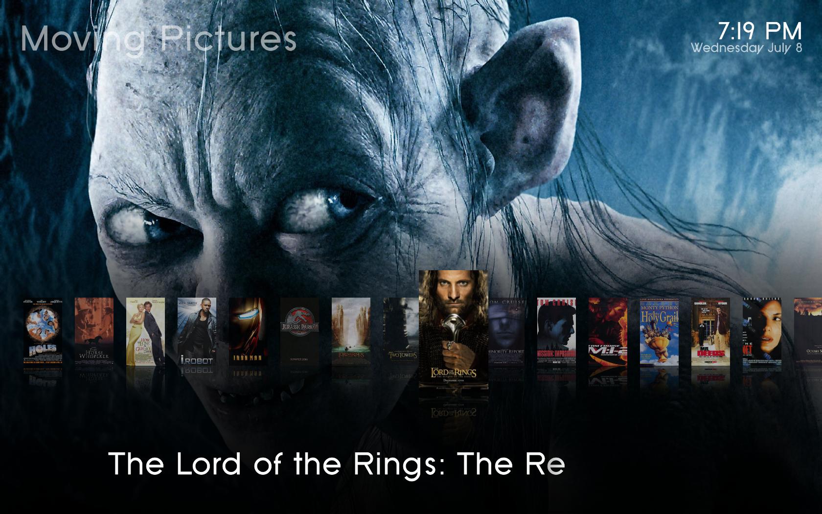
When I had a quick test of the skin, I noticed that the visualization in "Now playing" (at least in Basic Home, don't remember any other place) were overlapping the artist/track info. Perhaps the object is bigger than CD covers for visualizations?
Do you mean music visualisation? that may be. I don´t have vis set up on my machine so i cant tell. I will fix it. thanks!
Hi,
I really like your skin! Very nice basic home screen. Like the purple and whitish color.
I have a few questions.
1. As some people stated earlier, in the now playing screen the countdown timer falls half out of screen. (1920x1080)
2. on the basic home screen, the text for pictures (in dutch afbeeldingen) falls half out of screen
3. the tv guide has only 6 lines. Some of us have big screens, 32", and are able to read 10 lines.
4. I really like the OSD when I hit the i-button on the remote! Very cool!
I am looking forward to see this skin growing! I am waiting the next update!
thanks

1. Really? Can you post a screenshot?
2. Thats a problem with the different languages. Don´t know how this could be fixed. i could use a fadelabel, so that the text is scrolling if it is longer than the screen. Would that help?
3. I want this skin to be as easy to use AND easy to read as possible. so i deceided to go with only 6 lines. Personally i think this is enough. Do you really need (and i mean NEED) more lines? I dont want to offend you. I just want to understand why more lines are better. i think more lines are more confusing.
4.
I like it too This skin will grow. I have big plans with it
well, I am pretty stumped with that fadelabel thing. I did change however the width of that fadelabel control, it is found in common.window.xml. I changed the width to 1250 so basically it will take the width of the whole screen. My question I guess would be are there any windows that this would cause problems with? I haven't seen any yet, but only time will tell I guess. Anyways with a wider fadelabel it won't have to go in scroll mode as often, so that means less items are cut off, but I am still hoping to find a fix for it though.
EDIT:
So i figured out that if I change the font of the fadelabel to font16 instead of font28, there aren't any problems, but then the text is smaller. I wonder why it would cut off like that at a larger font size.
Found another layout issue. it is when you are viewing the imdb info of a video the spincontrol for the images is overlapping so moved its position to 630 instead of 600. It is a bit better. Also the pictures are out of proportion, and that is easy enough to fix just takes a little effort. Maybe I will get to it...lol. Oh yea that spincontrol is in the file DialogVideoInfo.xml.
If the fadelabel is that long it will cause problems (overlapping) with the little "now playing info" on the bottom left.
The thing with the cut-off label is real strange. If you find a solution i would be happy! I tried several things too - without luck.
Hmmm. Could it be a problem with the font? Will check this this weekend...Thanks for the info on the IMDB Info. will fix this. Thanks.
At the moment i collect all your reports, bugs and suggestions. I have a lot of work (in real life
) to do, but i think i will have time on the weekend. A new version will come when enough bugs are fixed and this justifies a new version. I don´t want to release every few days something new. Every version has to be much more better, i think. Hope its OK for yall.
Cheers
nanogod