Aeon Wide (1366x768) (3 Viewers)

daHive

Portal Pro
March 1, 2007
109
0
Home Country
Austria Austria
this seems to be becoming a great skin!
i can´t get it to work properly though:
i downloaded the aeon alpha from the homepage
then i downloaded the svn files from https://mp-plugins.svn.sourceforge.net/svnroot/mp-plugins/trunk/skins/Aeon Wide/
but some newer media files seem to be missing(eg. green focus buttons like in bluetwo...) and i don´t know where i can get them?

i´ve made an example screen within tvseries, but it´s the same in other plugins too(tv, videos, weather...)
 

Attachments

  • aeon.jpg
    aeon.jpg
    78 KB

Paranoid Delusion

Moderation Manager
  • Premium Supporter
  • June 13, 2005
    13,062
    2,978
    Cheshire
    Home Country
    United Kingdom United Kingdom
    Hi Sambal

    This has got rid of the crowding when MP first launched of the homescreen menu, brilliant, one request though, could the highlighted item be white, as grey on grey not good for reading.

    Thanks
     

    Sambal

    Portal Pro
    February 4, 2008
    144
    144
    Home Country
    Netherlands Netherlands
    Only drawback is I was using the BasicHome.xml you posted on #260 , in which FanArt didn't disappear when pressing up buttons... and this version seems to be based on previous .xml. If only you could merge them both then it would be more than perfect.

    Thanks again :)

    The FanArt shouldn't disappear when you enter the upper menu. At least it doesn't on my machine. Did it also happen before you altered the file? Or if anybody else is experiencing this please let me know.

    This has got rid of the crowding when MP first launched of the homescreen menu, brilliant, one request though, could the highlighted item be white, as grey on grey not good for reading.
    Thanks

    I explained why the crowding happened in this post. Also attached a fixed version of the BasicHome there. I guess i forgot to mention it in this thread. Sorry for that.

    Regarding the colours, do you mean the text colour or the dark item background?
    I made it easy to change the colours. At the top of the BasicHome.xml you see the following lines
    Code:
      <define>#menuitemFocus:ff626262</define>
      <define>#menuitemNoFocus:ff232323</define>
    Just alter these to your liking. If other colours turn out to be better i'll make them default.

    O and i forgot to mention. Because of the new highlighted background image, you'll need to clear the Aeon wide cache folder. Should be something like
    C:\Documents and Settings\All Users\Application Data\Team MediaPortal\MediaPortal\Cache\Aeon wide
     

    Yabba

    Portal Pro
    July 13, 2007
    131
    4
    Home Country
    Spain Spain
    Did it also happen before you altered the file?

    Not at all... I changed to the xml from post #260 just to avoid that behaviour...

    Anyway I didn't clear the cache folder... I'll try it later and maybe that solves the problem...

    EDITED : I cleared the cache folder and now it works 100% fine. Thanks, Sambal... :)
     

    Yabba

    Portal Pro
    July 13, 2007
    131
    4
    Home Country
    Spain Spain
    Sambal, about the problem with series with just one season, it seems it was a problem in TVSeries plugin.

    "Revision 332
    Fix for season banners not being displayed when season view is skipped (ie. local series with only 1 season available)"

    I tried to update the plugin before posting, but SVN repository was down (or at least I couldn't reach it these days). I'll try this update and tell :)
     

    Darre

    Portal Pro
    April 21, 2007
    925
    80
    Home Country
    Norway Norway
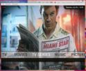
    The one with dexter looks just the way I want it too :)
     

    Paranoid Delusion

    Moderation Manager
  • Premium Supporter
  • June 13, 2005
    13,062
    2,978
    Cheshire
    Home Country
    United Kingdom United Kingdom
    All my backgrounds are dark, so atm the white lettering stands out much better, but then the idea is choice, hence both files.

    Reversed the focus\nofocus of sambal's, as it seemed more logical to have the black as selected and also stands out more than the grey :)
     

    Users who are viewing this thread

    Top Bottom