New Zealand
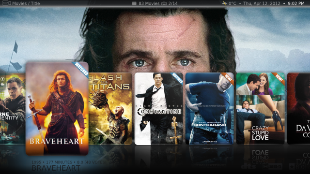
Actually i dont like the coloured/dimmed text in the lists myself. Imho opinion all text should be the same color. In Avalon we had this as user setting.
And i agree that only one icon would be enough. I would recommend only a icon for unwatched. That seems only logical.
I will contact Nico to tackle this issue.
I'm not a fan of unwatched icons because so far I haven't seen an icon i like for unwatched. There is an eye with a cross through it or a red eye, and I don't feel either of these icons strongly convey the meaning of unwatched to me. However I feel that having an eye next to watched episodes does convey the meaning quite well.
With regards to having coloured / dimmed text I don't have a strong feeling either way, however I do like that you swapped the watched/unwatched colours from the original titan version. I felt that the original version had the colours the wrong way round. If I think about it more, I think you are right that having all the text the same colour would be best, however I would put icons on the watched episodes rather than the unwatched episodes
")
PS. Once again great work on the titan skin, I think it has really elevated MP to a new level of awesomeness and It makes a lot of people think WOW, I want to switch to MediaPortal.
Last edited: