Monochrome (for those who like dark skins), updated... (9 Viewers)

rtv

Retired Team Member
  • Premium Supporter
  • April 7, 2005
    3,622
    301
    Osnabruck
    Home Country
    Germany Germany
    @ Furetto, thanks for those tv xmls, I should have a new release soon ;).

    Btw: can't you just use the OSD and tv/videofullscreen xml files from your other skin?
    This way the positions etc are already matching and just the cluttery, irrelevant properties could be commented out.
     

    m0deth

    Portal Pro
    December 31, 2006
    78
    2
    58
    Home Country
    United States of America United States of America
    Also Reptile, can you adjust the mouseover sensitivity location on the left menu when in My Videos/Other screens that use side to side graphical list?
    I have no idea how to fix that really...

    And is it me? or does the new layout seem like a 4:3 skin now, slapped onto a 16:9 background?
    Ouch!

    @ Furetto, thanks for those tv xmls, I should have a new release soon ;).

    As far as a fix goes....can you pad the left side as to where the icons are displayed? They seem to have a left justification(horrible font term), is there any way to shift them over maybe 20 more pixels? I don't know how that would affect all the rest. But it should give enough room to reduce the number of times the left menu pane is triggered accidentally.

    Second point....that wasn't meant as an insult sir, you have done a fine job on this skin and thank you for doing so....but if it's completely based off b2w now...then there is the culprit as it's layout differs only slightly from it's 4:3 counterpart. That wouldn't be your fault if using that as a baseline. But I did hold some paper up to the monitor on each side,....and the home screen interface fits in 4:3 even when blown up to 1680x1050, and on my 1366x768 HTPC monitor. There looks to be more wasted space on the sides as elements tightened up in the layout. My guess is BlueTwo Wide over-adjusts for overscan monitors, and as a result, this is what happens in yours. I have the older version on another comp hooked to this 22" now, and when I swap inputs...it's the general impression I get due to the older version using more of the layout evenly. Seeing the way the two look a button click away makes it easy to see ya know?

    Anyway...good luck, the skin does look great, nice and smooth, quick operation for me on 3 clients of varying horsepower, and it gets comments from friends too, they like the easy to see and understand aspect, and have commented that in dark lighting, it's easier to see and use from 10ft or more than the defaults....so you're on the right track. And thanks again for your time and effort, and the others who've helped you bring this skin this far!
     

    eloo

    Portal Pro
    January 20, 2005
    216
    7
    45
    Aarhus, Denmark
    Possible bug

    Hey PS,

    I can't seem to move up/down in Current Playlist (Music) or delete the track unless a track is playing in the playlist. Might be a MP programming bug.
     

    Furetto

    Moderator - Dutch Forums
    April 11, 2005
    664
    61
    53
    Brussels
    Home Country
    Belgium Belgium
    Hey PS,

    I can't seem to move up/down in Current Playlist (Music) or delete the track unless a track is playing in the playlist. Might be a MP programming bug.

    If you suspect it could be a MP issue, please test it with BlueTwo.
     

    DLHalcyon

    New Member
    October 26, 2007
    4
    0
    Home Country
    United States of America United States of America
    I reworked tvZapOSD.xml so that it now uses one of Monochrome's graphics for TV change instead of the default blue too. It uses osd_bg_video.png, just resizing it to the correct size. I haven't noticed any problems, but make sure to backup your original in case I did break something.
     

    Avigrace

    Portal Pro
    December 13, 2005
    85
    3
    126
    Home Country
    England England
    Thanks for the updated version :) The new font I was unsure of for a few minutes but it quickly grew on my, it makes the guide seem much clearer.

    One issue I have is this..
    If I goto TV Home and then guide the large preview from TV Home is still playing on the guide screen covering most of it up. Also, when watching fullscreen TV I cannot press guide button on my remote, I have to goto some other screen first and then press guide for it to display.
     

    Darre

    Portal Pro
    April 21, 2007
    925
    80
    Home Country
    Norway Norway
    Thx for the update =)

    Im not sure about the font either, looks good in a way.. but then again it doesnt. Guess ill have to give it a couple of days :)

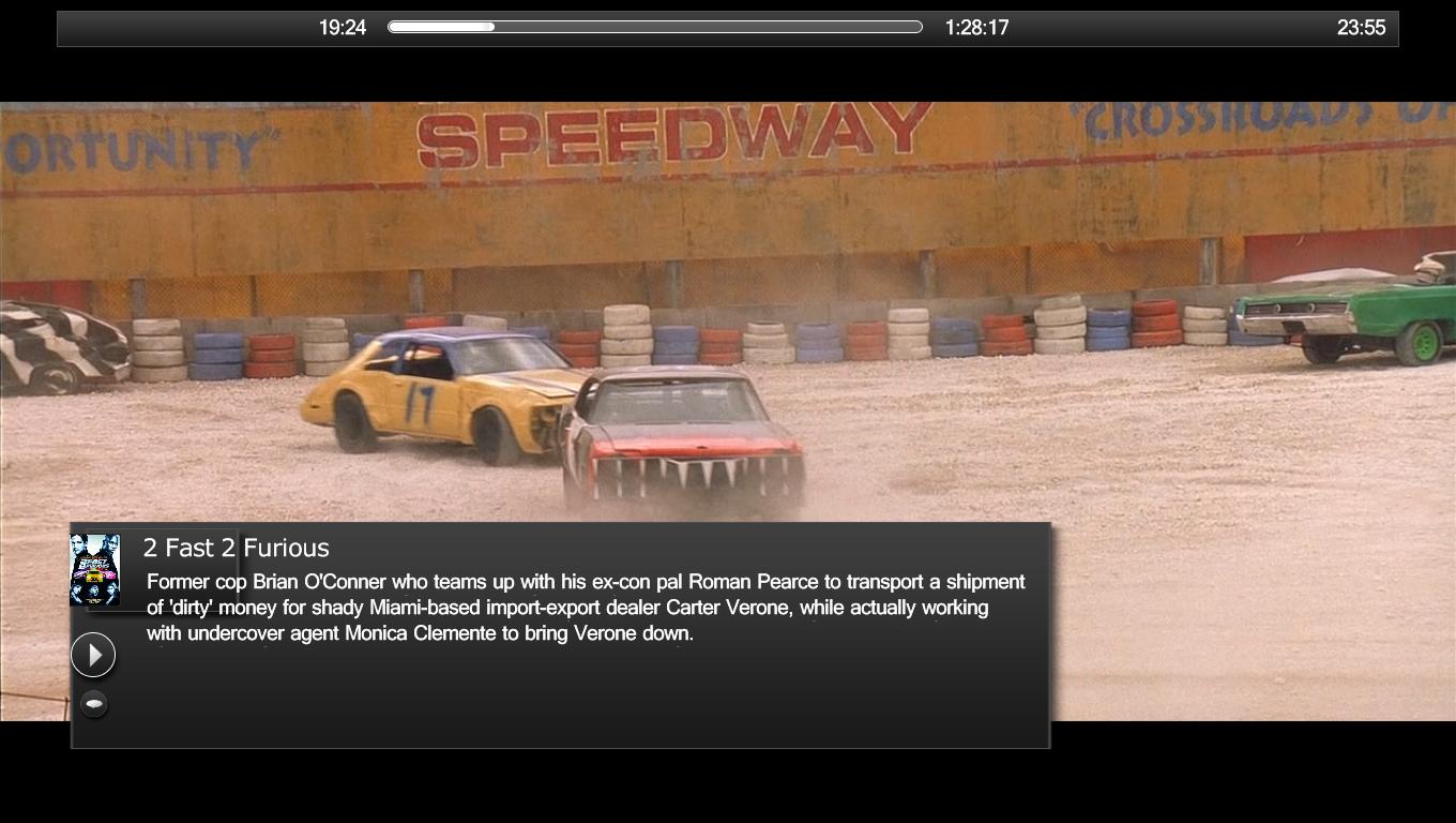
    Edit: I like the idea of the larger VideoOSD, but its not looking 100% here. Attached scr shot.
     

    Attachments

    • videoosd.jpg
      videoosd.jpg
      122 KB

    Users who are viewing this thread

    Top Bottom