Monochrome (for those who like dark skins), updated... (3 Viewers)

THDBASED

Portal Pro
January 30, 2006
469
2
Home Country
Belgium Belgium
There are indeed still a lot of errors in the TV part but Psycho doesn't use the TV part so that explains a lot :) I will try to post some errors here too the next couple of days...

First one:

- On channel change the gfx from Blue Two Wide is used
 

patricon

Portal Pro
June 16, 2007
543
18
Home Country
Spain Spain
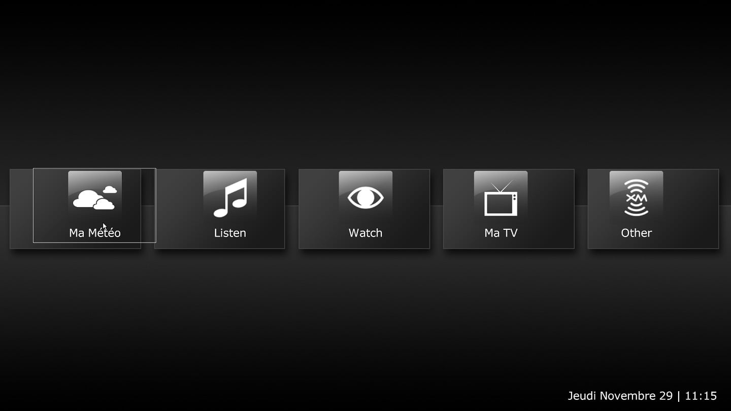
Well, after some testing i've decided to keep the new font suggested by spuck (please, psycho, consider to include it in new release, i think that it looks nice with that font). However, i have not noticed any changes other than the skin resolution optimized for 1366x768 and that now, there is no animations. So i suggest following changes (to all readers of this post: please, add also your suggestions and oppinions about all of this...)

1 - In fullscreen video the info panel is a bit small for my taste, so i think that it could be better to enlarge the with a bit (half width of screen or may be, a bit less)

2 - The now playing screen does not have a link to My lyrics, it could be nice to add it, and also a link to the playlist.

3 - The worldmap plugin doesn't work fine, the panel for searching places is out of place

4 - The small video window that it's showed in home screen and also in other screens, it's a bit small and the symbols for play, pause, etc, doesn't work. It could be nice also, to show the info (movie title, time, etc) at the right side of the window, and not below de window as it's working right now.


regards,
 

patricon

Portal Pro
June 16, 2007
543
18
Home Country
Spain Spain
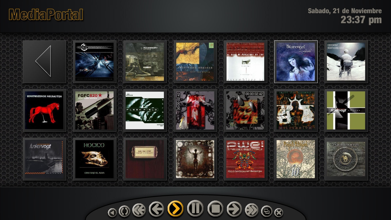
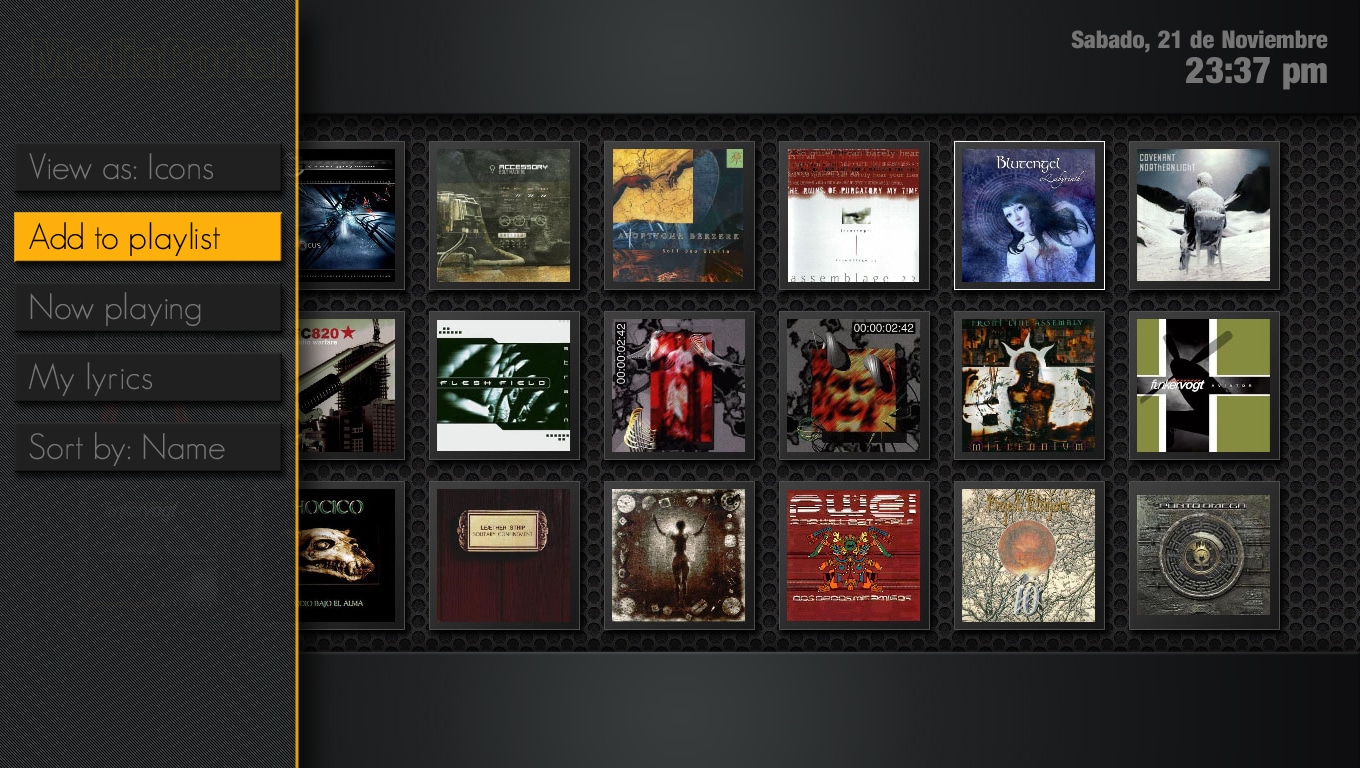
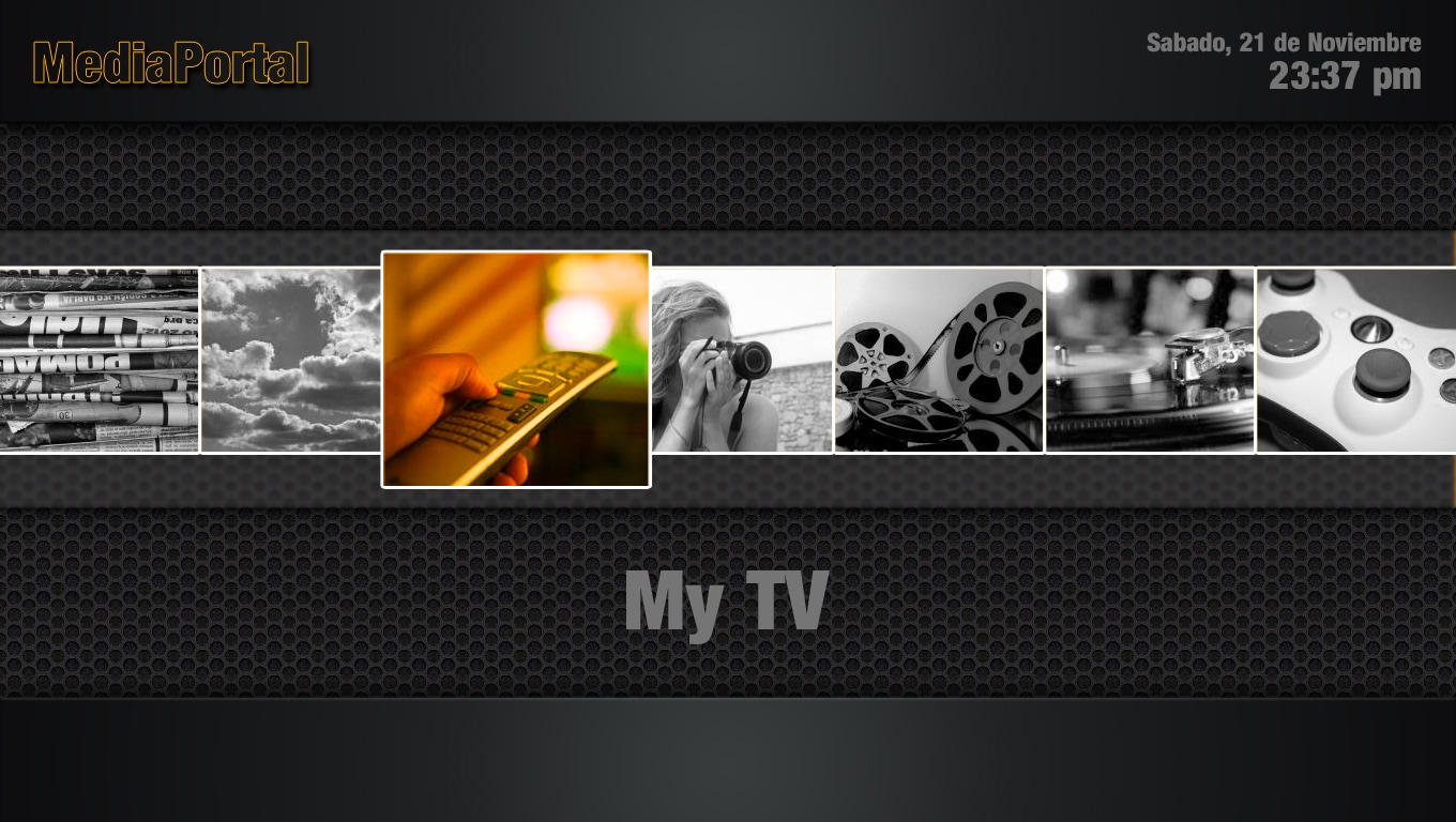
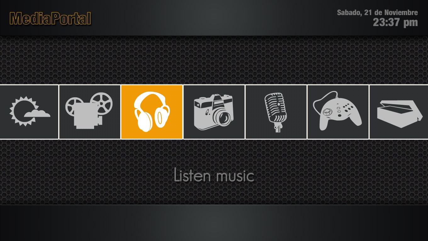
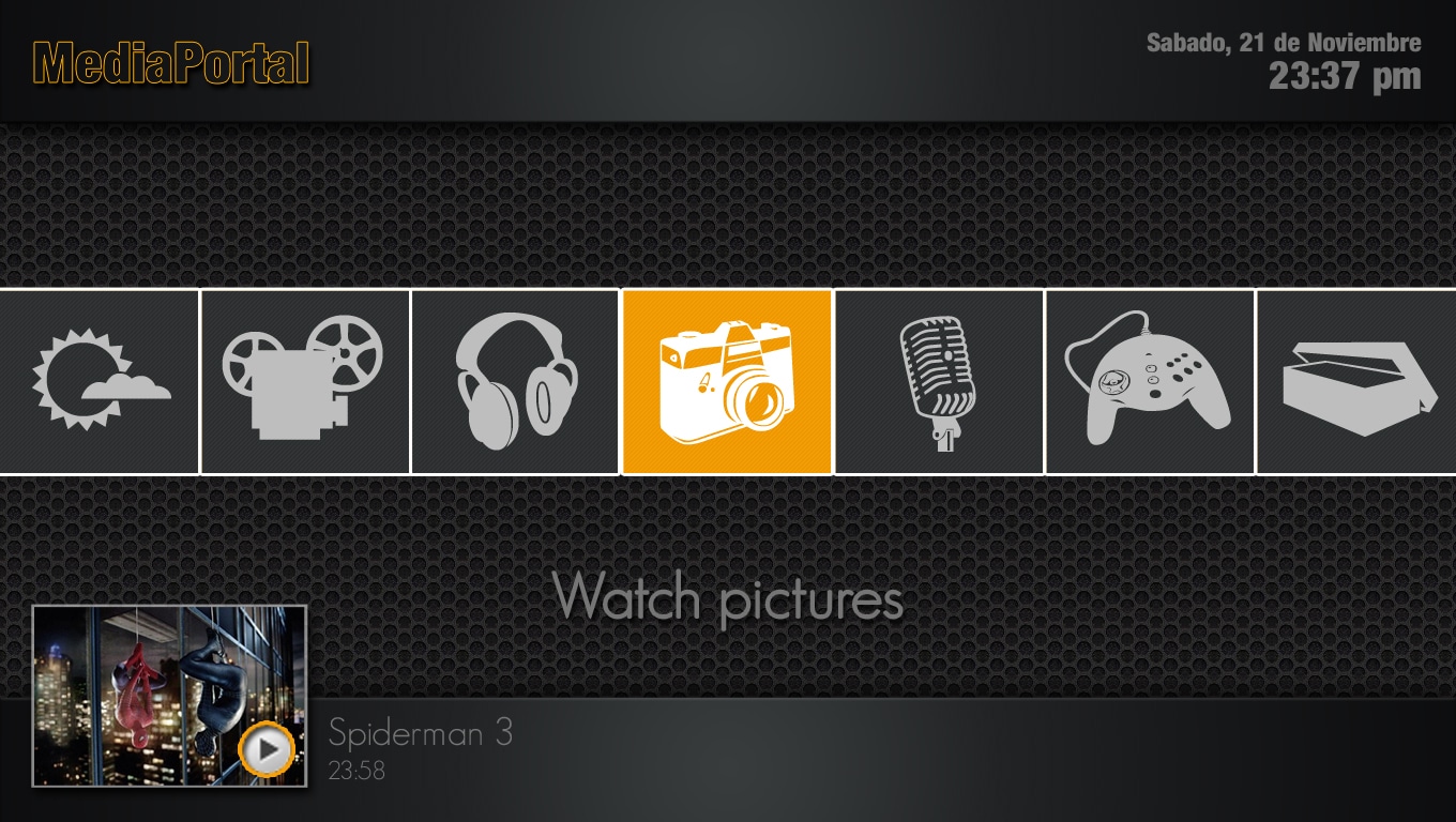
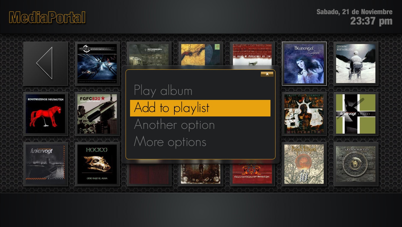
Ok, i've been experimenting a bit with monochrome looks and i've created some mockups to post here and to get your impressions about them. I've not the time and knowledge to convert this mockups into xml files to use with MP, but if Psycho Reptile or another user agree, we can create a mod for Monochrome skin that replaces it, or may be as a different version of the skin (may be that it could be called "Monochrome lead" or something simmilar)

It's a bit late and i must go to sleep, so i've no more time to polish the appearance of the mockups, but i think that them gives you an aproximate idea of what i'm suggesting. The contextual panel in the middle needs a bit more work and also i've added a sample texts (i don't remember the exact options in MP). Also i've made two basic screen desings because i'm not sure already about how to make it.

Also, my idea is to use gray tones and also a single color (orange) to give to the skin a more showy look. Tell me what you think...

regards :)
 

Attachments

  • Monochrome lead 1.jpg
    Monochrome lead 1.jpg
    711.3 KB
  • Monochrome lead 2.jpg
    Monochrome lead 2.jpg
    741.5 KB
  • Monochrome lead 3.jpg
    Monochrome lead 3.jpg
    579.6 KB
  • Monochrome lead 4.jpg
    Monochrome lead 4.jpg
    623.4 KB
  • Monochrome lead 5.jpg
    Monochrome lead 5.jpg
    652.9 KB
  • Monochrome lead 6.jpg
    Monochrome lead 6.jpg
    582.6 KB

zeflash

Portal Pro
July 7, 2005
199
16
Home Country
France France
I've updated to the latest release, and since then I have an issue with the selection box in the main basic screen;
the rectangle highlight around the different element gets offset when it's on the left or on the right items. Didn't do that with alpha 0.6, so I guess it has to do with the rescaling that occured?
My config is 1920x1080, but the screenshot has been scaled down.

A picture being better than a thousand words...
I think I'll go back to 0.6, given I kinda liked the animations and it looked fine :)
 

Attachments

  • offset.jpg
    offset.jpg
    75.6 KB

zeflash

Portal Pro
July 7, 2005
199
16
Home Country
France France
And also (just noticed), with the new layout for the series list, when I come back to it from the season list, the selection doesn't stay on the series I was within previously.

I still does in revision, so I'm wondering where the problem is. I have a lot of series and always having the selection back to the first one of the list is a bit tedious :)
 

Darre

Portal Pro
April 21, 2007
925
80
Home Country
Norway Norway
Patricon: I like it=)

Two things tho:
1) It would have to be a new skin since it very different from monochrome(or at least the basic idea of monochrome)but maybe you could be allowed to base it on the skin files of M.

2) I would use a blue color instead of orange since i feel orange(and red) gives the impression of being cheap electronics. I think blue looks way more professional and pricey =)

I think I'm gonna try to edit monochrome with more blue in it, don't have a clue where to start but i want to try.
 

patricon

Portal Pro
June 16, 2007
543
18
Home Country
Spain Spain
Ok, darre i've been testing with blue and it also looks very nice... So i'll change the orange into blue.
 

JackTramiel

MP Donator
  • Premium Supporter
  • November 22, 2006
    1,400
    79
    47
    Recklinghausen
    Home Country
    Germany Germany
    What about, if adding color to the menus, using the colors the buttons of the mce remote would have.
    ( MyTV, MyMusic etc. ) Maybe not only inside the menus but also in the mainmenus.
    E.g. the highlighter of MyTV would not be white but had the color of the mce remote button.
    Still would be decent but user friendly.
    A lot of other remotes have that buttons, too. Sure not to add too much color since its called monochrom.
    Just a thought.

    Once it works nearly perfect and i could set it up all plugin buttons i really need to get rid of the home screen, but thats a different topic. If possible it would be great i you could de/activate the home screen in settings. But i guess i have to do some xml editing for that.
     

    Users who are viewing this thread

    Top Bottom