You are using an out of date browser. It may not display this or other websites correctly.
You should upgrade or use an alternative browser.
You should upgrade or use an alternative browser.
PureVisionHD 1080 (67 Viewers)
- Thread starter catavolt
- Start date
- Thread starter
- Moderator
- #3,692
- February 10, 2023
- 186
- 1,071
- Home Country
-
 Germany
Addition to your TV guide:
In order to fill the corresponding empty button of the channel group selector button on the program overview for a single TV channel with the selected channel, I have added a corresponding control and attached the result for the mytvguide.24Lines as an image.
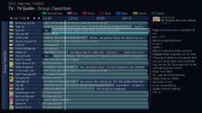
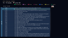
I would also have liked to have added the title of the page with e.g. single channel overview, but I was unable to create a corresponding dependency.
In order to fill the corresponding empty button of the channel group selector button on the program overview for a single TV channel with the selected channel, I have added a corresponding control and attached the result for the mytvguide.24Lines as an image.


I would also have liked to have added the title of the page with e.g. single channel overview, but I was unable to create a corresponding dependency.
Attachments
- Thread starter
- Moderator
- #3,694
Well, as the channel group selector button is not shown in single channel view, it is also not necessary to show its frame, so I just added <visible>control.isvisible(100)</visible> to that control 
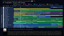
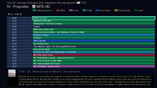
BTW: I also changed the timeline GFX and formatting a bit, so all you need is the content of the new ZIP attached
Don´t forget to clear the skin cache after copying (overwriting) before starting MP


BTW: I also changed the timeline GFX and formatting a bit, so all you need is the content of the new ZIP attached
Don´t forget to clear the skin cache after copying (overwriting) before starting MP
Attachments
- February 10, 2023
- 186
- 1,071
- Home Country
-
 Germany
You are of course right in principle that the background for the channel group selector button does not have to be displayed in the individual channel overview, and that is fine. Nevertheless, I would like to briefly point out the alternative with a background, perhaps to draw attention more clearly to the individual channel overview and to fill the empty space on the left. 
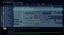
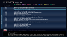
The new vertical blue dividing lines of the timeline with a caliber jump in line thickness look interesting, but I personally would prefer the previous uniform dividing lines.


The new vertical blue dividing lines of the timeline with a caliber jump in line thickness look interesting, but I personally would prefer the previous uniform dividing lines.
- Thread starter
- Moderator
- #3,696
- February 10, 2023
- 186
- 1,071
- Home Country
-
 Germany
Well done!  Just one small point regarding the font. In my opinion, the “Label” font would be better suited for the “Single Channel” label, as it is also used on the main page of the TV guide for the “TvGroup” button and would make the title line “TV-TVGuide-Channel” stand out better on the single channel overview of the TV guide.
- Thread starter
- Moderator
- #3,698
It is "LabelBold" (at least in the latest attachment)In my opinion, the “Label” font would be better suited for the “Single Channel” label,
I also thought a bit about the positioning of the labels: As it is unfortunately not possible to center them correctly, I´d prefer a fixed distance from the top, e.g. 100 px - will experiment and report back
- February 10, 2023
- 186
- 1,071
- Home Country
-
 Germany
Yes, I know. I meant that “Label” instead of “LabelBold” font would suit better.It is "LabelBold" (at least in the latest attachment)
- Thread starter
- Moderator
- #3,700
Well, I made it working 
Now you have to decide: Do you want the label centered:
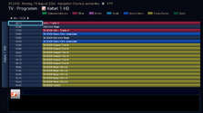
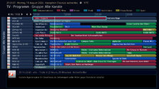
Or would you like it with a fixed distance from the top:
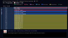
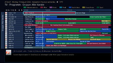

To be honest: Now that I found the way to position exactly, I prefer the fixed distance from the top - I believe it´s nicer to read
ZIP with fixed distance attached
Now you have to decide: Do you want the label centered:


Or would you like it with a fixed distance from the top:


To be honest: Now that I found the way to position exactly, I prefer the fixed distance from the top - I believe it´s nicer to read
ZIP with fixed distance attached
Attachments
Last edited:
Users who are viewing this thread
Online now: 66 (members: 0, guests: 66)

