Xface Skin Version 1.6 ready for download 09.06.2008 (2 Viewers)

Harley

Retired Team Member
  • Premium Supporter
  • May 7, 2004
    2,053
    1,993
    Germany
    Home Country
    Germany Germany
    first of all,
    great work Harley as usual

    My config : MP 0.2.3.0 RC2 +svn 15813 (090907)
    Ive got a little issue with the labels in the basichome as you can see in the screenshot above.
    Is it a bug skin or my svn's version is outdated? Have you changed something in the skinengine since the beginning of september?
    thx


    ..yes you must use a newer svn for that because i have need labelcenterstuff for this ( thanks to rtv, who have made the skinenginechanges for this) :)

    Greetings Harley
     

    Itisme

    Portal Member
    February 1, 2006
    33
    0
    Nice Nice Nice

    thanx for the very nice skin

    For me there is only one thing missing and that is a button on the now playing screen for the lyrics, like in revision/replicant skin

    keep up this great work!!
    are we already using the wpf skin engine??
     

    spuck

    Community Skin Designer
    April 6, 2007
    397
    59
    Home Country
    Sweden Sweden
    To be honest, the episode thumbs are not that important to me. My only issue, is that they show as little icons next to the episode name, but you cant actually see what they are... in fact, i would prefer it if they didnt show at all. I suppose i could just go and delete all the thumbs, but it only goes and re-downloads the entire lot when i do a full import :/ maybe an option in the My-TVseries to NOT download thumbs? (Inker? :) )

    If thumbs are not displayed, then the logos are perfect where they are. Just those 3 icons to lose.

    PS. I like the fade for light fanart, is that standard at the moment? I had a VERY light fan art for desperate housewives which i made, and i struggled to read the menu.
    PPS. The fan art for Weeds is more riveting than the actual show imho :)

    EDIT: Your XML is different to mine... yours shows the file size and date and season whereas mine shows the series type... i think i prefer yours to be honest. Only thing i would do, is on the left above the logos have it display the episode number, so like: 2x11 Yeah, Just Like Tomatoes

    What do you think?
    If you'd take a closer look at my screenshot in my last post you would see the episode thumbs will be removed in my next version. Your weeds comment doesn't even make sense.

    Of course my XML is different than yours because I'm doing the XML for the tvseries plugin. :)
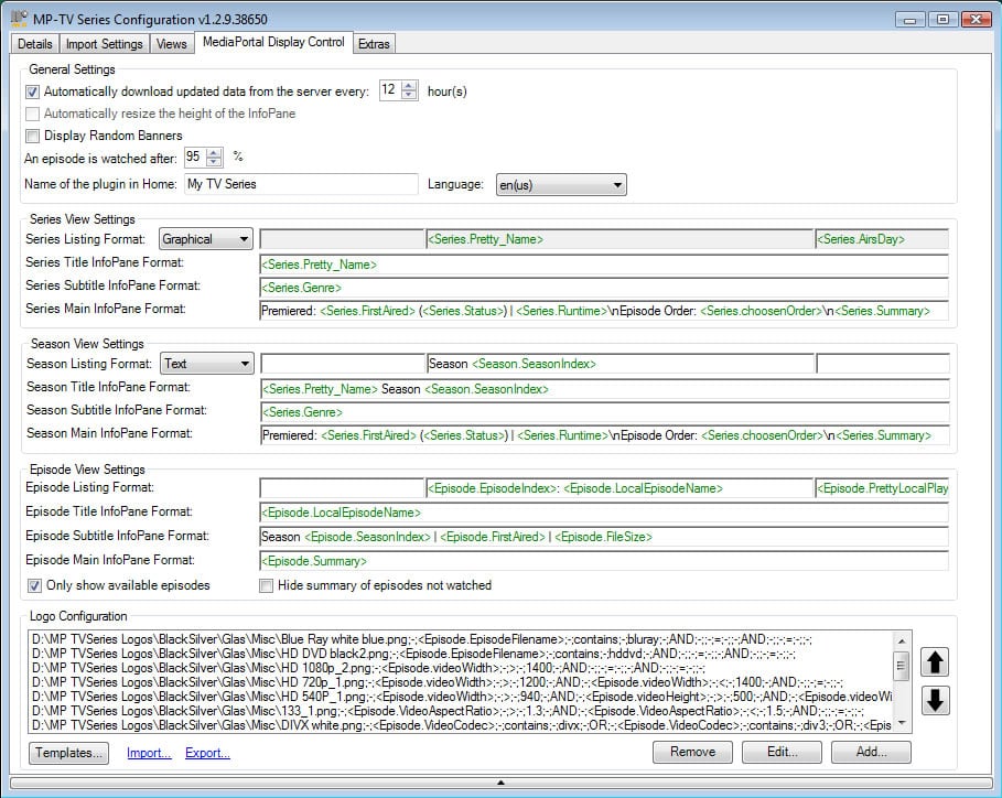
    But what you are talking about is actually present in the configuration and has nothing to do with the skin.. made a picture for you.. :p
     

    Attachments

    • tvseries_config_stuff.jpg
      tvseries_config_stuff.jpg
      228.9 KB

    Bobb25

    Portal Pro
    November 26, 2006
    232
    0
    Durban
    Home Country
    South Africa South Africa
    To be honest, the episode thumbs are not that important to me. My only issue, is that they show as little icons next to the episode name, but you cant actually see what they are... in fact, i would prefer it if they didnt show at all. I suppose i could just go and delete all the thumbs, but it only goes and re-downloads the entire lot when i do a full import :/ maybe an option in the My-TVseries to NOT download thumbs? (Inker? :) )

    If thumbs are not displayed, then the logos are perfect where they are. Just those 3 icons to lose.

    PS. I like the fade for light fanart, is that standard at the moment? I had a VERY light fan art for desperate housewives which i made, and i struggled to read the menu.
    PPS. The fan art for Weeds is more riveting than the actual show imho :)

    EDIT: Your XML is different to mine... yours shows the file size and date and season whereas mine shows the series type... i think i prefer yours to be honest. Only thing i would do, is on the left above the logos have it display the episode number, so like: 2x11 Yeah, Just Like Tomatoes

    What do you think?
    If you'd take a closer look at my screenshot in my last post you would see the episode thumbs will be removed in my next version. Your weeds comment doesn't even make sense.

    Of course my XML is different than yours because I'm doing the XML for the tvseries plugin. :)
    But what you are talking about is actually present in the configuration and has nothing to do with the skin.. made a picture for you.. :p

    Lol. I usually just skip over all that stuff in the setup since its greek to me :p But i will take a look and fiddle now.

    With regards to the weeds comment, i meant that i think the series itself is pretty crap, but the chick in the series is good eye candy :)
     

    Harley

    Retired Team Member
  • Premium Supporter
  • May 7, 2004
    2,053
    1,993
    Germany
    Home Country
    Germany Germany
    Well it's time to do some constructive critics to this skin. There is some bugs and also some aesthetics than can be enhaced:

    1) Icons in basic home screen. The colors should be more simmilar beetwen them, right now it appears to have two groups of icons: Pictures and Music, and in other side, Plugins, Video and TV. The black parts should be in the same gamma and also may be that the metallic parts are too bright.

    2) There is no now playing overlay in basic home screen, so please, consider this: https://forum.team-mediaportal.com/showpost.php?p=178826&postcount=141 and also this: https://forum.team-mediaportal.com/showpost.php?p=178826&postcount=141

    3) Top bar. The selected button is not very visible, it's hard sometimes to identify what button is selected.

    4) News reader. There is some overlapping bugs with the title in top right zone. Also, the news content overlap the white zone to the bottom and it's hard to read it.

    5) Full screen OSD when watching movies. I think that the right approach to this design is something like Replicant skin, your info covers almost all the screen and it's not very practical. I think that it could be more useful only a little top bar, and also a horizontal semitransparent area at the bottom. Also, when i pause the movie i like to see at the top the progress bar showing the remaining time and other info (like in Replicant skin)

    6) Home screen (not the basic one) the crystal selector should be bigger (horizontally) to allow wider text. Also all plugins have the same picture (bug). Also please, consider to use here the icons that i've sent you i think that they are like the basic home screen ones and fits in a better way the aesthetics of this skin. Or change the basic home screen to fit that pictures that you've used in home screen...

    7) Worldmap plugin doesn't work.

    8) File explorer plugin have some bugs (the list is displaced to the right)

    9) Web browser plugin. Please consider to have the top bar with simmilar design than the used in basic home screen

    10) My lyrics. Please consider to have a button link from the Now playing screen (like in Replicant skin) it's very useful and also, a button link to current playlist from this screen.

    11) Fonts. Font used as title for Movies, when viewing in filmstrip mode, is very small and may be it's to low. I think that it could be better to use a bold font, and also, move the texts a bit to the top (near the bottom of the video case icon)

    12) In Now playing screen, there is a small speaker at the bottom, please consider to use here the black speaker that i've sent you (that fits better with other icons in the bottom right)

    13) White zone at bottom of most screens. I¡m not sure about this colour/desing. I think that you could work a little more improving the bottom zone to keep the same high level of design as in other screens and gfxs..


    I agree with others who thinks that this is a fantastic skin, you are doing a great job, but it still can be better.I hope that my critics don't bother you a lot.

    thanks again, and best regards...


    1: the icons in basichomescreen are real pictures, you know. You and many other people have mention to use this instead of the icons i have draw. I have do a complete cleaning of this pictures to get them in nearly same style.
    But it is allways a problem if you use real pictures to get them in absolute same style. The icons i have draw self ahve not such problems because i can draw the with same textures and lights and shadows.

    2: ..there is a new nowplaying overlay in basichomescreen, please delete your "cachefolder".

    3:..yes you right, will overwork the gfx, perhaps with some blue glow.

    4, 7, 8, 9, 10: This skin supports at the moment not all avaible plugins, but would be nice to add them.
    So i calling all plugin programmers and the community, to do the xml´s for not working plugins.

    Thats the way "opensource" works ;)

    5: ..many user have mention that they will have bigger osd´s and bigger text, so i have do it.
    It´s allways a problem to do it right for all.

    6:..yes Homescreen is not in final stage at the moment, all is working but the design Layout and gfx are not final done at the moment. I´m working on a better one.

    11: ..yes will make the font bigger and on other place.

    12: ..yes good idea , will do it.

    ..many thanks for all your comments.

    Greetings Harley
     

    ronsonol

    MP Donator
  • Premium Supporter
  • April 2, 2007
    178
    23
    Kingston
    Home Country
    Canada Canada
    And those three icons always at the bottom of the screen, can never navigate to them anyways with remote...only using mouse it seems.

    ..the icons are a part of the topbar you can easy navigate from topbarbutton shutdown to the icons.

    But the icons are more for mouseusers, if you use a remote you can go direkt to pictures, tv and music so no need to navigate to them.

    Thanks Harley, it works well now that I understand how to get to those icons using the remote.

    Regarding the focus of My Pictures in the basichome screen, how does one change it to something else? Everything I start or go back to the home screen My Pictures icon is in focus - I'd prefer somethng else, as I do not even use MP for photos.

    Many thanks for a great skin.
     

    krl69

    Portal Pro
    October 12, 2006
    86
    2
    57
    Great skin! Looks even better than XBMC's Vision skin...

    One request though:

    Is it possible to change the default plugin picture in home screen(not basic)? TVseries, Play DVD and Trailers should have their own home screen arts when they are configured "listed in Home". All selections should have different pictures - much easier to keep them apart. :)

    And possible a bug:

    When starting MP, menu selections label are hidden. If I scroll up or down and back again, the label/text is back.

    Thanx again!

    KRL

    The highlighted selection label text are hidden... a little more precise! :)
     

    patricon

    Portal Pro
    June 16, 2007
    543
    18
    Home Country
    Spain Spain
    1) Icons in basic home screen. The colors should be more simmilar beetwen them, right now it appears to have two groups of icons: Pictures and Music, and in other side, Plugins, Video and TV. The black parts should be in the same gamma and also may be that the metallic parts are too bright.

    I was talking about the light and colours gamma, i'm sorry if i have not explained very well my idea, but sometimes my english is not good enought to express all my ideas.... But forget about it, tomorrow when i have a bit of time i'll send you corrected icons using the same palette,

    regards,;)
     

    Users who are viewing this thread

    Top Bottom