4:3 skin ::: aMPed 2.0 final (2 Viewers)

jamiro

Portal Pro
July 14, 2007
117
8
52
Home Country
Well I installed it and love it so far! A quality skin perfect for 4:3 with lots of support for the major plugins. Keep up the great work guys.

I don't have to look at Mepo anymore!

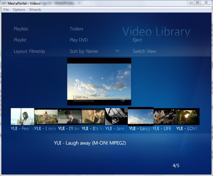
Seriously though this is really nice, I got rid of the overlay background for the darker backdrop and it is sweet, the lighter background made the text difficult to read on my crappy TV.

I love the idea of the games menu, but I am not using it because I would like to get rid of the plugins menu and replace it with the games menu, can I remove the plugins menu?

A great improvement would be a GUI to edit the extra menus i.e games and watch.

Thanks for this one.
 

Dadeo

Docs Group Manager
  • Premium Supporter
  • November 26, 2006
    5,340
    3,321
    Himalayas, India
    Home Country
    Canada Canada
    Just noticed another bug or missing feature with the labels. Again, in My Videos, if using another view other than list view, there's no blue tint color on the label if the selected video has been watched before.

    First off thanks a lot for testing this out for us.

    Sorry it took a while for me to get back to you, I got stuck reloading and reconfiguring MP to install TVServer and it took me 8 hours to get it going and it's still not perfect!

    Yes, you are correct, there's no blue tint color on the label if the selected video has been watched before. I cannot find a way to get it to work unless I use the hardcoded feature of MP that puts the text below each icon, which looks really crappy in large fonts, (even in small fonts imo) and you only get to see a few characters!

    What font size are you using? I can add it back in on the filmstrip view for you, and I can totally redesign the icons view to show it again - would you prefer less icons or smaller ones :)! That would only work for shares view though since in Titles the text is usually too long to be of any relevance below an icon.

    I am still hunting for a way to make it work on the existing selected titles but I don't have a lot of hope.

    However, I am curious - why are you using other layouts in Shares views? Since you don't have IMDB info, you would not have a cover would you? Sorry if I am being dense! After 8 hours of hell, my brain is a bit sluggish!

    I'm also curious why Shares view? Is that just to save the time downloading and maintaining the database and all IMDB info (I can understand that!).
     

    joz

    Portal Pro
    March 17, 2008
    1,353
    306
    Home Country
    Netherlands Netherlands
    Hey Jamiro,

    Thanks for all the praise! We put a lot of effort into it, good to hear.

    The GUI tool you're suggesting can of course be created. However C# is not my field of expertise (although I do know stuff) and would be the best environment to set it up (from my perspective). I'll have to take a look at the source of other menu generators out there (such as x-factor for example) and see if I can re-use some of that code.
    This will not be something you'll be seeing soon though, most likely.

    In the meantime, have you checked this page;
    Customizing basic menus - aMPed - General discussion | Google Groups
    It explains how to edit the menus, you'd have to do it by hand though, dunno if you feel up to that.

    I could also create a webpage for this purpose (since I'm a webdev this comes more natural to me atm) but I'd rather not. A standalone tool is more suited for this purpose.
     

    Dadeo

    Docs Group Manager
  • Premium Supporter
  • November 26, 2006
    5,340
    3,321
    Himalayas, India
    Home Country
    Canada Canada
    jamiro About the background - how did you remove it? If you just deleted or renamed it, then it won't diffuse the fanart in TVSeries. Just a tip, you might like that even better!

    Please keep the feedback coming we really want to know what our users want.

    Just curious, which font size did you pick?
     

    jamiro

    Portal Pro
    July 14, 2007
    117
    8
    52
    Home Country
    I am using the default font size, which I think the Amped manual said was 14, I have not got around to trying 18 yet, will do when I have more spare time. By the way this is a great feature, I usually have to edit the fontsxml to make these changes, but having 3 options already done for me is a nice touch.

    For the background I just renamed the overlay file, the fanart in moving pictures looks OK to me, again when I have some time I might follow the instructions in the manual to get it to diffuse, but at the moment i don't really know what I'm missing. :D

    As for the menu's I would like to do away with the plugins menu in home. I do not use the basic home menu which your manual gives instructions on editing. The only things I have in the plugins menu are games, so I would like to do away with the plugins menu and replace it with your sweet games menu. Anyone know how to switch or edit plugins menu item out? I have been hunting through some of the xml files, but I am at a loss. Briefly tried the Aeon menu editor, but it just did not work.

    Cheers
     

    Dadeo

    Docs Group Manager
  • Premium Supporter
  • November 26, 2006
    5,340
    3,321
    Himalayas, India
    Home Country
    Canada Canada
    ...the fanart in moving pictures looks OK to me
    Moving Pictures fanart is not diffused, TVSeries fanart should look the same now that you renamed background-overlay (i.e. not diffused)

    As for the menu's I would like to do away with the plugins menu in home. I do not use the basic home menu which your manual gives instructions on editing. The only things I have in the plugins menu are games, so I would like to do away with the plugins menu and replace it with your sweet games menu. Anyone know how to switch or edit plugins menu item out? Briefly tried the Aeon menu editor, but it just did not work.
    Cheers

    In MP Configuration there is a builtin plugin called Home where you can edit the way the MyHome menu displays. (order of items for one thing) One of the options is to turn off MyPlugins. However, once you have done that, everything that was under MyPlugins moves to the MyHome Menu.

    I haven't ever done that, so I can't help a lot, but that should head you in the right direction. I think if you tinker around you might get what you want.

    You can get a lot more control if you decide to use BasicHome!
     

    Migue

    Retired Team Member
  • Premium Supporter
  • January 27, 2006
    381
    305
    Florida
    Just noticed another bug or missing feature with the labels. Again, in My Videos, if using another view other than list view, there's no blue tint color on the label if the selected video has been watched before.

    First off thanks a lot for testing this out for us.

    Sorry it took a while for me to get back to you, I got stuck reloading and reconfiguring MP to install TVServer and it took me 8 hours to get it going and it's still not perfect!

    Yes, you are correct, there's no blue tint color on the label if the selected video has been watched before. I cannot find a way to get it to work unless I use the hardcoded feature of MP that puts the text below each icon, which looks really crappy in large fonts, (even in small fonts imo) and you only get to see a few characters!

    What font size are you using? I can add it back in on the filmstrip view for you, and I can totally redesign the icons view to show it again - would you prefer less icons or smaller ones :)! That would only work for shares view though since in Titles the text is usually too long to be of any relevance below an icon.

    I am still hunting for a way to make it work on the existing selected titles but I don't have a lot of hope.

    However, I am curious - why are you using other layouts in Shares views? Since you don't have IMDB info, you would not have a cover would you? Sorry if I am being dense! After 8 hours of hell, my brain is a bit sluggish!

    I'm also curious why Shares view? Is that just to save the time downloading and maintaining the database and all IMDB info (I can understand that!).

    I use the default font (12pt I think).
    The icons are already small enough now so I guess fewer per row would be better.
    While I don't have covers I do have thumbnails for my files (with this patch: https://forum.team-mediaportal.com/...st-here-48/my-videos-thumbnail-support-58027/).
    And as for why I use Share view well partly because of laziness and mostly because I don't have movies on My videos, I have Anime videos, music videos, game trailers, movie trailers, game speedrun videos, home videos, etc, all of which of course don't have imdb data and I don't see the need to enter random stuff of them in the database.
     

    Dadeo

    Docs Group Manager
  • Premium Supporter
  • November 26, 2006
    5,340
    3,321
    Himalayas, India
    Home Country
    Canada Canada
    Thanks for the info Migue. I am trying to figure out what to put on the Shares view. I also use it sometimes for videos that don't have IMDB info. But I never have thumbnails, or descriptions, etc. So I just use the list view. It's always interesting to hear the unique ways MP can be used. So I am inspired to try and make that Shares view something more useful, since I can't see much use for it as it is!

    In order to design something that would work for your case, and hopefully others, I need to know what data you would like on the screen. For example:
    Descriptions, Cast, Length, etc.

    I think our Details ticker (the blue text scrolling across the bottom) is probably useless on that screen since none of the data is available. I also image the thumbnails and filmstrips don't even work that well for you since they are designed for cover thumbs. Since I cannot imagine a case where anyone would have covers in the shares view perhaps I can make the icons and filmstrip suit a video thumbnail instead!

    If you could post me a screenshot of what you would like it to look like, or what it looks like in Blue3 that works for you, I can try to duplicate it for you. Just give me your wish list and I'll see what I can come up with. If it works we can put it in the final version of 2.0!
     

    Migue

    Retired Team Member
  • Premium Supporter
  • January 27, 2006
    381
    305
    Florida
    I guess what I want is sort of a combination of these 3 screenshots. In the first one I modified in myvideo.xml the line:
    <import>common.facade.video.xml</import>
    to
    <import>common.facade.pictures.xml</import>
    and also modified id 500 and 600 to include:
    <keepaspectratio>yes</keepaspectratio>
    <centered>yes</centered>
    and diffuse and flip to <texture> tag

    This way the image on the left pane isn't stretched but then the border makes it look kinda ugly so I guess maybe removing it?? so it looks like the third image (Vista MCE Skin).

    The second image is how it looks on aMPed 1.0 with the facade changed to pictures.
    I don't know if there's a way to have the labels under the icons with a smaller font than the label on top, since, in my case at least, I only need it to see if it's blue to know if I watched it. The best solution would of course be if the top label could be tinted blue then there's no need to show labels below the icons.

    I hope I made sense and thanks for hearing me out =)
     

    Attachments

    • amped 2 - icons.JPG
      amped 2 - icons.JPG
      97.7 KB
    • amped 1 - icons.JPG
      amped 1 - icons.JPG
      94.8 KB
    • vista mce - filmstrip.jpg
      vista mce - filmstrip.jpg
      100.6 KB

    Dadeo

    Docs Group Manager
  • Premium Supporter
  • November 26, 2006
    5,340
    3,321
    Himalayas, India
    Home Country
    Canada Canada
    I think I got what you mean. I agree the nicest would be to enable the titles to change color when watched, but so far I haven't had any luck with anything I have tried. My second choice would be to use a watched icon or something, but that has the same problem. MP does not give me any way to access the 'watched' code. You can only define "playedcolor" in lists.

    However, your screenshots gave me some ideas, so I'll have a go at it tomorrow. Am I correct in assuming that you do not need any data other than the filename? Is it OK if the text is very small since it is only indicating whether or not the file has been played?

    Finally, what is the usual size of the thumbs you create. Are they all close to the same size or resolution?

    Very clever using common.facade.pictures by the way!
     

    Users who are viewing this thread

    Top Bottom