4:3 skin ::: aMPed 2.0 final (2 Viewers)

Dadeo

Docs Group Manager
  • Premium Supporter
  • November 26, 2006
    5,340
    3,321
    Himalayas, India
    Home Country
    Canada Canada
    Hey Migue, thanks for the feeback. Great you are fixing the thumbnails for playlist. Can you fix a few other things as well? LOL! There are other places where MP does not support thumbnails, current file tags, common tags like center, etc. Sorry, skinner frustration!

    1. How are you switching to windowed mode? I'm not sure why this is not working, I may have to ask Joz the tech guru! I always resize my screenshots, so it would be nice to have this work so I don't have to! It used to crash MP on me so I stopped using it.

    2. Long titles - yeah, it's hard to find a height that works in all font sizes. I sized them for 18pt selfishly cuz that's what I use. But I think I can set the height in references so it will auto adjust for the font size. So thanks a lot for the idea! Will take some work, so be patient. I want to put as much as possible in references (defaults), but I can't do that until all the screens are redesigned since some of the 2.0 screens use the defaults in references and wont' work if I change them.

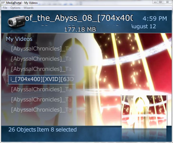
    3. I removed the icons from list controls because they are too small to see on smaller screens. I don't like to waste space with duplicate data, and I wanted to make the graphics as visible as possible (your anime thumbs look real nice!) hence filesize and other data from the lists is shown larger on the screen. File size should be at the top under the title/rating stars, and I will check why it is not! Actually are the rating stars even relevant on that screen? If you are not using IMDB then they will never display anything.

    The reason it doesn't look like it is scrolling is because we have set it that way so your highlighted item is always in the center of the screen until you get to the top or bottom of the list. This is a design feature :) I guess you are visually oriented since the thumbs mean more to you than the text which changes as you scroll! LOL, I'm just teasing you! It is a big change and a lot of new features will take some getting used to. Try it out for a while and see. I'll think about it and see if I can come up with something. If you think of some other way that might work really well, let me know.

    4. The text below icons only appears in the Video Shares Thumbnails view. It is a unique screen, so I can alter it however you like. But how? If you don't think darker background, then what? Make the unfocussed icons less transparent? If you want to try that, go to common.facade.video (not video.title) and in the section on thumbnails change the <unfocusedAlpha> tag from 120 to something higher. 200 is totally opaque I think. Try that, it will also make the text of unfocussed items brighter. I can always change the text colour to something brighter. Hmmm, I usually use golden yellow for played items! And I can change the unplayed item text to white if that will help (it is off white at present). Just let me know what you think works and I can put that in SVN.
     

    Migue

    Retired Team Member
  • Premium Supporter
  • January 27, 2006
    381
    305
    Florida
    OK I did the patch for thumbs on playlist (just 2 lines of code needed). Could you elaborate on the other stuff about thumbs (in a PM or other thread possibly so as not to go offtopic here)?

    As for the skin:

    1. I use Alt-Enter to switch between windowed and fullscreen. For some reason it does not work on aMPed 2.1.

    2. Thanks. I changed the font to 18 for now and no cutoff =).

    3. OK, here's a video hopefully showing what I mean: mp amped 21 capture.avi - Windows Live - I don't know if it's possible to do like the home screen where the animation is smoother or maybe change the color of the focus rectangle while it is switching item. Still not sure if it will help at all. BTW I love the new listview mode and I think I'll use it exclusively except for this minor issue with long titles.

    4. Setting unfocusedAlpha to 200 helped a lot, thanks! Now, if the background can be made darker but only on icon and big icon view and not on list view then even better.

    Another issue I noticed (unless it is intended) is the topbar always showing on the home screen.
     

    joz

    Portal Pro
    March 17, 2008
    1,353
    306
    Home Country
    Netherlands Netherlands
    Hey all aMPed users,

    as you probably have noticed, I'm not as active any more maintaining this skin. It has to do with lots of personal reasons, which I won't bother you guys with.

    So therefore we are still actively looking for some more help from the community!
    Dadeo has been digging thru XMLs and doing his magic on them but maintaining a whole skin is a lot. So therefore it would be awesome if more users jump in, to develop XMLs for the plugins that need development!

    You know how to contact us if you need us to provide any more information.

    For now users can just upload XMLs and screeenshots they have created/tweaked/bugfixed here as a post on this thread.
    Thanks guys! Already for all the testing and patients :)
     

    Dadeo

    Docs Group Manager
  • Premium Supporter
  • November 26, 2006
    5,340
    3,321
    Himalayas, India
    Home Country
    Canada Canada
    Migue I'll PM you about thumbs (might take a while as I did not record where they don't work)
    1. Alt+Enter works here. I tried on +10 screens and I cannot duplicate your problem. It works for you in other skins? Just not aMPed? Does anyone else have this problem?
    2. I will still work on fixing the height for titles for all font sizes
    3. Thanks for the video. Were you scrolling irregularly? Cuz the scrolling is kinda jerky which it is not for me. There are a few issues:
      • Your long titles all start with the same text, so the text visible on the screen doesn't change. This likely only happens in rare cases for most users. Don't know what to do about that! You could always rename the files, which would look much better! But I still think you are right and we can find a better way to show the highlighted item. I wish there was a way to number the items on the list, then you would see 1,2,3... but I don't know if that is possible or how to do it. TVSeries shows Episode Numbers but that is coded in the plugin. I'll try and think up some creative solution!
      • animations - On the backgrounds? They should be fading in and out like the images on the home screen. I'll have to work on that because it is a problem everywhere and I want them to fade in and out like fanart does in MovingPictures and TVSeries.
      • The home screen does not use list, it uses Menu which is only available on the home screen. But I will see if I can duplicate the effect. It's a good idea to have the menu focus (rectangle) change colour, or fade in when in focus. Thanks. I'll see what I can do.
      • In the video you posted, all your text is blue which means they are played files? If you are scrolling through files that have NOT been played, the text will change colour (brighter white when highlighted). However, I have no control over the color of played text when in focus/nofocus. If you see something you like in another skin, please let me know and I can try and duplicate it.
    4. Yes I can darken the background just on Icons view. In all Icons views everywhere? Or just Icons on the video thumbnails shares view? If you mean Icons Views everywhere, then I would like to see if everyone else agrees before I change it globally. I will change the played colour to yellow like in other screens, that should help some more.
    Topbar always showing on Home Screen??? MyHome or BasicHome? If you mean the four icons on MyHome that is not a topbar and those always showed in all versions of aMPed and is intended. If not, can you be more specific or send me a screenshot?

    ************************************************ (automerged double post)
    Migue -
    1. Changed list view a bit so unfocused text is dim (if you like this I think I will do this everywhere)
    2. Changed played colour to yellow
    3. Fixed Big Icons size
    4. Darkened Background in Icons view a bit - is it enough, or too much?
    5. Added Filesize at top, removed Rating Stars.

    Does this help? I'm still working on the fading for backgrounds, it's tricky!
     

    Migue

    Retired Team Member
  • Premium Supporter
  • January 27, 2006
    381
    305
    Florida
    Dadeo
    1. Yep Alt+Enter works on other skins including aMPed 2.0 just not on 2.1. Curiously it happens on MP 1.0.2, on the latest SVN it works fine.

    3. The jerky scrolling was probably due to the screen capture program so no worries.

    So a quick patch and I added the #selectedindex property and edited common.window.bars (don't know if it's the correct place, because I get the label in incorrect areas such as myhome) and got the result on the first screenshot. I think this perfectly addresses the long title issue.

    As for the second post:
    Yep everything looks perfect, the dimmed text, the filesize, the darkened backgrounds and the yellow played text (filmstrip is still showing blue text though).

    2nd screenshot shows the topbar always visible on myhome.
     

    Attachments

    • amped 21 itemindex.JPG
      amped 21 itemindex.JPG
      83.7 KB
    • amped21 myhome.JPG
      amped21 myhome.JPG
      79.1 KB

    Dadeo

    Docs Group Manager
  • Premium Supporter
  • November 26, 2006
    5,340
    3,321
    Himalayas, India
    Home Country
    Canada Canada
    1. I have no clue, if you figure out why it works in SVN and not 1.0.2 I will fix it.
    2. Where did you find #selectedindex??? It is not documented anywhere I can find. And it does not work for me! Did you mean you did a patch to get it to work? Common.window.bars is not the correct place, and I don't like the long display with all the text. Is there any way to just get the number without the text? (I can add the revelant text in the skin file). Even better would be if we could add just the number to the listcontrol! If not, I think this issue only applies to the MyVideos Shares view, so I am inclined to add it only to that screen. On many screens it will conflict with and overlay other data in that position.
    3. I only tried the yellow played colour to see if you like it. I will turn it on everywhere, including filmstrips.
    4. In My Home it looks like you have the RSSTicker turned on but have not entered any data. Try disabling RSSTicker or entering data for it and see if that fixes the topbar. However, I did accidentally have autohide turned off so I corrected that, thanks!
    You really don't mind your long dates scrolling? I just edit the strings_en xml to use abbreviated forms and I like it MUCH better.
     

    Migue

    Retired Team Member
  • Premium Supporter
  • January 27, 2006
    381
    305
    Florida
    Yes I added the #selectedindex in a patch, and it only returns the number. The other text and position I hardcoded to the xml just to quickly see how it can look; I actually waned to put it below the object count but I guess the posY I used was too high.

    The RSS ticker without data and the long date is only because those screenshots were taken with SVN which I haven't configured fully.
     

    Dadeo

    Docs Group Manager
  • Premium Supporter
  • November 26, 2006
    5,340
    3,321
    Himalayas, India
    Home Country
    Canada Canada
    Ah, you are using latest SVN! Topbar used to be disabled in MyHome but I believe it was turned on in 1.1.0 so it likely needs the autohide on. I put a corrected version in SVN. Check if that fixes it.

    Good to know aMPed 2.1 works with MP1.1.0, thanks for testing that.

    I also added the played colour to filmstrips, but just in MyVideos Thumbnails Shares layout for now.

    And I'll PM you about #selectedindex, that's more of a development issue.
     

    Eyep0p

    Portal Pro
    June 24, 2007
    146
    3
    Home Country
    Germany Germany
    hi!
    why do you call it a 4:3 skin??? 720x576 is 5:4. Since i am using the 720-resolution all 4:3 videos have black borders on top and bottom. and i found a new bug. ;)
     

    Attachments

    • tvseries.jpg
      tvseries.jpg
      75.8 KB

    joz

    Portal Pro
    March 17, 2008
    1,353
    306
    Home Country
    Netherlands Netherlands
    That was on my mind too Eyep0p when I started this project.

    You're right, normal TVs are not 4:3 but 5:4, although they are sold as 4:3... Blue3 (not the wide one) has the exact same resolution, as well as I guess other MP 4:3 skins
    So what is your problem exactly? 720x576 is the correct PAL resolution.

    What bug do you refer to?
     

    Users who are viewing this thread

    Top Bottom