About the X-Factor Skin (R479) (1 Viewer)

Status
Not open for further replies.

Imokles

MP Donator
  • Premium Supporter
  • April 27, 2009
    115
    14
    Home Country
    Germany Germany
    Hi Cul8er,

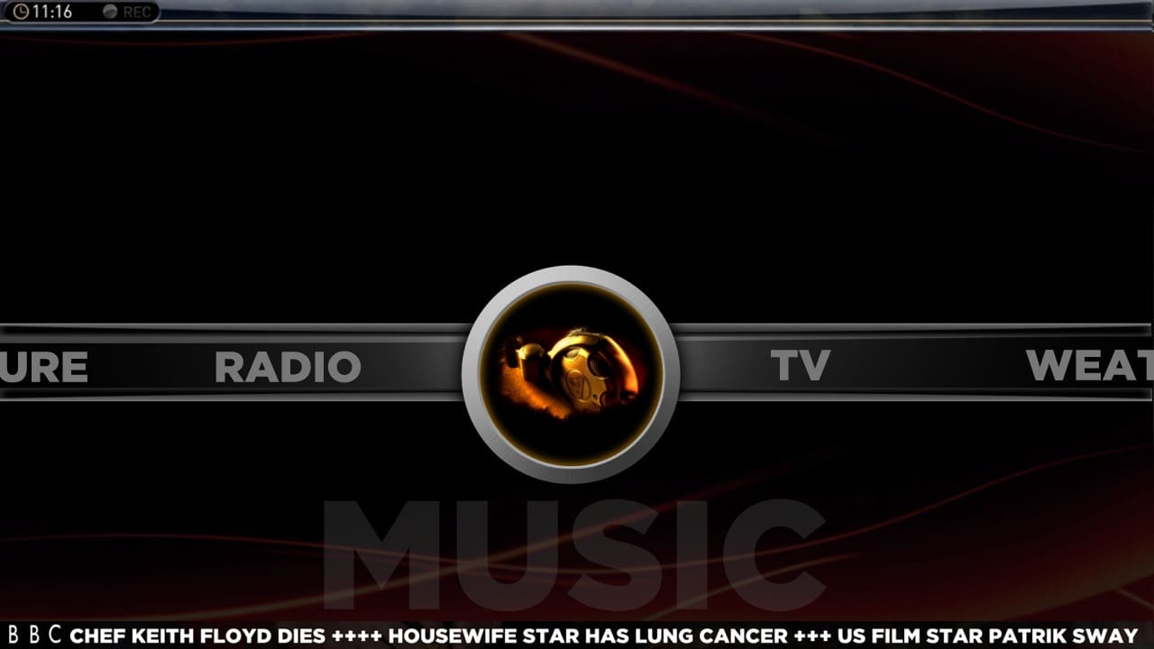
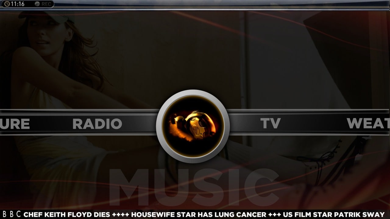
    I think the new menu looks great, very promising! :D a lot for the effort you put in this skin!

    I also think that you should add something to this new menu to make navigation more intuitive, maybe a visual indicator which directions can be chosen or even the names of the adjacent menu items in each of the four directions.

    Best regards
    Imokles
     

    zilexa

    Portal Pro
    October 22, 2008
    151
    6
    Home Country
    Netherlands Netherlands
    I have created a guide on how to customize you X-Factor basic home screen. It covers the following table of content:
    * Introduction
    * Details
    **Step 1 - Download and Install
    **Step 2 - Familiarize Screen Areas
    **Step 3 - Open Menu Editor
    **Step 4 - Change Main Menu Items
    **Step 5 - Add/Change Sub Menu Items
    **Step 6 - Customizing Menu And Sub Menu Backdrops
    **Step 7 - Customizing Item Image (Thumbnails)
    **Step 8 - Generate And Save
    **Step 9 - Select Menu And Display Options
    *A View To The Future

    Please let me know about errors, shortcoming and additional information.

    Click Here To View The Guide

    Fantastic!
    do have a suggestion, perhaps some explanation for the new people about the MultiImage possibilities.
    A No multiImage: provide a static path to an image
    B with multiimage: provide a path to the folder containing images (relative or static)

    multiimage per menu: provide B for the menu and the same path for every menu item


    @ Cul8er: I think you are a Terminator. You just can't be human.. :eek: you've created such a sophisticated skin and you are now even working on a completely new menu structure/navigation. :D:D
     

    cul8er

    Retired Team Member
  • Premium Supporter
  • August 31, 2006
    2,159
    2,679
    Home Country
    Sweden Sweden
    Hi,

    Thank you all for your feedback on the menu video. I have done some more work and now things look more like this.. what do you think? Better or worse?

    cheers
    cul8er
     

    Attachments

    • menu_ex1.jpg
      menu_ex1.jpg
      97.3 KB
    • menu_ex2.jpg
      menu_ex2.jpg
      118.4 KB

    ysmp

    Design Group
  • Team MediaPortal
  • May 17, 2008
    1,863
    744
    Seoul.
    Home Country
    South Korea South Korea
    Hi,

    Thank you all for your feedback on the menu video. I have done some more work and now things look more like this.. what do you think? Better or worse?

    cheers
    cul8er

    hi cul8er ! i like it ... look better ,
     

    orph

    MP Donator
  • Premium Supporter
  • March 8, 2009
    62
    5
    Home Country
    Canada Canada
    much better... as long as the sub-menus are clear and intuitive. But looking great!
     

    Imokles

    MP Donator
  • Premium Supporter
  • April 27, 2009
    115
    14
    Home Country
    Germany Germany
    Hi,

    Thank you all for your feedback on the menu video. I have done some more work and now things look more like this.. what do you think? Better or worse?

    cheers
    cul8er
    Definitely better! I think the first screenshot (with the generic background) looks even more stylish, but that's up to configuration, I suppose?
    How will you implement the sub-menu system? Horizontal or vertical?

    Btw: I also like the fact that the RSS feed has lost its yellow background.

    As always... :D
     

    cul8er

    Retired Team Member
  • Premium Supporter
  • August 31, 2006
    2,159
    2,679
    Home Country
    Sweden Sweden
    Hi Imokles,

    I'm not sure that I will use submenues;) but if you think it would be good and give some idea on where to put it and how you think it would look like please let me know. Right now it is a horizontal menu where all items are on that menu. The item in focus will turn from text into a picture and the large text below shows what menu is selected.

    cheers
    cul8er
     

    Imokles

    MP Donator
  • Premium Supporter
  • April 27, 2009
    115
    14
    Home Country
    Germany Germany
    Hi Imokles,

    I'm not sure that I will use submenues;) but if you think it would be good and give some idea on where to put it and how you think it would look like please let me know. Right now it is a horizontal menu where all items are on that menu. The item in focus will turn from text into a picture and the large text below shows what menu is selected.

    cheers
    cul8er

    I think you definitely should use submenus. The one reason I am not using the "Aeon style" menu at the moment is because I get totally lost in the long row of menu entries (I have about twenty including rarely used stuff like the menu selector, settings etc.).

    I personally like a combination of horizontal and vertical menus because I think this is more intuitive. I could think of two ways how submenus would fit here:
    • In-place expansion of the selected menu similar to how it is done in the basichome of the new "Monochrome 3.0" skin by Psycho Reptile.
    • Similar to the style you used in the first video you posted: Related menu entries would be accessible by up/ down. In this case arrows on the circle should indicate that there are entries to select. For the topmost entry, the up arrow would be hidden. For the lowest entry, the down arrow would be hidden. Left/ right will always bring you to the neighbor menus.
     

    ghanz

    Portal Pro
    September 18, 2007
    109
    2
    Ouderkerk
    Home Country
    Netherlands Netherlands
    Cul8er,

    You know I'm the biggest fan of X-factor, especially the vertical one, because it shows all possibilities with unmatched clarity. As much as I like the graphics on the new homescreen i would really mis the vertical submenus. I think it would be possible to create that vertical submenu border surrounding the new icon, while displaying the submenu items below and above the icons as a scrollist. In effect this would be a merge between a vertical and horizontal menu. Just a humble suggestion :)

    thanx for all the good work!
     
    Status
    Not open for further replies.

    Users who are viewing this thread

    Top Bottom