- January 5, 2010
- 63
- 5
Re: Now Playing Screen - All elements [ACTUAL - WIP]
Just tried it out.
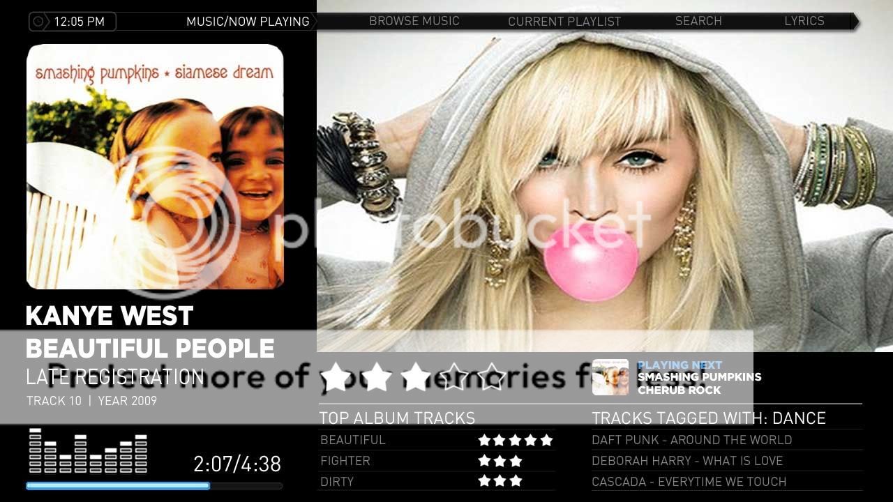
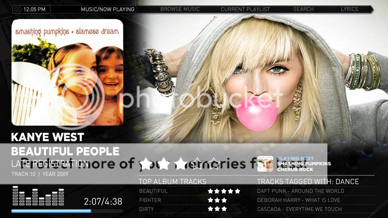
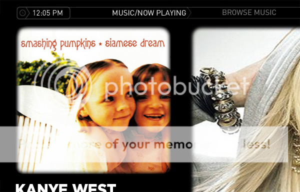
1) It really needs the rounded corners and the faded edges around the fanart.
2) The second column on the right (in your picture its about vocalists and stuff) does not appear for me.
3) I dont have any rating stars appearing.......(EDIT: fixed)
4) The information on the left about the track could be organized a little better.
5) The Track Progress time / Track total Time are too big and arent lined up right on mine. The fonts generally dont look right on mine for some reason too... could be my fault.
I'm not trying to bash you, im just saying what would make it better. Its constructive! This is going in the right direction, keep it up!
EDIT: these issues are appearing on my 1080p tv.
EDIT2: instead of the flyout 'go to current playlist button' , you could put a static button over on the right bottom corner instead of having that vocalists column... just a thought
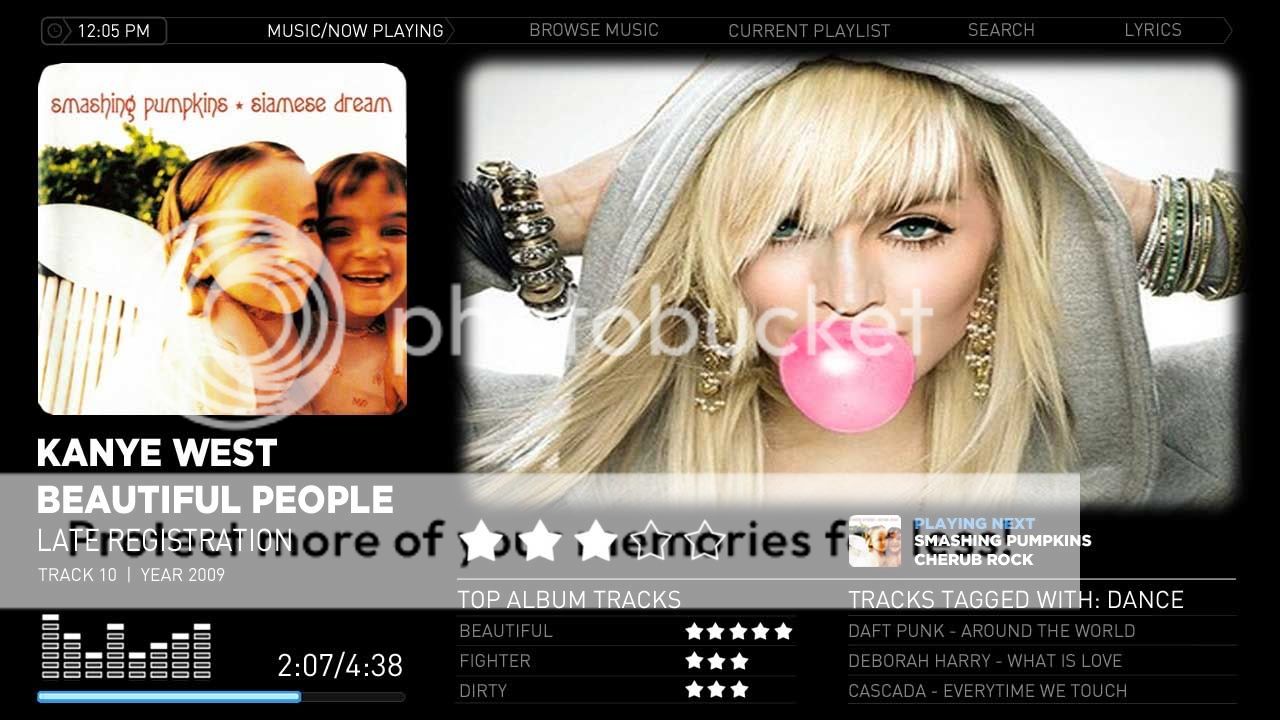
EDIT3: heres a black background i made with faded edges.

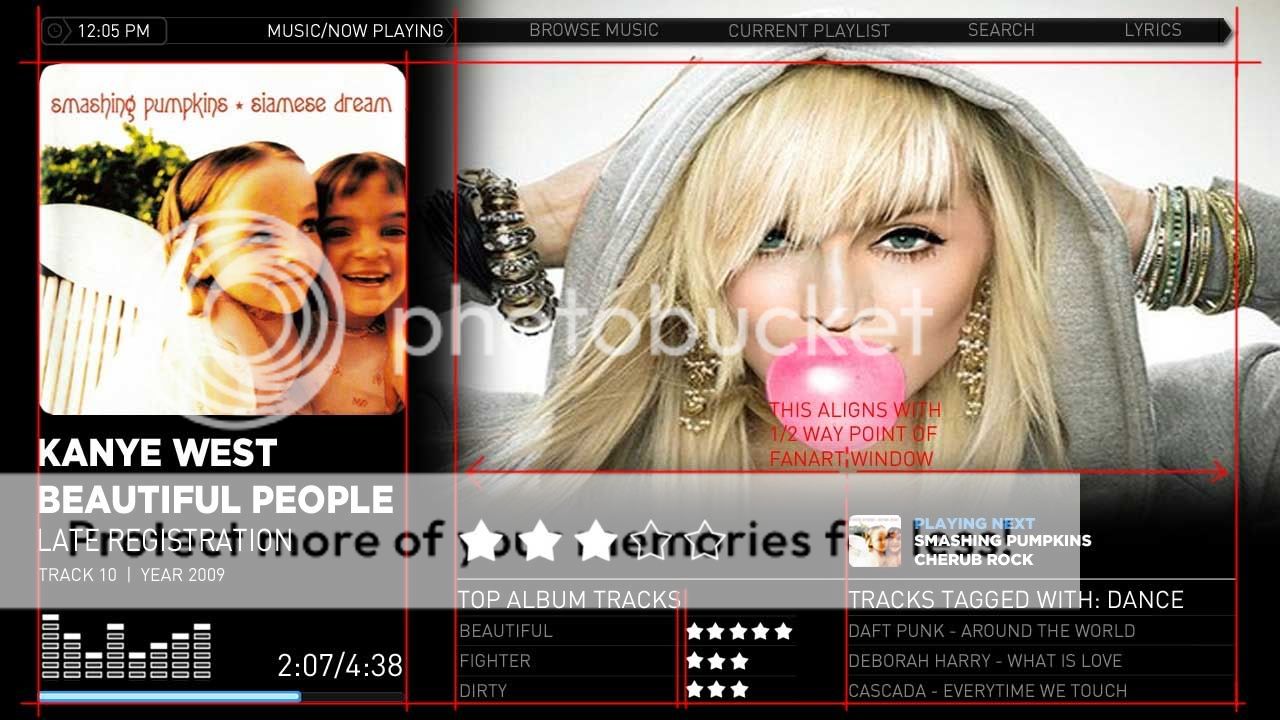
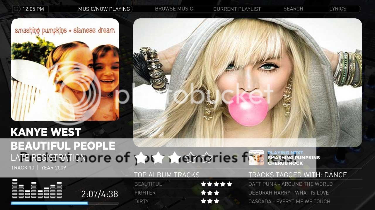
Ok, there is shed load of possible layouts here and all as mockups, I have full screen fanart and a version using the original backdrop (in the streamedmp svn).
Here are the xmls files for the black background version, this is very much work in progress and me and kiwi are working on this, but this is something that that can be installed and tested, and viewed in the flesh. I have tested on 1280x720 on my laptop and on a full HD system but there may be scaling issues, would be greatful if these are reported.
Please backup you current versions of the files...copy the contents of the zip into the StreamedMP skin directory.
Fanart Handler is required and can be found here Downloads - fanart-handler - Project Hosting on Google Code
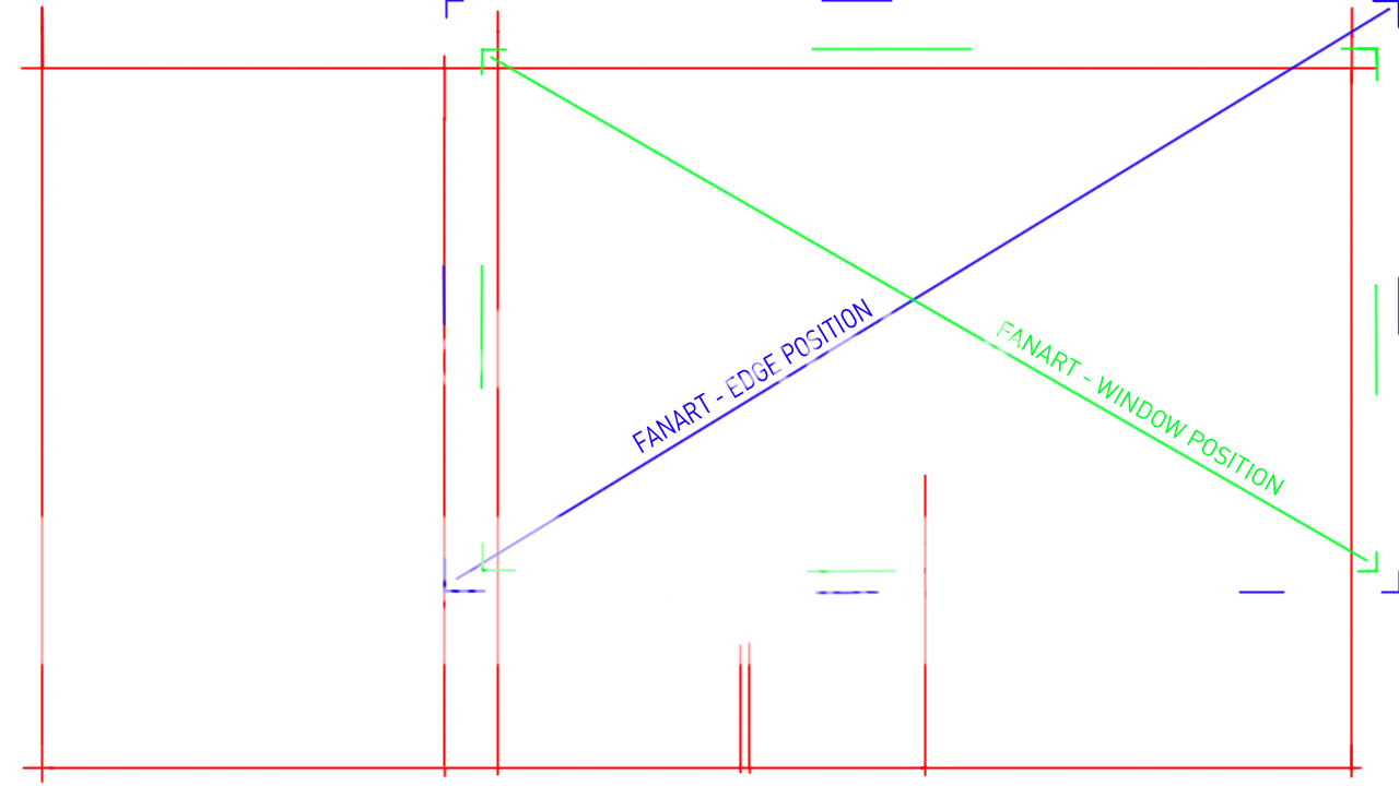
Problem reports are welcome....we are working on the various masks for fading, rounded corners etc and also looking at a new analog VU.
Have fun
Cheers
EDIT: The menu is animated and pops out as an extension to the topbar, hit up arrow from either of the list controls
Just tried it out.
1) It really needs the rounded corners and the faded edges around the fanart.
2) The second column on the right (in your picture its about vocalists and stuff) does not appear for me.
3) I dont have any rating stars appearing.......(EDIT: fixed)
4) The information on the left about the track could be organized a little better.
5) The Track Progress time / Track total Time are too big and arent lined up right on mine. The fonts generally dont look right on mine for some reason too... could be my fault.
I'm not trying to bash you, im just saying what would make it better. Its constructive! This is going in the right direction, keep it up!
EDIT: these issues are appearing on my 1080p tv.
EDIT2: instead of the flyout 'go to current playlist button' , you could put a static button over on the right bottom corner instead of having that vocalists column... just a thought
EDIT3: heres a black background i made with faded edges.
 New Zealand