Now Playing Screen - All elements [SUGGESTIONS] (4 Viewers)

kiwijunglist

Super Moderator
  • Team MediaPortal
  • June 10, 2008
    6,746
    1,751
    New Zealand
    Home Country
    New Zealand New Zealand
    If you read the post, there will be 3 versions.

    (1) Fullscreen Fanart

    Basically a minimalistic version with fullscreen fanart, very similar or exactly the same as the first pic. This is the easiest screen to make. It will look very close to this pic.

    52932d1262906891-streamed-mp-community-mods-bug-fixes-muiscnowplaying.jpg


    (2) Windowed Fanart - Version 1

    A fairly minimalistic version with non fullscreen fanart. This is because if you look in the artist thumbs directory you will see that most of the thumbs are too low resolution to be dispalyed fullscreen. This screen does not have to support all the skin elements so hopefulyl wont look cluttered. I have already done some work on this screen, it will probably look something like the image below.

    mod09.jpg


    Ideally I'd like to move all the extra stuff to a pop out side menu (see below), however it currently isn't possible unless a programmer rewrites the nowplaying plugin code.

    example-sidemenu.jpg


    (3) Windowed Fanart - Version 2

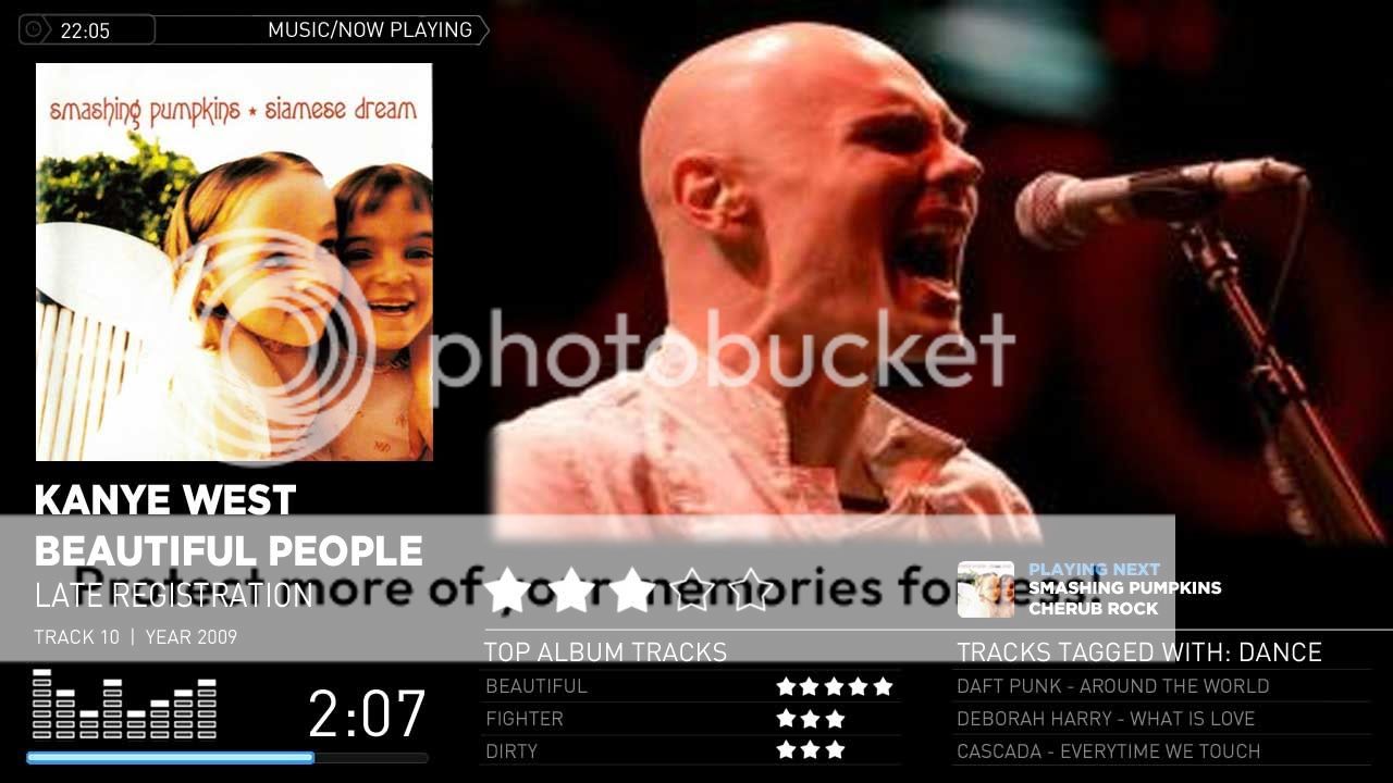
    This version has to support all the default skin elements, and might end up being the default now playing fanart screen. It's always gonna look cluttered, but I'm trying to find the best way that it doesn't look too cluttered, this is the hard one to design and why i made this thread. It will look something like the pic below and has to include all the below elements. (eg. track list , equaliser etc..)

    Now-Playing-Mod22d.gif


    I think the idea behing the mod is great, however I really dislike the "fading" effect used with the fanart. I personaly would really prefer some kind of fixed place or frame were the image would be shown. There is already quite a lot of information on screen and this combined with a very busy background (the soundboard) makes it a bit cluttered up I think. I hope you understand what I mean and please don't feel offended because that was certainly not my intent, thanks for all your effort!

    No problems, I really want ideas to try. I will post a few examples with your suggestion of a fully black background, and I'll post you a sample without any fading and we can see what it looks like!

    Now-Playing-Mod22d-1.jpg

    Now-Playing-Mod22e.jpg

    Now-Playing-Mod22f.jpg

    Now-Playing-Mod22g.jpg


    Now-Playing-Mod22h.jpg


    I think you are right, a plain black background helps a lot with the clutter!
     

    adam_purkis

    Portal Pro
    May 10, 2008
    120
    0
    Home Country
    United Kingdom United Kingdom
    yeah i like your new ones there, the first one with a bit of fade but no studio equipment in it is probably my favourite for that style
     

    kiwijunglist

    Super Moderator
  • Team MediaPortal
  • June 10, 2008
    6,746
    1,751
    New Zealand
    Home Country
    New Zealand New Zealand
    Black background , no fade

    Now-Playing-Mod22i.jpg


    Black background , mild fade

    Now-Playing-Mod22j.jpg


    Black window, mild fade, rounded covers

    Now-Playing-Mod22k.jpg


    Black window, no fade, rounded covers

    Now-Playing-Mod22l.jpg


    Black background, no fade, rounded covers

    Now-Playing-Mod22m.jpg


    Black background , mild fade, rounded covers

    Now-Playing-Mod22n.jpg


    **********************************************

    my opinion is

    1. Plain black background looks better than having the studio background. It removes the clutter a lot.

    2. Black window probably looks better than having the fanart touch the top right corner of the screen.

    3. Rounded cd corners look better than straight edge covers. Screens look better without the CD Case, as this looks cleaner and is more consistent with the rest of the streamedmp skin.

    4. I'm not sure if it looks better with or without the mild fade. I'm having a very hard time deciding, what do you think?

    Please remember that this version needs to have all the stuff in it.

    *******************************************

    PS - Just to complicate things further, for windowed look we can have rounded corner with/without a fade.

    Black Window (rounded) , no fade , rounded covers

    Now-Playing-Mod22o.jpg


    Black Window (rounded) , mild fade , rounded covers

    Now-Playing-Mod22p.jpg


    PPS - Ignore the fact that the artist images/albums don't match, i got sick of looking at kanye west's ugly mug.
     

    emphatic

    Design Group
  • Team MediaPortal
  • August 25, 2006
    3,736
    1,196
    Alingsås
    Home Country
    Sweden Sweden
    That rounded fanart without fade or background looks very nice. Much cleaner, and quite stylish. What possibilities do the meters give us? Would an animated semi-transparent overlay on top of the fanart look crazy, or kinda cool? Like have the fanart, but making it "alive" if you get me?

    Emph
     

    kiwijunglist

    Super Moderator
  • Team MediaPortal
  • June 10, 2008
    6,746
    1,751
    New Zealand
    Home Country
    New Zealand New Zealand
    That rounded fanart without fade or background looks very nice. Much cleaner, and quite stylish. What possibilities do the meters give us? Would an animated semi-transparent overlay on top of the fanart look crazy, or kinda cool? Like have the fanart, but making it "alive" if you get me?

    Well the old style EQ is just a looped animation. It can have as many frames as you want, and then it just dissapears when music isn't being played (ie pause is pressed). The newer style VU meters have about 12 frames each, and they represent the left / right volume levels respectively.

    Can you post a kind of mockup of what you mean? I think i know what you mean but it's hard to know where to start.

    animatedoverlay.jpg
     

    Zinu

    Portal Pro
    February 28, 2008
    650
    23
    Home Country
    Netherlands Netherlands
    I like those latter ones too. I think the user should have the choice to have it fanart orientated with less info or like the ones above, more info orientated.
     

    kiwijunglist

    Super Moderator
  • Team MediaPortal
  • June 10, 2008
    6,746
    1,751
    New Zealand
    Home Country
    New Zealand New Zealand
    I like those latter ones too. I think the user should have the choice to have it fanart orientated with less info or like the ones above, more info orientated.

    As far as I understand, the plan is that the installer will let you select between
    1. Full screen fanart
    2. Non fullscreen fanart with all the cluttery bits (DEFAULT OPTION)
    3. Non fullscreen fanart with less bits (eg. no top album track list etc...)
     

    emphatic

    Design Group
  • Team MediaPortal
  • August 25, 2006
    3,736
    1,196
    Alingsås
    Home Country
    Sweden Sweden
    That rounded fanart without fade or background looks very nice. Much cleaner, and quite stylish. What possibilities do the meters give us? Would an animated semi-transparent overlay on top of the fanart look crazy, or kinda cool? Like have the fanart, but making it "alive" if you get me?

    Well the old style EQ is just a looped animation. It can have as many frames as you want, and then it just dissapears when music isn't being played (ie pause is pressed). The newer style VU meters have about 12 frames each, and they represent the left / right volume levels respectively.

    Can you post a kind of mockup of what you mean? I think i know what you mean but it's hard to know where to start.

    animatedoverlay.jpg

    Yes, that's exactly what I had in mind. Or just an animated frame that reacts to the music around the fanart. (Click on the attachment to see animation).

    Emph
     

    Attachments

    • mockup.gif
      mockup.gif
      89.6 KB

    kiwijunglist

    Super Moderator
  • Team MediaPortal
  • June 10, 2008
    6,746
    1,751
    New Zealand
    Home Country
    New Zealand New Zealand
    well you could have the frame either zoom in and out (this would be annoying)
    or have an animated edge fade that appears and dissapears, but i think it might actually look annoying too.

    animated.gif


    Also it would look bad, if you had missing fanart. In the case of missing fanart it is kinda emphasizing part of the screen that is not relevant to the current track. The other problem is that you are animating an extremely large image, this may cause problems for the skin. I'd like to know what others think.

    I thought about having ripples or waves running through the fanart, but again i think this will have the same problems.
     

    emphatic

    Design Group
  • Team MediaPortal
  • August 25, 2006
    3,736
    1,196
    Alingsås
    Home Country
    Sweden Sweden
    Yeah, while it does look cool, it might be very processor heavy. For missing fanart, won't just some random one be shown? It's fun to explore what those peak animations can be used for, no doubt. As it's a MediaPortal Configuration -> Music section selection, the effect should really reflect the "LED" versus "Analogue" as well, huh? :D

    Emph
     

    Users who are viewing this thread

    Top Bottom