- January 20, 2007
- 57
- 8
- Home Country
-
 Norway
Why don't you make it all like on MP homepage as your style is very similar?
+1
 Norway
Why don't you make it all like on MP homepage as your style is very similar?
Germany
If you want a more detailed assessment of the needed changes i would like to do, read my post in the issue tracker.
https://github.com//MPExtended/issues/130
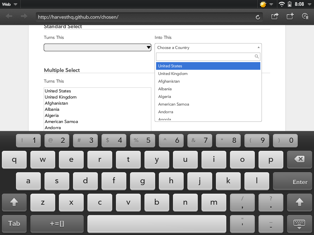
I like the Google Music Layout, I use it every Day. I think a similar Layout would be great. There are a lot of nice features on this Layout. The small triangle is very cool to open the Popup Menu (send to Playlist, Delete Song etc.) I think this Layout would be very nice for the Music Section.
Then please tell me about what _exactly_ you don't agree? I'm open to most changes as long as there respect most of my guidelines.I simply don't agree with the direction you'd like to go.
I don't think it's useful to work on different versions since i'm more concerned about consistency than specific designs.It's not as though this draft cannot be easily adapted to follow your concepts either. You're more than welcome to take aspects of it for your design. (I'm using a tremendous amount of css3, so it shouldn't be terribly hard to port over to your layout). Ask for my files, I'm not against giving them to you . (and many of them are contained in the www folder I posted earlier)
Well i really like the advantages of the RESTful approach more than the eye candy js based menus offer.Though I think some of these could be accomplished through filtering rather than a bulky navigation system.
My problem is i have an idea on how it should look like, but not the skills to realize it(and the technology isn't that goodI think you have a great concept going for the grand scheme of things, that said I think you should maybe start smaller. We don't need all of mediaportal's features ported over to a web interface right away, we can start with the basics and work our way up. That's just my opinion though.
") ) United States of America
) United States of America
Because mentlegen, that would be really boringWhy don't you make it all like on MP homepage as your style is very similar?
+1
.Well primarily side nav with fluid width. In my opinion fluid width designs are more difficult to work with. Additionally, I'd prefer this project be focused primarily on streaming TV over the internet as there is currently no other open source option for this. You seem to want to make this a full port of MediaPortal's features to a web-based environment, which is fine, I just disagree that its the direction to go right away as it involves a lot more up-front development.Then please tell me about what _exactly_ you don't agree? I'm open to most changes as long as there respect most of my guidelines.I simply don't agree with the direction you'd like to go.
I believe you mean functionality rather than consistency, but point taken.I don't think it's useful to work on different versions since i'm more concerned about consistency than specific designs.It's not as though this draft cannot be easily adapted to follow your concepts either. You're more than welcome to take aspects of it for your design. (I'm using a tremendous amount of css3, so it shouldn't be terribly hard to port over to your layout). Ask for my files, I'm not against giving them to you . (and many of them are contained in the www folder I posted earlier)
I could certainly see the use of a side navigation as a subnav, but I would question whether that is more intuitive for tablets as it would force a wider page width (or smaller content area), and thus create smaller text sizes. As far as drop-downs not being intuitive for tablets... it seems fine to me.Well i really like the advantages of the RESTful approach more than the eye candy js based menus offer.Though I think some of these could be accomplished through filtering rather than a bulky navigation system.
First it's more cross-platform compatible(especially for tablets) and second i don't think drop-down menus are that intuitive.
(see attached) If anything the javascript seems to make them a lot easier to use on a tablet, which is something I had not previously considered.I understand what you mean, but I must respectfully disagree. The software technology is most certainly there. (HTML5, JQuery, AJAX)My problem is i have an idea on how it should look like, but not the skills to realize it(and the technology isn't that good
Danke sirSince there were some discussions in the background just let may say that i'm quite happy about your interest in working on WebMP and i like your schematics!
I suppose I don't see the need to make the navigation overly complex at this time. There are plenty of relatively simple ways to avoid having a two-navigation system (main and sub navs). Especially when this initial release won't have very much functionality yet. In summary, I would be of the opinion: "lets cross that bridge when we come to it" with regard to adding complexity to the navigation.I only see a problem in the "top navigation only" layout since not only tv but also the other media types have specialized requirements for additional navigation.
It might be a personal opinion but i don't need specific LiveTV, Recordings,Schedules menu items at the main navigation, i would rather prefer more specific items for tv shows, other might want specific music items and i think to adress these specific whishes it's useful to add a sub navigation in addition to the top navigation.
Mostly just hate them.Do you have a specific reason why you don't like a sidebar for navigation?
They annoy me to no end on my tablet. (I'm a landscape man)That seems like a nice interface for its purpose. I'm not partial to it myself because of the side nav (something that still annoys me about grooveshark). I'm also not a huge fan of all the blank space around the search box.I specifically like this layout http://imag.malavida.com/mvimgbig/download/google-music-frame-9553-1.jpg (and just in case i only mean the layout! not the coloring or "design) because it allows using the header for navigation between media types like tv shows, television, movies and music but also gives the possibility of RESTful navigation within these types for example to access interprets, or albums in the music view, or all specific television views like live tv, epg or recordings.
Well this is part of the project yes, but that's not what it is focused on. It should offer all media in a similar manner.Additionally, I'd prefer this project be focused primarily on streaming TV over the internet as there is currently no other open source option for this.
May be it's just me, but on my Transformer i hate using drop downs because (although they might look nice) it's way faster to click a link then scroll trough a sidebar. Your screenshot looks good but the itemcount is very limited.I could certainly see the use of a side navigation as a subnav, but I would question whether that is more intuitive for tablets as it would force a wider page width (or smaller content area), and thus create smaller text sizes. As far as drop-downs not being intuitive for tablets... it seems fine to me.
)Well leaving out things like sorting is mainly caused by a lack of the current(my) design and not because it's not easily done.Especially when this initial release won't have very much functionality yet.
Well as i said it's mainly about how navigation and content area could look like, we obviously had to change the header in order to support more than musicI'm also not a huge fan of all the blank space around the search box.
United States of America
Of course notWell this is part of the project yes, but that's not what it is focused on. It should offer all media in a similar manner.
I have no problem with you focusing on tv, but i wouldn't like if the result is that other aspects of WebMP get out of sight.
I can tell you didn't visit that page at allMay be it's just me, but on my Transformer i hate using drop downs because (although they might look nice) it's way faster to click a link then scroll trough a sidebar. Your screenshot looks good but the itemcount is very limited.
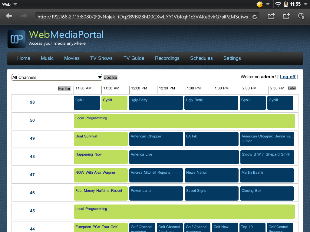
. The item count for that particular drop-down is near 30, and ugly/unusable without the javascript. However, I don't think it's necessary to have large item counts for filtering anyway. The only dropdowns necessary are "Sort By" and/or "Group By" (artist, letter, etc). Followed by a text input filter to find specific ones that you're looking for in that group/sort. No, any apparent blank space on the left will be filled with channel icons (55px), channel names (~150+px), and the numbers. Any attempt at a left navigation would either force the content to be smaller, or force a fluid width. Neither of which are particularly desirable to me. Unless you are speaking about the background area, in which case this only exists on a wide screen monitor (because it's a fixed-width page @960px). I'll attach a screenshot of the mobile view, and you can visualize what would happen to the content. (this is the same width as my friend's photoshop concept that I posted earlier.)And i don't see the problem with the side bar because based on your screenshot there is enoug blank space on the left and right don't you agree?
As I mentioned earlier, large category drop downs aren't necessarily the direction we'd need to take. For instance:Just look at the amazon category drop down, it's a really looooong list and that's neither nice nor intuitive, i think.
(But may be that's just on android tablets, nevertheless it's not nice )
A JQuery sorting option should not be difficult to find or implement, I'll see about finding one. Trying to do it on the back-end would probably be unwise anyway. Most browsing function should be offset to the client here to avoid load on the server. We certainly don't want the web experience to be slow because the server is busy encoding.Well leaving out things like sorting is mainly caused by a lack of the current(my) design and not because it's not easily done.
I was looking at that this morning, seems to me tv shows should be a filter within a "videos" menu item. Same for movies, and maybe recordings?I mean it also doesn't look nice if we have a main navigation full with items. I mention this because based on the latest screenshot there is music and pictures missing.
United States of America
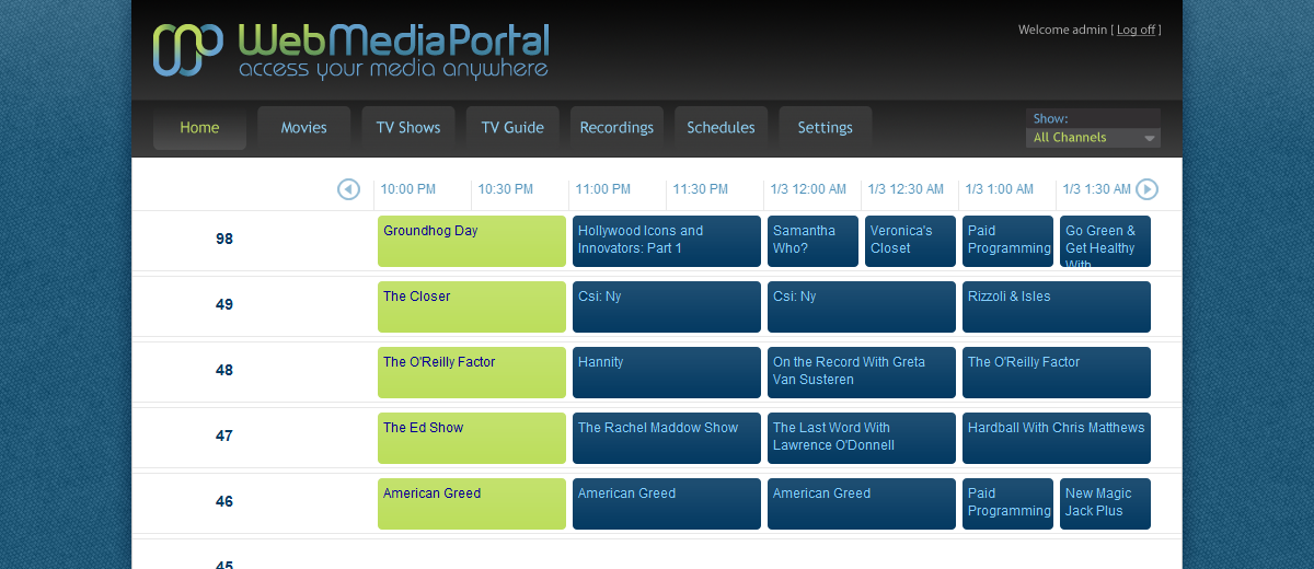
I like the new design
You've posted a screenshot not a link, as far as i can see...I can tell you didn't visit that page at all
Yeah i mean the background. Since most newer Tablets and Screens are way about 1280px width i don't see a problem in using some of this space(which would be wasted with a fixed 960px width).Unless you are speaking about the background area, in which case this only exists on a wide screen monitor (because it's a fixed-width page @960px). I'll attach a screenshot of the mobile view, and you can visualize what would happen to the content. (this is the same width as my friend's photoshop concept that I posted earlier.)
I was more thinking about things like categories, genres...As I mentioned earlier, large category drop downs aren't necessarily the direction we'd need to take. For instance:
I think this is mainly based on the amount of data. Sorting long movie lists is much faster @ the backend. Of course shorter liste would cause high latency.Trying to do it on the back-end would probably be unwise anyway.
That's a common scenario also in XBMC's standard design, but personally i don't like this, and yeah i know that it's mainly the same argumentation for television...I was looking at that this morning, seems to me tv shows should be a filter within a "videos" menu item. Same for movies, and maybe recordings?
United States of America
Back several posts to your original comment on drop downs, and you'll find itYou've posted a screenshot not a link, as far as i can see...I can tell you didn't visit that page at all
.This isn't true, mobile browsers display rendered images and do not obey pixel density. They load the page, create an image that approximately holds all the content, and then display that to fit the resolution. This is why there is never side scroll, so 960 stretches to roughly the full 1280, and anything above 1280 gets compressed. Ergo: when you attempt to add more content and use the "extra space" you will effectively shrink the rest of the page. Unless you fit it exactly inside the 1280 resolution, but then you'd have no margin on that page, and you'd also be neglecting devices with smaller resolutions.Yeah i mean the background. Since most newer Tablets and Screens are way about 1280px width i don't see a problem in using some of this space(which would be wasted with a fixed 960px width).Unless you are speaking about the background area, in which case this only exists on a wide screen monitor (because it's a fixed-width page @960px). I'll attach a screenshot of the mobile view, and you can visualize what would happen to the content. (this is the same width as my friend's photoshop concept that I posted earlier.)
This could be added to the group-by dropdown could it not?I was more thinking about things like categories, genres...
The sorting itself may be faster, but if you do your sorting on the back end you have to add in page load times. Which means more data fetching and more load. It's easier on the user to sort client side in most cases.I think this is mainly based on the amount of data. Sorting long movie lists is much faster @ the backend. Of course shorter liste would cause high latency.
Is that really much different than skins?To solve this what do you think about using a simple Setting to switch to different views? May be with this we can implement both strategies, and for me it's okay if we start with your version...
That sounds doable, I can't promise I'll have time to do both (but i'll try). Really the only reason I'm doing this is I don't have any projects that are earning me money while I'm on break. I need my code fix .